GT Life Menu Design Competition

  • Thread starter Thread starter Earth
  • 163 comments
  • 23,767 views
@TuomaZ

Very nice I like that you left out the B-Spec mode. I truely hate it and it is useless.
In addition I would love that PD kills the 24h and 1000miles/km races from the Enduro section. More shorter (200miles, 2h, 3h races at various tracks) ones.
Only fools and addicted race them 24h races and leave the PS3 running :yuck:
 
See below...
 
^ Thank you very much!

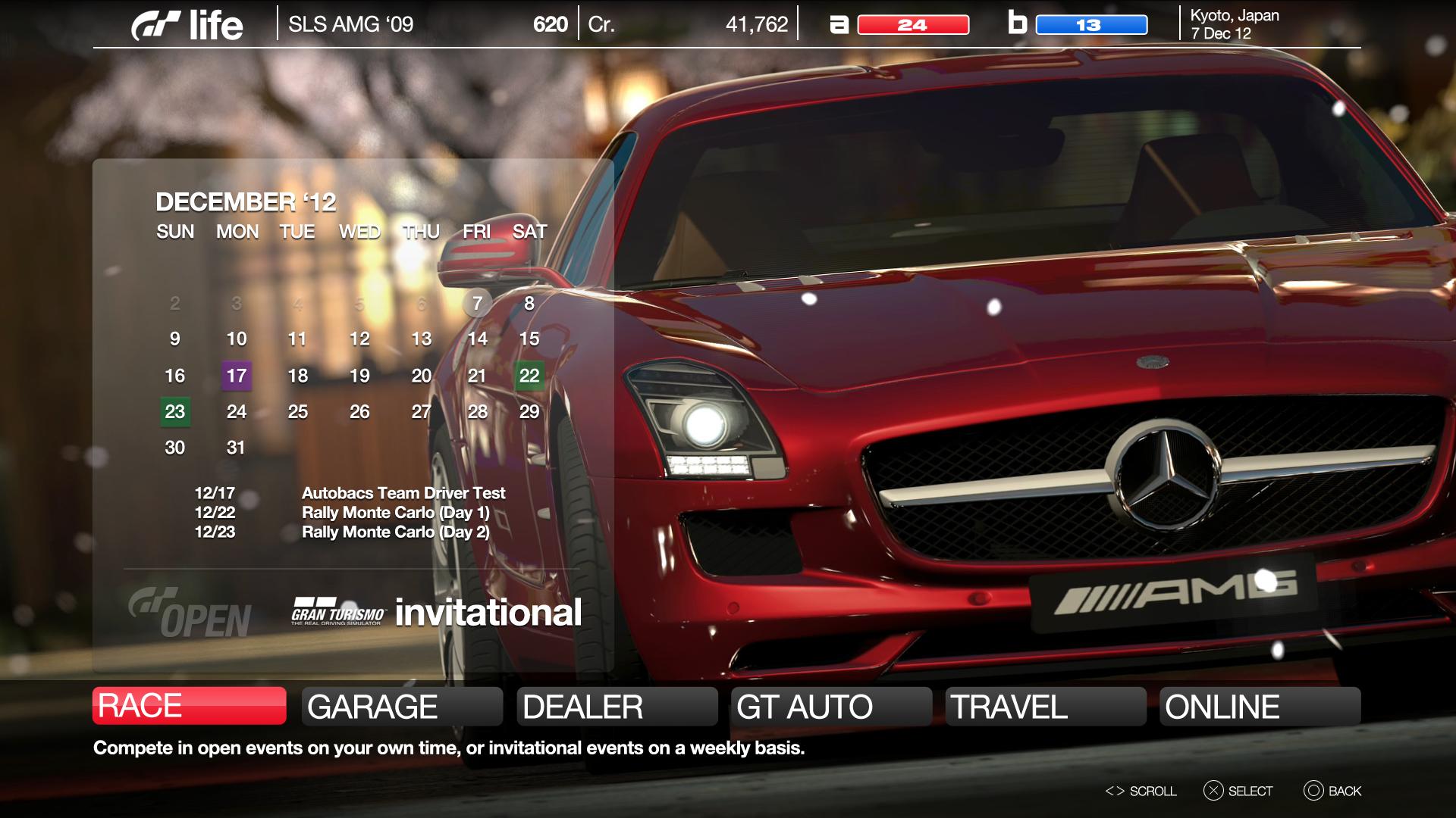
I found some time and cleaned up / enhanced a few things, added oil change warning light next to car name. I hated not knowing whether my car needed one or not. This will probably be my final entry but i guess I will wait a bit more just in case I change my mind about anything. Thank you all for the comments! 👍

F I N A L – E N T R Y

GT6-MENU_zps849385b9.jpg


Photo Credit: Old Tiger

Excellent. Just found this area of the forums, lots of good work here

Being older, my preference is usually for stuff that is uncluttered and smooth and this fits the bill as do several others..well done fellas. Couple of suggestions:

1. I would change "Photo Travel" to "Media" and make it the go to place for taking and storing photos, replays, game saves, importing and exporting photos etc.

2. I'd suggest removing GT Auto and using that button for the Track Creator which doesn't seem to fit in any of the categories. My thinking is that in GT6 you should be able to go from your garage and the dealerships into GTAuto and Tuning directly without having to go back to the main menu. 99% of the time that's how you'll use those options when you buy a car. You go into the main menu when you first open up the game and it's pretty rare when you first open the game to set about tuning the car that you happen to be in at that time so having that button on the main screen isn't really necessary.
 
I didnt like gt screens at all until gt5 so pd plz plz plz leave it the same as gt5 menu (wise)
 
nascarfn
I didnt like gt screens at all until gt5 so pd plz plz plz leave it the same as gt5 menu (wise)

Seriously?
 
nascarfn
Ya i dont know why cause most others like the map menu but i just find it un organized and confusing

Most find the gt5 one unorganised and confusing!
 
GT2 style was the best to navigate thru
in
East City - Japan & Korea,
South City - US cars
West City - Italy, France, Spain
North City - UK, Germany
Each city had its own music track. Thats important too to differ the cities from another.
Easy to navigate. Easy to find what you are looking for.
Each manufacturer had few introduction words VERY nice real life (i think no photoshop) photo of one or more of their cars
Icons available on the main screen of each manufacturer:
New and/or Used Cars, Manufacturer Events, Tuning shop, Special model(s).

Only GT5 main menu has no "map" under icons. So GT6 must have it :)
 
^ I definitely agree:

I miss the road map menu's (not made by me)


^ In my opinion this is the best one, zero-lag, almost zero loading times, simple, direct, and straight to the point. No glitzy-washy form like in GT5P or in GT5.

-> All PD has to do is to modernize this simple format to comply their specific features onto this retro-style menu format. No more, way less! :grumpy:
 
There are no loading times because it's just a video animation, not a game actually loading anything.
 
^ I'm aware that its a VA. But if applied onto the game the difference will be more dramatic.
 
Very clean and I like the adaption of your game interface to the small screen, well done as always Paul 👍
 
Back