CodeRedR51
Premium
- 56,018

- United States
Maybe someone could modify those to fit into GT?





This is nearly perfect but....
The background ought to be some type of garage scene. Then it would be the best imagined menu, for me at least.
Still, without that, it's the best so far


Thank you, how about now?


I like it, but I don't want it to scroll. I would rather use the joy stick as a cursor.

Same here, but I didn't want to say that.Just to put in my two cents, I'm not a huge fan of that interface.
Again, just my opinion

The feedback you received is well deserved. Your screen is wonderfully clean and easy to use. I preferred it with the original image though as the garage scene makes it look slightly warped.Wow guys thank you very much for the positive feedback, I wish I had more time, I put that together at work real quick.

Looks nice but I have to be honest, I hate that block font you keep using.


Here is a quick concept I tossed together. The icons are just really quick stuff I grabbed from the internet so some of them look a bit cheap...
The concept is a chequered flag grid of icons. The active icon is coloured and expands with the icon name. The top row of icons are driving related, "A-spec", "B-spec", "C-spec" (curious?), "Online", "Time trial/Test Track", "Free run/Free roam/Whatever..."
The second row is "Car dealership", "Garage/Home" (which contains all tuning, maintenance and customization options - no more menu hopping!), "Licence/Special Events/GT Academy", "Photo travel", "Social stuff", "Options"
[image]
[image]
The square grid makes it easy to navigate with the arrows: up = up, down = down, left = left, right = right. Why make it any more complicated than that?
I've probably missed a few important features, but this is the basic concept.
Edit: I guess the background picture could change accordingly with the icon that's selected. So for "Garage" the background could be a garage scenery etc.

I love this design. I hate bouncing all over the place trying to navigate through
GT5’s menu.
I especially like the idea of C-spec.
That is if you are using the C-spec as an online experience level. There are a lot of lousy level 40 A-spec drivers online. In that case you really wouldn’t need the Online icon to the right of the C-spec icon. The C-spec icon could take you directly to the online lobby list just as the A-spec and B-spec icons take you to those event lists.
Nice. It is quite similar to my first design on the previous page...


Things are starting to like the main menu, as oppose to a "GT World" menu. I know we're going for simplicity and ease of navigation, but when it gets too simple, it doesn't feel right for some reason. That's just my opinion though.
Yeah, what I meant is just that; the GT Life Menu you guys are designing are starting to look like the main menu, not so much my preference or what I like better. My preference would also go to GT's main menu rather than GT's World menu. Then again, it just feels different. Maybe I still feel the nostalgic of the world map from GT1-GT4.
It's a bit tricky to design, and I guess it would be a pain to drive for ten minutes each time you just want to buy some small detail to your car... but it would be an interesting approach Menu + free roam in one!

So, here's my take...
Ended up not "feeling" like GT at all, but maybe that's not such a bad thing.
I see you guys are opting for some kind of selectable grid, I kind of agree that the grid thing might be the best option for a console.
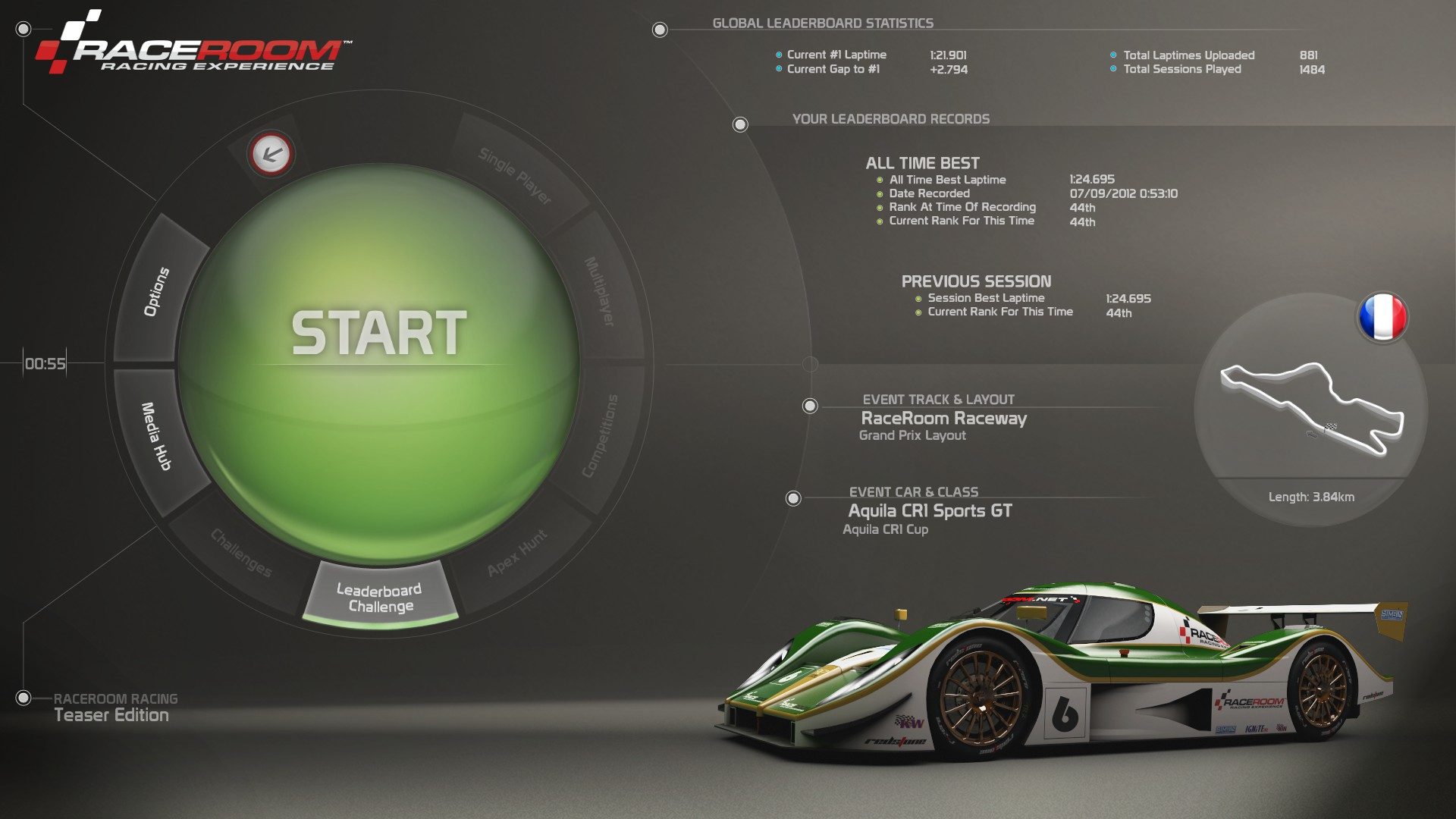
but anyway... the left column on "my" menu is basically a list with every option. From Garage to photo travel.
Selecting that option a new board appears on the right side (which would be a map for the racing events).
That's pretty much it. I would also change this map, but it was the best I could get.


 👍
👍