Hispania F112 Launch

  • Thread starter Thread starter Alex.
  • 98 comments
  • 10,920 views
1330968437.jpg


Here it is! The car made it's on track debut today at Barcelona for a filming day.
http://www.autosport.com/news/report.php/id/97856
 
Is that supposed to be their logo in the background?:confused:

Really like that paint scheme, glad they aren't doing another generic scheme.
 
Plenty of room for 'This Could Be You!' on that sidepod.

Very 2008 Force India.
 
Justin
Is that supposed to be their logo in the background?:confused:

Really like that paint scheme, glad they aren't doing another generic scheme.

Yeah, that's their logo. I think that paint scheme is awesme!
 
Is it just me, or does the rear wing look like it's on backwards? :confused:
 
That is a pretty little car. Looks a lot meaner than their previous designs.
 
Might have to root for the Hispania this year! :P
 
Best looking of all the teams running a stepped nose👍
 
Also doesn't mean its generic.

IN MY OPINION
IT LOOKED GENERIC!!!

Is that good enough for you?
Is it that hard to accept someones opinion?

Now I remember why I rarely comment on F1 related crap, you can't say a damn thing withough being pounced upon for having a view that differentiates from the herd.
 
Looking at it now from a few other angles there seems to be a tad too much gold!

Doesn't mean it's good looking.

I never insinuated it was good looking!
 
Last edited:
Very little looks changed from last years car, but it's still probably going to beat Marussia in the standings.
 
Very little looks changed from last years car, but it's still probably going to beat Marussia in the standings.

I do believe a lot of things are still missing on the car. The front wing is a past design, and the car is lacking in bargeboards. On the outside, it really is not that much of a change, but underneath the car, it's almost completely new.

I think that the car will end up looking more refined as we head towards Asutralia. Updated front wing, and whatnot. I still think they are in a more solid position that Marussia, though.
 
Screw Force India, this design reminds me more of good old Super Aguri. 👍

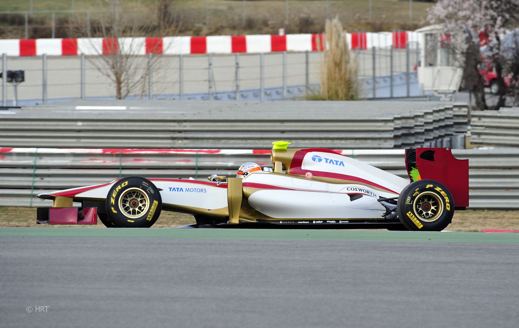
I like the use of red and gold, makes it a clearer reference to Spanish colours and a much tidier design than the past 2 seasons.
I also like it in a similar way that I liked the Brawn livery - a relatively simple livery. I hate the current "fashion" of complicated and messy designs using multiple colours and layers - particularly drivers helmets. To me, the better looking colours and liveries are ones that use the fewest colours and patterns. My favourite kinds seem to be ones that use either stripes to follow the lines of the car or panel/part sectioned designs.

So to me, this is a great livery.

On a side note, I love the shade of red they used - instead of using the bright reds that Ferrari, Total, Santander and Vodafone use. It kind of reminds me a little bit of the old days when Ferrari were scarlet red.
Funnily enough - the two colours they've chosen (dark red and gold) are two of the worst for TV pictures, or at least were in the past.

It will be interesting to see who has made the faster car between Marussia and HRT as this year particularly they look evenly matched resources-wise (though Marussia still enjoy slightly more permanent resources than HRT).
 
Last edited:
I’ve got to say – HRT has one of the most stylish liveries I’ve seen in a long time. It might be a case of style over substance, but if they’ve going to come stone-cold last, at least they’re going to look good doing it.
 
Yes... but that orange and green splatter inside the rear wing ruins it for me...
 
Last edited:
Back