Hyundai Staria

  • Thread starter 05XR8
  • 5 comments
  • 735 views
48,827
Australia
Australia
Hyundai Staria Previa much? Or If Ford mated the Aerostar & Probe.


A09ADE67-ED85-4177-AD53-1418AD4080BB.jpeg

9392A079-B627-4F8B-923F-033D8A83A8FF.jpeg


5C9B7F08-66F6-4A6B-B98B-98637885E023.png


Ive seen the panel van a few times. Easy to get used to quickly.
 
Last edited:
The front reminds me of Citroen design language.

This van follows an old design trend that has become new again in the age of EVs. It wasn't a good trend then, it's not a good trend now, and it never will be because it's just bad design. The problem is a lack of depth to the body design.

The entire body is just one smooth flat surface - the headlights, tail lights, windows, all the edge lines, all the panel gaps. They're all one flat continuous surface as if the car was a marshmallow or something. It's horrible. While that can be done well, it often isn't. Sketch Monkey got a new car recently and addressed this point in comparison to his old car. He starts talking about this design aspect at 1:00:


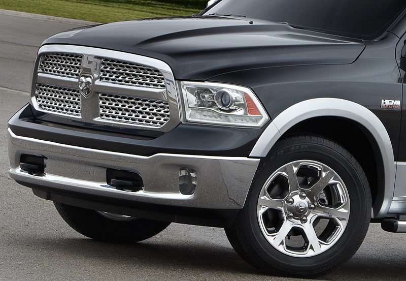
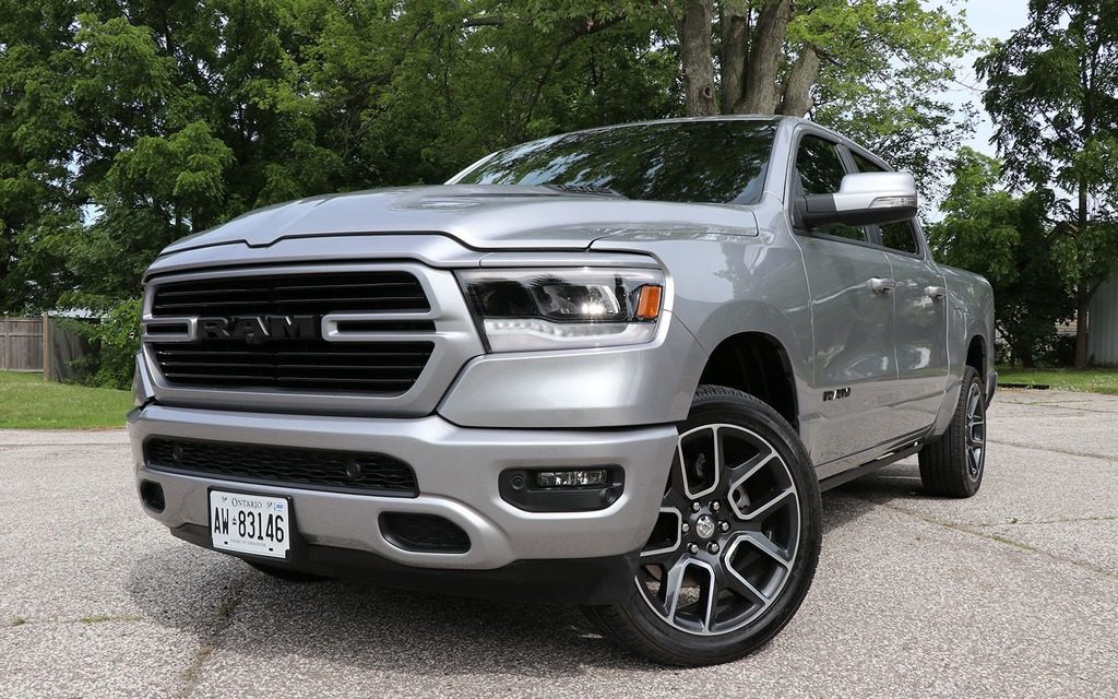
If you really pay attention while walking through a parking lot you'll notice which cars have a substantial design to them and which ones don't. In general, the use of chamfered edges creates a framework around graphics like lights and vents and makes them look like they belong where they are. You wouldn't simply take a paper movie poster and tape it to the wall, you would frame it, right? Photos aren't just stuck on shelf, they're framed because that's where they belong. That's what these little chamfered edges do. Here is an example of that Ram from generation to generation:

Ram1.jpg

341216_2019_RAM_1500.jpg


Which one of those two looks more like the designers thought and cared about what they were doing? Which one looks like it's made out of solid, strong material? Which one looks like it was designed with purpose rather than tacked on afterwards?

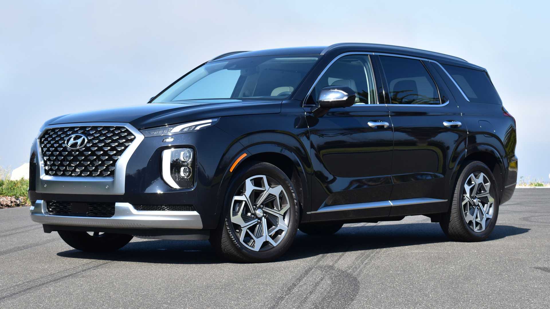
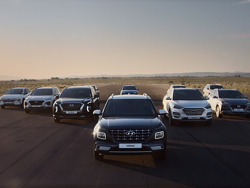
Let's find some of Hyundai's own examples. Actually we can compare both methods on one car.

2021-hyundai-palisade-calligraphy-exterior-front-quarter.jpg


The grille, the lower grilles, and the headlights on the Palisade look good. They're inset, they have depth, they appear chiseled out like the car was a solid billet that had holes milled out for the headlights and grilles etc. And then there are the DRLs above the headlights which are just kind there.

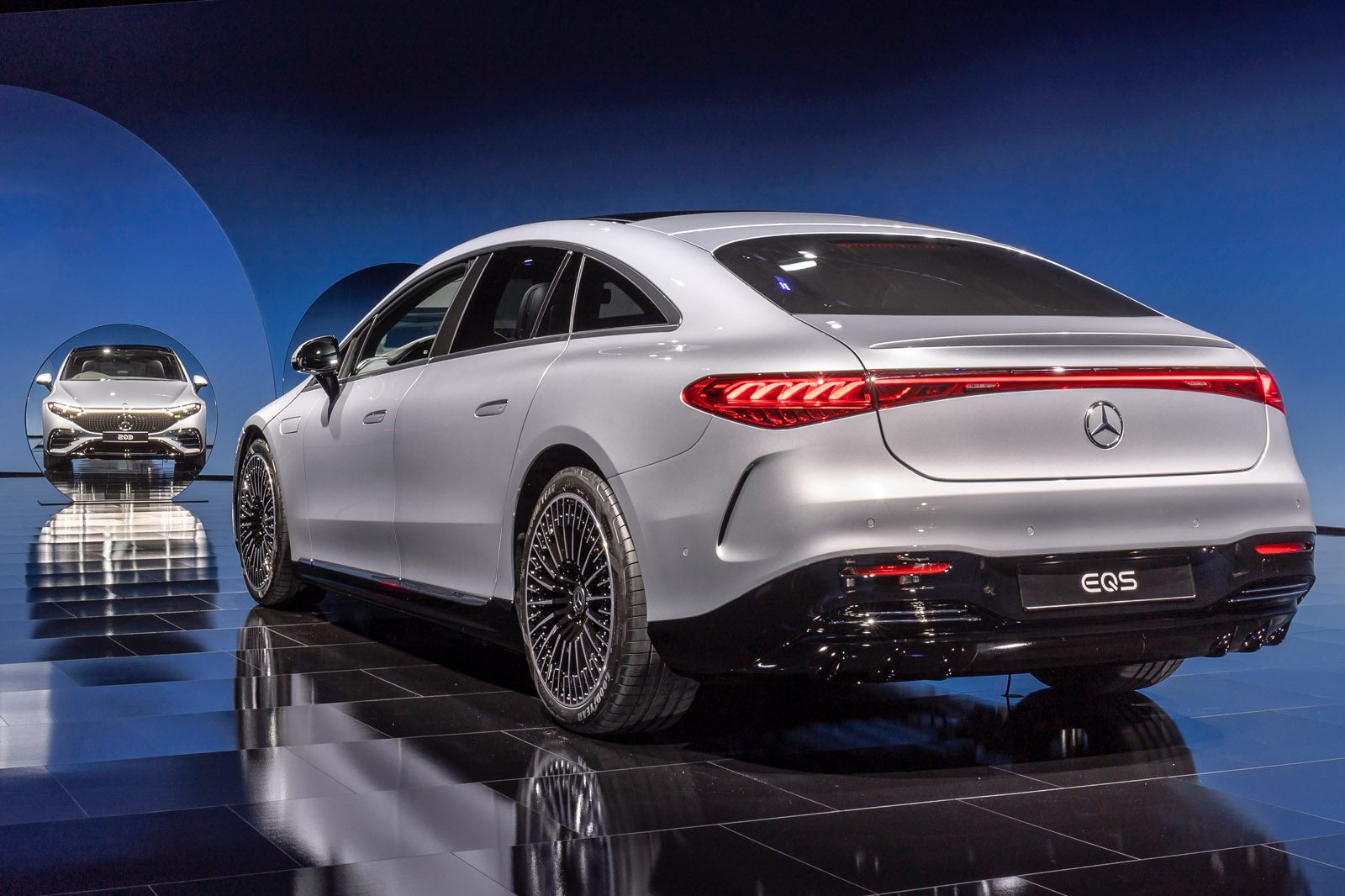
We can compare different design philosophies with new EVs and can obviously tell which one is better.

97-mercedes-eqs-official-reveal-images-rear.jpg

2022-audi-rs-e-tron-gt-103-1615819914.jpg


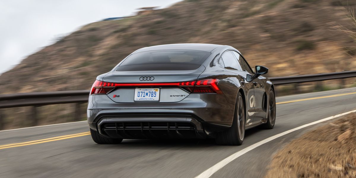
Even from a distance you can see how Mercedes and Audi approached graphic design very differently. While the Audi's rear lights have depth and appear framed within the solid body, the Mercedes lights might as well just be a sticker. A sticker on a melted blob of cheese. That EQS is one of the most egregious 2-dimensional design disasters of the modern era, honestly.

Anyways, that was a long story just to say that this Hyundai van design is terrible and ugly and unsubstantial and forgettable and derivative and is a symptom of a big problem we're going to deal with in the age of EVs. These fresh-out-of-school designers all think EV surface contours have to be a flat as a sheet of paper, like they're all made of glass or something. It's terrible.
 
Last edited:
Long before sketch monkey made this point, I tried to argue a similar one on this forum using almost the same reference vehicles @Keef

Compare these two designs. Telsa and Audi. Notice how the panel join lines seem somewhat arbitrary on the Tesla whereas they flow with other design elements in the Audi. Notice also that the Audi's panel joins are not only smaller, but they are "finished" to a higher degree of detail...it's hard to see in the picture but the edges are filleted in such a way as to convey that the body panels have thickness and strength. By comparison, the panel edges on the Tesla appear flat and kind of two-dimensional. It makes the body panels look thin as paper, they haven't really got the "return" edge detail figured out. The front door's rear edge ends in the center of the B pillar, but the rear-doors cut rear cut line ends in a kind of vague spot near the C-pillar. The bottom edge of the doors ends abruptly and its very visible, compared to the Audi. Towards the rear of that same line (bottom right corner of the rear door) the cut line is an un-radiused hard angle - not only does this clash with the curvaceuous body, but its also a weaker shape, and it necessitates a 3-panel join which both looks bad and also makes the assembly process more difficult (the rocker panel, rear door, and fender all meet at one discrete point). Take a look at the cut line for the hatches. In the Audi, its completely hidden behind a solid element of the rear pillar. In the Tesla its awkwardly visible. The rear arch (the flat part, towards the face of the wheel) on the Tesla just sort of ends at the bottom of the car, whereas in the Audi, it's cleanly incorporated into the rear bumper/fascia. These are just some examples. All these small little things add up to a car that looks good from 100ft away, but starts to look worse the closer you get. Teslas just look insubstantial and unresolved to me, lacking finish. With its very well resolved details across the board, the Audi appears both stronger and lighter simultaneously. It's all in the details.

The most egregious example of this I find is the new Land Rover / Range Rover design language. They look absolutely terrible - like spandex stretched over a fiberglass mold. No depth at all to the bodywork - which is particularly sad when you think of the pretty rich JLR design history.

This Hyundai is pretty meh.
 
Last edited:
Long before sketch monkey made this point, I tried to argue a similar one on this forum using almost the same reference vehicles @Keef


The most egregious example of this I find is the new Land Rover / Range Rover design language. They look absolutely terrible - like spandex stretched over a fiberglass mold. No depth at all to the bodywork - which is particularly sad when you think of the pretty rich JLR design history.

This Hyundai is pretty meh.
You mentioned LR and I completely agree. Smooth as glass. Might as well just be a single sheet with headlight stickers like a NASCAR.

Here's a comparison that was actually deeper than I initially thought:

1920px-2020_Land_Rover_Defender_SE_D240_Automatic_2.0_Front.jpg

ford-bronco-eruption-green-2022-11.jpg


The thing about the Defender is that LR tried to give the face some depth - until this photo, I had never known that the headlights actually are inset deep inside a gloss black housing. Somehow they managed to make deep-set headlight look like a completely flush pane of glass. I assume it has something to do with the fact that their gloss black "frame" isn't actually a frame because it's on the same plane as the rest of the body and has no depth. It actually reinforces the illusion that the headlights are on the same plane as the body panels.

On the other hand, the Ford's design has much better depth and framing. And the funny thing is, for retro reasons Ford was trying to imitate the face of the 60s Bronco which was literally a lifeless piece of stamped white sheetmetal, but in doing so accidentally designed a headlight surround with complex contours and chamfers. So while LR was trying to make a good design but failed, Ford was trying to create a bad design and failed.

Edit: There is one aspect of this Bronco that bothers me because again it's not properly framed and that is the top of the windshield frame. Whereas the A-pillars wrap around and the resulting highlight looks like a chamfer, the upper frame is just flat and seems to blend right into the windshield. That was a missed opportunity and the Defender does it better. Framing the windshield with thick cuts of bacon is actually something the old FJ Cruiser does better than any truck in its category.

2014-toyota-fj-cruiser-ultimate-edition-front-three-quarters-2.jpg


Man. I wonder if Toyota is done kicking themselves yet.
 
Last edited:
You mentioned LR and I completely agree. Smooth as glass. Might as well just be a single sheet with headlight stickers like a NASCAR.

Here's a comparison that was actually deeper than I initially thought:

1920px-2020_Land_Rover_Defender_SE_D240_Automatic_2.0_Front.jpg

ford-bronco-eruption-green-2022-11.jpg


The thing about the Defender is that LR tried to give the face some depth - until this photo, I had never known that the headlights actually are inset deep inside a gloss black housing. Somehow they managed to make deep-set headlight look like a completely flush pane of glass. I assume it has something to do with the fact that their gloss black "frame" isn't actually a frame because it's on the same plane as the rest of the body and has no depth. It actually reinforces the illusion that the headlights are on the same plane as the body panels.

On the other hand, the Ford's design has much better depth and framing. And the funny thing is, for retro reasons Ford was trying to imitate the face of the 60s Bronco which was literally a lifeless piece of stamped white sheetmetal, but in doing so accidentally designed a headlight surround with complex contours and chamfers. So while LR was trying to make a good design but failed, Ford was trying to create a bad design and failed.

Edit: There is one aspect of this Bronco that bothers me because again it's not properly framed and that is the top of the windshield frame. Whereas the A-pillars wrap around and the resulting highlight looks like a chamfer, the upper frame is just flat and seems to blend right into the windshield. That was a missed opportunity and the Defender does it better. Framing the windshield with thick cuts of bacon is actually something the old FJ Cruiser does better than any truck in its category.

2014-toyota-fj-cruiser-ultimate-edition-front-three-quarters-2.jpg


Man. I wonder if Toyota is done kicking themselves yet.
2021-land-rover-discovery-r-dynamic-exterior-rear-quarter.jpg


🥴
 
Back