- 2,690

- Titan
stairs = epic. Awesome contrasts and well composed, speaks a lot. The Lotus is also a model?
Well, I'm glad you like them. And the Lotus is real. ^^
stairs = epic. Awesome contrasts and well composed, speaks a lot. The Lotus is also a model?
I love the stairs, beautiful exposure. Really like the preview too, a little dark maybe but still really cool.
Awesome close up shot of the rim. That would work really well as a print on Kodak Endura Metallic paper.
 But thank you.


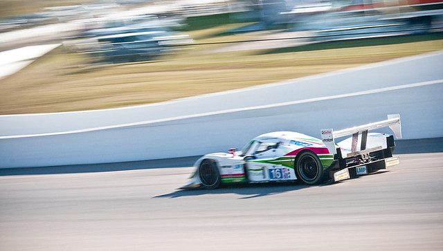
 I kid, I kid. Great work can't be rushed. That blue racecar is wicked. Love the textures of the background. Almost looks like a painting.
 Sheesh... talk about taking your time with updates
I've already commented on the GTR before, love it every time I see it. 👍
Now onto the experimental arty shots. I dig them. The dark silhouette shot works for me a little better than the others, probably because the darkness of it gives it more impact.
I reckon the blue Elan looks pretty good. As you mention the background colour tones really set it off. It's a very vibrant blue. 👍
As for the experimental shots, I feel the same as Syntax. The black one works best I feel. The higher contrast in tones plus the mostly shadowed aproach suits the grainy texture better to me.
Is that PS's reticulation filter? Because it looks a bit like it to me.
Also, since no one said anything and in case it wasn't obvious - when I said a..."local model" I really meant "me" and "obviously not a model."

I've seen a similar shot the first one using a "local model" as you put it (or is it that same shot?) on either your flickr or devart site a fair while back but never made the connection...
Nice to put a face to the name in any case. I certainly dont think it was unsuccessful at all. The shots are great and the minimalistic approach is great. The darker shot steels away the focus however as the dark tones have a very strong impact.


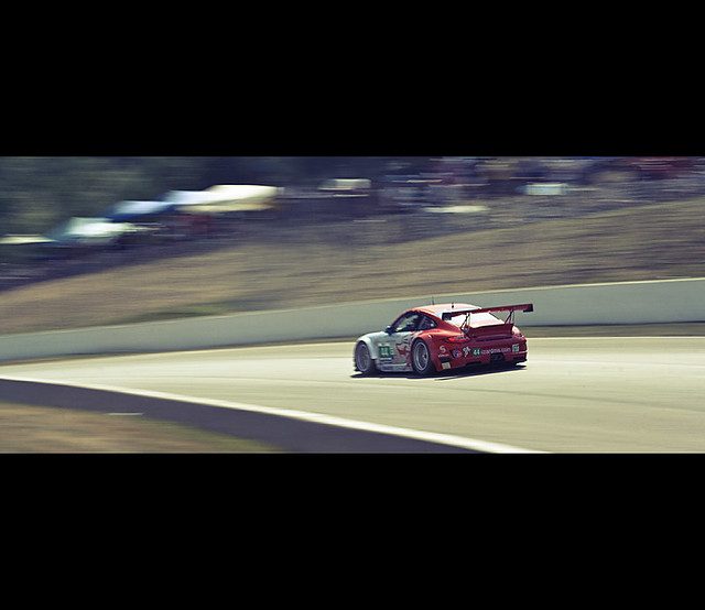
That's pretty good Chris, but my liking of it may also be swayed by the fact that I'm a porsche fan.
But from a graphic design point of veiw its pretty decent. I assume its a poster or generic ad of some sort?
Am also interested in seeing the lighter variant you mentioned.
As for the cars in there, was that from one shot? or were they comp'd together in PS? either way good job on that. 👍
Well, I'm glad it is swaying in...some way.
I'm not much of a graphic artist. At all. I would say it's some kind of poster. You're going at me with these purpose questions but I really just did it for fun, and it fulfilled the requirements of the course I was taking at the time (which was a Photoshop course, not a graphic design).
The lighter version is just that, a little lighter and more vibrant. I chose this one because it preserved the detail more in the reflections and such on the cars.
The cars were all one shot. My shot...in my studio...
Thanks. ^^
Ah fair enough, just assumed it was more of a graphic design specific project. In any case I think it works as a poster quite well.
The photo element itself looks good and almost illustrative in treatment which works well for a poster particularly with cars of that age.
The only thing I felt was a little off was the tranparency of the windows ove the coloured shapes. They look a bit milky and light, not transparent enough. But it's pretty minor.
Tell ya what though, has kind of got me in the mood to do some auto posters just for fun. 👍
Damn Chris!. I actually didn't realise they were models until you mentioned it in the subsequent post.


An excellent update again, great stuff, the garage shot would be my pick of them, just a nice balanced piece of composition.
Have you not looked at getting a photobook printed, they are a great idea and resonable cheap as well. You own shots with text in a bound hardback book, all arranged by yourself and ordered on the web.
This site is in the UK.....
http://www.photobox.co.uk/shop/photo-books
...but should give you an idea of what I am trying to explain.
Scaff
Hi LongbowI wondered if anyone would notice that. I found it distracting. Among other things that I were wrong with it. I really chose it for one reason: to break up the other motion shots. It was the only GT3 Challenge car I photographed in the garage. And, I didn't like it to begin with. It's amazing I managed to do anything with it at all. It was really bad originally, the lighting was terrible there. I assume by detail in the shadows, you mean underneath the car. I could do something about that...but I don't think it would make all that much of a difference. And I'm not a fan of the shot anyway...>_< Thank you for the critique though, I appreciate it. ^^
Heh. Thanks. ^^ Especially considering all that I just said about it. XD
That sounds like my house:
"Do you think I put up a car picture above the Fireplace?"
"...No. I want something nice. Like flowers."
"Cars are nice! Especially this 1985 Ferrari 288 GTO!"
"........No they are not."
I really like the book idea though, I've been looking for some kind of book I can put 8x10's in or something like that. No luck though. I would like a book of my work to show people, sometimes. Thank you for that website, as well. I will definitely check it out. Maybe for the basement we are renovating I can find a place for one or two. I agree, things look so much better in print...
")