- 4,387

- Lisboa


Last edited:
 As SweetshopUnion said, you have some great framing 👍
Thanks allot 👍Wow I love these! The framing and style of all your shots is fantastic. I can't wait to see this gallery grow 👍
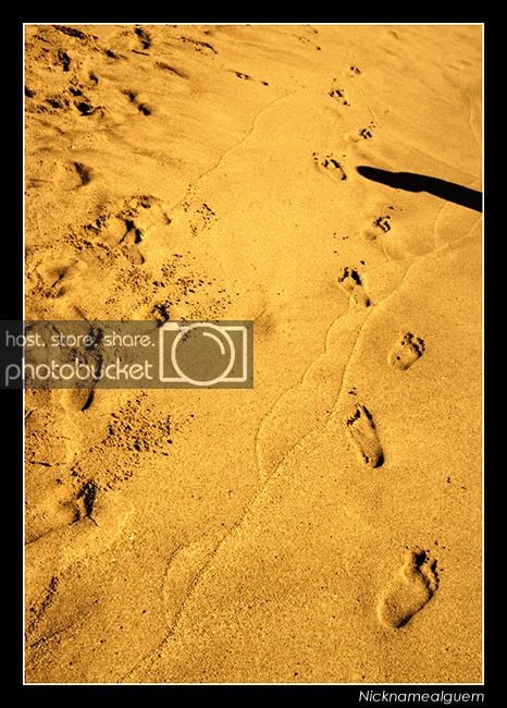
Thanks. It was the best I could get with a beach full of people. Those lonely footprints at the far right are mine, and I think that shadow is my dad, at least it looks like himI absolutely love the "Footprints" image, but oh dear does that shadow spoil its perfectness near the upper right corner


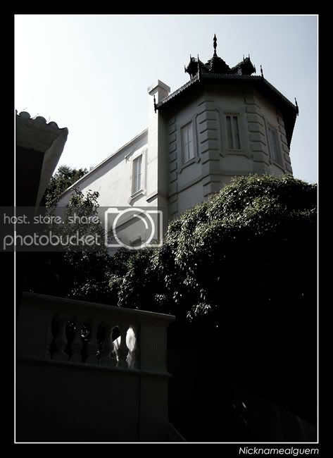
Welcome to the photography sub forum. Nice start to the gallery. The vintage feel is pretty good however the composition doesn't work for me on the first two photos you posted up. Just a little off in my opinion.
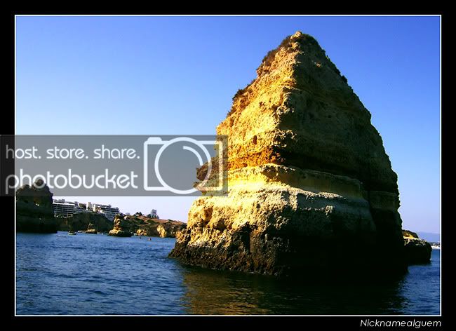
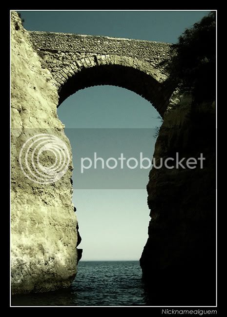
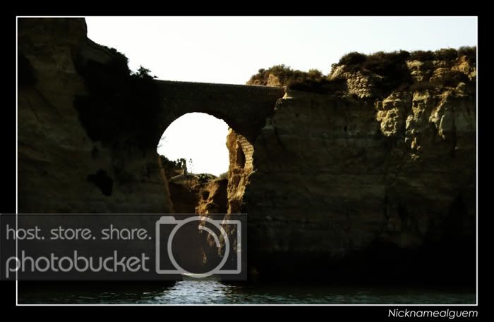
The Buddha Cliffs are good shots however. Nice simple shots with good composition and the vintage pp works well with these shots too. 👍 Regarding the sand shot, the foot prints certainly works well in leading the eye but unfortunately the shadow suddenly steals the focus.
Keep the shots coming, interested to see more.


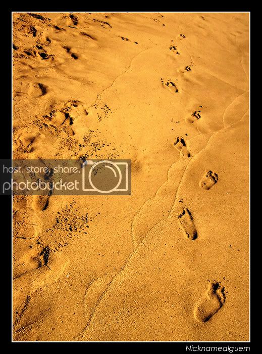
Very nice edit of the footprints shot -makes it just about perfect!
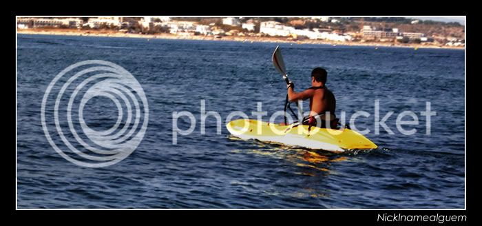
The vintage style is used to great effect, as always. The second canoe shot I feel has a little bit too much black, and a lot of detail is lost. It's a style choice though, and if you like it - keep it.

Heaps better without the shadow. Props for the great editing as well... can't even notice that the shadow was once there.
Some great shots here. Just watch your horizons: if you want them flat, make them flat. If you want them not flat, make them sufficiently not-flat that it doesn't look like you forgot to make them flat.
If you can follow that sentence, you haven't been drinking!!!
Nice work and I also have to add my like of the footprints shot, excellent stuff.
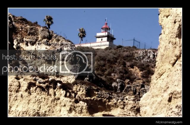
I do also have to echo the horizon line comment as well, Giles is quite right on that. I would also mention a similar thing regarding the Lighthouse shot, the building is leaning over, which keeps diverting my attention from what is a really nice shot, straighten the verticals on the building and it will make the world of difference.
Regards
Scaff
 .
.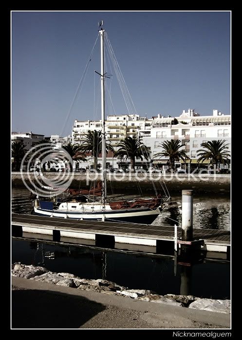
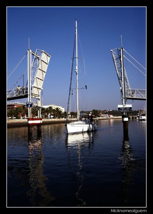
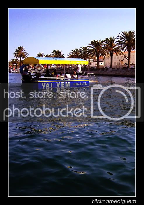
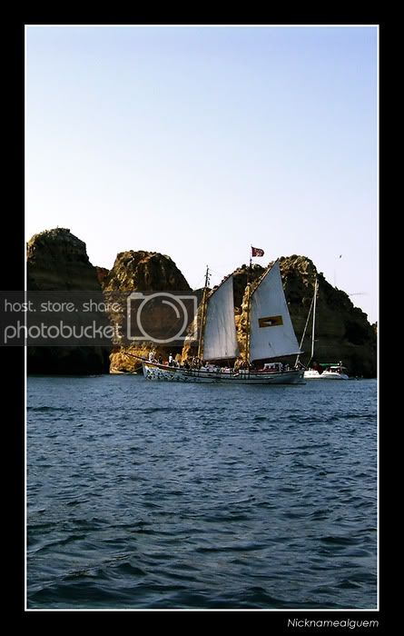
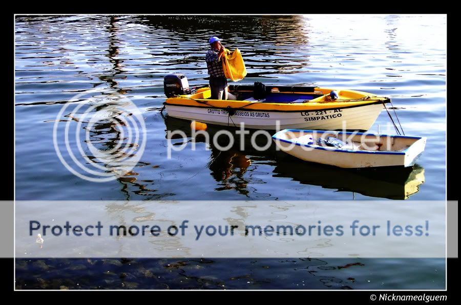
Thanks Scaff, and yeah, I kind of agree with you in the first picture. I seem to have risen the whites a little too much, making the background even more distracting that it was, being difficult to focus on the boat.The second one I like a lot, the framing either side by the bridge and the reflection of the boat in the water gives a nice balance.
The first one however the boat gets lost in the background and as such its difficult to see what the focus of the shot is.
He he, this are shots from my vacations to Lagos, Algarve, south of Portugal, since where I live, I dont have many things to photograph. Anyway, I just have one or two sets to post of it. 👍I do have to say you have one nice part of the world to take pictures of.
Agree with Scaff regarding the shots. The second shot is far more distinguishable.
BTW, I'm totally green with envy at all the traveling you've done.


I love this shot. I think it's the best one you've posted yet. Great colours, DOF is good, composition is spot on and it conveys the atmosphere well.


 They're just awesome... 👍