- 100
Ok!! I just wasnt sure if it would be allowed because a source outside of GT4 was used to make it!! Now I know that no matter what, everything has to be from in-game, thanks GrumpE.
Can I recieve more information on how this analyzing will go forward? Does every member of this service analyze each and every image in this thread? Or are certain members assigned to certain areas of Photomode?
And what are the criteria for chosen images to be analysed.
Shouldn't those persons came here and ask for a deep analysis of why they're photo wasn't in the poll?
I think it would be easier than analyzing every single image that doesn't go to the poll. Some cases are too obvious.
Or, otherwise, you are the one who would like to know why?
Also, can we be mean and honest? Like saying: "To tell you the truth, I am not surprised your photo wasn't in the poll. Even a five year old could take batter photographs. It's all wrong. The car is out of focus, etc."; or do we have or should go with nice but not so honest analysis: "well, it's not a bad photograph, the colours are quite nice and I like the light and the surrounds of it (lots of compliments), but there are some minor photography mistakes, like this and that...." ???
I'm in, I don't consider myself a photography expert or anything, but I could contribute.

Another issue, can we for example, issue a photograph that didn't made into the poll and compare to one that is on the poll, but looks inferior.
Let's say, we have shots "a" "b" "c" "d" "e", only "a" "b" "c" got to the poll. Can I bring shot "e" to here, stating my doubt, making my own analysis and compare to shot "b", that I think it didn't deserved to be on the poll?
I don't want to cause any trouble with any theme chooser, but sometimes, I see (in my eyes) inferior, edited shots getting into poll, and slightly unedited, but superior shots, staying on shore.
EDIT: I updated the 1st post listing everyone involved, and linking their names to their profiles, as well as the 5 competitions' hosts.
")
Drvac photo didn’t made into the poll
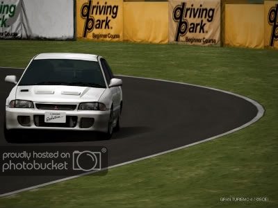
Speedemon photo made to the poll
^^Yes, I am just waiting for the theme.
Grump, I am clarified. So, lets start, shall we.
NicknamealguemJetboy entry:
I am really not surprised it didnt go to the poll.
Firstly, I dont know if it was a compression problem, but the car seem to have lost some definition. There are some weird pixilations in the photograph, like when you save a .jpeg in poor or medium quality mode.
Secondly, I think the camera its too zoomed in the car, not leaving too much room to get a decent framing and overall angle and leaving the car too on the bottom. The bottom of one of the front wheels is almost cropped out of the frame, which is quite bad.
Unfortunely, theres nothing I can say positive about this photograph, and I have to say, for me, it was one of the weakest entries in that competition week.
NicknamealguemGrumpEone entry:
In terms of editing, its quite a step up, the car is overall, quite clean and it has some kind of shape. It also shows some concern on working the car and door lines, which is praiseworthy, though, some thick dodge/highlight in the limit of the door line would made the car have even more shape.
Now, the bad stuff? You really need to calibrate your monitor screen. Its not just this photo, but all your photos look a bit washed out, with no significant contrast levels. This photograph, for example, is all in the grey scale of things, not being black and white. The highlights are not as white as they should be and the shadows are not as dark as they should. I can even see the pixilation form of the tire itself.
Also, its only the car and nothing else. No background scenery, no nothing, only the car in the frame and nothing else, which in some photographs doesnt quite mix so well. I don't mean like, having a big scenery behind, but something beside the car would be quite nice
As for the ugly stuff, I would say, leave the mechanic adjustments to the track. I mean, the front of the car is too low compared to the back, and that kind of makes the photo a bit weird.
 Anyways, what really bugs me is that too much paint was filled in into the door lines. The car looks a bit cartoonish, which is a bad thing.
Nichnamealguem_____
Now that the 2.0 poll closed, I would like to read some srutinization of these photographs from the same week and competition than those presented by GrumpEone.
Drvac photo didnt made into the poll
VS.
Speedemon photo made to the poll
My doubt is, how did drvac photo, that is superior to speeddemons photo, didnt get into the poll. I mean drvac photo is absolutely awesome, and has allot of potential edited. The car itself looks quite clean and the reflections are great, especially in the front window, where they seem absolutely perfect. Also, the tones are fresh and the angle of the shot is very eye catching.
In addition, speedemons entry is edited (badly edited, I may add). I mean, the car is blurred, has no definition, the door and overall car line are just left unedited; it seems quite rushed if you ask me. The only thing good about it is, not only the idea behind, but the background looks quite good, though, the car degrades it, in my opinion.
I think ideas are good, but the final execution is more important. But let me hear what you guys think about these two.
 If I had to choose which of these two shots has to go to the poll, it would be drvac's shot. The quality is overall good, if not very good and the car was well positioned. The camera is angle is good and the car shows some great reflections.
Jetboy entry:
I am really not surprised it didnt go to the poll.
Firstly, I dont know if it was a compression problem, but the car seem to have lost some definition. There are some weird pixilations in the photograph, like when you save a .jpeg in poor or medium quality mode.
Secondly, I think the camera its too zoomed in the car, not leaving too much room to get a decent framing and overall angle and leaving the car too on the bottom. The bottom of one of the front wheels is almost cropped out of the frame, which is quite bad.
Unfortunely, theres nothing I can say positive about this photograph, and I have to say, for me, it was one of the weakest entries in that competition week.
GrumpEone entry:
In terms of editing, its quite a step up, the car is overall, quite clean and it has some kind of shape. It also shows some concern on working the car and door lines, which is praiseworthy, though, some thick dodge/highlight in the limit of the door line would made the car have even more shape.
Now, the bad stuff? You really need to calibrate your monitor screen. Its not just this photo, but all your photos look a bit washed out, with no significant contrast levels. This photograph, for example, is all in the grey scale of things, not being black and white. The highlights are not as white as they should be and the shadows are not as dark as they should. I can even see the pixilation form of the tire itself.
Also, its only the car and nothing else. No background scenery, no nothing, only the car in the frame and nothing else, which in some photographs doesnt quite mix so well. I don't mean like, having a big scenery behind, but something beside the car would be quite nice
As for the ugly stuff, I would say, leave the mechanic adjustments to the track. I mean, the front of the car is too low compared to the back, and that kind of makes the photo a bit weird.
My doubt is, how did drvac photo, that is superior to speeddemons photo, didnt get into the poll. I mean drvac photo is absolutely awesome, and has allot of potential edited. The car itself looks quite clean and the reflections are great, especially in the front window, where they seem absolutely perfect. Also, the tones are fresh and the angle of the shot is very eye catching.
In addition, speedemons entry is edited (badly edited, I may add). I mean, the car is blurred, has no definition, the door and overall car line are just left unedited; it seems quite rushed if you ask me. The only thing good about it is, not only the idea behind, but the background looks quite good, though, the car degrades it, in my opinion.
I think ideas are good, but the final execution is more important. But let me hear what you guys think about these two.
Now I'm not going to completely tear apart my own shot, because Nicknamealguem did an excellent job of that in his analysis, which is all valid imo. First I would like know how my shot looks "washed-out", is it mainly because I dislike the over-contrasted look, as it accentuates the whiter light, it drastically reduces the color in the darker areas of the shot. The lack of scenery/background was by design, because the theme "Salon Show" the focus should be entirely on the car, when you go to a show do you really focus on the backgrounds or the car itself. Again if this was open-edit, I would have created a better background to work with, more oriented to the car's presentation. The ride height adjustments were done specifically to capture some of the reflections that I would have lost at that camera height and angle I wanted to use, if left it stock the lighting would have changed to something less presentable. I noticed after submitting my changed entry, the pixelation and lack of touch-up on the tires, and the grille didn't jump-out like the original.
Please elaborate on the "washed-out" effect, and how I can eliminate this in the future, because I honestly don't see it, nor did Nenad. If someone else notices this please speak up, as I still want to put the best shots I can into these competitions.
 V.S.
V.S. 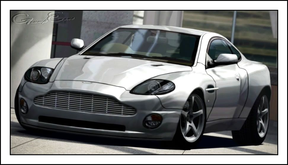
Can't believe I forgot CCCL, and that's one of my six favorites too...GrumpE, you forgot CCCL in the comps section...
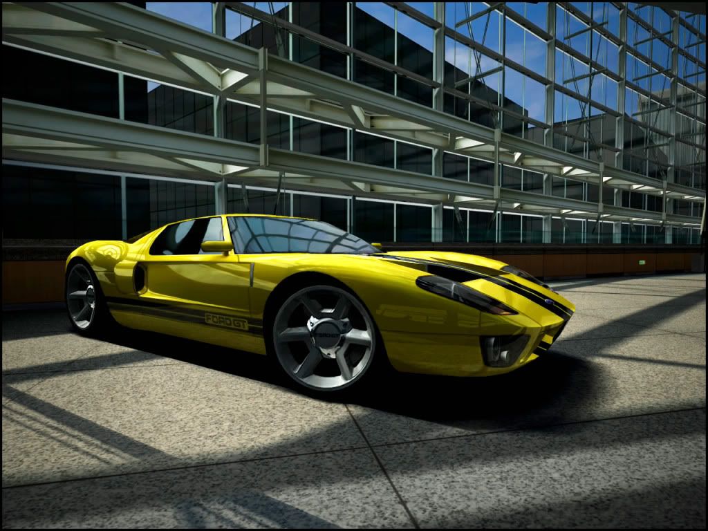
As for Grump's entry, I believe that your first entry was better. The focal blur probably could've been fixed with smudging and maybe a little sharpening.
Could you open just one more spot for me please?
 .
. . And I would also like some critique on my entry.
David48

And I would also like some critique on my entry.
Could I have some criticism too?
")

 Close, but no cigar.