-=> Photomode Discussion & Analysis Thread. (Discuss here, not in Comp. threads) <=-

  • Thread starter GrumpEone
  • 77 comments
  • 4,424 views
I agree with that analysis. The two things that catch my eye in the photo are the car and the "driving park" wall in the back. Since both of these things are very close to the edge of the picture, it leads the eye out of the picture rather than into it. I would suggest angling the camera up more, showing more of what's above the barrier rather than below it. The grass and track are also rather flat and uninteresting, so I would suggest moving the focus to more interesting objects.
 
uuuuuuugggghhhh o: I can't believe I missed that. =/ I saw the green grass and yellow wall and I assumed.
 
No, I do not know what they say about assuming. But I do know what happens when you assume. ;D
 
For the PmC tournement, I didnt make it by one vote! This is a shot that I tried out, not like me at all, tried something different! This was the first time in PmC that I adjusted the colors(contrast and such to PmC rules), just wonder what everybody thinks of my shot! Let me know what I need to improve on and your overall critisism of the shot!

 
I would be happy to help people improve their artistic ability, is there any chance to sign up for this?
 
Would anyone like to do some extreme criticism on my recent losing entry in the Tournament??

Tear it apart in every aspect! (The theme was SUPRA)


I would be happy to help people improve their artistic ability, is there any chance to sign up for this?
Just go ahead and critique all you want, as this thread didn't catch-on nearly as well as I had hoped.
 
Last edited:
With pleasure! :lol:


Like I said in the poll thread, what broke this shot for me was that the background stood out way too much compared to the car. You would think a bright red Supra would stand out well enough on its own, but for some reason, lighting perhaps, it looks washed out and isn't quite bold enough.

The lights in the background are also distracting, especially because they are all different colors, and it makes the shot feel disjointed, like something doesn't fit.

However I will say that it is a very well composed shot, and had those details not been so distracting, it probably would have had my vote. 👍

Edit: Not to nitpick, but I can't quite understand the positioning of the wheel. It looks like there should be a rim there but it's just a dark tire, which is also a little distracting. I remember noticing that when I looked at the full size in the poll.
 
Compered to the other shot, it doesn't have as much as "action". Good work anyway though.
 
With pleasure! :lol:


Like I said in the poll thread, what broke this shot for me was that the background stood out way too much compared to the car. You would think a bright red Supra would stand out well enough on its own, but for some reason, lighting perhaps, it looks washed out and isn't quite bold enough.

The lights in the background are also distracting, especially because they are all different colors, and it makes the shot feel disjointed, like something doesn't fit.

However I will say that it is a very well composed shot, and had those details not been so distracting, it probably would have had my vote. 👍

Edit: Not to nitpick, but I can't quite understand the positioning of the wheel. It looks like there should be a rim there but it's just a dark tire, which is also a little distracting. I remember noticing that when I looked at the full size in the poll.

On the wheel positioning, that was a drift, or the ending right before squaring up, I held it late to get the reflection of the wall on the car, I didn't expect the streetlights would reflect that well. The slicks didn't provide real visible smoke, which is what I wanted for the shot.

Nit pick, that's what I'm looking for... I'm not crying yet...lol

SVX
Compered to the other shot, it doesn't have as much as "action". Good work anyway though.

I normally provide more 'action' and motion blur, but I really thought a semi-still would work well. Thanks, but what are the cons to the shot itself (regardless of the other shot)?
 
Critique on my shot? I need to improve myself a whole lot. I don't feel ready for nicknamealguem. :nervous:

PMC Round 2 Entry

click for full size
 
Critique on my shot? I need to improve myself a whole lot. I don't feel ready for nicknamealguem. :nervous:
Rocky was nervous before he faced Ivan Drago in Rocky IV but he kicked his ass. Personally I think it looks great. But then you're talking to a guy whose only vote in Photomode competitions was disqualified for using a Photo Travel location.
 
I will say that normally that kind of composition would not normally get my vote, but you made it work very well. It's very clean and powerful. 👍

The only problem I can really see is the quality of the car - there are a lot of jaggies around the wheel wells, but there's not much you can do for that. I keep scanning the photo and I have to say there is nothing wrong with your background that I can see. The blur is perfect. 👍 The reflection in the road is a little strange looking but I don't think that's fixable either.

The only advice I can give is to analyze your shot for these things before you submit, and weigh the effect you think they might have on the voting. Enough little things wrong, and you might lose some votes. Aim for a bold shot that expresses the theme to your best ability, and doesn't have distracting mistakes or strange qualities that take away from the impact. If you can do that better than the competition, you've got my vote. :)👍
 
Sorry for the Bump.

Hasn't been a poll yet for my image.


Ignore.
 
Last edited:
Sorry for the double post (I just want to get this noticed because last time the poll hadn't been done for the image I posted).

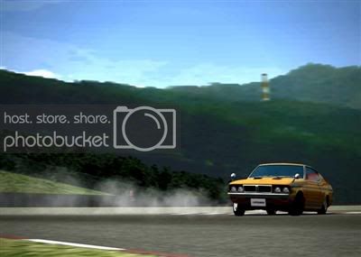
How is this shot that I recently entered in the Unedited comp? The theme was: "Gran Turismo Classics", and you had to enter cars and tracks that were in Gran Tursimo 1.


I really want to improve, but were do I start?
 
this picture is from my last entry
cpiadeimg0045.jpg


i would like to wear some criticism and some sugestions:)
 
this picture is from my last entry
cpiadeimg0045.jpg


i would like to wear some criticism and some sugestions:)

My personal tastes tell me to tell you to make the car itsself more focused and maybe add a little contrast.
 
Back