
Yeah I was noticing the black bars and the logo conflicting as well, just a I was posting.Good stuff man! The Corvette set is good, but it has a bit too much yellow. Really like the 4th photo, the angle is really cool. The Ferrari/Aventador set: like the way you edited it. Subtile but pleasing. Like the last 2 the most. The last photo has a quite interesting angle and I find the Aventador vertical photo very realistic. Just think you could get rid of the gt logo, as it conflicts with the black bars. Really like these last sets. Great improvement!
Thanks man@cruzthemaster Agreed, much improvement. I will add that he just gained access to Photoshop, whereas before now it didn't work. So expect more good sets from my good friend nick in the next few weeks!
Now that you point it out, that is one jaggie picture! Although, i can barely repair jaggies either, but oh well! Its still a great shot. GT6 just be hating!While I like the layout in this shot I feel the shot would look better if the car was cleaned up a bit.
Thanks! Really appreciate your feedbackVery nice job on this last set! Lovely colours and great lighting. I can see where you got your inspiration and it translates very nicely onto the pics. In the last pic the car is a bit too close to the edge of the frame, in my opinion. But, well done nevertheless 👍👍
. I agree the last pic is a bit to close, and it would have been great to zoom out, but gt6 only allowed me to zoom out to fifty.Thanks Y00PAY, really appreciate it.I'm with KodjeFord GT shot is perfectly done
 From Heavens Above by Nick (Pollux918), on Flickr
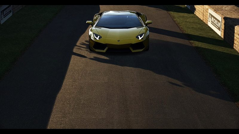 Raging Bull by Nick (Pollux918), on Flickr
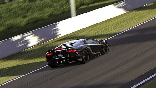
 Goodwood Hillclimb_33 by Nick (Pollux918), on Flickr
 Outlaw by Nick (Pollux918), on Flickr
 Angels flight by Nick (Pollux918), on Flickr
 Instability by Nick (Pollux918), on Flickr
 Jaggies by Nick (Pollux918), on Flickr
 , well anyway I was


")
Awesome work !!! Especially for your age, or maybe i should say because of your age...
Whatever...
The only constructive comment i would maKe is: (not sure if anyone has already told you)
I notice that you have a tendency to center your subject... try to vary a little and put your subject off side or at least in the thirds...
Otherwise, i would say your photo skills are so much better than mine
I would give you a grade of 98/100 overall
Keep it up young man!


Thanks Kodje! It's great to that from you!I like a lot your recent work Nick. The last 458 shot is really good. I also like a lot all your white One77 shots : all are really good
Thanks Nux!Really like this shot! The angle and reflections are great. One thing to note though is that the gradient is very noticeable on the bodywork of the car. You should ask @Chameleon9000 to give you some pointers on how to clean gradient banding.
It's an honor to have you reply here! I did actually ask him how to do that because Gulietta73 also said much the same thing. So I asked josh and he showed me an since then I have completely forgotten how too . Hopefully he has the patience to explain again...
 Thanks again though
Thanks Jamie!There is many reasons why I like your latest shot. But in the end the main reason I like it is the layout.


