Thanks PunkRock! I have to say the same for your's as well. I like how bright and defined the colors of the car is! Oh and the *wooooosh* effect of the font as well.
Concept:
I wouldn't say that mine puts yours to shame, but something that will help cleanup your image files to give it a cleaner, smoother, less saturated look is to do all your editing in a higher resolution.
Example, start a new document with a pixel size of 1950x354 at 300dpi. When your creation is complete, export the image within the banner size requirements. You will be pleased with the results.
For example, my first banner was created in the 468x85 size limits. The rest were created at higher resolutions, later sized down during the export. The text is especially smoother and more detailed.
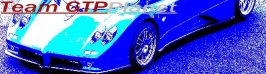
I took the liberty to resize your latest banner to reflect the size contraints of 468x85. Hope I didn't step over any boundries. I did not edit your image in anyway, I just resized it.

")


")


 Hey Lotus!
