RKPhotography - Motorsport Ranch 2013

  • Thread starter McLaren
  • 150 comments
  • 29,727 views
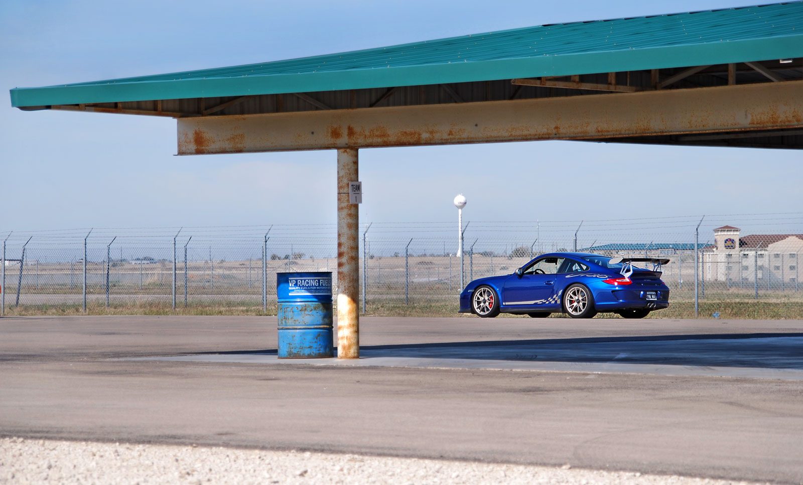
Fantastic photos 👍 I'd forgotten how great your detail shots are, especially with the cars - but the can of Duff and the Hard Rock cafe sign really stand out too.
 
Thanks, mate. 👍

Also just realized none of my Vegas shots were posted here. Lots of photos below mainly because I never actually got around to making a thread about the trip.
dsc0017it.jpg

dsc0018wp.jpg

dsc0042cr.jpg

dsc0043ml.jpg

dsc0050er.jpg

dsc0142tf.jpg

dsc0154kl.jpg

dsc0164jv.jpg

dsc0204du.jpg

dsc0207nb.jpg

dsc0219tb.jpg

dsc0228ui.jpg

dsc0320k.jpg

dsc0402t.jpg

dsc0429jnc.jpg


The Bellagio Fountains dancing to "Your Song" by Elton John. This where a tripod & a wider angle would have come in handy. However, near impossible with the sheer amount of people that stop to watch.
dsc0257jq.jpg

dsc0259ua.jpg

dsc0267r.jpg

dsc0268sm.jpg

dsc0275d.jpg

dsc0276ot.jpg

dsc0282b.jpg
 
Last edited:
Awesome pics of Vegas McLaren 👍 The fountain pics turned out very nice.
 
A few from our show yesterday. Played with a couple effects to mix up the angles I usually take for some of these cars. :)
dsc0074x.jpg

dsc0020wu.jpg

dsc0021yz.jpg

dsc0014ho.jpg

dsc0019tr.jpg

dsc0037ww.jpg

dsc0063au.jpg

dsc0058lq.jpg

dsc0060at.jpg

dsc0065bo.jpg

dsc0071zq.jpg

dsc0077g.jpg

dsc0079dz.jpg

dsc0082pz.jpg

dsc0087md.jpg
 
The shots from the Italian Car Festival as well as shots from the XDC drifting competition this past Saturday. Lots of photos ahead.
dsc0004nvm.jpg

dsc0056bl.jpg

dsc0084vp.jpg

dsc0087rt.jpg

dsc0095qg.jpg

dsc0107ts.jpg

dsc0123wp.jpg

dsc0137ru.jpg

dsc0145x.jpg

dsc0148ji.jpg

dsc0155dn.jpg

dsc0157wm.jpg

dsc0188iz.jpg


And XDC.
dsc0214uh.jpg

dsc0218dv.jpg

dsc0219bv.jpg

dsc0230kh.jpg

dsc0244du.jpg

dsc0249ls.jpg

dsc0252zj.jpg

dsc0257t.jpg

dsc0267tp.jpg

dsc0279jl.jpg

dsc0282u.jpg

dsc0292dz.jpg

dsc0293j.jpg

dsc0313jk.jpg

dsc0315kw.jpg

dsc0360t.jpg

dsc0372hl.jpg

dsc0373lg.jpg

dsc0379w.jpg

dsc0389ji.jpg

dsc0405ar.jpg

dsc0439d.jpg

dsc0428r.jpg
 
I've looked through these latest shots a few times now and I keep going back to the Maserati. The striking difference between the black of the grille and the overexposed outside is perfect. 👍

Word of criticism on the Aventador shot - perhaps not so steep an angle? Something along the lined of / instead of | ?
 
You are right. Originally, the shot was actually horizontal & after I had got done editing it, I thought it looked better vertically. I may remove my logo & rotate it back and see how it looks then.
Edit* Better TB?
dsc00942p.jpg
 
Last edited:
^ Definitely looks better horizontal :)👍 Nice shots once again in your last update. The black and white Lambo interior is a cool shot with the colored emblem. Nice work!
 
These are around a month old, but I thought I'd finally share them after an owner wanted a couple pics from the set. Not one of my best efforts (& hence I cropped many of them), but they seemed to satisfy our local club. That is also my buddy's Elise in the shots as well. :)
dsc0539n.jpg

dsc0654t.jpg

dsc0672n.jpg

dsc0694i.jpg

dsc0705wl.jpg

dsc0590h.jpg

dsc0533v.jpg

dsc0557z.jpg

dsc0581dq.jpg

dsc0584a.jpg

dsc0598hr.jpg

dsc0599l.jpg

dsc0600c.jpg

dsc0609vy.jpg

dsc0647wl.jpg

dsc0664a.jpg
 
If you leveled that 2nd to last shot a bit and did some fill light and adjustments on the car, it would be golden I feel. Right now it just doesn't have those finishing touches needed, but the idea behind it solid along with how its framed.
 
If you leveled that 2nd to last shot a bit and did some fill light and adjustments on the car, it would be golden I feel. Right now it just doesn't have those finishing touches needed, but the idea behind it solid along with how its framed.
I definitely had a bunch of ideas of how I would like the shot to look. But unfortunately, I don't believe I have the right programs or enough editing skill to get it there. Learning, though. :dunce:
 
Oh wow, the contrast is so completely different initially. I'd say you are crushing too many details in the shadows out while smashing some whites around as well. I did two separate crops, and if I was doing something with this for print, I'd probably remove that white water tower in the background. The exposure is quite nice initially, so working with this from a jpeg wasn't bad at all.

Crop1, a bit wider
mgnMi.jpg


And a tighter crop, which I felt was nice because it removed the somewhat distracting Best Western logo from the background.

u7w5n.jpg


The dodging and burning is a touch rough, but you can see how a nice contrast can be maintained while preserving detail and tone.
 
Ok, so I most definitely need to dive deeper into learning about editing. Those look fantastic compared to mine. The blue on the RS just stands out more & everything just looks better without my usual tactic of darkening the shadows to get said colors to "pop".

I have much to learn.
rice.gif
 
Generally, when editing, I start with color balance, then adjust the exposure/fill light a bit to see what I want in the shadows. Then I change the curve a bit to crush the blacks if needed. After that, burning in areas, generally some shadows and mids if they are too distracting, then dodge some bits that should be more white or could benefit from a touch of contrast, such as the details on the 911 above. After that, some selective sharpening in areas, usually though a high pass filter and layer masking with opacity changes to keep the strength in check.

If there are spots, dirt, or other things that have to be cleaned up, I'll usually do that before all the other processing, as I work in layers for many steps so I can compare what I am doing and recover it later if needed for some reason. I also save the full size PSD files whenever I finish editing, so I can go back for cropping at various print sizes. Which is why I have 600 or gigs of images and related work in my photo folders. From this year.
 
It feels like you are crushing out the blacks far too much, thus losing a lot of detail in shadows. The histograms on a few of those tends to agree, along with clipping out highlights a bit in some cases, such as the orange R8.
 
It feels like you are crushing out the blacks far too much, thus losing a lot of detail in shadows. The histograms on a few of those tends to agree, along with clipping out highlights a bit in some cases, such as the orange R8.
In the case of the R8, you're right. I tried experimenting with a way to bring out more detail in the tree & the wheels, but it didn't come out very well, so I went back to what I had. As far as the auto show pics go, I did do that intentionally to bring out the brighter colors more. I did it on a few to minimize the appearance of the other rude guests as well.

I haven't started working on my Boardwalk or Uptown pictures yet, so I'll try to take heed on it.
 
Try selectively burning and dodging. The issue I have is detail is being lost in the grills, tires, and so on that could add to the texture of the image.
 

Latest Posts

Back