- 4,776

- Texas / Sichuan
I like the large greenhouse, as it's the opposite of the usual current trend of having tiny windows and high sides. As others have stated, it really needs a faux grille. It looks unfinished as it is now.
Everyone is complainting on how ugly the Model 3 is but Tesla made $115 million in pre-order deposits on it.
I was scrolling through Instagram last night for #model3 and most people posting screen captures of their confirmation screens were not current owners. Not saying that's the majority, but it may not be as clear cut as people think.That's because Tesla is turning into a cult like Apple. Some people will buy anything they release and I'm willing to bet a vast majority of the pre orders are from existing Tesla owners.... who also own key chains, hats and never stop banging on about how amazing their car is.
I like a large greenhouse, but in terms of proportions it doesn't really work with that shape. Perhaps we've just got so used to seeing small DLOs, but it just looks weird here.I like the large greenhouse
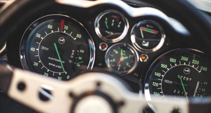
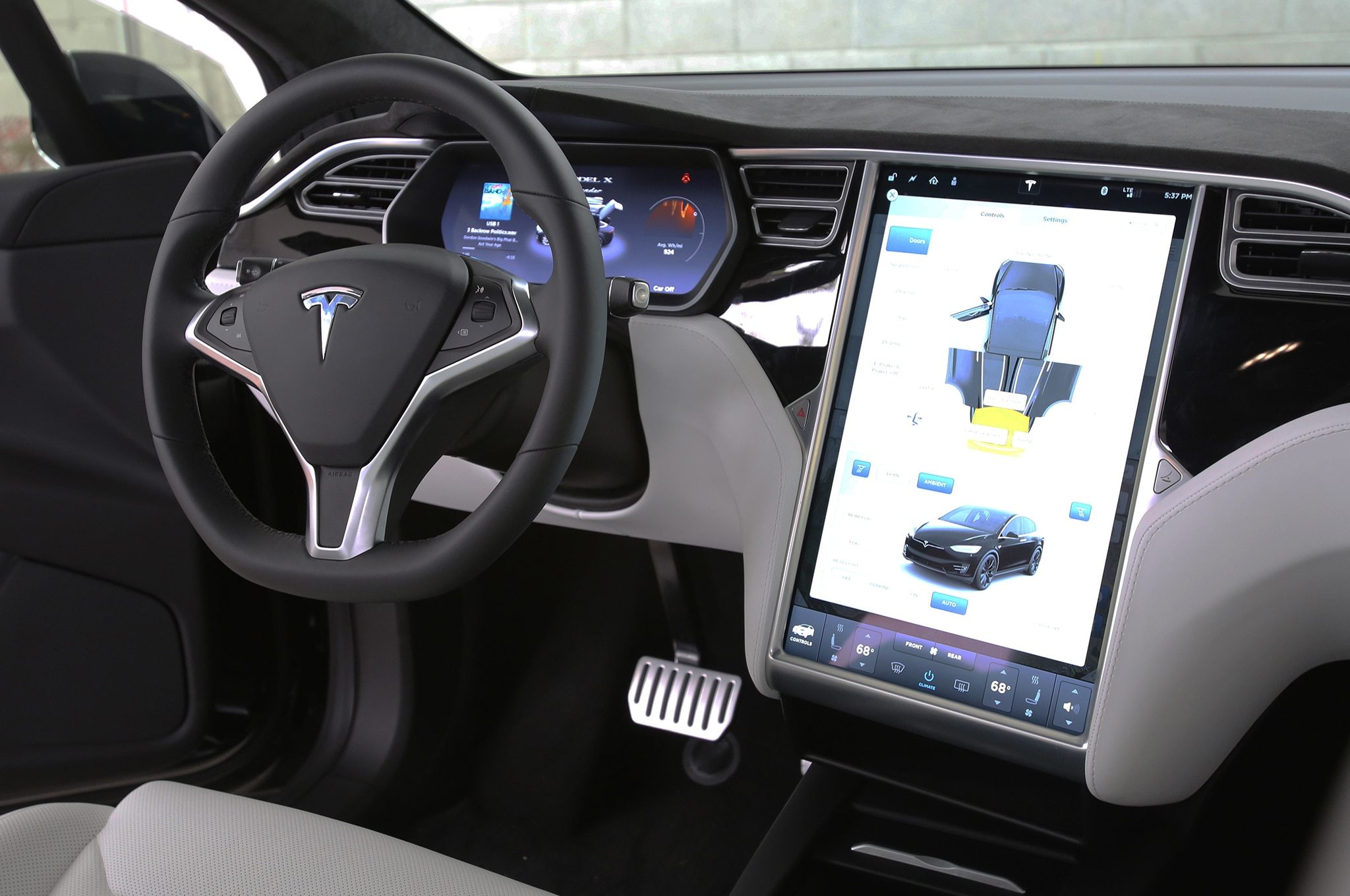
While I agree, from a functionality standpoint, beauty or boredom are largely irrelevant. I've not looked in too much depth at the Model 3's specs but I saw someone mentioned a head-up display before. If that's the case, then classic dials and that big screen are doing different jobs.This is beautiful:
This is dull:
From a personal perspective, I still love dials like those in the Alpine. But I'm also entirely happy for beautiful Alpine dials to remain in beautiful Alpines, and for modern cars to seek modern solutions.
Indeed.I couldn't agree more. I see the BMW I3 as a phenomenal example of this in terms of interior. It's part Zaha Hadid, part Tron and utterly contemporary. Contemporary absolutely does not have to mean blank-white. That's actually rather more 1920s from a design standpoint. 'Less is more' was spoken by Mies Van Der Rohe in 1946! We should be well beyond that phase by now.
Indeed.
There are plenty of "nice" interiors on the market at the moment but very few that actually excite me from a design perspective.
The i3's does (the i8's does not, though it comes under the "nice" category). I'm a big fan of the interior in the Citroen C4 Cactus, because they've tried something new (installing the passenger airbag in the roof is a neat way of reducing dashboard bulk) and it's far more attractive and comfortable than you'd credit of a car available so inexpensively. The Audi TT works well (TT interior always have) but even then it's arguably too "traditional" in its layout. Ditto the MX-5, though traditional is probably part of the brief with that car.
Most are bland. Functionally little different to say, the 1970s, when people largely started putting vents and dials and audio systems in the same places. Decent ergonomically, but modern technology makes most of those ergonomic points redundant.
Struggling to think of any modern, production automotive interiors, beyond those mentioned, that break any new ground. Even money is no guarantee. A Pagani interior is beautiful but still unremarkable in its layout. A Rolls-Royce is opulent, but hardly inventive.
Tesla has been disruptive in so many different areas - sales, ethos, performance, network - that it's a real shame they aren't doing anything different in terms of design.

I like Volvo's latest cabins, but I'd stop short of calling them minimalistic, at least from a design perspective - they're still big, bulky modern car interiors. I've driven a few XC90s and they're also weirdly susceptible to trim level - in bright colours like those pictured, it feels great, but I tried one a few months ago which was mostly black inside and it was pretty oppressive.I really like what Volvo has done with the interior of the new S/V90.
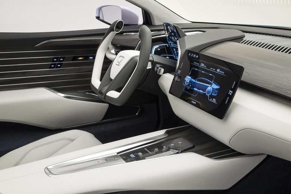
The interior reminds me a little bit of the Honda Fcv, what with the screen.
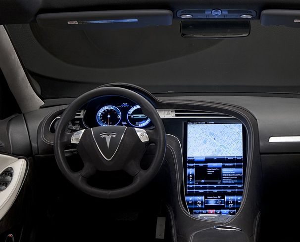
@[Nor]McLarenF1 I actually quite like what Tesla have done. I suppose it is lacking a bit, but I really like the minimalist approach.
Let's not forget that these are early prototypes and Elon has said that things can change before launch.
Pre-orders surpassing 200,000. Musks comments about that:
I think they've got the space for it. Watched a documentary (on discovery, I think) a while back, they were only using a fraction of the available space.I was actually just thinking about how they could probably double their production rate and still have problems getting the cars out fast enough. I think they underestimated how big the demand was going to be.
A good example of minimalistic design without it feeling naked and unfinished.
Exactly, as long as there is a variety of depth, layers and differing materials a minimalistic / modern dash can look excellent. The 3's interior is way too clinical and one dimensional but I guess they will take feedback from the concept and refine the design.
I hope they'll embed the display into the dashboard. The floating mount style on the reveal cars looked too intrusive and in your face. Then there's the risk of it breaking off and being thrown around the cabin in a collision.
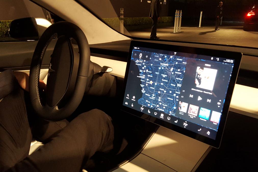
And it looks like you could easily bang your knee on the corner of it...

Very well could, probably just glued that laptop screen on there.Not exactly ideal when you're late for work and get in the car in a hurry. You'll end up with a sore knee and the display lying in the passenger foot well.
")
Not exactly ideal when you're late for work and get in the car in a hurry. You'll end up with a sore knee and the display lying in the passenger foot well.