- 28,503

- Brooklyn, NY
- KR_Viper
- I Renown I
Mercedes-Benz SLS AMG - A Day in Serenity
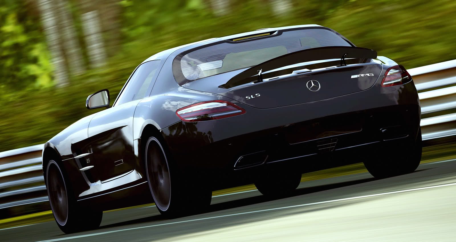
(Click to make it BIG)

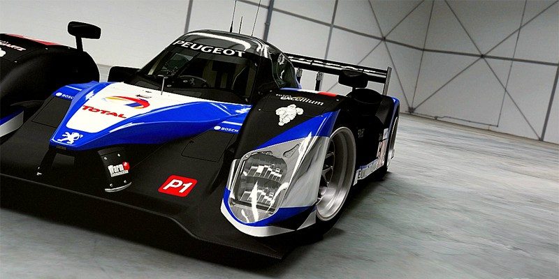
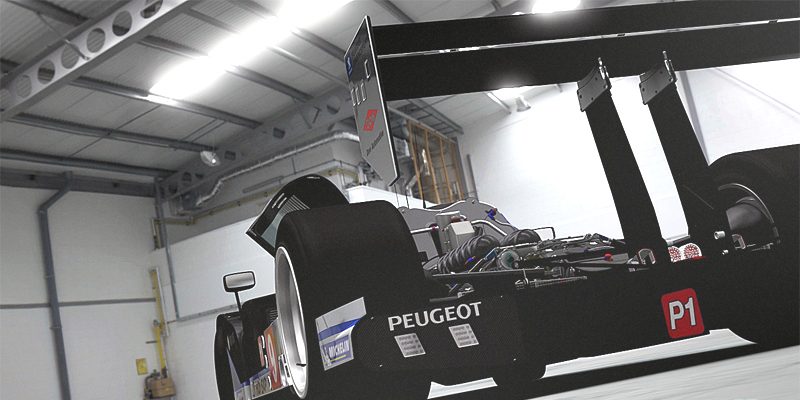
(Click to make it BIG)
Last edited:


My favourite shot from post 30, has to be the last one.

Woah, I must have missed that Bentley somewhere. That thing is gorgeous!

I have just got, my own back on you.I knew you'd show up sooner or later. What I'm surprised about is you didn't go for the second shot.


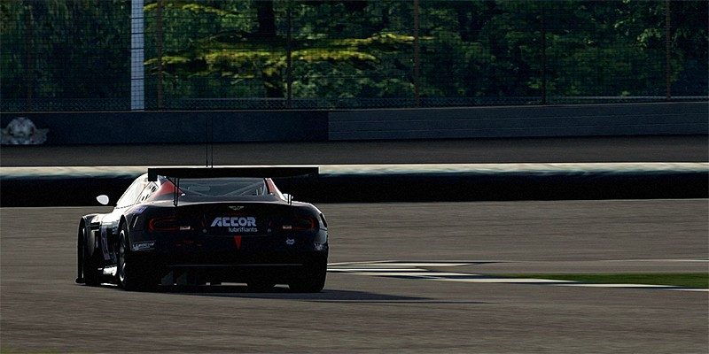

your pictures make me realise I've got a long way to go as a photographer. Especially that last shot of the DBR9, with the added noise 👍
Agreed on the last shot, such great editing, VERY realistic!
Gosh the Aston Martin ones look real photos, especially the last one.

The DBR9 pictures look great. The realism is underlined by good contrasts and lighting.")
Excellent pics T12. Favs are the first F1 and the last Aston.
How are you finding the photomode compared to FM3?
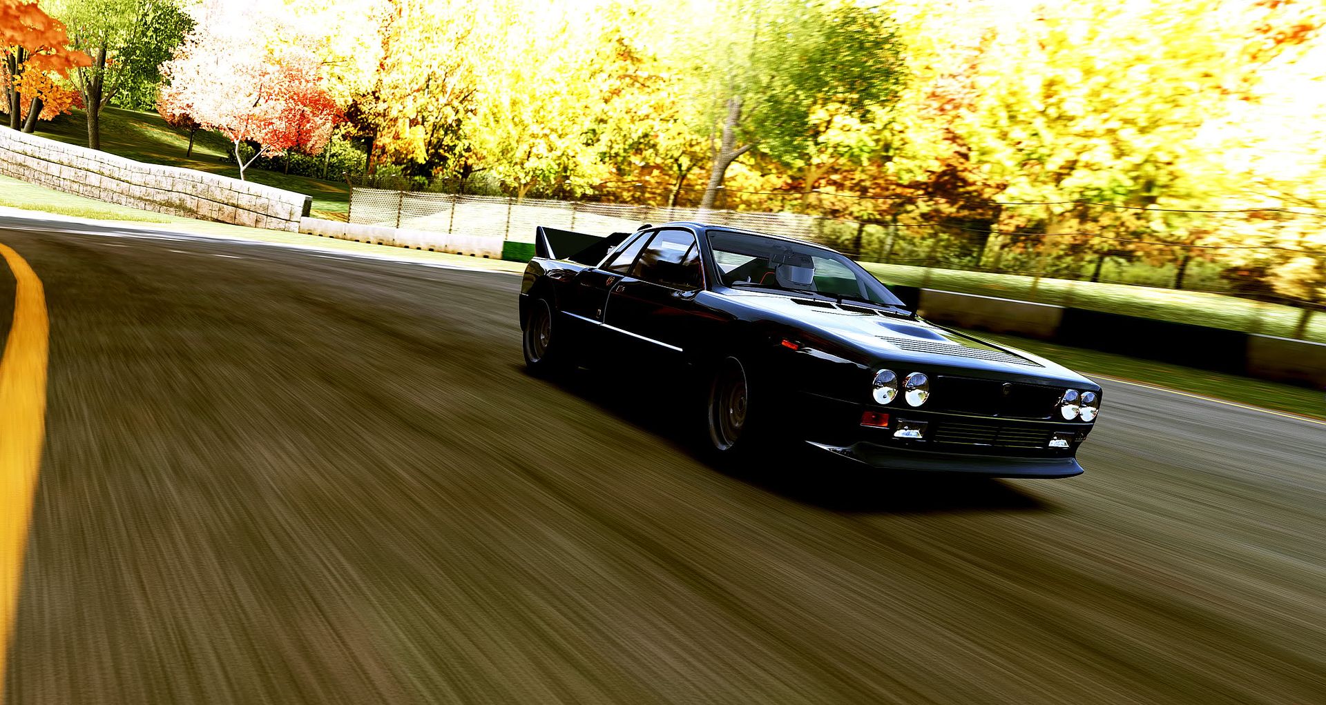
The Lancia ones are absolutely fantastic, the angle in the first pic is simply professional.
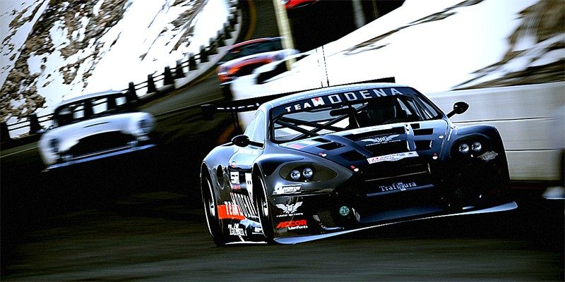
Kudos to the thrid Aston shot too, well done. 👍
* returns to the shadows *
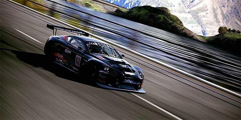
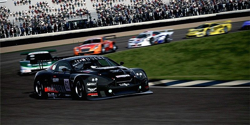
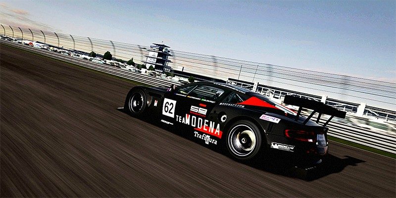
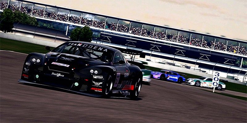
DBR9 set is superb. All your sets are though to be fair.
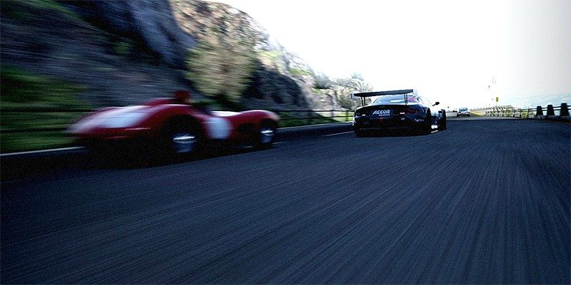
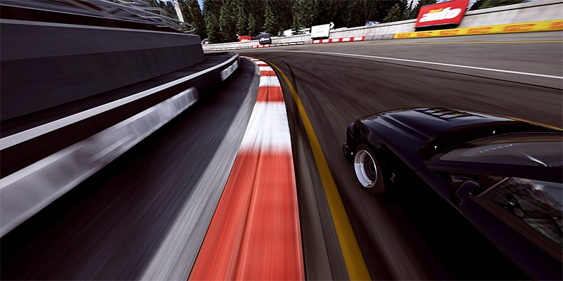
Second one really captures the racing feel. Great job!
Agreed, they're all great, but the second one is outstanding!
I think you need to work on the logo a bit more but the basic shape is good
Jag shots look real good! Very realistic.
As for the logo, I like the "T" but I don't care for the gradient on it. I would maybe try something with a T-12 or T12. You are on the right path though for sure though. I still contemplate changing mine up. I'm never satisfied.

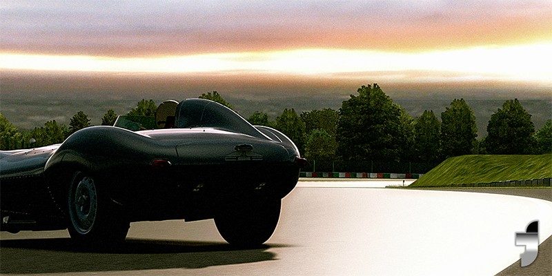
I absolutely love that second shot of the D-Type... Brilliant. As for the logo, dunno... It kinda reminds me of the Facebook logo

How honest can we be about our opinions here on on FP?