- 4,771

- Paris
- Kodje75
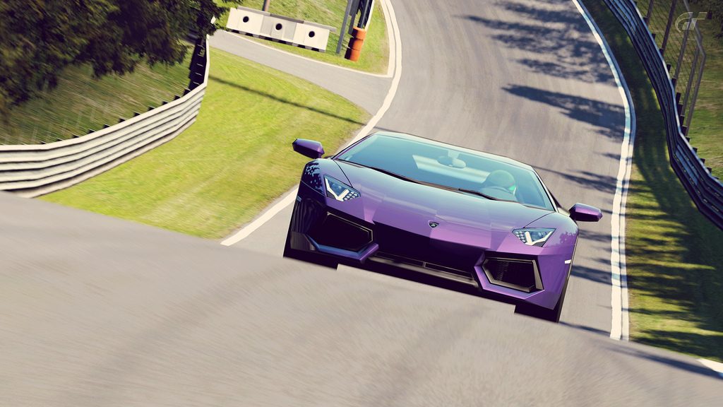
I agree with George about the shot 3, really like this one, very well done 👍
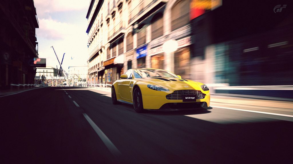
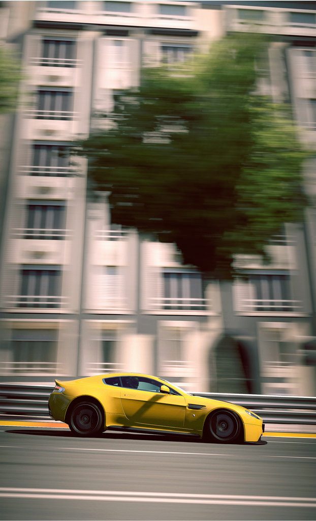
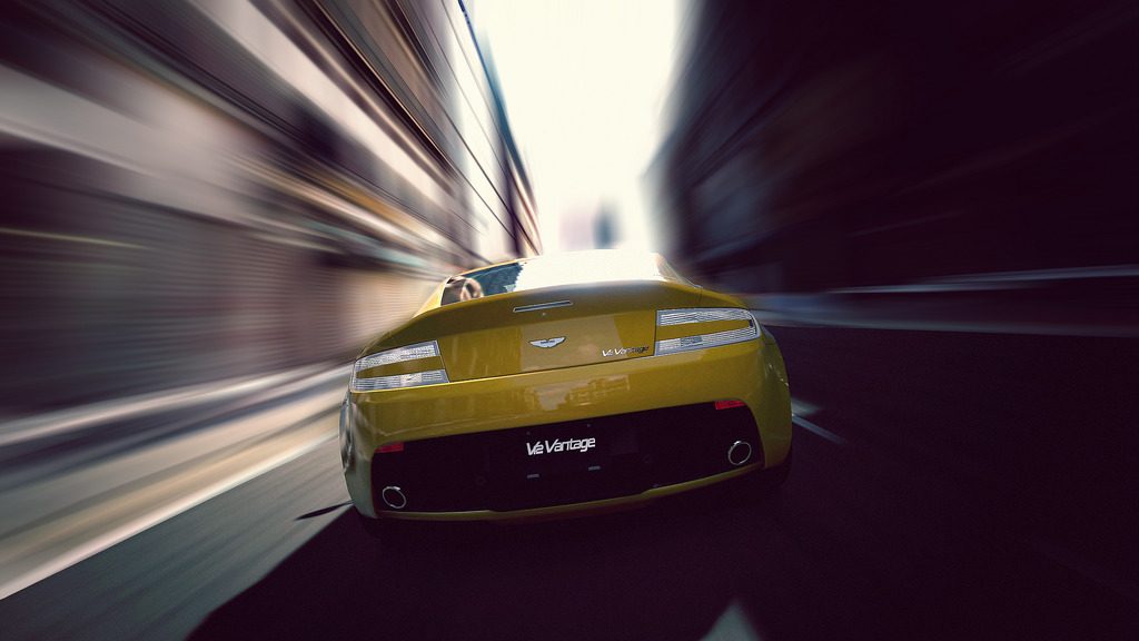
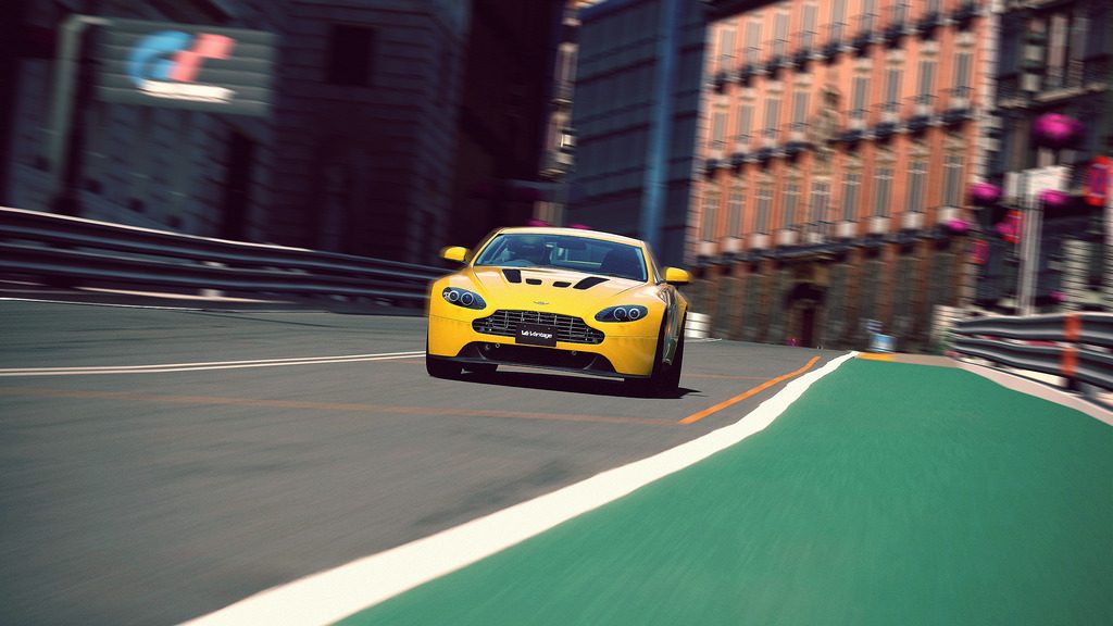
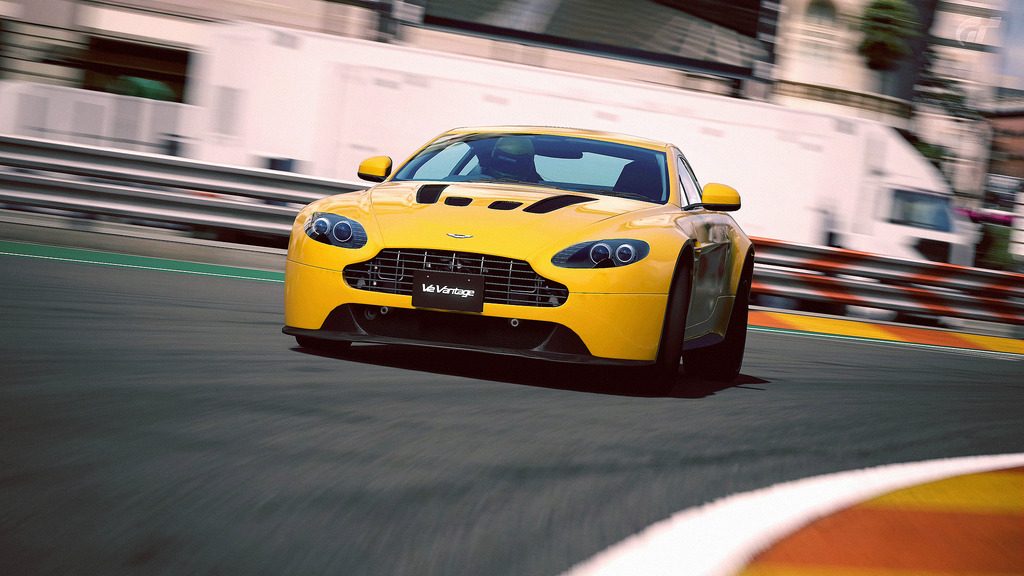
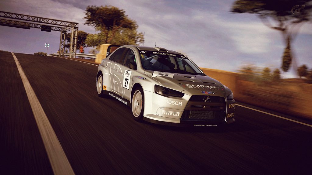
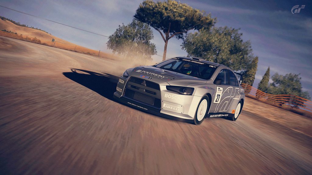
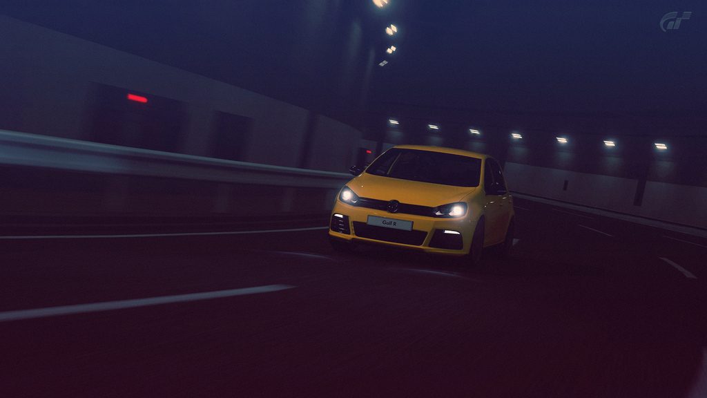
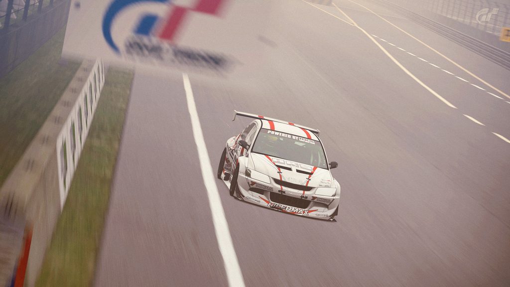
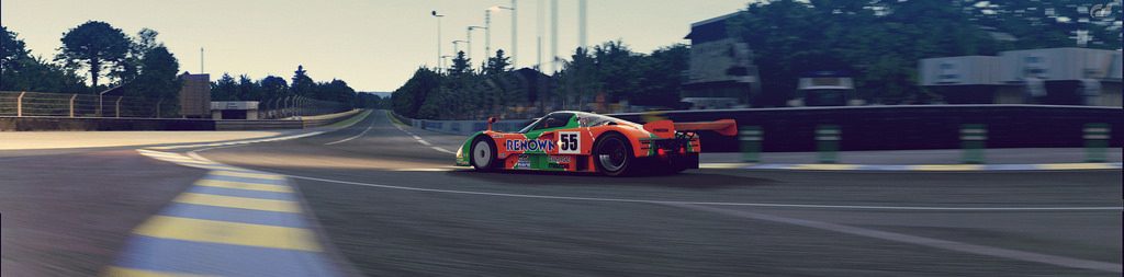
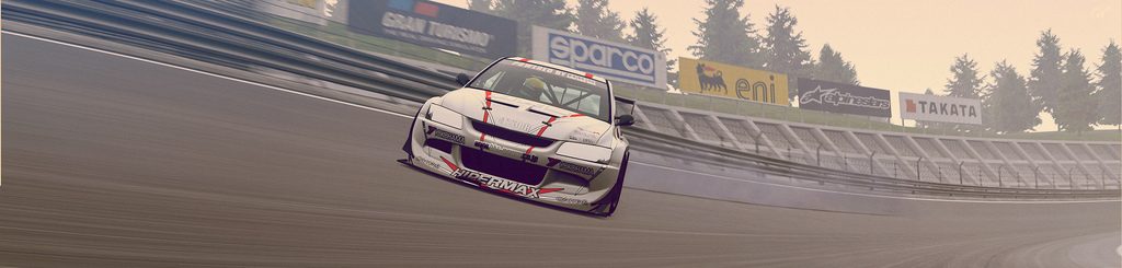
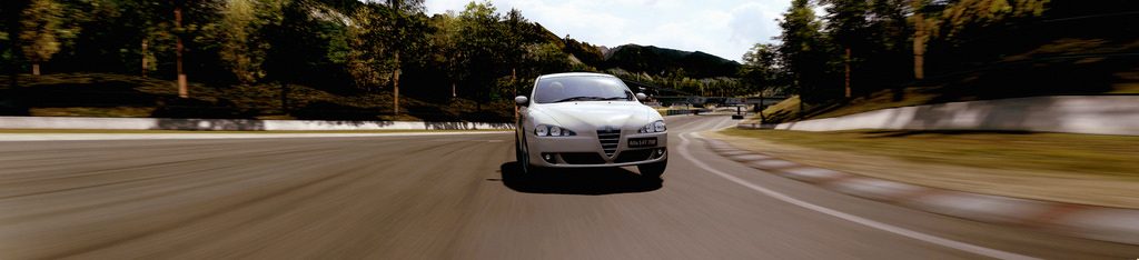
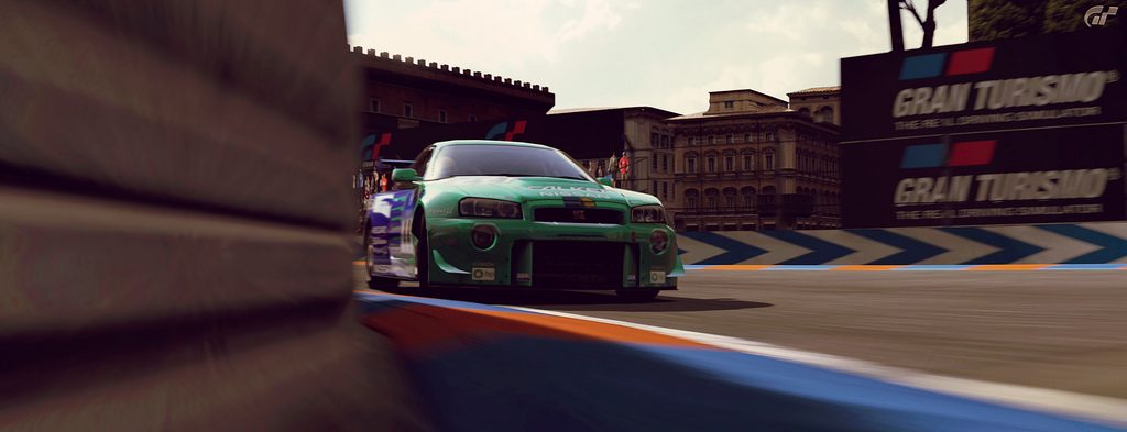
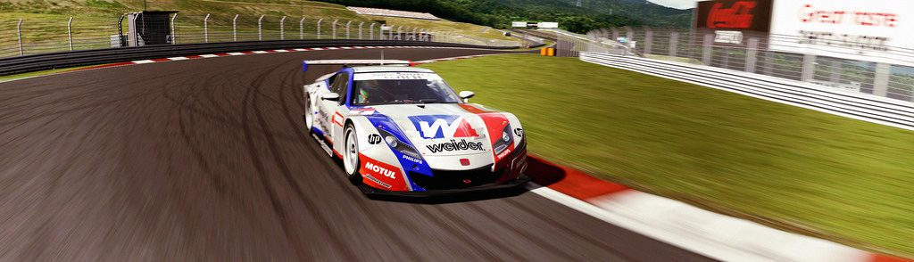
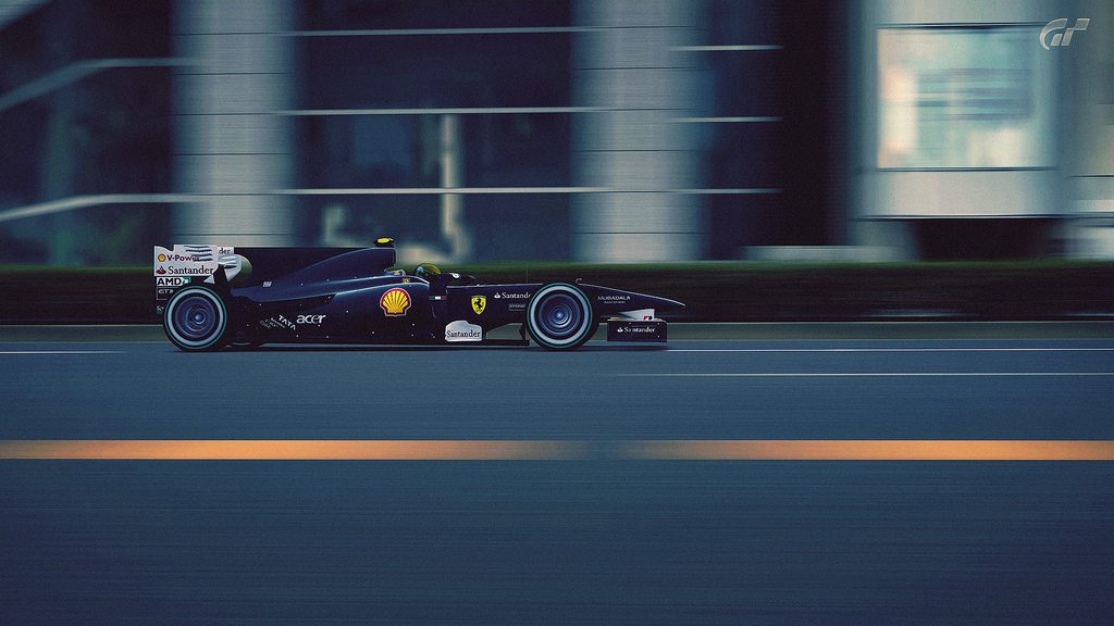
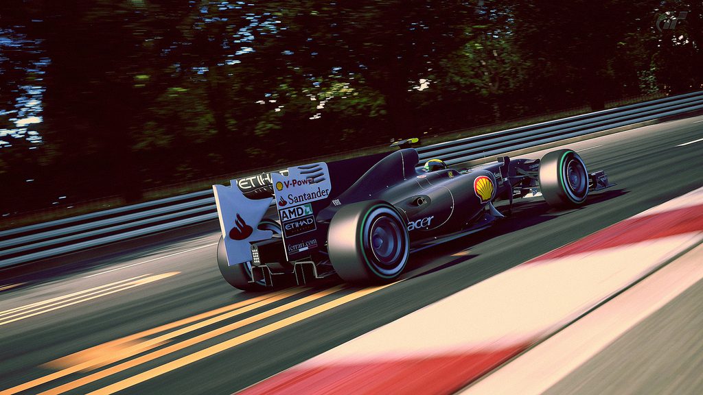
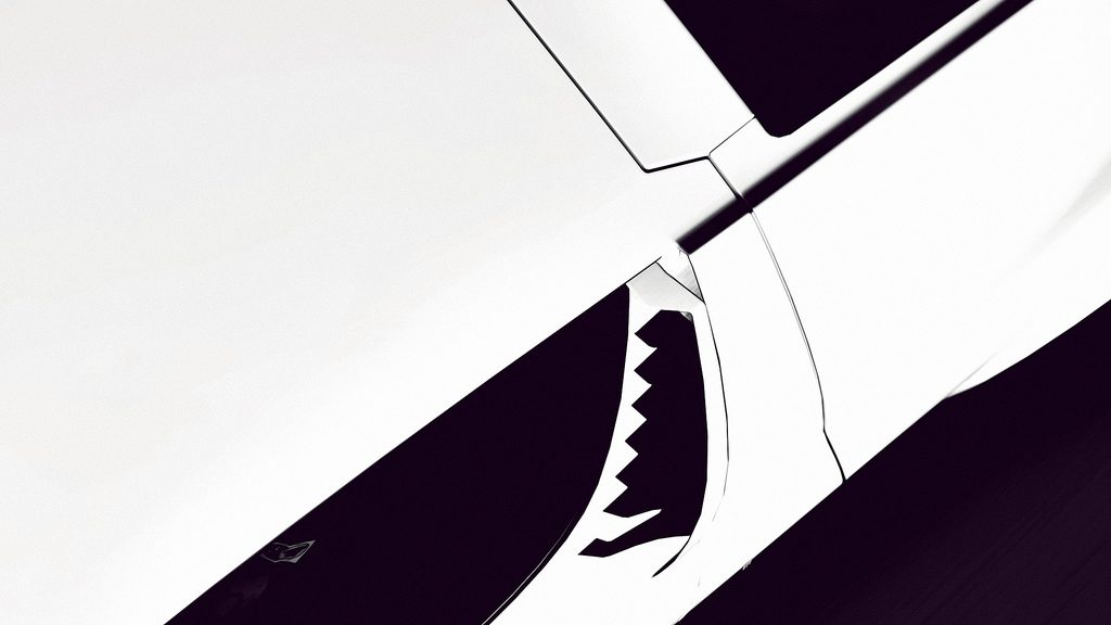
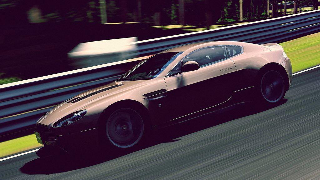
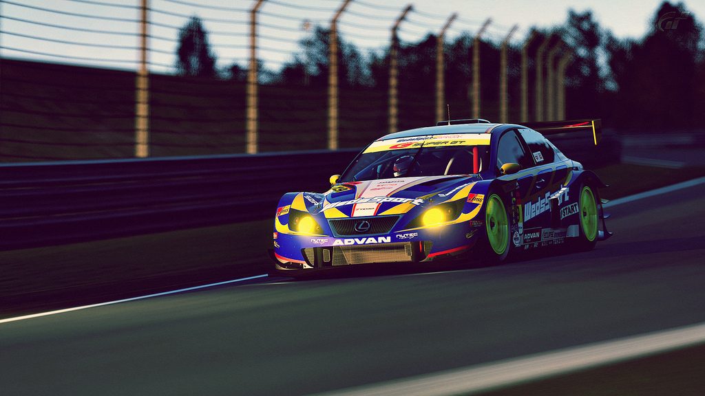
The first one offers a good use of panning mode 1 with a good choice of angle. Nice light and bokeh in the second one. I also like the wide angle of the fourth for this hard brake shot. I also agree with George about the tonning of the fifth, one of my fav' in this set with the abstract one. Maybe the car is a little to close to the right border but great shot mate 👍
The first one offers a good use of panning mode 1 with a good choice of angle. Nice light and bokeh in the second one. I also like the wide angle of the fourth for this hard brake shot. I also agree with George about the tonning of the fifth, one of my fav' in this set with the abstract one. Maybe the car is a little to close to the right border but great shot mate 👍


")

 👍 Great work T-12
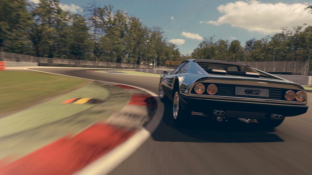


") 👍
👍