- 9,736
Really liking the sense of motion in all of these, Michael.
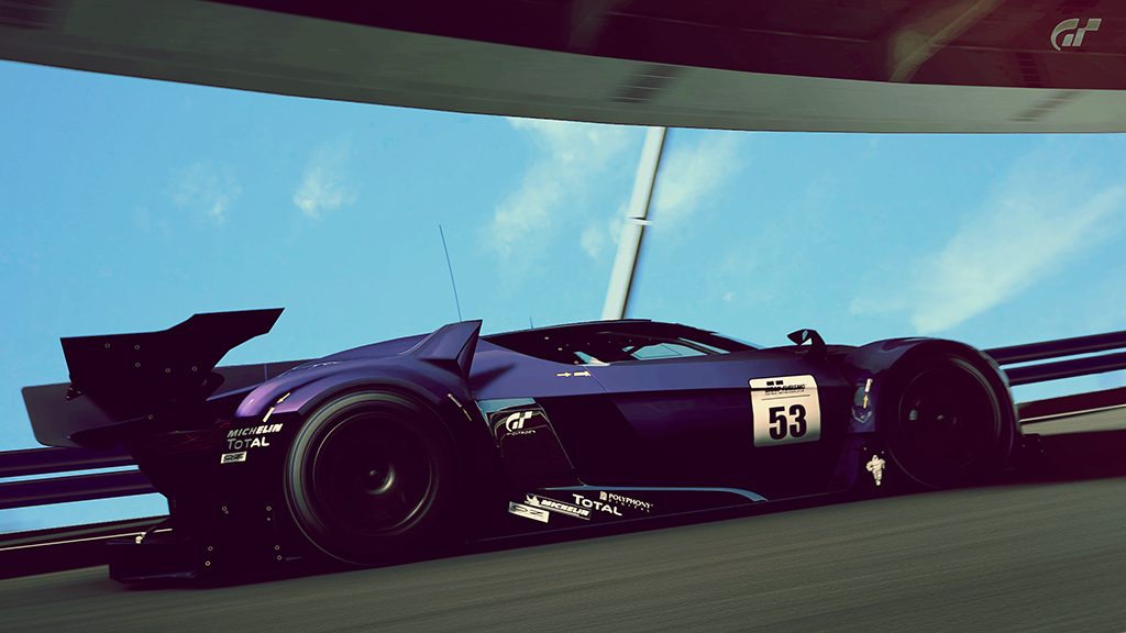
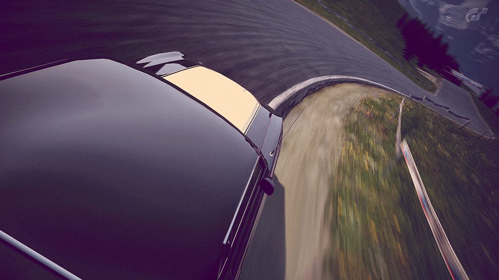
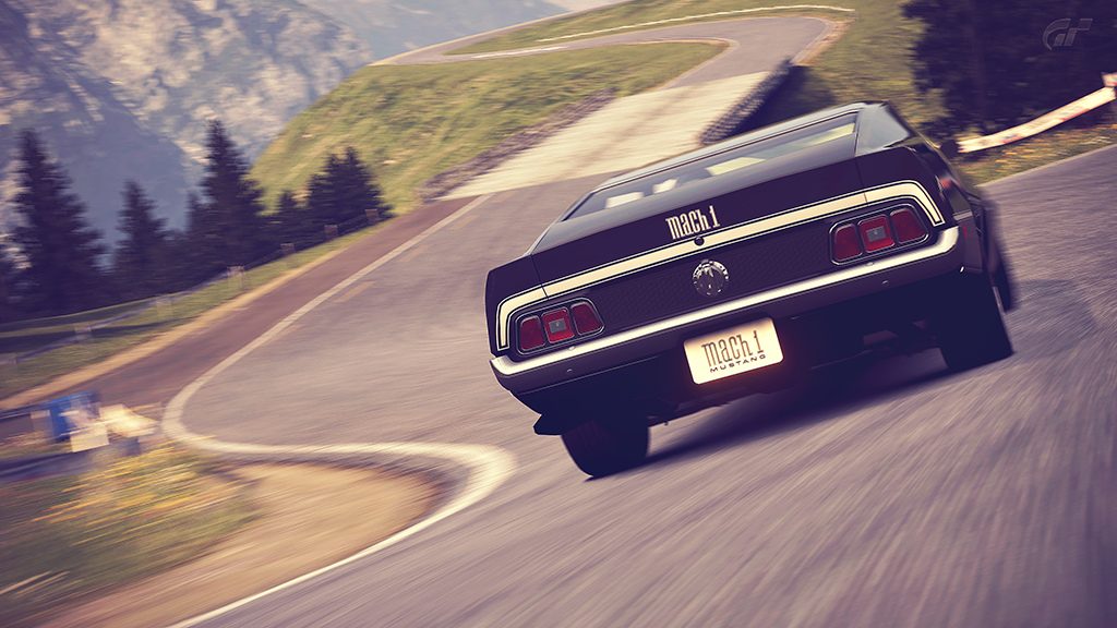
Picture #1 - The smooth and well-illuminated background and the rich shadows on the side of the car both create a very good contrast. The shadow of the car does not look as sharp as it possibly could (this might be due to the fact that you resized the image, though!), but I'd let you get away with that one, anyway, because I really like the gradient (lighting) found on the road itself. The only thing I could actually criticise is the fact that the amount of space in front of and behind the car is equal - firstly, the car is too centred (which takes away from the appeal of the image) and, secondly, the forward motion of the car is - to an extent - missing.
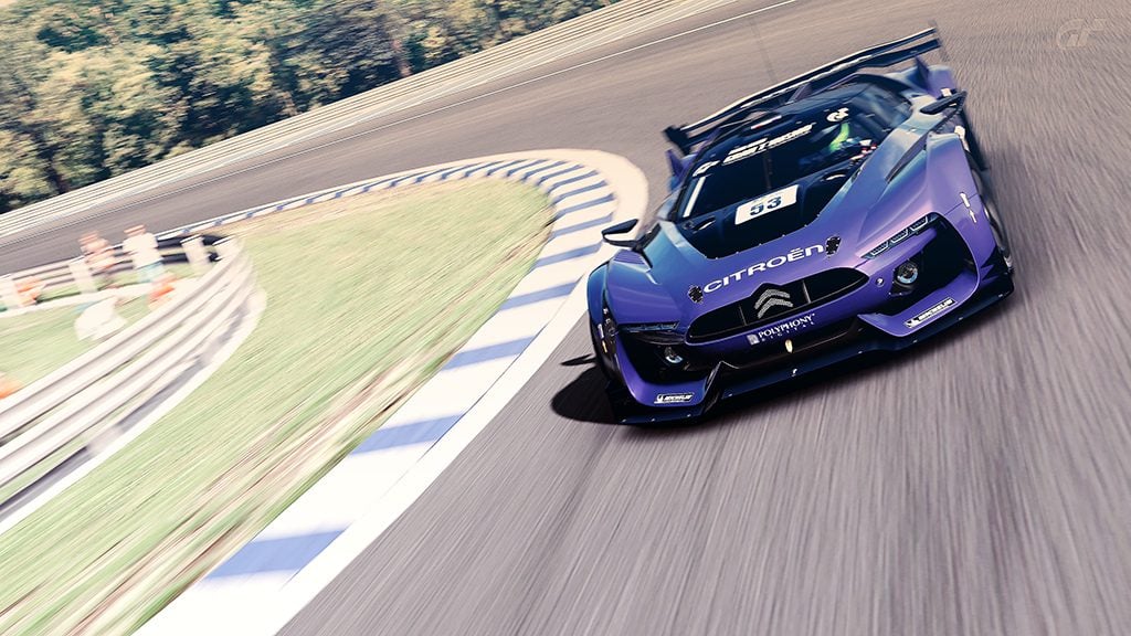
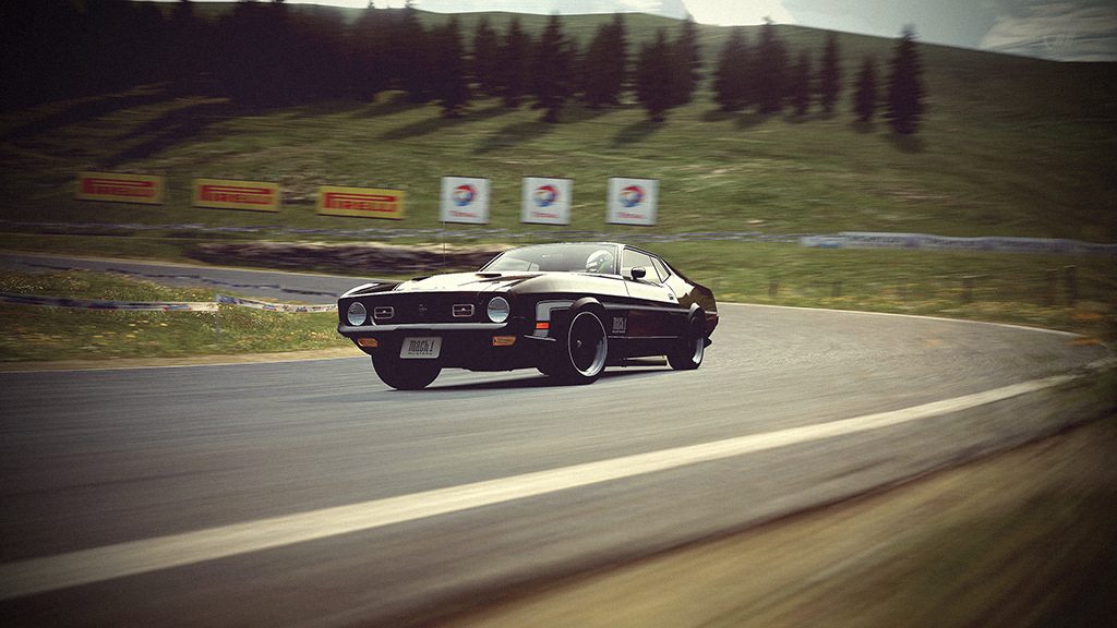
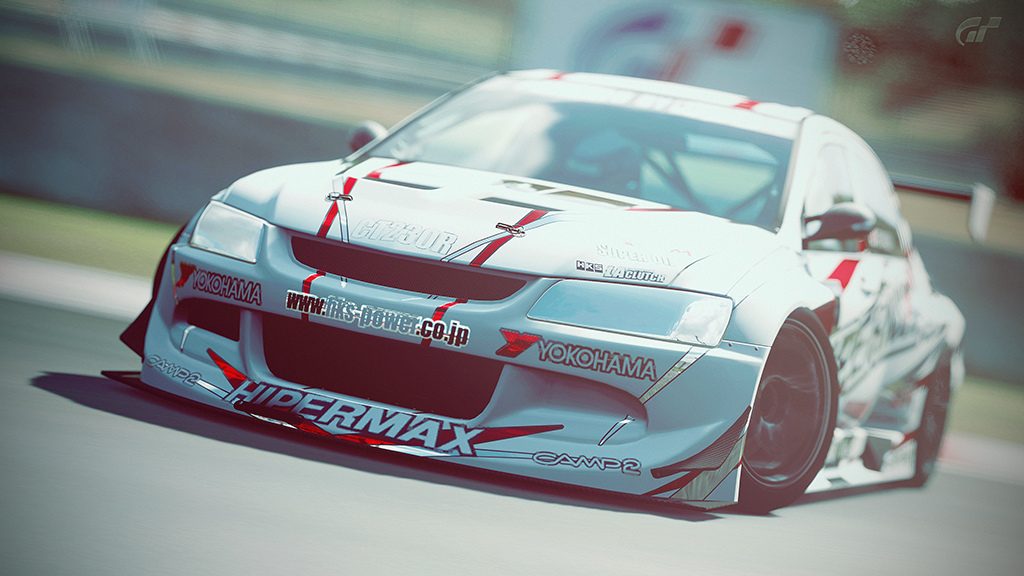
Picture #2 - What I like most about this one is the low camera angle - on the one hand, it emphasizes the sense of motion pretty well, on the other hand, the contemplator is presented with a lot of detail. Additionally, both toning and contrast are fine. What bugs me a bit, though, is the exposure; more precisely, I don't like how the licence plate is overexposed - you could either add your own text or remove the licence plate altogether in order to fix this.
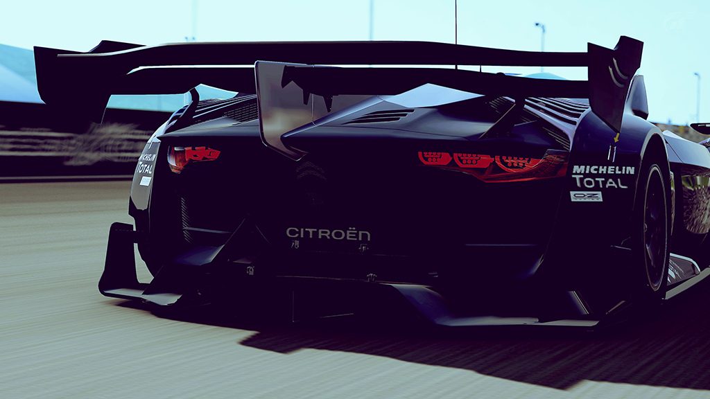
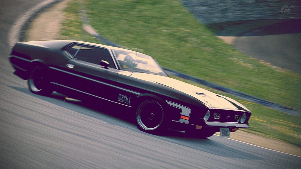
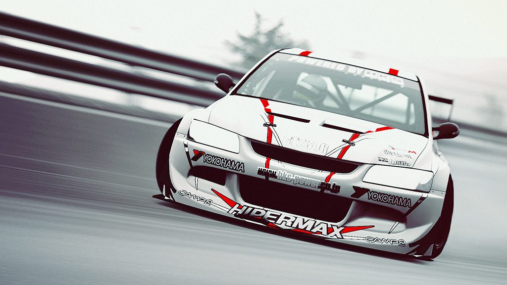
Picture #3 - Talking about details, this is the best shot when it comes to that aspect. I like the fact that you went with colder tones here - they fit the rich shadows and overall darker look of the image very well. Lighting and background blur are both smooth, so... I have nothing to complain about.
👍
Picture #1 - The smooth and well-illuminated background and the rich shadows on the side of the car both create a very good contrast. The shadow of the car does not look as sharp as it possibly could (this might be due to the fact that you resized the image, though!), but I'd let you get away with that one, anyway, because I really like the gradient (lighting) found on the road itself. The only thing I could actually criticise is the fact that the amount of space in front of and behind the car is equal - firstly, the car is too centred (which takes away from the appeal of the image) and, secondly, the forward motion of the car is - to an extent - missing.
Picture #2 - What I like most about this one is the low camera angle - on the one hand, it emphasizes the sense of motion pretty well, on the other hand, the contemplator is presented with a lot of detail. Additionally, both toning and contrast are fine. What bugs me a bit, though, is the exposure; more precisely, I don't like how the licence plate is overexposed - you could either add your own text or remove the licence plate altogether in order to fix this.
Picture #3 - Talking about details, this is the best shot when it comes to that aspect. I like the fact that you went with colder tones here - they fit the rich shadows and overall darker look of the image very well. Lighting and background blur are both smooth, so... I have nothing to complain about.
👍
")
")