The Best/Worst Badge in the Business (Literally)

  • Thread starter Thread starter BKGlover
  • 90 comments
  • 15,683 views
Definitely not the best badge, but I love Peugeot's:

peugeot-lion-emblem-12-01-10.jpg
 
chevy-bowtie-1969.jpg


I liked the blue one way more.
I agree, not only with this, but all the people posting the gold one. The gold one is too... Pimpish, if that makes sense.

Plus, the blue one was on a truck my dad borrowed one time, and the 1969 ZL1 Camaro. Looks sweet on both.
 
My favourite, well when used in discretion (on cars it came fitted from the factory).

Bmw_M_logo.png

When used at all, my least favourite.

smart.jpg
 
They could bring the blue one back, for performance models perhaps? Like the red H badge for Honda Type-Rs.
That would be kinda cool. I think it would be nostalgic in a way.
 
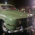
Another bid for Saab, more vintage though. I'm a bit biased though as these are all over my car.
SAABaeroplanelogo.jpg
SAABaeroplaneLogoBlue.jpg

Always thought Vector's was pretty awful
vector_motors.png
 
They could bring the blue one back, for performance models perhaps? Like the red H badge for Honda Type-Rs.

I seem to remember at one point the blue was used on the cars, gold for the trucks & SUVs, and then the red outline badge (below) was for performance cars. Again though, this is GM, so they probably were finishing out the blue and red badges because they liked the gold but had bought the others in uber-bulk. Greedy 🤬.

chevrolet_red_bowtie_small.jpeg


Also, some great picks on both sides. I have some more, possibly a bit biased:

I seem to prefer two common aspects: Wings and Stars. Wings? Well, that Chrysler logo is better with them, as is the Bentley logo, but I think these are best. Take your pick, but I prefer these versions:

Thunderbird
0608mmfp_03z+1988_ford_thunderbird+thunderbird_emblem.jpg


Firebird
th_BirdDecal_color.jpg


Now stars:

Chrysler Corp
chrysler-emblem.jpg


Mercedes
mercedes-benz-cars-logo-emblem.jpg


As for crap, I give you-Volvo.
volvo-cars-logo-emblem.jpg

What was the idea here? Proving it was made by men?
 
Apparently the Volvo logo derives from the ancient symbol for iron.
 
Worse
interesting-tale-of-incredible-logo-of-mercury-automobile.jpg

Could be for anything other than an automobile. Investment fund, washer/dryer, lightbulbs, tupperware.

Best
seven-c2a9-christopher-martin-4087-2.jpg


I'm a Taurus as well. A bit biased towards Lamborghini but, no confusion about what the Seven is just by that logo.
 
Worst, Dodge Ram, I especially dislike the taillight covers with this logo.

 
mdmp_0806_07_z%252B1964_ford_galaxie%252Bemblem.jpg


ford_390_badge_by_theman268-d3h9kuw.jpg

I always liked the "Thunderbird Special" badges for the high HP engine options on Galaxies.
 
I'm a bit biased, but I always felt the Honda logo was very crisp and stylish.
honda.jpg

Worst logo for me is Tata's. Just looking at it you know the cars are going to be rubbish.

451px-Tata_logo.svg.png
 
No nominations for Daewoo as one of the worst? :p
daewoo.jpg

Or...Mahindra
mahindra_logo_1_392293912.jpg


And Merkur
0913232215-0.jpg


Some of the best for me have already been taken. I'll be on the search for some another day.

 
As much as I love Mazda, I really dislike their current badge. Here is the evolution of the badge:

mazda-car-company-logos-evolution.jpg


1959 and 1975 are so cool. 1991 was too similar to Renault (which is why it was quickly changed) but I think even the 1992 is pretty cool. The new one is just a little blah.

Forgot about this one; the Efini RX-7 badge.
EfiniDetail.jpg

Very cool.


Edit: I also quite like the Citroen DS badge:
4-ds3-badge.jpg
 
Nissan Silvia has a cool emblem

nissan-240sx-180sx-silvia-emblems-244pic1.jpg

car-chrome-badge-emblem-sticker-s-nissan-silvia-240sx-cf012.jpg


The Fairlady Z logo is cool
Nissan%20(Datsun)%20Fairlady%20Z%201st%20generation%20(S30)%201969-1978%20(1971%20240Z)%20(01)%20[EB1].jpg
 
Skodas first badge:
12990144399q1yzV.jpg


jaguar:
5899087132_2148e62465_z.jpg
 
American car company badges have been crap in the past couple of decades. Chevy, Ford, Chrysler, and their subdivisions are all lacking any sort of "flare" to them.

Logotipo%20Chevrolet.jpg


Ford%20550.png


Chrysler-Logo.jpg
 
No nominations for Daewoo as one of the worst? :p
daewoo.jpg

Or...Mahindra
mahindra_logo_1_392293912.jpg


And Merkur
0913232215-0.jpg


Some of the best for me have already been taken. I'll be on the search for some another day.
Agreed, they have to be among the top of the worst.

The best, for me, and always has been...

images

images


images
images
 
Love this badge, though it may be too familiar with GT fans...
7629080556_776103bb11_z.jpg


Another fave:
4907502216_5c743de0c1_z.jpg


This is horrible, mainly because is it worn by terrible cars
Ssang_Yong_logo.jpg
 
My best has already been posted. The Mustang.

Here's the worst. I can't even imagine spending hundreds of thousands of dollars on these otherwise great cars but having these badges on them. I mean honestly, $200,000+ for a car and this is the best they had? I even understand where the Ascari logo came from, but I still think they should have dressed it up some. I also think the new Noble crown is bad.
5842630078_96aeb97254.jpg


800px-Ascari_logo.jpg
 
I miss the old badges that are hood ornaments.

71813928-bugatti-la-royale-type-41-hood-ornament-gettyimages.jpg


hood-ornament.jpg


voisin_resized.jpg
 
Back