I last updated it almost 3 years ago. How much more do you want from me?!?Any mods planning an update soon?
") Good luck! You need a dedicated person to keep up with updating things!
Good luck! You need a dedicated person to keep up with updating things!Even I come in here to see if someone is going to do an update one of these days.

I too wonder.
I think we need to keep bugging @TB

@axletramp and his Porsche are the only known inhabitants.What is Steve-land and who lives there?
Many people ask this question, yet only a few know the true answer.What is Steve-land and who lives there?
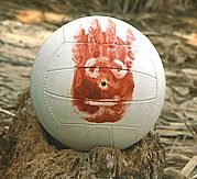
Do you know anybody called Wilson on the island?Many people ask this question, yet only a few know the true answer.
OK yeah, one of them is @Daniel.
'Jersey Island'? That makes it sound like it's somewhere near New York. It's the Bailiwick of Jersey, thanks, where Superman (Henry Cavill) comes from.
'Jersey Island'? That makes it sound like it's somewhere near New York. It's the Bailiwick of Jersey, thanks, where Superman (Henry Cavill) comes from.

All my friends are inflatable.Do you know anybody called Wilson on the island?
")
https://drive.google.com/open?id=1k57E7AxGLTGGQB_qovkk73mXh0cL69rI&usp=sharingDone! 👍This means that if this were to make it into the OP, it wouldn't have to be edited after posting the link. Less work and hassle, wooo!
That is pretty cool. One question - I don't know whether it is possible to do on that platform - can you change it so that the current red/green/yellow is changed to shapes, and then have a colour scheme to represent the number of members? I would just change Australia to the same as other countries, and don't bother with the continent category.Updated to October 17th, 2010, or top of page 23 (yes, I still have 8 years/25-ish pages to go).
Since it's being updated on Google's side, the linked image map in my previous post can stay the same while having an updated perspective. This means that if this were to make it into the OP, it wouldn't have to be edited after posting the link. Less work and hassle, wooo!
Check it out!
EDIT: I also changed it so where if you follow this link below, it'll take you to an actual interactive map where you can click on the pins and view who resides there!
Code:https://drive.google.com/open?id=1k57E7AxGLTGGQB_qovkk73mXh0cL69rI&usp=sharing
Also, don't pay attention to the images associated with the locations. They're chosen entirely by Google's algorithm and sometimes don't have any relation.

I've just changed the pins to small dots, which certainly helps with the clutter situation. When I'm out of class I'll redo the color scheme to reflect population instead of specificity. It might become more colors than red, green, and yellow depending on how I measure the step intervals. Thanks for the feedback!...can you change it so that the current red/green/yellow is changed to shapes, and then have a colour scheme to represent the number of members? I would just change Australia to the same as other countries, and don't bother with the continent category.
The dots do clean it up nicely. What I had in mind, which I don't know how easy to do in that version of maps is say, circles for cities. squares for states/provinces and triangles for countries. Still nicely separates categories and leaves room for the population with colors.I've just changed the pins to small dots, which certainly helps with the clutter situation. When I'm out of class I'll redo the color scheme to reflect population instead of specificity. It might become more colors than red, green, and yellow depending on how I measure the step intervals. Thanks for the feedback!

