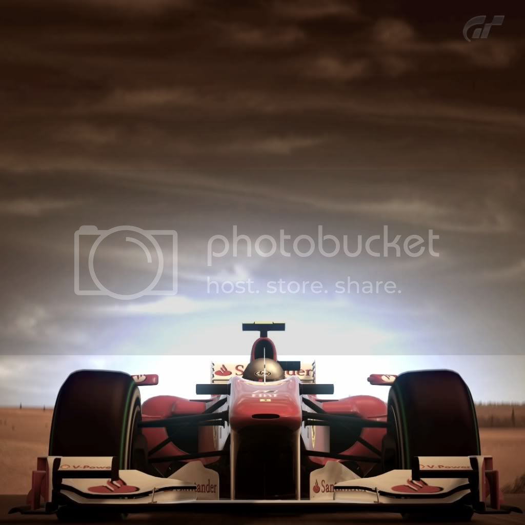
The "Rate My Photo" thread! **Read the OP Before You Post**

  • Thread starter Thread starter MSD Drifter
  • 2,388 comments
  • 185,872 views
8 for the aston shoot
and 7 for the merc. because it looks like a random shoot for me...but it's good btw.

AutodromoNazionaleMonza_2.jpg


GT500130Rsmall.jpg
 
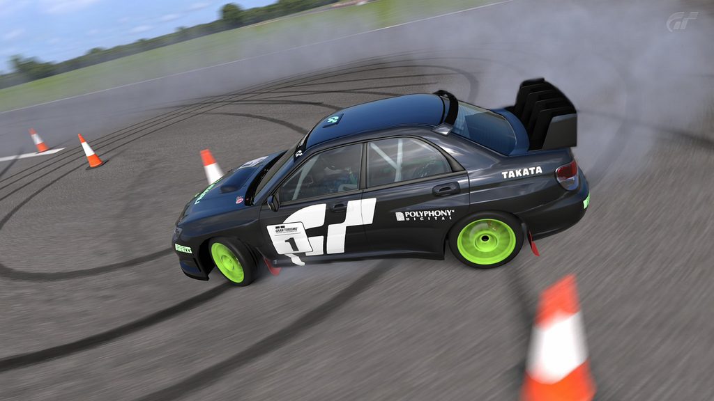
1: 8/10, very nice, perhaps a little too over exposed in some areas.
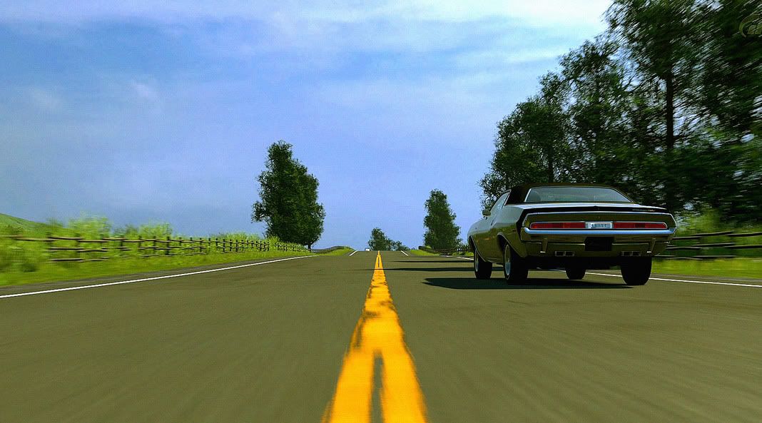
2: 7/10, nice picture, though would look better without the blur imo.
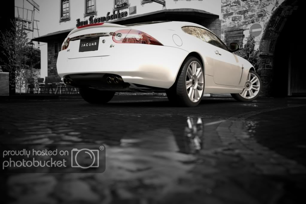
3: 9/10, awesome.

_smaller.jpg

Nice picture, but only showing the car and not the track and background is not my style, so 7/10

5375974269_2f714360d6_z.jpg

5375970835_1f075998e9_z.jpg

5376571354_cc4628b23f_z.jpg

5375971369_e471a290d6_z.jpg
 
@ Stigsblkcousin; LOOOOVE that pic, it looks like something from a magazine. Personally I would have upped the saturation just a smidge to bring out the colour on the car, but I'm sure you got it how you wanted it, and that's just my preference anyway. Going to go 9.5 out of 10, simply because there is no such thing as a 'perfect' picture, but that's as near as damn it.

Anyway, here's one of my recent ones. Photoshopped the levels, added a little bit of grain.. I was trying for realistic, did I manage it well enough?

Click pic for larger image
 

This picture is very well done! I'd give it a 7.5/10. It could use a slower shutter speed since its drifting to catch more action into the shot. Make sure to put panning mode to 3! ;)

Want comments on this please!
5355031474_0c038a6738_b.jpg


- And please check out my photo gallery! #advertisingwin
 
AutumnRingMini.jpg

TsukubaCircuit_50.jpg

tryin to get better...thoughts on if their good or how they could be better?

First one 9/10 I like how it's quite imposing and 'in your face'.

Second one 8/10 In my own opinion it might look better from a slightly higher angle, maybe even with the track ahead more visible/the back end of the car not slightly cut off.


My picture if someone could rate:


Sorry if it's very big. Don't know how to reduce the size :(
 
My picture if someone could rate:


I really like the idea of the shot. The contrast is is used very well. I give it a 7/10 simply because the shot is a little too wide for me, which lessens the drama of the shot. Have you tried something similar but with a tighter crop?
 
Good idea. I'll see what I can do. Thanks.

I was actually going to ask someone in another thread if they could photoshop it (I don't have photoshop nor know how to use such software properly). Might look nice as some kind of advertisement...

But I'll give it a bit of cropping as you suggest 👍

EDIT: Turns out I do indeed have a photoshop program on my PC, so I had a quick noodle around and came up with this:

 
Last edited:
9/10, love the car and the shot. The color of the car really pops against the night background

EifelCircuit_7.jpg


EifelCircuit_10.jpg


RedBullHangar-7_3.jpg

#2 would be my favorite. I love the sun in the shot. It puts the shadows in to perspective and kind of gives it a "reason" to be so contrasty. A great dramatic shot.

For the Corvette, I love the crop on it. My issue is that the 'Vette is not the focal point of the shot due to lighting differences. the stairs in the left building and the really hot spotlight in the center grab my attention. If you do an PP work, I'd try to properly expose one image and under expose another and composite the properly exposed 'Vette over the darker BG. Or, try some HDR work to balance the detail out some.
 
Good idea. I'll see what I can do. Thanks.

I was actually going to ask someone in another thread if they could photoshop it (I don't have photoshop nor know how to use such software properly). Might look nice as some kind of advertisement...

But I'll give it a bit of cropping as you suggest 👍

EDIT: Turns out I do indeed have a photoshop program on my PC, so I had a quick noodle around and came up with this:

it'd look better if it's brighter and if it showed more of the car.. 7/10

Here are my photos.... still new to this though..

5254223241_5cc26dcaf4_b.jpg


5254840038_e6466deba9_b.jpg


5254837780_fa59199837_b.jpg
 
#2 would be my favorite. I love the sun in the shot. It puts the shadows in to perspective and kind of gives it a "reason" to be so contrasty. A great dramatic shot.

For the Corvette, I love the crop on it. My issue is that the 'Vette is not the focal point of the shot due to lighting differences. the stairs in the left building and the really hot spotlight in the center grab my attention. If you do an PP work, I'd try to properly expose one image and under expose another and composite the properly exposed 'Vette over the darker BG. Or, try some HDR work to balance the detail out some.

Thanks! I'm sharing the track I took the first two shots on. That one uphill section is great for taking photos. If any of you want this track fr me and download it, it's also a blast to drive
 
I rated the post before mine and my photo's still not rated... All the ones after didn't rate. I don't want to sound like I'm complaining, but I was hoping for feedback for my photo. >_>
 
7/10 :) The F number probably should have been increased, the depth feels a bit odd if I'm honest. Could just be me. >_>

Here's mine. Hard to choose out of 278 pictures >_>
AhrweilerStreet_5.jpg

The idea is good, what separates your picture to some of the other pictures that uses this idea is angle and car colour. Try bringing the camera higher and angle it down a bit to capture more reflection. Also, you opted to use the selective colour filter, for this particular car, which is white (close enough) it sorta blends itself into the background and doesnt give that "pop" of colour that catches attention. This is definitely a 7/10.
* Sorry for not scrolling a little bit more up! >< ~
 
Last edited:
#2 would be my favorite. I love the sun in the shot. It puts the shadows in to perspective and kind of gives it a "reason" to be so contrasty. A great dramatic shot.

For the Corvette, I love the crop on it. My issue is that the 'Vette is not the focal point of the shot due to lighting differences. the stairs in the left building and the really hot spotlight in the center grab my attention. If you do an PP work, I'd try to properly expose one image and under expose another and composite the properly exposed 'Vette over the darker BG. Or, try some HDR work to balance the detail out some.
I rate the vette 8/10 really like the picture the only thing is that io had to use a stock car in that situation maybe something like an sls amg or something luxury don't you agree???
s13drift.jpg
what do you think of mine??
 
I like the idea, but I would also give it a little bit more angle. 7/10 (photo above/green silvia)

5393703853_4499e028fa_b.jpg

I`m not playing very often with the photomode feature, but I have try to make the best of it :lol:
 

I usually only rate if i have a picture for the next person to rate. Im going to break that rule.. LOL
For the first picture, i would show a bit more ground. It is also obvious that you are going for a very symmetrical look, that said, its a bit to the right.. but thats just extreme nitpicking :3
The second one is just wow! If that had been a premium model and the taillights gave more detail, it would had been P-E-R-F-E-C-T!!
Both 9.95/10 very good job! 👍

Thanks! I'm not even a photographer, my little sister is and quite a good one. I do enjoy playing with the photomode though. Might have to go out and get a DSLR and try my hand at the real thing :sly:


Hmmmm, 7/10.
I can't really put my finger on it, just something about two of the same cars.
Maybe show less of the ground?

One of mind. Not sure of the focus.
ChamonixWest.jpg
[/IMG]

Sorry about the low quality, only on a 480i TV.
 
Here are my photos.... still new to this though..

You use monochrome quite well! The first one in your set is probably the best one. The thing i think is missing would probably be the sense of speed. Try using a slower shutter speed and use panning mode 2 or 3 if your arent already. 7.5/10
The second one could use a better angle. Try capturing the path of where its been or emphasize the smoke. It is drifting after all, and drifting is more of an exciting sport. Using colour would most likely bring out pictures like these. 7/10
the last one in you set is quite strange. The F40 seems stationary and the similarities in colour with the background is a bit distracting. 7/10
 
Hmmmm, 7/10.
I can't really put my finger on it, just something about two of the same cars.
Maybe show less of the ground?

One of mind. Not sure of the focus.
ChamonixWest.jpg


Sorry about the low quality, only on a 480i TV.

I like the filter you used in the picture, gives it a cold and chilly feeling to it. Which is good as the car is driving in extreme weathers.

As you know the car isn't focused in the shot. I can tell your trying to show the speed of the car, but I think the front of the car should be in focus and not the side mirrors.

In all I would give this picture a 7/10

Here is one of my pictures.
Nothing too amazing, just want to see what people think about it. Thanks
 
One of mind. Not sure of the focus.
ChamonixWest.jpg


Sorry about the low quality, only on a 480i TV.

I like these kind of pictures! Very on site rally feel. Maybe move the camera lower and aim a little to the right. 8/10! Its a picture that gets people excited!!

I think i should post a picture after all these posts.. hahahahaahaa~

5394395762_2a9056f937_b.jpg

In the theme of excitement.. :3
 
Back