The "Rate My Photo" thread! **Read the OP Before You Post**

  • Thread starter Thread starter MSD Drifter
  • 2,388 comments
  • 185,870 views
Can someone rate mine it got skipped

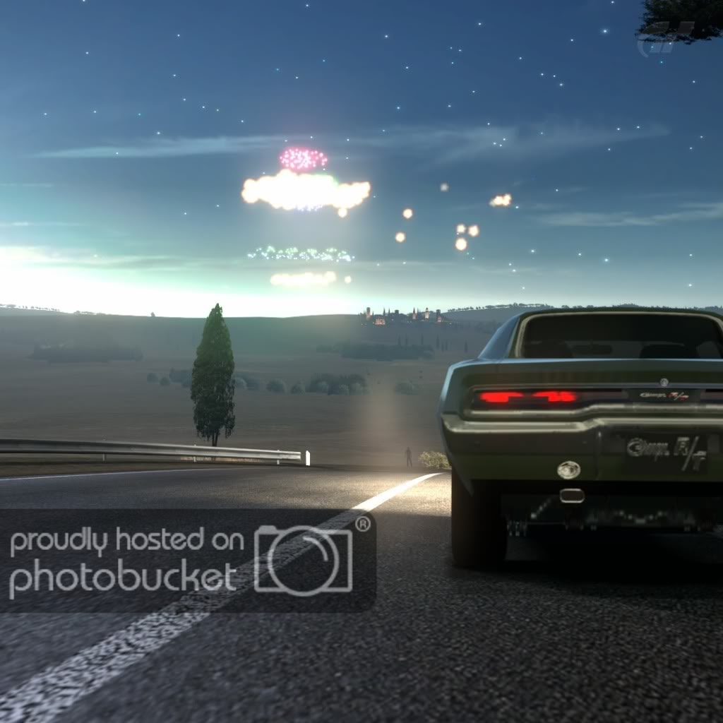
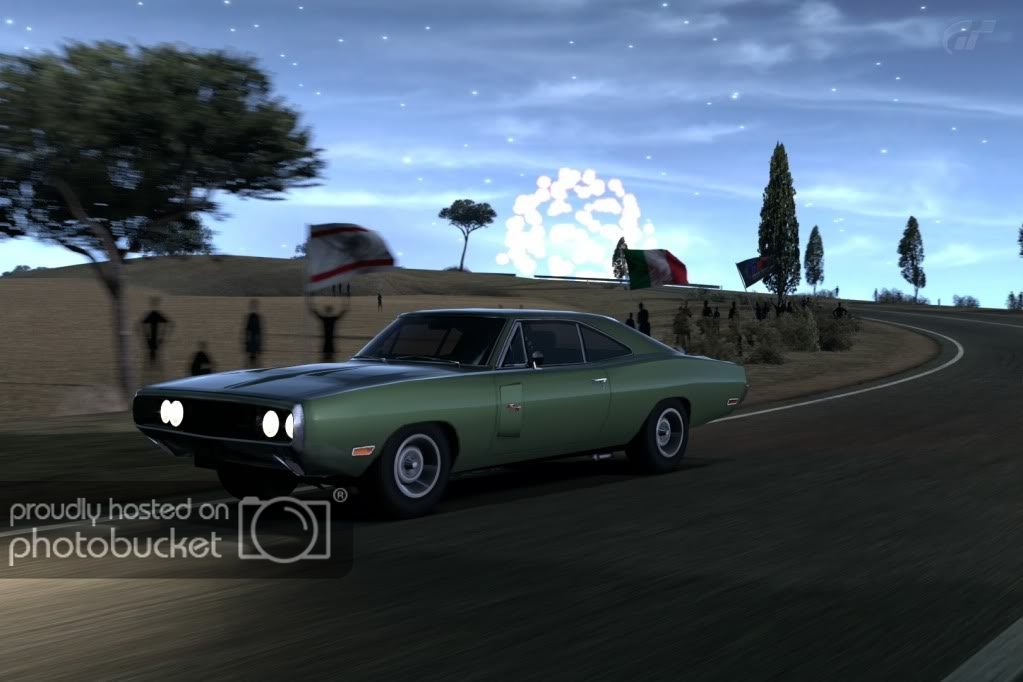
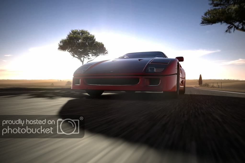
Good lighting and use of warm filter, but there is no sense of motion even though you seem to be in the middle of a race track, the trees are distracting (could be improved with lower F value), and there is too much road in the foreground. 7/10.

Here's mine again:
c1.jpg
 
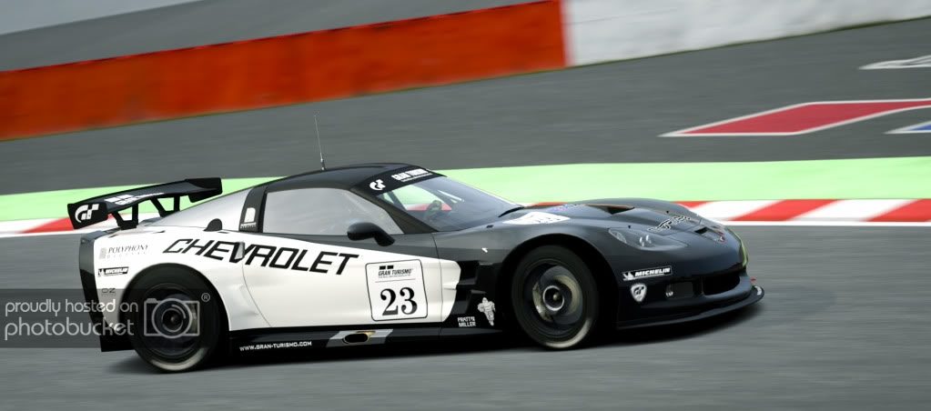
No sammich for Zupplu lol. Thanks for the critique though.👍 Your pic is stunning however.

Exalt1k thanks for the suggestions. I really have no idea what Im doing other than focal, f number and shutter. Ill look into what you suggested. 👍
 
Last edited:
Good lighting and use of warm filter, but there is no sense of motion even though you seem to be in the middle of a race track, the trees are distracting (could be improved with lower F value), and there is too much road in the foreground. 7/10.

Here's mine again:

c1.jpg

The picture looks good, but it lacks a bit of emotion and it looks cut.

My verdict is: 7/10

Here is mine

ahrweilerstreet3i.jpg
 
I like it. 7/10... That thing blocking the front of the car is messing it up for me visually.

Here's my last attempts for the night. Mode 2 as Exalt1k mentioned:
TrialMountainCircuit_4-1.jpg

DeepForestRaceway_31.jpg

DeepForestRaceway_33.jpg
 
^^^
First pic looks like it's poorly focused but I'm not certain, maybe it's the matter of resolution. Again the problem here is aperture and shutter speed, both needed to crank down more. In term of composition, maybe you need to put the car (subject) bigger. The jagged edge distracts but that's not your fault I know... 6/10.

For second one, I might gave you 8 or above if not the miniature filter. The upper part of the car is completely out of focus and it ruins the nice picture. Camera may slightly moved to left to show more portion of the car's front. Miniature filter is kinda difficult to master so avoid using it unless you're really confident about that. 6.5/10.


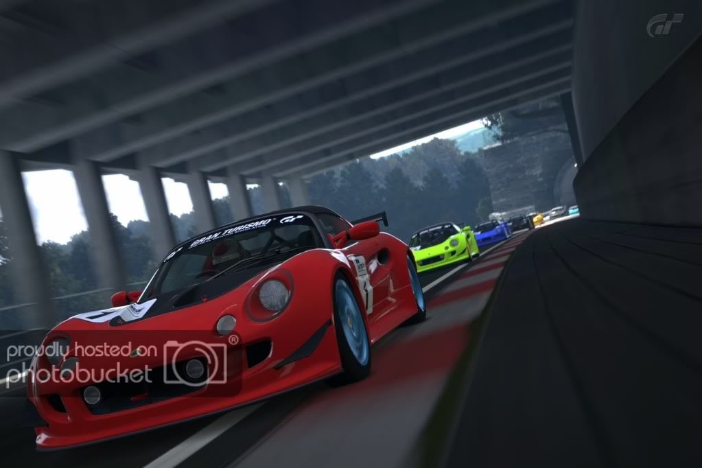
Copy of Circuit de Spa-Francorchamps_10 by m-SimmGT, on Flickr
 
8.5/10 Great sense of space and very nice scene. Wish there was more light though.

I would like someone to critique each picture. I am trying to get that realistic look, so tell me how close or far i am. I play with a bright setting on the tv, so sorry if its a bit dark

Kyoto-Gion_1-1.jpg


RedBullHangar-7.jpg


SpecialStageRoute5.jpg


SuzukaCircuitEastCourse.jpg

1st Picture: It would look more realistic if you really put focus on the back and increase the exposure a litttle bit..but it's really good!

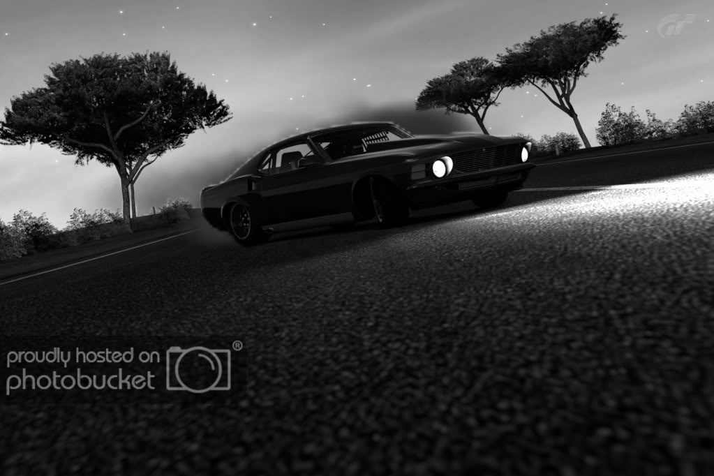
2nd picture: It's too Blurry..need that put that focus on the front of the car!

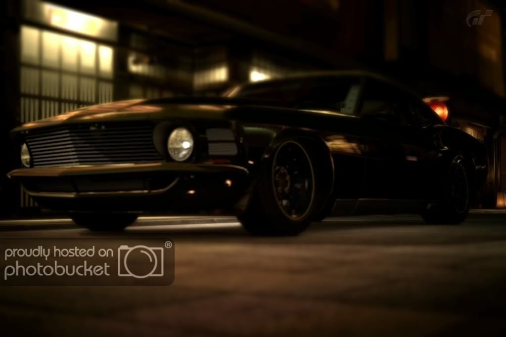
3rd picture: Again with the focus problem....and increase the exposure

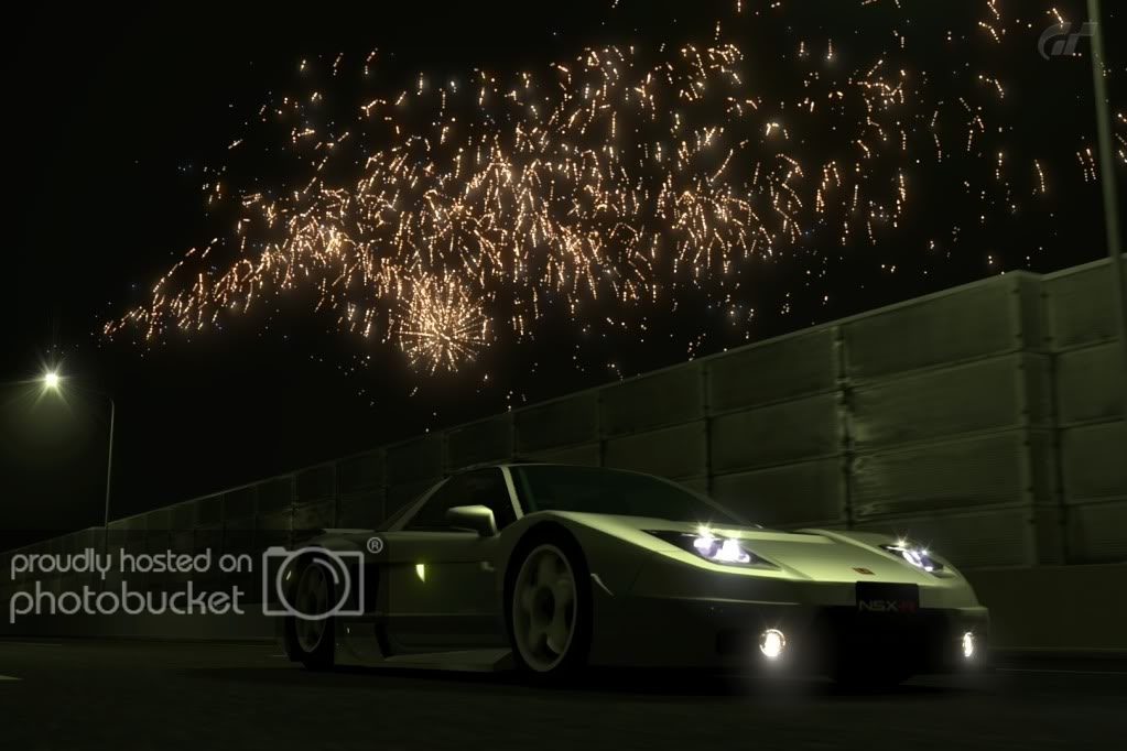
4th picture: It's quite ok actually.
 
breezy23d
The whole pictures has a sense of realism. I like stationary photos like that. You managed to make good use of detail in the mountains and also of the lense flare. The reflections also seem realistic for how low-detail they are. I do feel, however, that if you bring the E.V. down 0.2 0r 0.3, then it would look a wee bit better and have more details. Also, if you zoom out and pan to the left so there is more road in front of the car, it might look a bit better, like the car was about to start driving hard.
Verdict: 8/10

Now someone rate e_dub64's photo.
 
I think Im getting the hang of the different modes but they don't always work for what I'm going for. Here's my latest attempts:

CircuitdelaSarthe2009NoChicanes_5.jpg

CircuitdelaSarthe2009NoChicanes-1.jpg

GrandValleySpeedway_1.jpg
They're good, but a bit boring. I wish there was more sense of action. Try using more complicated compositions. overall, 7.5/10. You're on the right track!
411366_276689042387095_100001380033327_738335_225720479_o.jpg

416717_276871265702206_100001380033327_738765_144798189_o.jpg

411025_276870709035595_100001380033327_738763_2120552823_o.jpg

331818_276871009035565_100001380033327_738764_1102970588_o.jpg

here are a couple more pics to critique.
I like the last one best. I think that the first two would be better if you used panning mode 2 or 3 and decreased the shutter speed. On the other hand, you're compostions seem good. Overall, 8/10.
 
I'm finally back and my picture, in my opinion its one of my best so please rate guys!
*i was trying to put emphasis on the front of the car and i was going for a abstract color
b9RCgt
 
Last edited:
I'm finally back and my picture, in my opinion its one of my best so please rate guys!
*i was trying to put emphasis on the front of the car and i was going for a abstract color
6663782137_5d28a9ba7b_m.jpg

Very cool


(I had to delete most of your links soo you could show your pictures ;))
Heres mine

6663702125_a8f5fcea14_b.jpg
 
e_dub64, i didnt quote you because you have to Rate someones pic so you can post here.


What do you mean ?

Heres another ...


Nice pic mate. Love the filter, the lighting and angle. Could be better in my opinion if the scenery wasnt some much focused. A 8.5/10:tup:


My pic:

deepforestraceway1g.jpg

By mines_r34 at 2012-01-09
 
^Looks like it would be a good angle but the filter is waaay off. Next time just try panning mode 3 and a low shutter speed.
spaenzo.jpg
 
Pretty good; I like it. The sense of speed is there, and the composition and angle are great. The only thing I would recommend is that you use a different colored car. The grey sort of blends in with the pavement. 8/10

ToscanaTarmac_7.jpg
 
Back