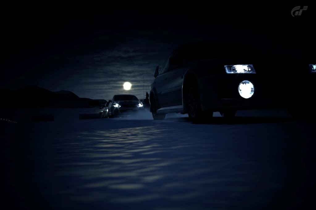
Here is my S2k pic, no photoshop here. Tell me what you think.

Great shot. Love the colours, gives it a futureistic look. 9/10
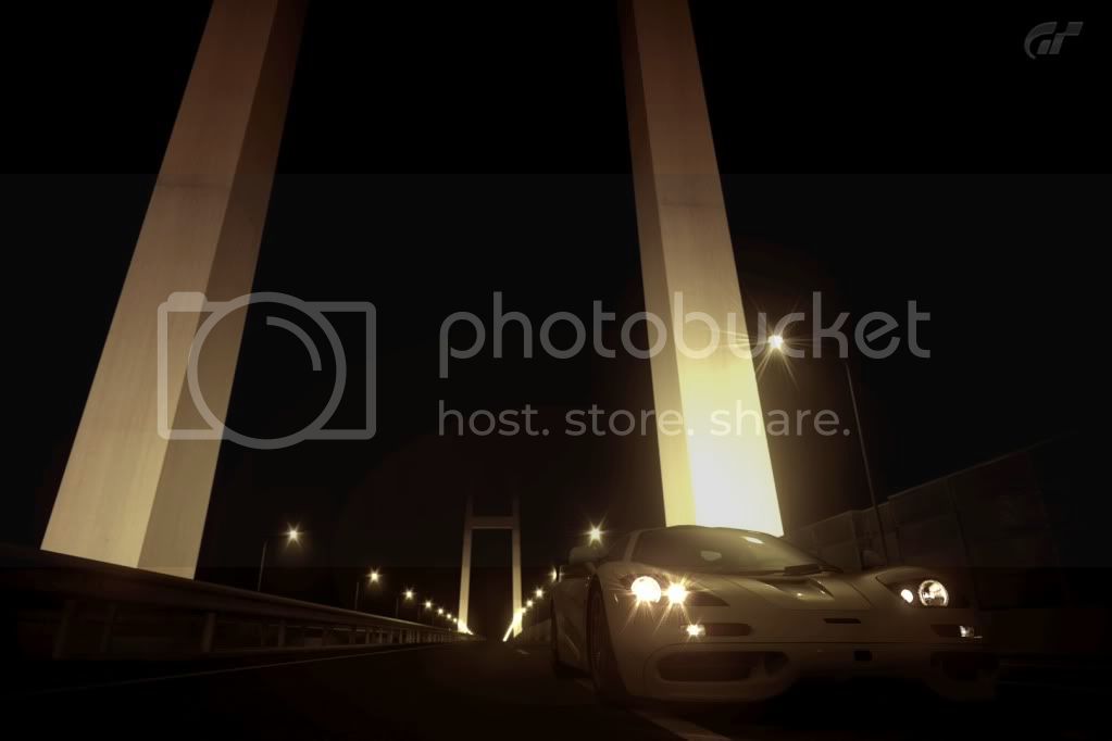
Here is my S2k pic, no photoshop here. Tell me what you think.


Nice angle, colours are a bit dull though so... 8/10

My rubbish attempt at photomode...

8/10 Great it's just the filter doesn't really do it justice

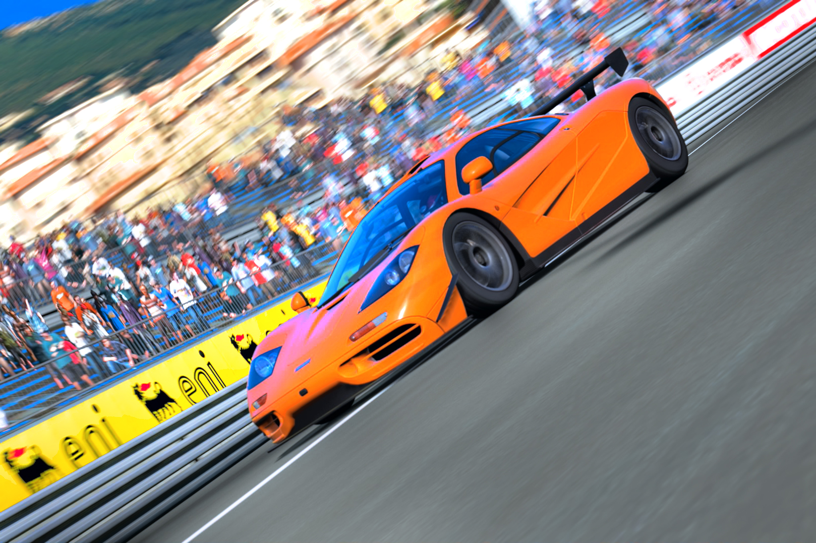
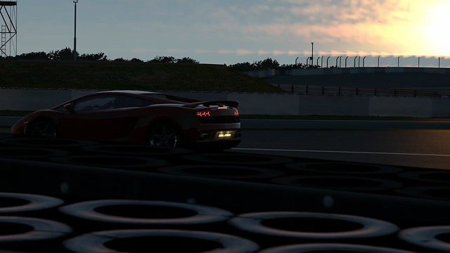
6/10 but it can be improved very easily (tl;dr: the car is misplaced):What do you all think? I think this is my favorite shot that I've taken so far.
6/10 but it can be improved very easily (tl;dr: the car is misplaced):
The car is in the bottom-left corner inside the third where it gets little attention thus is far too close to the edge. If it's the subject, it has to be given some room in the direction it's going.
Imagine a profile shot of a moving car where the car takes up, let's say, half the width of the picture and is moving to the left side. If it's in the center, it's not such an exciting shot. If the car is near the left edge, in the direction it's going, it simply does not have enough room. Push the car to right of the center to give it room to go left and make the picture more interesting.
Attention is drawn more to the "Agip" sign than the car. If the car was placed coming right out of that turn under the sign, the picture would be significantly better, with a longer focal length too of course. F/11 is a pretty safe aperture to use. The quality of the jpg is a bit poor and exposure a tad too high.
Otherwise, the angle and lighting are pretty good.
Also, it's better to use a longer focal length when shooting cars in the first place. I think the reason is called "lens compression"; it's been a while.
5/10. Unfortunately im not a fan of this one. For me theres too much going on without any real focal point. sorry
Heres another two of mine.
Evo on ss7 by Bluebaws, on Flickr

Here is couple of mine:


What do you guys think?
I like the first shot, a tad dark but it adds to the effect. Cars look like they are on water 👍
How about mine?


Thanks for the response SuperVeloce!
Posted these two pics in the American Muscle Thread. Any feedback would be greatly appreciated!


The aperture is too bright on the first two. The first can be fixed easily with a slightly higher f-stop, then I won't have much to say about it. On the other hand, the f-stop on the last is the opposite, it's not a landscape.4th photo is gorgeous, If the front of the car was lit up a little more it would be perfect 9/10; sorry if I can't provide a better opinion for you
Here's my new batch:
http://i665.photobucket.com/albums/vv12/HumanDestroyah/Rome.jpg
http://i665.photobucket.com/albums/vv12/HumanDestroyah/TokyoR246_2.jpg
http://i665.photobucket.com/albums/vv12/HumanDestroyah/CtedAzur.jpg
The aperture is too bright on the first two. The first can be fixed easily with a slightly higher f-stop, then I won't have much to say about it. On the other hand, the f-stop on the last is the opposite, it's not a landscape.
The second and third are rotated too much for my liking and I don't like the use of such a wide-angle, specifically on the second.
8.5 on the first, 6.5 on the rest