Worst Liveries Of All Time

  • Thread starter Liquid
  • 1,105 comments
  • 185,353 views
Well, at least it's the more... tame version of that livery.
 
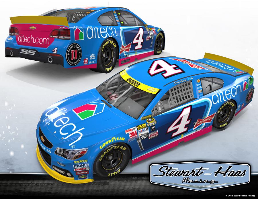
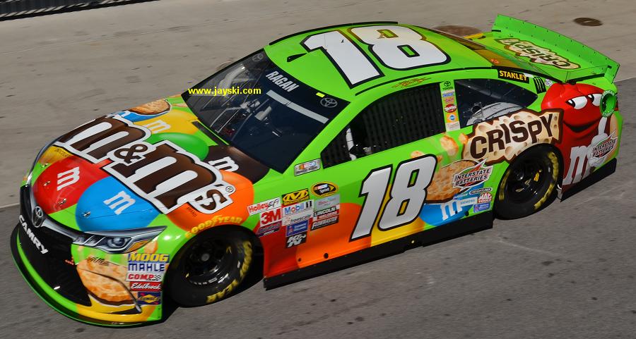
In my own opinion, modern day NASCAR liveries look ewwwwwwwww


4ditech-chase-nhms2-shrpr.jpg


18crispy-mms-front-lvms-borodkin.jpg


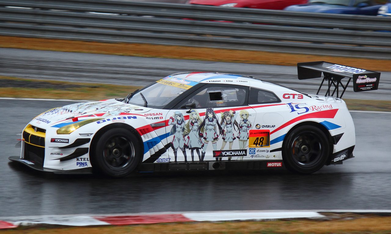
How NOT to do an itasha.

20130511193715545.jpg
 
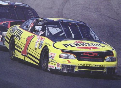
Do anybody else think if they painted the carbon fiber graphics black it might have been alright?
 
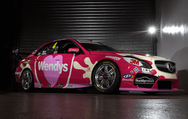
That particular shade of red is commonly associated with the Holden Racing Team. The livery was introduced at a time when Holden effectively bought the team. They deliberately redirected funds from all of their smaller customer teams to pay for it, and a lot of the merchandise and paraphernalia produced at the time claimed credit for the previous year's championship, even though it had been won with a different manufacturer.

Im sorry but this is the most hilarious thing I have read, it belongs in the jokes thread!

1. Vodafones colour is RED.
2. The particular livery you have shown is from 2012.
3. 888 switched to Holden for the 2010 season.
4. The livery you have pictured was introduced in 2012, so if the merchandise claimed credit for the previous years championship then thats because its true! In 2011 888 ran Holdens.
5. 888s cars are no longer red, but blue, due to RB being their sponsors. No signs of Simon "marking his territory" or "clear statements" being made there :lol:.

I honestly dont know how you come up with these wild theories :lol:

Apologies for being off topic but when someone is writing such garbage, it needs to be addressed.

EDIT: To keep with the theme, Ill post the SBR 2003 Bathurst and Sandown livery. This is the result of two drivers sponsors sharing the same car Pirtek and Caltex/Havoline.

Left side:
18123.jpg

Right side:
03714__11855.1371885589.350.350.jpg


For me, the shades of green and blue just dont mix well but its the best they could do with the situation they were in.
 
Last edited:
In my own opinion, modern day NASCAR liveries look ewwwwwwwww
Indeed, to me it feels like some of the modern liveries are trying to jam way too many sponsors and colors into one car, which ends up looking incredibly messy and unfocused. I feel like after 2012, teams just went crazy with the liveries, and have only become worse as years passed.
 
It's like they borrowed bits of another car and didn't bother painting it. The side is a mess too.
 
What I don't get is that for every other "partner" that's on the hood thus far they've changed the spikes on the side to go with it.

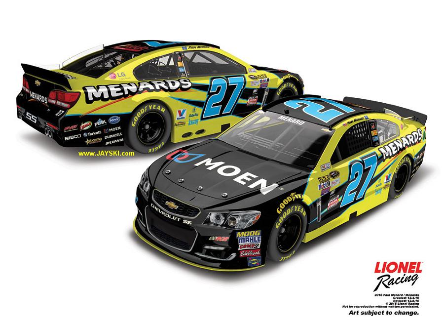
27menards-moen-diecast.jpg


27menards-libman-wgi-rcr27tw.jpg


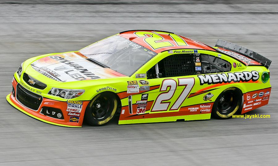
27menards-sylvania-bms1-mccoy.jpg


Granted the scheme is rather horrible no matter what, but that Valvoline one is especially bad. Thankfully he's an also-ran that nobody pays attention to so we won't have to see it much.
 
Sadly this thread turned into the "I vaguely dislike this livery..." thread. There are hugely inoffensive paintjobs in here. I was hoping for more entertainment.
 
Back