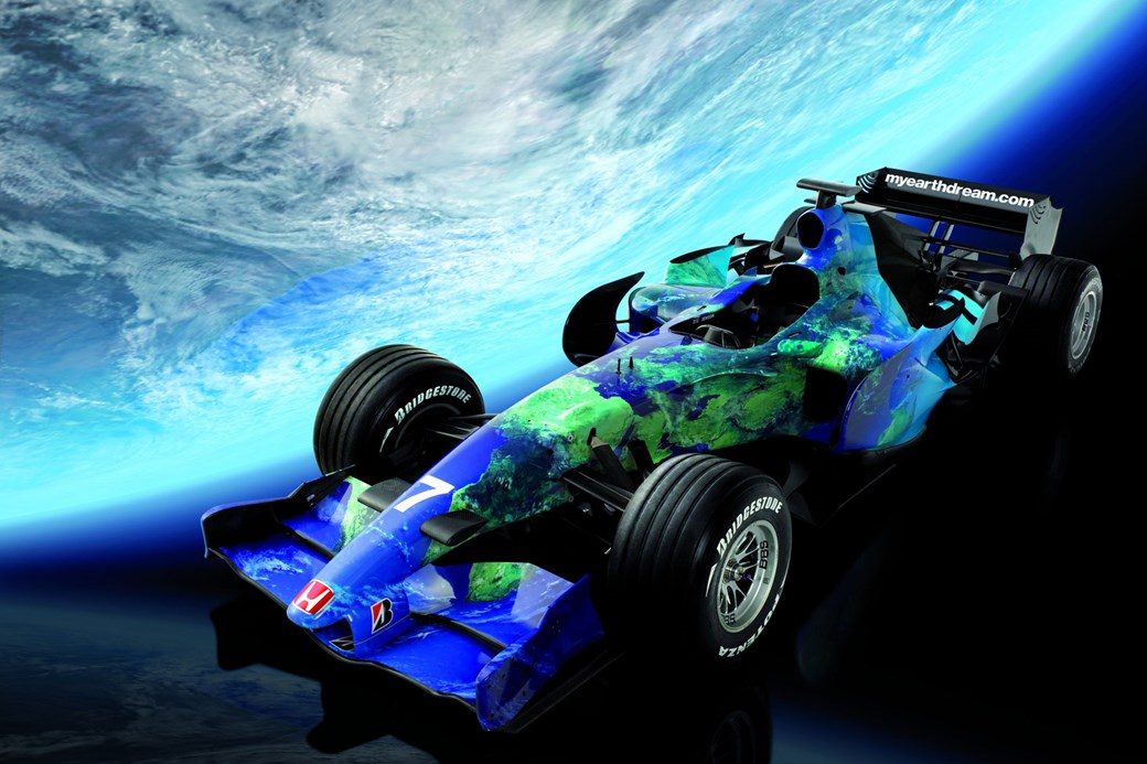
Worst Liveries Of All Time

  • Thread starter Liquid
  • 1,105 comments
  • 185,077 views
It might be harsh to call it one of the 'worst' liveries ever. It has the classic chevron design but there's an element of visual dissonance being so used to the red and white.

It still looks terrible though. The actual shade of yellow is poor. Too sickly.
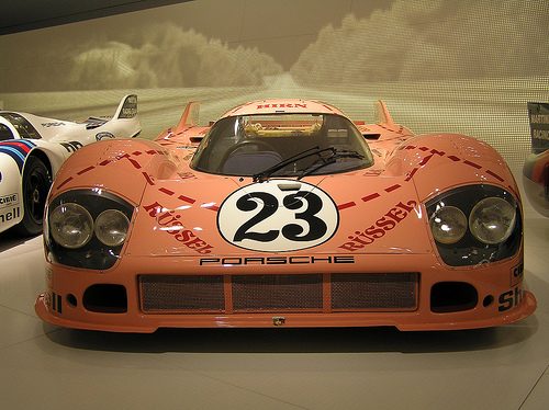
 
I like that gold yellow version of the McLaren. I might be biased, though.
Ftfy, contemporary cameras made it look yellow, but it was gold like the Marlboro Lights it was advertising.
 
image.jpg
 
Wait, Germans actually have a sense of humour?

Actually, I read somewhere that in German, you actually tell the punchline of the joke first. And because of this, lots of Germans assumed that you tell the punchline first in English, too. But I'm not sure if I believe that story.
 
Wait, Germans actually have a sense of humour?

Actually, I read somewhere that in German, you actually tell the punchline of the joke first. And because of this, lots of Germans assumed that you tell the punchline first in English, too. But I'm not sure if I believe that story.
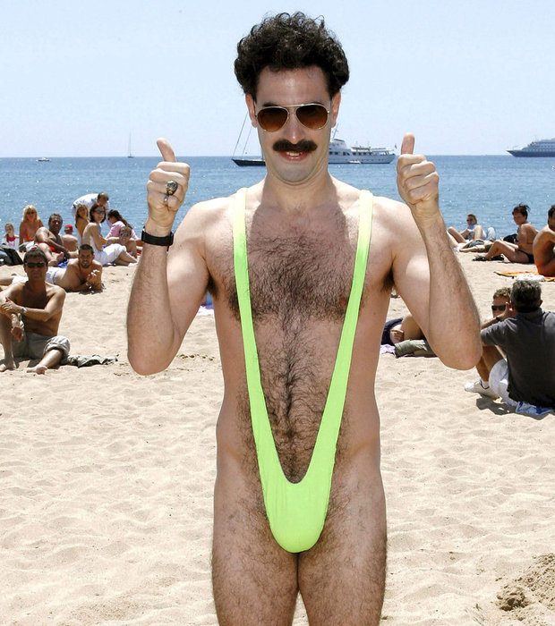
I give you 2 examples of German humor
DSC_0380.JPG

DSC_0463.JPG
 
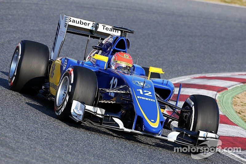
f1-barcelona-february-testing-2015-felipe-nasr-sauber-c34.jpg


I've tried to like this but the older Black/White/Grey Saubers looked so much better.

It looks cheap (like a lower formula team) and to be honest the car is one of the ugliest of this year anyway.

Yet another example of the whole livery being decided by a title sponsor.
Chelsea badge made it even worse. :P

image.jpg
 
f1-barcelona-february-testing-2015-felipe-nasr-sauber-c34.jpg


I've tried to like this but the older Black/White/Grey Saubers looked so much better.

It looks cheap (like a lower formula team) and to be honest the car is one of the ugliest of this year anyway.

Yet another example of the whole livery being decided by a title sponsor.
I completely disagree. It's one of, if not, the best liveries in this year's F1, the blue and the yellow go so well together.
 
It's either grey and black with an accent, red or blue. I actually miss caterham because of their green car, useless team but colourful car.
For me my favourite livery for this season is the Red Bull or Williams.
 
Yet another example of the whole livery being decided by a title sponsor.

Uh, apart from Ferrari with Marlboro, that's how pretty much all liveries work unless the car has no sponsors at all.
 
Uh, apart from Ferrari with Marlboro, that's how pretty much all liveries work unless the car has no sponsors at all.

Ferrari were Red/Black before Marlboro, even with Marlboro they only added some white which has stayed since then.

I believe they still have some deals with Marlboro even though they can't advertise (it may have expired in the last couple of years) but the teams logo is remarkably similar to a modified Marlboro red design.

It's until the end of this year!

http://en.espn.co.uk/ferrari/motorsport/story/51683.html
 
I've tried to like this but the older Black/White/Grey Saubers looked so much better.
When HRT did it, the cars looked unfinished. So too do the Saubers.

And we all know the F1 grid needs some colour.
Put a Sauber, a Ferrari, a Williams, a McLaren, a Mercedes and a Red Bull together, and there's plenty of colour - blue, red, white, black, silver and purple. It's only really missing yellow, green, and/or orange (Caterham, at least, was good for that). And Haas is said to be considering a yellow livery.

It's considerably better than a few years ago when it felt like half the grid was dark blue.
 
hsv
Is Moneytron the Decepticon with a degree in finance?

Well, there was a lot of deception surrounding Moneytron, if that counts.
 
Put a Sauber, a Ferrari, a Williams, a McLaren, a Mercedes and a Red Bull together, and there's plenty of colour - blue, red, white, black, silver and purple. It's only really missing yellow, green, and/or orange (Caterham, at least, was good for that). And Haas is said to be considering a yellow livery.

It's considerably better than a few years ago when it felt like half the grid was dark blue.
Problem is, those bolded colors are way too overrepresented these days. And when that happens, the grid gets a very depressing look, almost as if we're viewing the cars through black-and-white cameras.

Personally, I loved the 2002 grid - that was extremely colorful, even if the season was probably the most boring ever... We had red, silver/black, blue/white, dark blue, yellow, white, light blue/yellow, green, orange, black and red/white. Practically the whole spectrum save for purple, without any of the cars looking alike.
 
Back