Taiga | 2.12 | The Final Act

  • Thread starter Taiga
  • 1,463 comments
  • 75,771 views
Dat 787B Shot
e5029843.jpg
 
Kodje: Thanks Kodje!

20832: That made me crack up. :lol: Thanks Sir Nurburgring.

ZEROX: Yay for Final Fantasy! Thanks Zerox!

NBDESIGNZ: Thanks NB, glad you like and felt the mood! :)

It's pretty damn awesome seeing people like my works. I've put in quite a bit of effort into each of them and it's really great to see the support, thanks everyone!

your work is awesome man
 
I think ShaolinMasta captured my face when I saw those pics quite accurately (yes my face multiplied) :D. Great Job :drool:👍
 
marbel69: Thanks Marbel!

Primus Ortus: Thanks Primus Ortus!

ShaolinMasta: Dammit Ilya, quit wetting your table with your multiface. Go clean it up. Thanks a lot mate! :D

Horde_R35: Words are Thank and You from me. /yodafail

hgrf93: Thanks hgrf93!


Retrospect

The Challenger TC is a modern interpretation of a '70s stock car.
A pure-bred full-on American muscle car, with lots of muscles under its hood.
This car drives awesome, and actually pretty much like it's old counterpart.
In retrospect, this car didn't really grow much at all, it's still all the same.
I present you thee: Dodge Challenger and ShaolinMasta. Guess which one he's in. :sly:

I have also adopted a new style of taking photos and editing, and this is the first set with it. Hope it all turns out well.
Here's a few after this set:


Edit: Dammit, tree'd by Garrett.
 
Love the tones and angles, I wish the sets we did turned out as good. (Stop always following behind me damnit! :lol: )
 
Love the tones and angles, I wish the sets we did turned out as good. (Stop always following behind me damnit! :lol: )

Thanks Garrett. Don't worry, they will. :sly: 
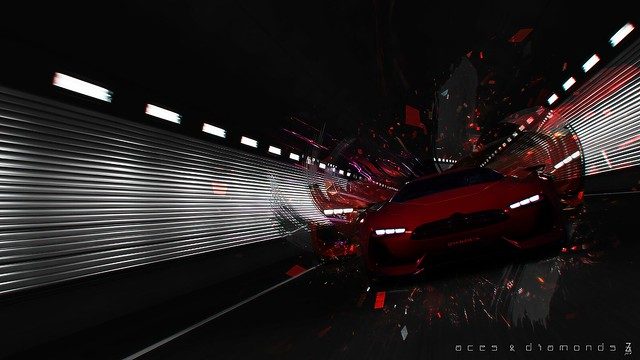
Especially the F1 one and the Heist. And god, Stanced was boring as hell. (Stop going infront of me, dammit! :lol: Lolwoops.)

My favourite has to be number 10.

Thanks for visiting TVR&FF. Glad you liked it. :)

Awesome shots! :drool: I'm loving the new style. 👍 :)

Thanks triple seven! Guess it's working then! :D
 
Really dig the new style.
Don't like that new name doe :lol:

Thanks Sir Nurb. Awww. Maybe I should've changed it to Sir Nurburgring. :lol:

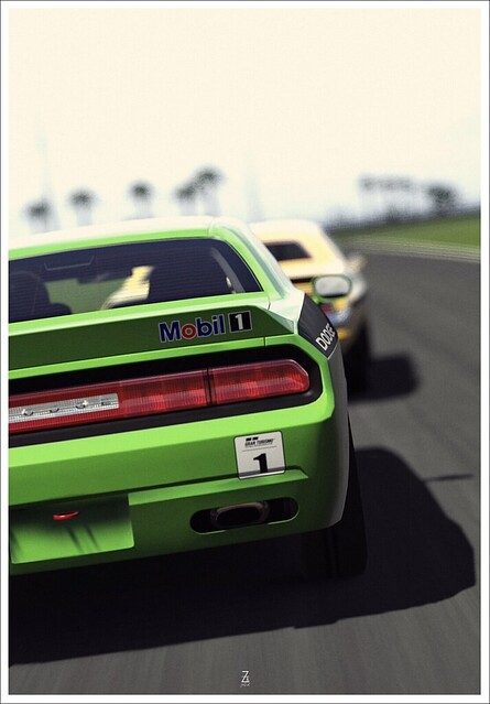
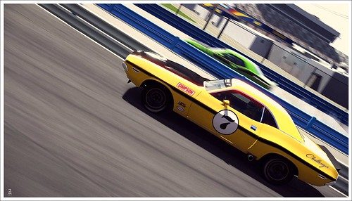
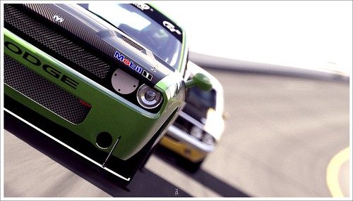
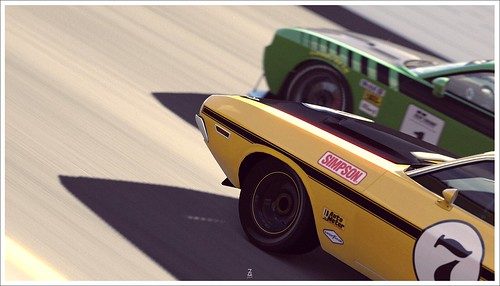
Nice meeting with the Challengers 👍 :drool:

Thanks Nuschel!

Sweet editing style you got there! 👍

Cheers, lilmann. :cheers:

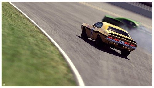
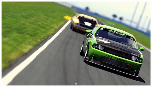
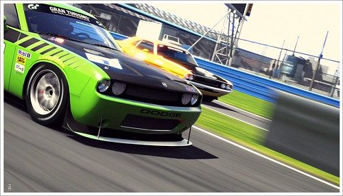
Really great work on the challenger set 👍
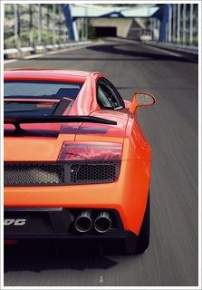
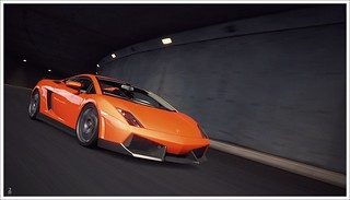
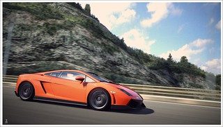
And that gallardo !

Thanks Kodje! I love the Gallardo in that colour!


To anyone who reads this, I require your help.
I think the contrast setting has been set too high on my previous monitor. My photos all look under-contrasted in my laptop's screen.


This is the one I re-edited on my laptop, mainly the contrast through curves and levels and such. On my laptop screen, it looks fine. But the contrast looks way too high on my desktop.


This is the original. On the desktop, it looks fine and just right, but on my laptop, it looks under-contrasted.

So which one has the better contrast? This is pretty urgent, thanks in advance if you helped. :)
 
It will totally depend on the monitor it's viewed on. On a break atm at work and on the work computer the re-edited version looks best (although the grain has been accentuated a little too much in the process). However, I know that the work screen is different to my home computers and I suspect the original will be better when I look again at home (I'll let you know).
So, in short, I'm no help to you at all! :lol:

EDIT: Checked at home - contrast still looks better with the re-edited version, although I would say maybe a little over-contrasted. Dial it back a fraction and perfecto! ;)
 
Last edited:
It will totally depend on the monitor it's viewed on. On a break atm at work and on the work computer the re-edited version looks best (although the grain has been accentuated a little too much in the process). However, I know that the work screen is different to my home computers and I suspect the original will be better when I look again at home (I'll let you know).
So, in short, I'm no help to you at all! :lol:

EDIT: Checked at home - contrast still looks better with the re-edited version, although I would say maybe a little over-contrasted. Dial it back a fraction and perfecto! ;)

Yep. The old monitor was conky. Thanks a lot, Nato!

As Nato, the re-edited version looks better. Maybe a very little bit to much contrasted.

Thanks for helping Kodje!

Gallardo in Grand Valley Speedway looks awsome! :)

Nice gallery!👍

Thanks for visiting! :)


And thanks to all that helped.


Bleed


Aventador @ Kyoto


Ferrari F10 @ Abbey


777

To commemorate 777, (I love the number 7) I have taken inspiration upon one of Nato_777's very inspring shots.
I sorta got the idea of an explosion behind the car looking at Nato's work.
And I thought, hmm, why not?


CCCL | PMC
2.0
 
Back