Thanks for the great comments guys. Looks like another week where I fall on my face for the comps. I need to start really being picky with my shots for the comps, I'm just not bringing it like I did in the past. Hopefully this week I can get something really good. Thanks again for all the comments, I really appreciate it!
I don't think the issue is with your photos, more the voting. I've seen you constantly come up with fresh, new, exciting ideas for photos that are perfectly executed and yet they're losing votes to basic images that look clear or have had the contrast ramped up.
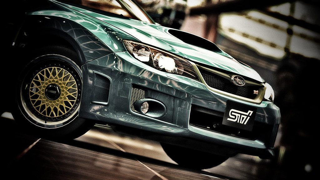
The problem isn't the photos because they are clearly stunning and well worthy of a win in any contest, the problem is that it's a new game and at the minute people are voting in the dumbest way possible. Look at the entries with the high votes in any poll and you'll notice that they are just clear shots of nice cars.
Very rarely are they unique or original, they're just a car plonked in the center of the image with the contrast ramped up in Photoshop. Entries which, back in the GT4 days, wouldn't get a look in. But because it's new and fancy, we're getting a lot of people voting for cars they like or shiny things that get them excited.
It'll calm down eventually, I'm sure, but for now I think we just have to sit back and watch the shiny cars get all the votes while the carefully composed, lit and colour balanced entries fall by the sidelines, only receiving votes from the more trained eye amongst us. Don't get me wrong, there are some new members who clearly have natural talent and are very very good at photography and editing, and they are voting in much the same way as the older members are (for the more exciting compositions with original ideas) but there aren't many!


")
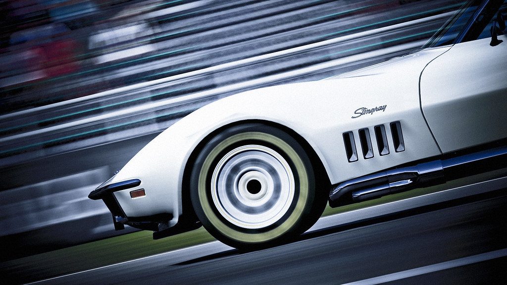
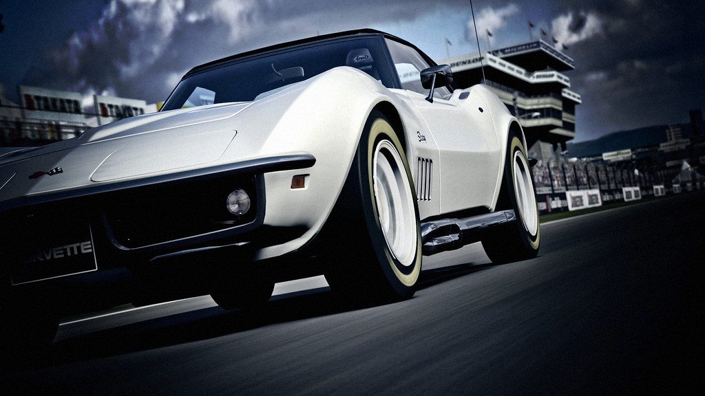
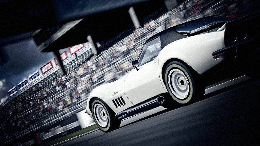
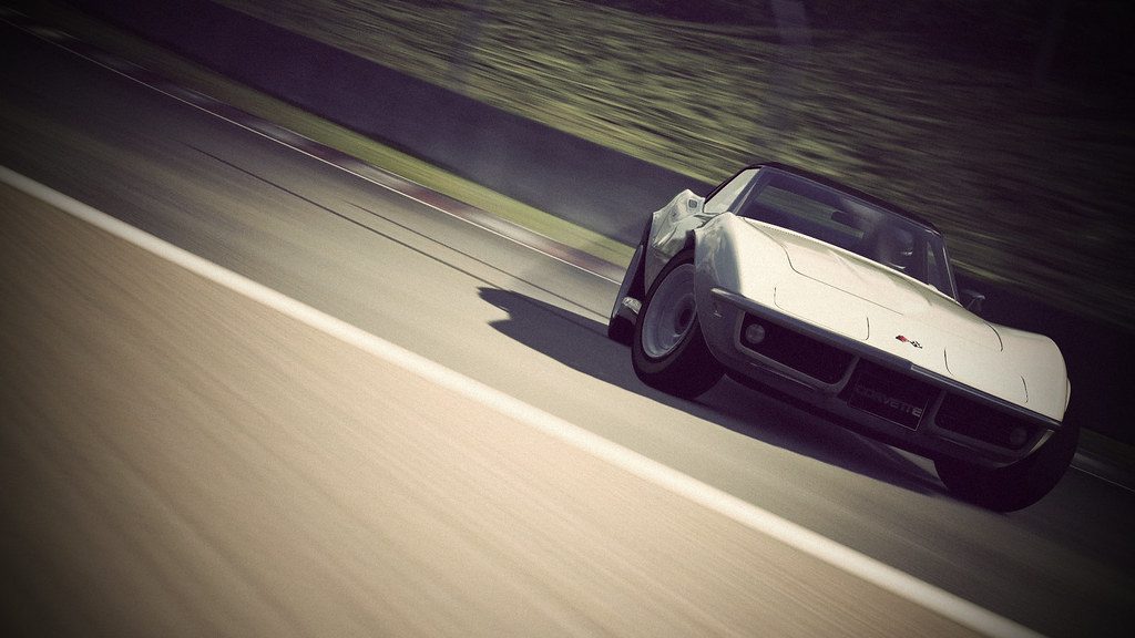
 The Stingray looks brilliant too, so clean and smooth and the style you've shot it in suits the car and colour combination perfectly!

") ) Lambo in the final right now?!
) Lambo in the final right now?!