- 3,600

- Middelburg
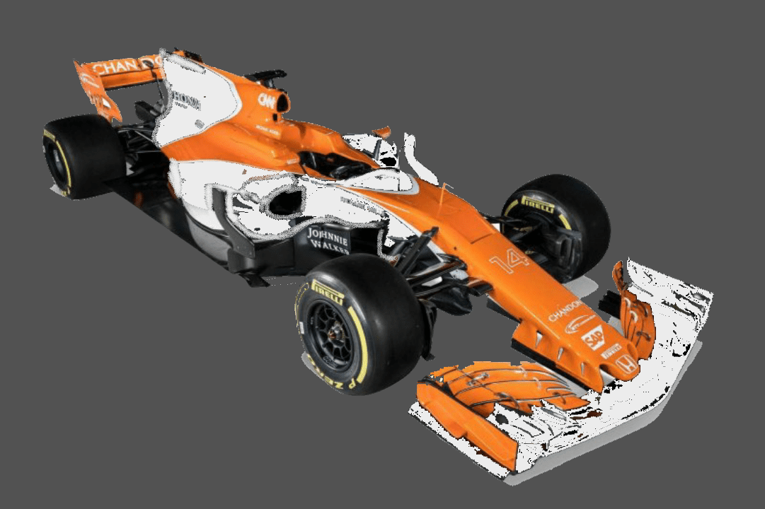
This McLaren orange has been approved by Max himself
I like the livery, but I think it's a bit much on places. Particularly the white on the sidepods - it just looks like filler to me.McLaren seem to have got that right, livery isn't bad just was expecting more McLaren orange than this.
Both cars today have some radical stuff going on.
Is the only part of the car that actually has the word Mclaren the back of the spoiler?
Hope it isn't the slowest car then.

No look at the picture I posted up, click it so you zoom in, then look really close at the nose right under the Honda symbol.
Exactly, but it does count.
I really hate F1 cars not having sponsors on the side, a big Mclaren decal to fill that gap on the sidepods could fix this livery.
For what? If ever there was a moment to reveal a big sponsor, it was about seventy-five minutes ago.Maybe they got a big investor signed up for that spot and are just waiting.
Maybe they got a big investor signed up for that spot and are just waiting.

A very quick edit on my phone to make it look more McLaren like. All I've done is changed all the black areas (bar the barge boards) to white.
For what? If ever there was a moment to reveal a big sponsor, it was about seventy-five minutes ago.
Alert the press! The McLaren is orange! That will easily be worth at least one second of discussion amongst television pundits.
Really not sure what to think of the front wing though. But at least it's something interesting.
As for the Ferrari, I'd say it looks comparatively ordinary.
No doubt, but I don't think the team is hard up for cash. This is the fourth season where they haven't had a major sponsor.Nothing, that's the joke, that they are still leaving spots open hopeful for the money trains to return.
How is the T wing on this car much different from this concept from Mercedes that we were discussing yesterday?T-wings would give the FIA the pretext to ban them - they would be able to ban all bodywork from appearing in that particular area of the car.
They should have launched it with "Your Name Here" in that spot.For what? If ever there was a moment to reveal a big sponsor, it was about seventy-five minutes ago.
This. Even if the horizontal wing is mounted on the shark fin, it's still a T-wing because the shark fin forms the vertical arm of the T. I'd like to see the FIA ban all bodywork in the space between the rear wing and engine cover; the cars would be drop-dead gorgeous if they all resembled the Mercedes.Or are you referring to both concepts in the same vein?
 It's so insane, and ORANGE!
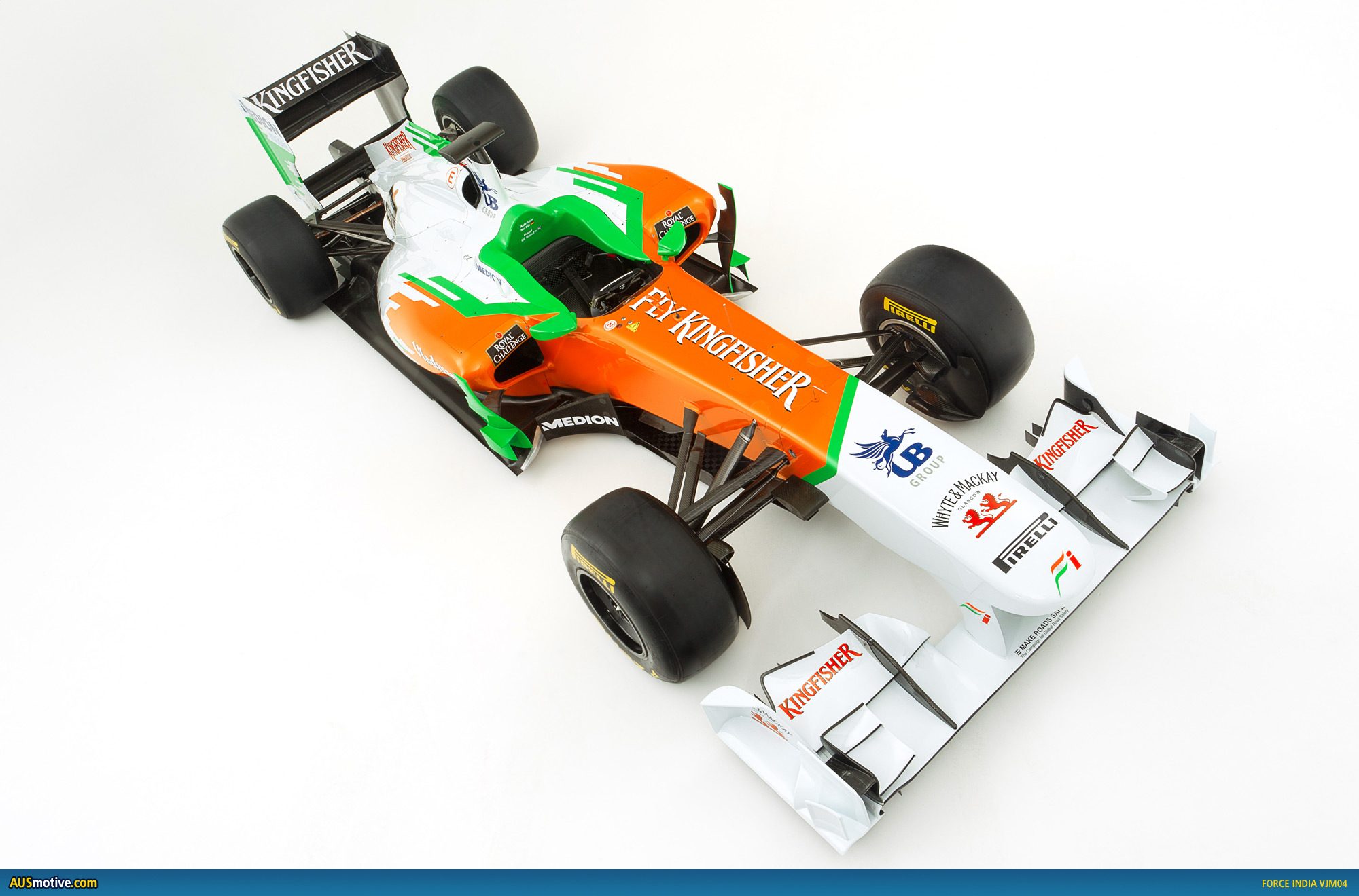
I came here to say that too...It also reminded me of the older Marussia F1 liveries just in a different colour.