- 1,561

- United States
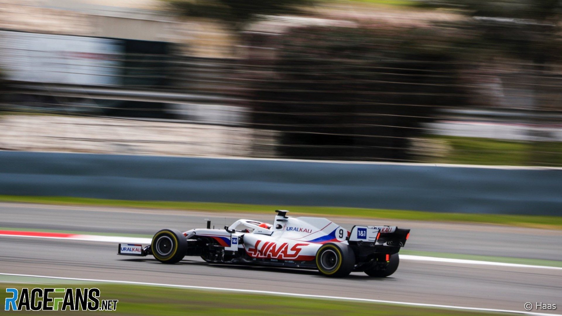
I don't think the green is attractive - but what's worse is the weird faded "old racing Ferrari" colour from the back...and the green. Together it's all a complete **** show. The green would have been less awful on last year's scheme. The fading colour..maybe would look okay with a non-green MW logo - but combined it's truly hideous.
Last edited by a moderator: