Lovely stuff Brad! I really like how the car info window appears from the corner of the name tab. It is amazing the difference in seeing a still and an animation. Worlds apart.
It really is something I should try. Great work again Brad.

With all the buzz today, I decided to go back to the drawing board. I wanted to try and do something more modern, going in the complete opposite direction from the retro designs I did a few months ago. I'm pretty sure that all the screens I make from here on out will be in this style.
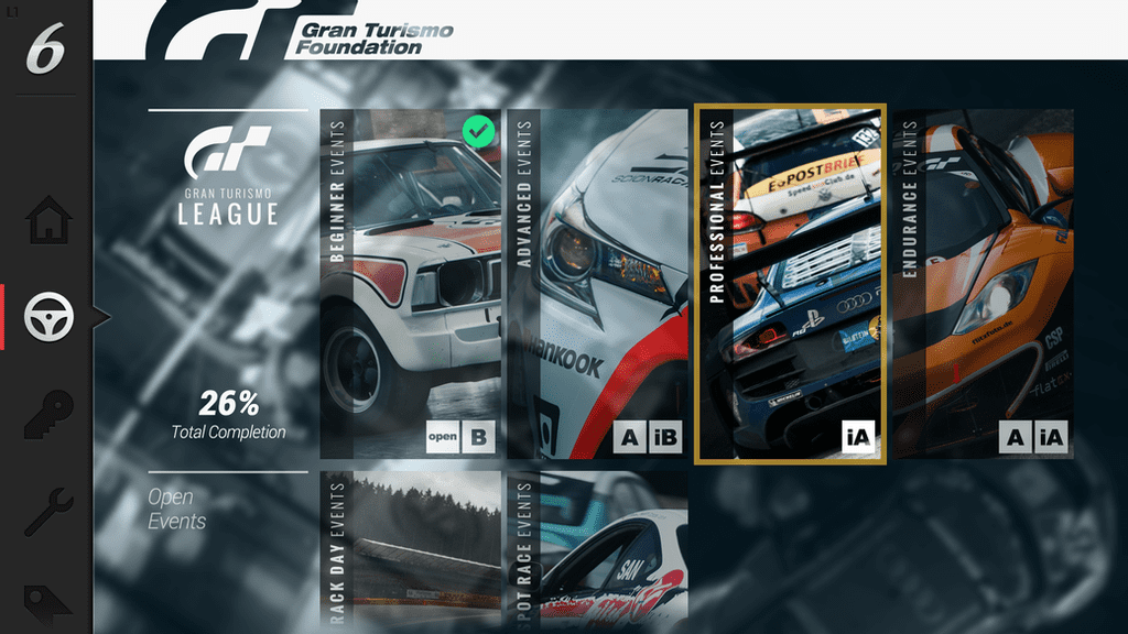
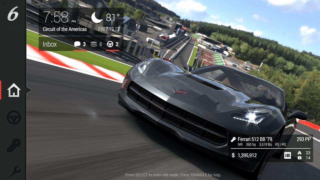
The inspiration for this design actually came from my tablet (Android specifically, as the Roboto font is a dead giveaway). It's functionally very different from my other designs as well. On the left, there's a scrolling menu with what you'd consider main options; the typical race/dealership/garage/etc. The home page, as you can see, is separate from the other options. My idea is that this page acts as a desktop, and the time, weather, current car, level, cash and inbox overlays are all widgets that can be repositioned or replaced. As you scroll up and down, that large right portion of the screen that comprises the homescreen will change to fit whatever option you've highlighted. As I do more designs in this style, this will be a bit more clear.
I should give credit to P.J. Onori for his Iconic icon pack, which I used extensively to make this UI. Normally I don't use icons because I'm awful at making them myself, but fortunately I was able to find a free set that was perfect for what I was aiming to do. You can download them for yourself here.
Also cause I haven't said it in a while, thanks everyone for the compliments and advice. I feel like I'm improving with each new screen, which is always a good thing.
") Much appreciated!
Much appreciated! Also think the widgets idea is an awesome one to implement! People always like customisability.👍 As Paul said, it would be nice to see some different backgrounds to compliment the design. Other than that keep up the great work pal.
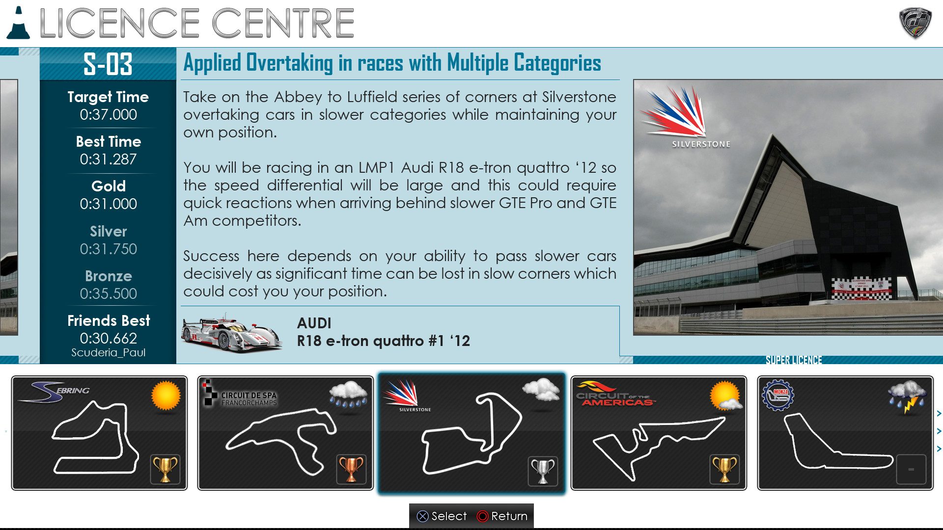
 Here is my latest piece - Licence Centre. It is the second screen for the Licence Centre, the first being the actual Licence selection, while the next is where you can get a preview demonstration. I will be doing these screens soon. Each licence will have a different colour scheme in the same way GT5 has.
Looking forward to seeing more of your concepts buddy!  HAHA! So when I get some time to myself, I plan on creating a new and fresh design concept.). If thats the case, just either reply here or drop me a PM (I'm online at least once a day). Looking forward to seeing more of your creative ideas in the future!
That video is fantastic!

Thanks Brad. The best I have done so far? I plan on doing the screens before and after this to complete the Licence Centre. Animating them is also on my list. That will take a long time as I have no idea where to begin.Paul. Also a brilliant design! 👍 I really do like the clean aesthetics of this screen. Showing an excellent design hierarchy, making navigation clear and simple. I'd say this is the best screen you've created so far IMO.
Brad
Thanks Brad. The best I have done so far? I plan on doing the screens before and after this to complete the Licence Centre.
Doesn't make much sense now I read it back because the other screens are of a different menu screen. HAHA! So ignore what I said about the best you've done so far. I think it's a strong design should I say. Looking forward to seeing your developments.Animating them is also on my list. That will take a long time as I have no idea where to begin.
Thanks again Brad!

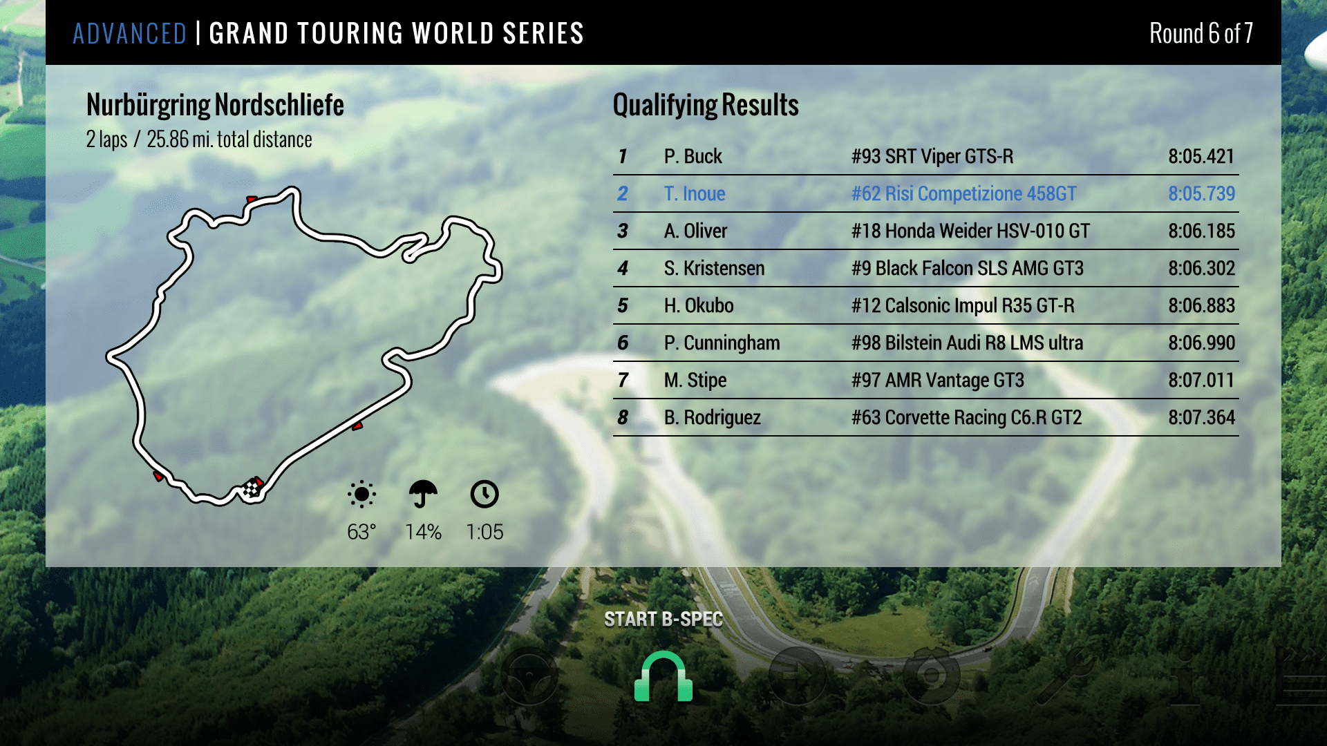
glassjawHere's the race tab to follow up my previous design.
Here's the race tab to follow up my previous design. I also redid the home screen with slightly altered widgets and made the bar on the left slimmer as it was taking up too much room. I also put in an L1 on that bar indicating it can be hidden (good suggestion Brad).
 I suppose that's the next step!
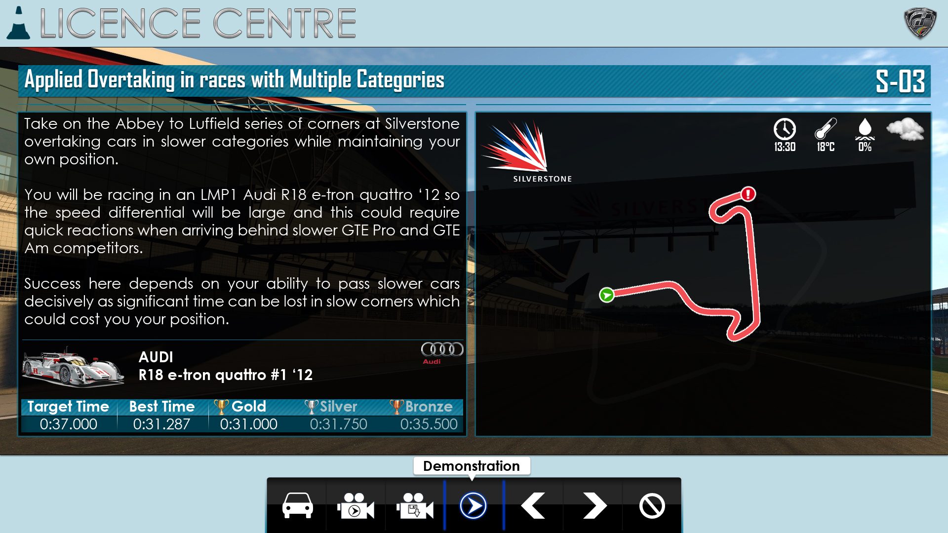
Lovely images Glassjaw. I particularly like your pre-race screen. It has a modern classy vibe about the colours and the fantastic background image helps. Great stuff.
Your garage image just teases us with the ability to organise our cars how we want! Clean and simple in it's layout, which is what games should aim for, would aid in slick navigation of menus.