Fonts that you love and hate: Typographical discussion.

  • Thread starter Thread starter Pupik
  • 276 comments
  • 39,959 views
I feel your pain Sage. The sudden cut on the top of the lowercase t really sticks out.
 
Last edited:
I actually use Comic Sans MS as my MSN font, why people hate it so much is beyond me.

If you dont like it, uninstall it. :)

I dont hate any fonts, theres some I avoid, but I dont hate them.
 
AAAAAAAAggggggggghhhhh

As a graphic design student, I have to say:
I hate Comic Sans as everyone else does, but not because of the typeface, but because it's been overused in almost every way! It was originally made as a kid's typeface for a game about learning how to spell (or something, minor detail anyway), yet has somehow found its way into logo design, CORPORATE DESIGN and pretty much every kind of design you can think of.

I share Sage's utter contempt and hate for Arial for all the same reasons he/she put forward, which also helps me hate Microsoft for everything they've ever done. Comic Sans also.

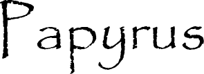
I dislike Impact, Papyrus, Sand and basically most slab serif, stencil style and display typefaces, I personally wouldn't use them in my own work and cringe whenever I see them used for, for example, signs for restaurants...

I have a very limited like of serif typefaces, Times New Roman makes me want to kill and why its the default typeface on so many programs is beyond me, but Baskerville is quite nice.

I love Helvetica myself, but people in my class have started to notice that I use it ALL the time, but generally that's because I don't want to go and buy typefaces at £120 for a full family or £30 for just one weight (I did buy VAG rounded for a project I was doing, didn't mind that since it was designed for Volkswagen AG's corporate stuff in the 80's and is now used on Apple's keyboards) and I love sans-serif faces because they suit a minimal style.

I've also started using Courier because the project I'm doing now required a monospace typeface and I found American Typewriter to be too cute, Andale Mono and Monaco to be too sharp and Courier New to be too thin. I personally think out of the four I've got, Courier is the best looking and most legible at tiny (i.e. 4-8pt) body sizes.


Basically, I've disabled any font appended with the letters 'MS', for the same reason that people would rather drive a real Ferrari 355 rather than a SW20 MR2 with a dodgy body kit (Arial) or a VW Polo Harlequin (Comic Sans)

/typographic rant

and for those who are confused as to why anyone would get so worked up because of a typeface... I think its one of those things where you have to care about this kind of thing to really understand, the same as how you wouldn't complain about the penalty system in GT5p to someone who doesn't even play games.

I sounded really stuck up just then but I do tend to get passionate sometimes, sorry
 
Last edited:
Fixedsys_Basic.png


Fixedsys. I'm not too sure why I dislike it. Oh wait yes I do. It reminds me of the days when I used to use windows 3.1..

Fixedsys just looks ugly.
 
I love fixedsys, though.
The only ones I really hate are those stupid webdings. They serve no purpose.
 
I love fixedsys, though.
The only ones I really hate are those stupid webdings. They serve no purpose.

Try seeing it every day on aim. It gets annoying.

I agree with you on webdings and wingdings. They're useless.
 
I think I don't really hate any type of fonts there are out there, but fonts like impact and fixedsys are a little hard to read..... :odd:
IMO, my handwriting is worse than all these fonts put together. :p
 
annoying.jpg


You will never decode this. Never. I will never understand why wingdings is even a word-processing font. Unless, of course, someone at Microsoft had a terrible sense of humor.
 
Last edited:
Dont click the link in post 1 about banning comic sans, Norton reported I had a high strength attack blocked from that site.

Norton would deem a granny with a handbag as a high strength attack.
 
Dont click the link in post 1 about banning comic sans, Norton reported I had a high strength attack blocked from that site.

I had no such issue, and I use Norton at work and home.

TB
Years of making boat licenses, door decals and windshield banners for people has jaded me more than I can convey.
Poor TB...Oh, and please cut me a vinyl for my car in white that says "2fast4u", use all caps, and in Old English/Blackletter Text.

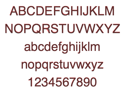
Arial.
...This shows you how much they copied Helvetica:

attachment.php
...
The tail on lower-case "a" is what always bugs me; if they modified letter like "q" or "j" that isn't used much, I'd hardly notice.
 
Last edited:
I can't say i hate any fonts, i just don't use fonts that i don't particularly like.

Now here's a font i love - 'LoweryAuto'


Unfortunately in my 13.5 years as a professional graphic designer i've never had chance to use it. One day, one day...
 
Poor TB...Oh, and please cut me a vinyl for my car in white that says "2fast4u", use all caps, and in Old English/Blackletter Text.
Alas, I haven't worked there for around 7 years now so you'll have to look elsewhere. :p

And yes, all caps Old(e) English ranks up there as well. 👎
 
Now here's a font i love - 'LoweryAuto'

Unfortunately in my 13.5 years as a professional graphic designer i've never had chance to use it. One day, one day...
That's from Chank, isn't it? I have it too...

I used it for a broken refrigerator, back when I worked at UF's catering division. I'd type up memos/warnings/signs around the kitchens and offices, and used all sorts of free fonts for simple things like that. I never had to use the same font twice...except for the reports and official memos.


I have to admit, I've taken to Georgia as an alternative to everyday serif fonts.
 
Last edited:
I really like Maiandra GD, I use it as my IM font.
Maiandra.gif
 
I lurv the Kozuka family and Book Antiqua.


BA looks awesome in print.
 
I absolutely love Royfont, because it is the closest handwritten Font that has some similarities to my real handwritten font.

Royfont.jpg


For normal school work, I prefer Calibri Font
 
I can't stand cosmic sands. It just seems so childish to me.
I was always annoyed by the teachers who typed up their notes/assignments in Comic Sans. It always came off as a shallow attempt to make it look like they genuinely cared about connecting with the students. Especially the ones who acted like they really wished they didn't want to be there any other time.
 
Back