GT6 ideas for GT Life and Main Menus

  • Thread starter NISMO_GTR_
  • 175 comments
  • 16,485 views
Hi everybody!

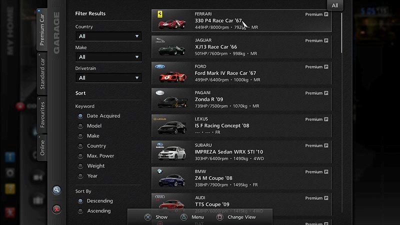
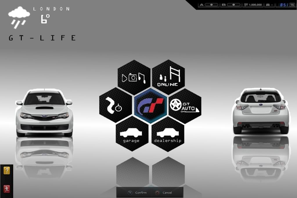
I hate GT5 life menu. Its boring and it has way too many buttons which clutter everything up.

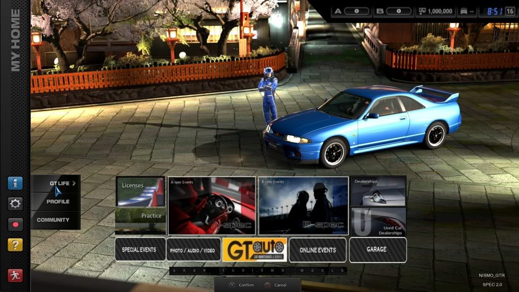
Also on the main menu where (you spend the least amount of time on) have these scenes playing in the background of your current selected car in certain locations why has PD not used these on the GT-Life menu where you spend most your time on.

So I had an idea of cleaner menu with those scenes playing in the background. I believe something similar can be achieved in a future update.

Here some Ideas I have:

  • Cleaner simple menu
  • Animated background like the main menu
  • Have your current car shown
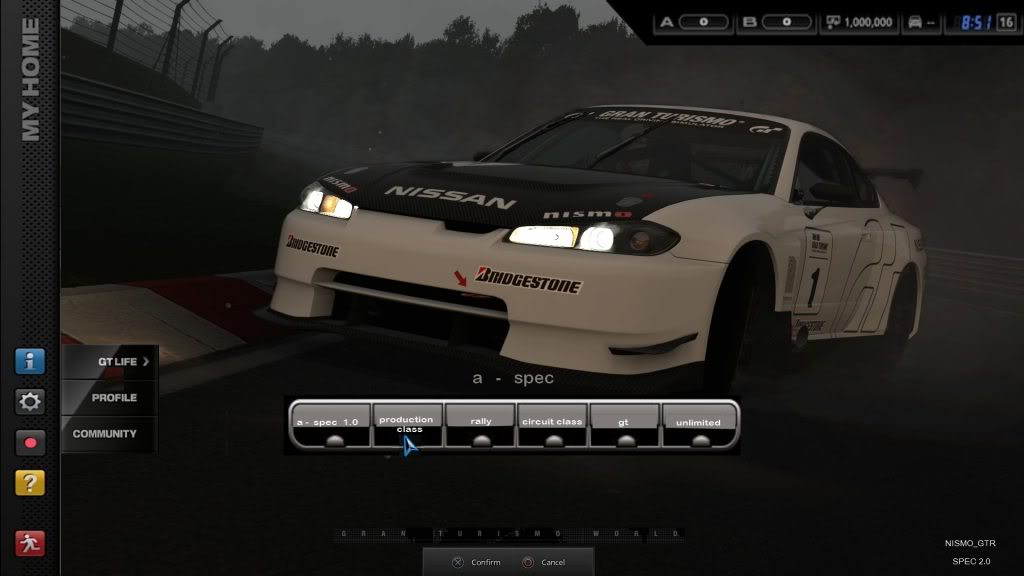
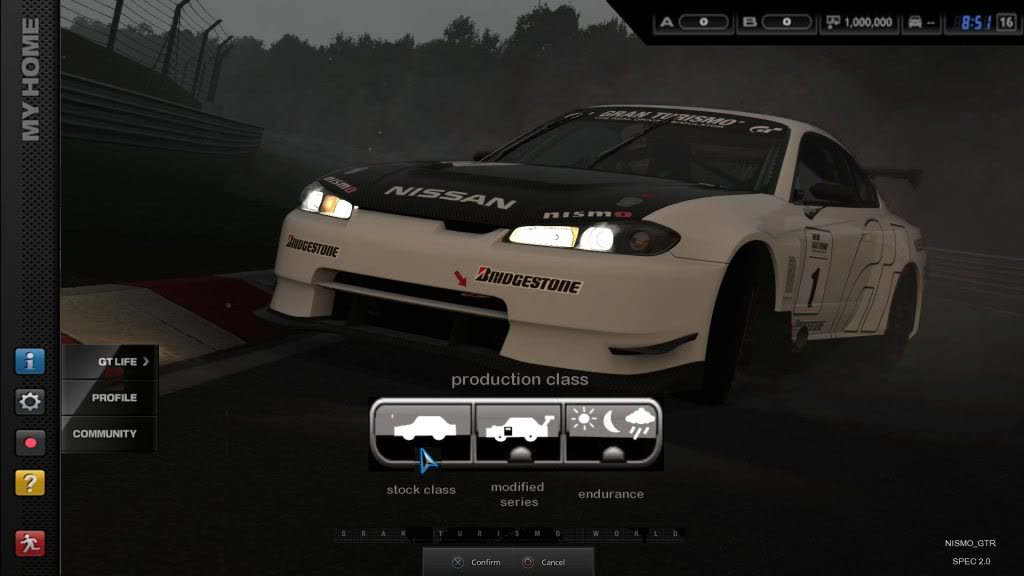
  • More A-spec/B-spec races
  • Combine Photo Travel/Replay into one
  • Move modifications to GT AUTO
  • More events with time/weather change


menu1.jpg


aspec.jpg


productionclass.jpg


I made before the Spec 2 update but I never posted them and please ignore the bad photo editing as I made the quickly.
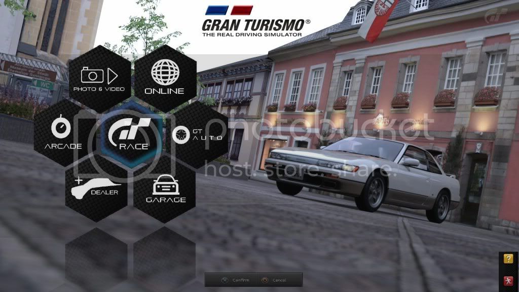
------------------

update : 6/5/12

This is what I think GT6 gt-life menu should look like

NEWMENU.jpg


quick mock up made from some sketches i posted in this thread.
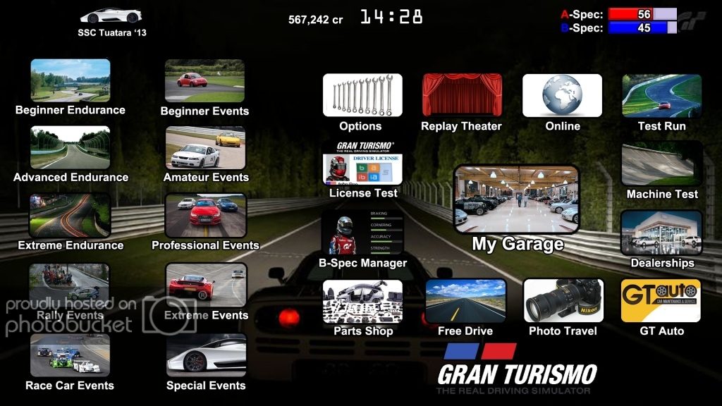
-----------------------

update : 7/5/12

Just another quick mock up on a gt6 menu (Loading times I think will not be a problem as I think GT6 will be on the PS4)

newmenu2.jpg


Remember guys I am just having a bit of fun here I am no expert on games development. I believe PD could have done a better job when designing a simple, clean interface. I hope to see that desktop/mouse style setup gone for GT6.
Why PD hasnt hired you yet is a crime. Your example is exactly the type of User Interface we need.Very simplistic and clean. Just to many menus to tune and choose a car in GT5. When I get Tires for my real life car, a number of aftermarket tuning parts, (suspension aero rims exhaust) tend to be available also.
 
Why PD hasnt hired you yet is a crime. Your example is exactly the type of User Interface we need.Very simplistic and clean. Just to many menus to tune and choose a car in GT5. When I get Tires for my real life car, a number of aftermarket tuning parts, (suspension aero rims exhaust) tend to be available also.
I don't get it.

His example is basically the same as we already have in GT5. Just extremely reduced and made monotonically looking. With monotonically I mean it looks way to similar.
I directly want to see what's for what and not have to read all that stuff over and over again and to keep it all in my mind (to be fair I personally know the GT5 menues by memory, but only because I play it that much).

I also think he left out way too many things. If you design it like this, then we would have to click through tons of menues before we finally get to what we actually wanted. This needs quite long and doesn't really improve comfort.
 
First thing to change- go back to the city-style menu. It's much better-looking without everything being clumped into one screen in one hot mess. Boo-hoo if you loved GT5's model better than the ones used in GTs 1 through 4. I would just keep everything simple and clean while retaining the classic city-like menu feel of GT1-GT4.

That's all really I'd recommend. Haven't thought too much further beyond that (when's the last time you seen me make few suggestions without much clarification or detail?).
 
Thank you guys.

I realize my menu screens arent the prettiest but they give an idea of how I would like to see things organized and presented

Next is the GT Life Menu Screen. The key was to give the player quick access to racing and different options that arent buried under layers upon layers of menus. Sort of like GT4 but less spread out

  • [Background is pic of your choice, in this instance I used a photomode pic of mine
  • Music Settings are in options
  • Career Stats are in my garage
  • Course Editor is in Free Drive
  • Manufacturer Races are in the Dealerships
  • Drag Racing is online only but there is an offline drag strip (no AI)

GTLIFEMenu.jpg
 
That one is basically exactly the same as the real one, i'm confused as to why it's better. The main problem with the GT5 menu isn't the look (It's more professional graphically than anything posted here, sorry) it's the way they function and how they're structured.
 
SimonK
That one is basically exactly the same as the real one, i'm confused as to why it's better. The main problem with the GT5 menu isn't the look (It's more professional graphically than anything posted here, sorry) it's the way they function and how they're structured.

Agreed
 
TokoTurismo
Awesome work Scuderia Paul. Personally I want to see GT6's menus just like yours, they're fantastic!

Thanks Toko! Im currently working on a couple of other pieces but the next to be completed will be the Livery Editor.
 
The main problem I see with the current menu system is that it's boring. I know PD has made an effort to make it look fancy and everything, but I think they're trying too hard, especially with the uneven sized menu icons, which in turn are not only confusing but also make the game seem small.

As of right now, I'd say Scuderia Paul's is the best. A few GT touches to it will make it look great.
 
Thanks Penguin. What would you class as GT touches?
Hmm... I know that I'll sound like I'm contradicting myself here, but what I mean when I say GT touches is stuff like the pre-race menus, which, throughout GT's history, has more or less the same format. If reworked properly, but with the same layout, I think it could have potential to be a lot better than what we currently have.

I'll try to have some examples up (soon), as that would be a much easier way to explain.
 
1241Penguin
... the pre-race menus, which, throughout GT's history, has more or less the same format. If reworked properly, but with the same layout, I think it could have potential to be a lot better than what we currently have.

I understand what you mean. When I started the Pre-race screen I intentionally went quite different for the very reason that they have been similar for years now.

I have a very minor update to that screen due tomorrow. I don't like the red and white lower strip.

I look forward to your screens too.
 
I understand what you mean. When I started the Pre-race screen I intentionally went quite different for the very reason that they have been similar for years now.
Actually, looking at your last one again, that's more or less what I'm saying. You know the pre-race screen with the [Start Race], [Car Options], etc., that's the screen I'm talking about. I quite liked this screen because everything is there; no scrolling necessary.*

*I don't think scrolling would be a problem with the main GT-life menu screen, as GT4 demonstrated.
 
Being the competitive person that I am, I would like a competition made out of this. At least it would give me more motivation to keep improving the menu
 
In my opinion, none of the GT games had particularly exciting home menus. It should really pop and grab the players attention while remaining in the professional driving simulator fashion. PD has always done an incredible job with the start-up movies so no changes to be made there. The current GT5 menu is better than Forza's and a lot of games don't even have a menu...just a start button:P It would be pretty cool to have something like Facebook for GT where we can share pictures, create events, and invite people to races. Maybe they'll even put a story to it...if it does turn out to be an open-world game, I have plenty of ideas for a storyboard;)
 
GT5 prologue menu was almost perfect.
Why oh why PD.

Haha yeah I totally agree with you on this one, GT5P too was near perfect. I'd take anything over the current GT5 menu system any day. Heck even GT3 and GT4 menus were 293857293875 better than GT5's, specifically the startup menu.
 
What particularly bothers me GT5 is when we are looking for a vehicle in the GT Mode's garage, we get this :
9874-gran-turismo-5.jpg


- And we have to select in the list to have zoom preview of the vehicle like this :
gran-turismo-5-menu.jpg


- This interface does'nt make easy the choice of vehicle because we can't change the car when you have already selected another

So what I suggest is to apply a display mode similar to arcade mode or car dealership in order to observe the vehicle closely, while being able to quickly select a different model.
IMG_1940.jpg
OptimisedMuch--article_image.jpg


gt6interface.jpg

This image was made only in order to expose my idea :
- Ability to rotate the vehicle with the analog stick
- Sort and classify vehicles according to their preferences in order to more easily choose a car before the race
- Vehicles are classified to avoid searching in a list of 1xxx cars
 
I would like something like this:

- Garage

- GT Tuning
- Body / Chassis
- Engine
- ect... like GT5 but with more stuff

- Car Dealership
- Premium Dealership
- Standard Dealership
- Used Car Dealership

- Licenses
- C
- B
- A
- IC
- IB
- IA
- S

- Races
- Beginner
- Amateur
- Professional
- Expert
- Extreme
- Manufacturer Races
- Special Events
- Seasonal Events

- Training

- Photo Mode

- Online


I will try do create in a draw and put here

Edit: This it's like i want GT6, GT6 maybe or maybe not like this
 
Back