Photoshopped cars.

  • Thread starter Thread starter sn00pie
  • 7,970 comments
  • 629,611 views
hmm... i forgot my own work :D

i was going to enter the week 63 comp but didn't have time to finish it so i just left it for a while...

now i think it's ready... so her it is...
original
7%20Mazda%206%20original.jpg


chop
7%20Mazda%206.jpg


C&C would be great... :confused:
and i know the driver looks wierd.... again...
 
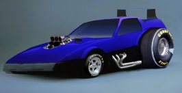
Any one have any ideas for improvement, i tried out a lot of new things on this one, and i need help making it look better thanks. its for week 67 contest.

THings i did:
1. added a airbrush spoiler (sucks i know, never done airbrush before.
2. Jacked up the back end
3. turned it into a dragster/funny car
4. added an engine block.
5. made the hoodscoop bigger (although i dont think it would have one with an engine this big)
6. changed front and back wheels
7. added pipes on the side
8. changed colors.
 

Attachments

  • nissan z31 copy.jpg
    nissan z31 copy.jpg
    49.8 KB · Views: 134
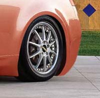
@SpideRi: Kickass! Did you make the vents at the side yourself? If so, great job. Nonetheless it's a great chop, like it pretty much!

@bluebanana763: It just lacks cleanliness in general. You have to make the people believe that it's real. Or at least trying to as hard as you can. ;)
 
Spider, i like those wheels. There's something slightly wrong with the front valance on the far side. Might come in too early, looking shorter than maybe it should (?) Weird looking driver :lol:
 
Originally posted by bluebanana763
Thanks for all you help guys.. ill just enter it as it is.:irked:

Well there's not really much that can be said. It's all pretty messy. Sorry, I think you went a bit over the top.
 
RX-7-1.jpg

COMMENTS REQUESTED PLEASE.. sheesh, whats a girl got to do to get a response around here?!
 
850- nice work dood- its probably one of the best drifting chops i've seen.
 
It's very good, suzq (as usual). If I were to be super critical, the whole signature-in-front thing doesn't really work for me. That, and I don't really get the caption, isn't that a Miata that you chopped?
 
Originally posted by suzq044
850- nice work dood- its probably one of the best drifting chops i've seen.

Thank you. Means a lot to me, if the more advanced photochoppers like my work (doesn't mean, that I don't care, if someone else likes it *_*!).

PS. I like your Mazda too. Though I think it's a MX5/Miata, too. Or was the slogan meant, like elders = RX7. In this case, I'm sorry. ^_^;
 
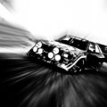
yeah it was a miata... but i made it 90% rx7.. and speaking to the newer cars from the RX7 point of view. the signature is to protect from chop-theives.. it'll be removed later.
 
i made it RX-7 bEFORE i put it in motion- so u can't really tell a damn thing. lol .. o well kinda defeated the purpose eh? :lol:
 
Originally posted by suzq044
i made it RX-7 bEFORE i put it in motion- so u can't really tell a damn thing. lol .. o well kinda defeated the purpose eh? :lol:
OK, cool, in that case I would say lower the blur a little around the back of the car (right-hand side of the image) to make the fact that it is primarily rx-7 a little more obvious.
 
Help me! :D

How can I get rid of this blurry-thing, like in that rear bumber, when I airbrush parts?

And any comments, criticism and suggestions of that Infiniti I posted before would be nice.
 

Attachments

  • blurry.jpg
    blurry.jpg
    9 KB · Views: 76
@SpideRi: Nice, i like those vents :)
@850: It looks so clean and real..
@suzq just amazing..

You are all too good.. :D
 
Suz, i love it. I think the signature adds some cool to it. I say keep it, it looks artistic.
 
RSCosworth: Here's what I would do to get rid of the after-blur effect you got going there.

Step 1: Create a new layer, and sample the color on the previous one to use in the new one.

Step 2: Use the paintbrush/non-airbrush style, and follow the bodylines with a 1 pixel brush tip.

Step 3: Repeat step 2 for a few pixels' worth on the body of the car.

Step 4: Use the Stamp and select the concrete and then stamp over the existing car on the original layer.

Step 5: Merge the two layers with CTRL + E.

Step 6: Enjoi! :D
 
850: yes i did those vents myself :D
btw good work with 300ZX ! it looks very good... but the J10 sticker looks kind of fake :confused: and that back wheel is lightly in wrong angle... but as said very good...

donbenni: you might be right... :odd: i'll try to fix it if i have time...
 
Originally posted by SpideRi
850: yes i did those vents myself :D
btw good work with 300ZX ! it looks very good... but the J10 sticker looks kind of fake :confused: and that back wheel is lightly in wrong angle... but as said very good...

The J10 sticker is a real one from some RX7, if I remember right and that back wheel... Uhm, let's say it's some hardcore camber. *lol*
 
Well, after seeing a magazine based photoshop (was an entry in the VW Lupo comp) I thought I try and make my own.

So far, this is as far as I got
MAG.jpg


ATM I think it sucks, so if anybody could give me some pointers about how I can make it look better I'd be grateful.

I'm also after a bar code for it, but can't find one. :(
 
Make the bar code. Looks good so far, but the writing doesn't look believable enough (font and colour wise, not content)
 
The Header looks like crap, and magazines aren't so straight edge on the edges. Try and get a screenshot of a real mag for it.
 
Add more detail. It's lacking interest. Try a different car too. That one's not bad but, there's better.
 
Here are a few of my first chops... the first 7 to be exact... feel free to laugh. or to compliment if you like
image-display


image-display


image-display


image-display


image-display


image-display


image-display
 
Originally posted by bluebanana763
Here are a few of my first chops... the first 7 to be exact... feel free to laugh. or to compliment if you like
Feel free to laugh, ok then :lol:. No, I acutally like the Saab, the Chevy truck, and the Ranger. The Camry (is it? the 1st blue one, anyway) would not be bad if it wasnt lowered sooooo much. That bronze tint looks kinda cool.
 
Back