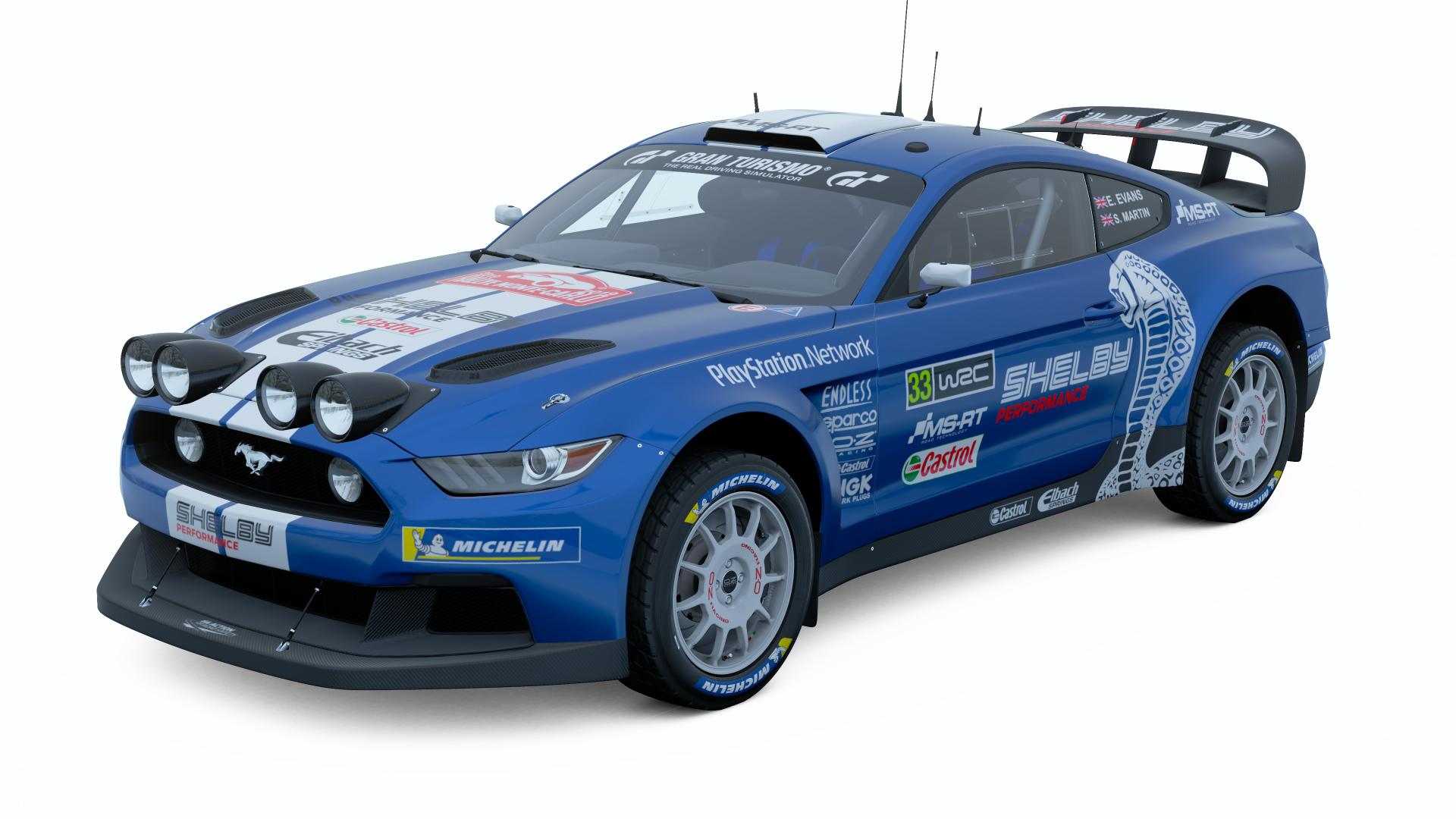
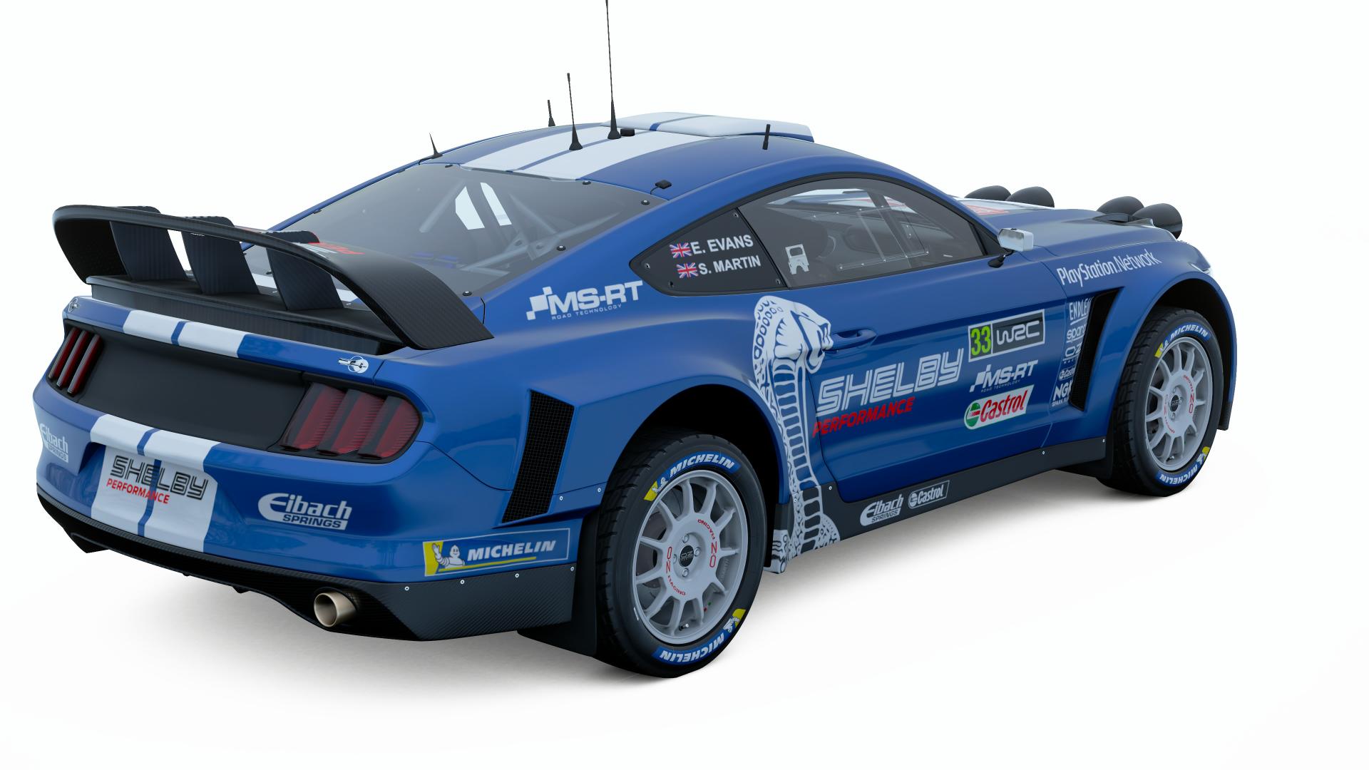
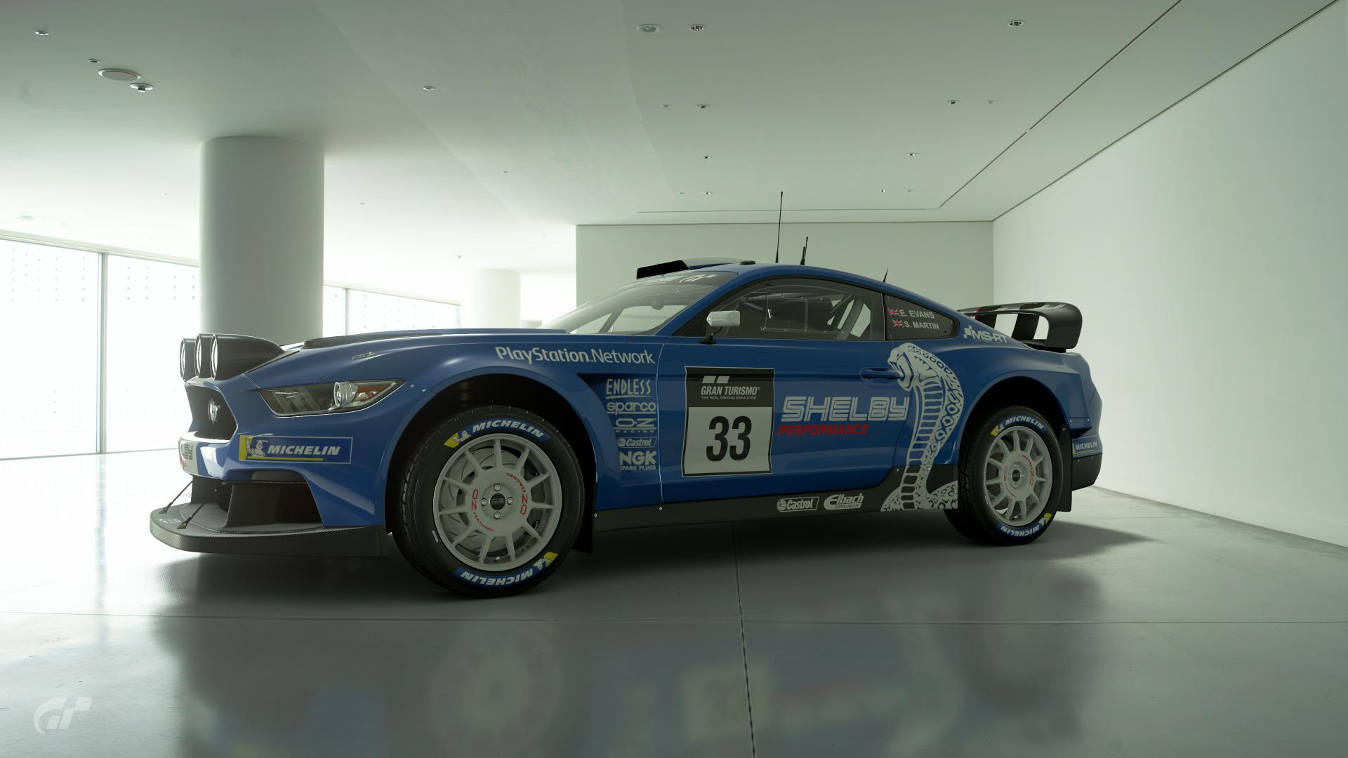
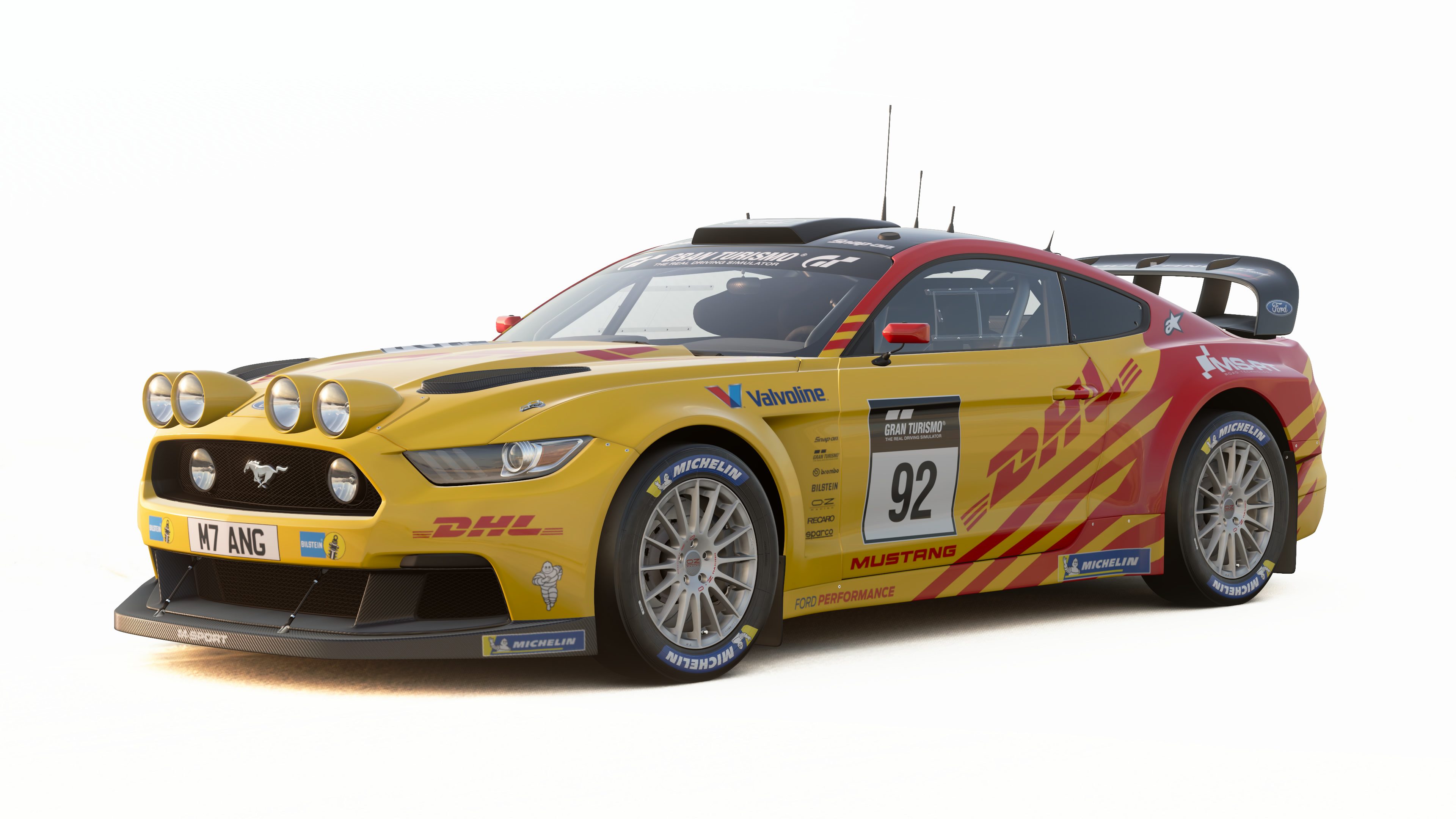
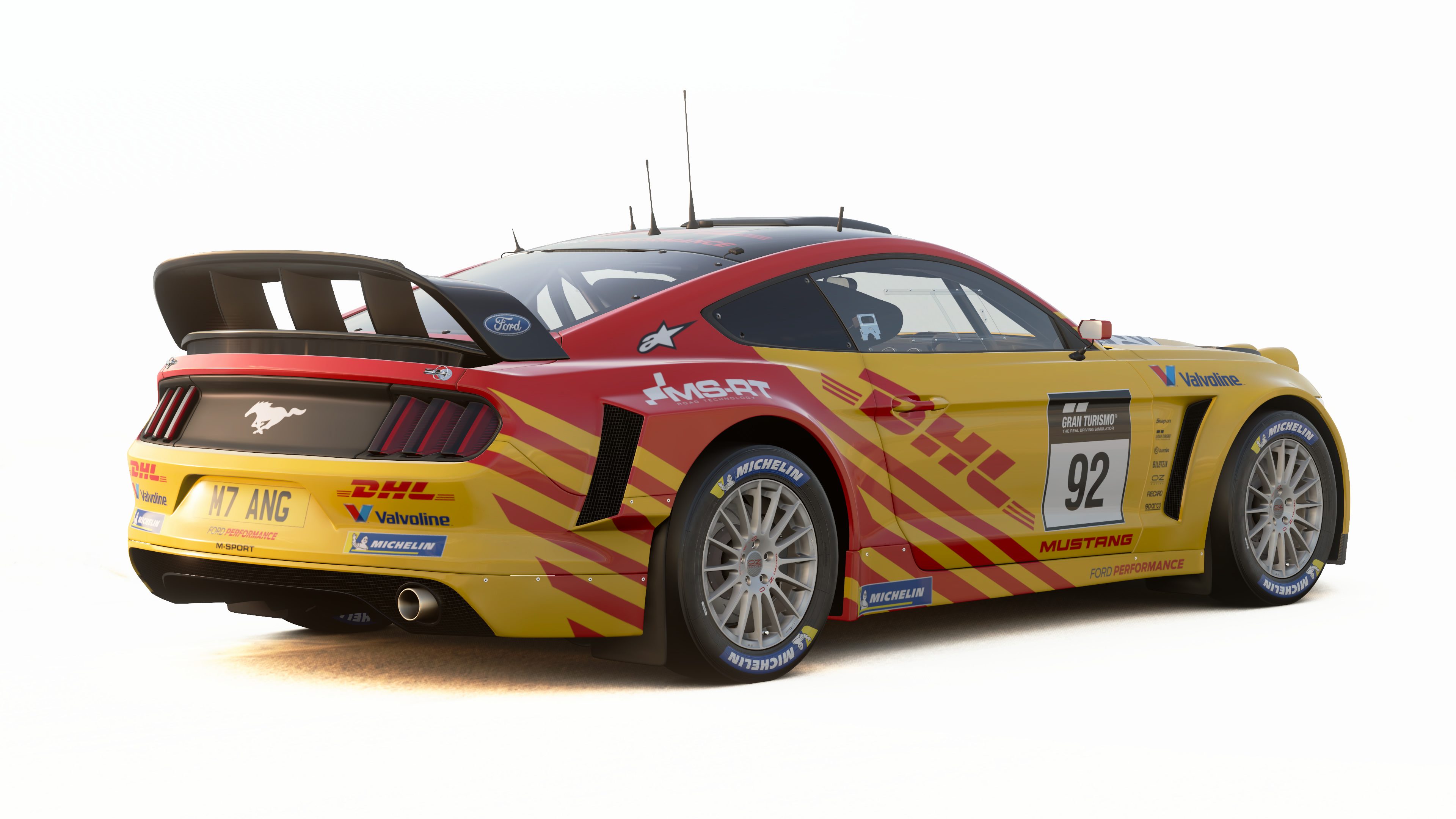
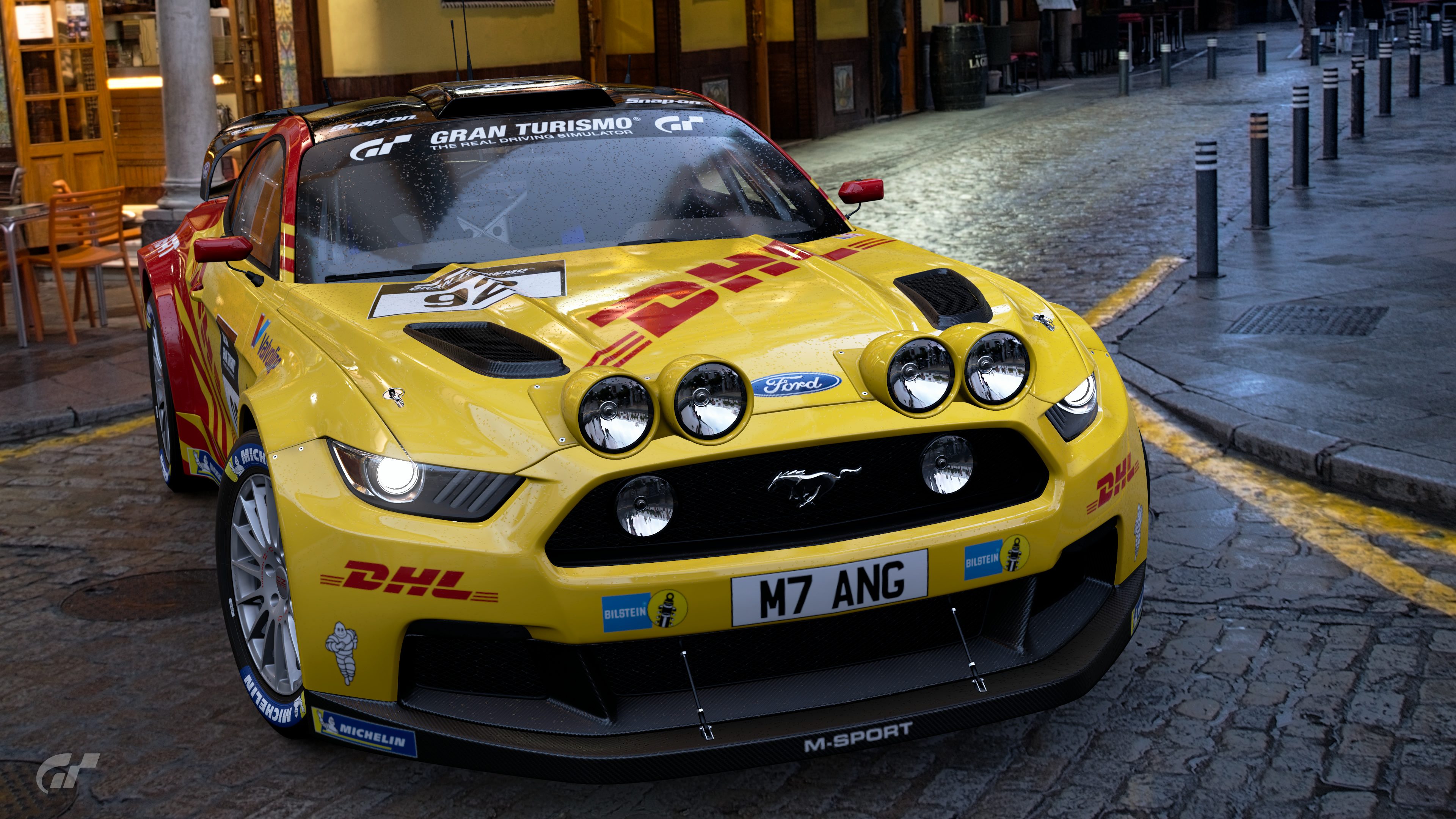
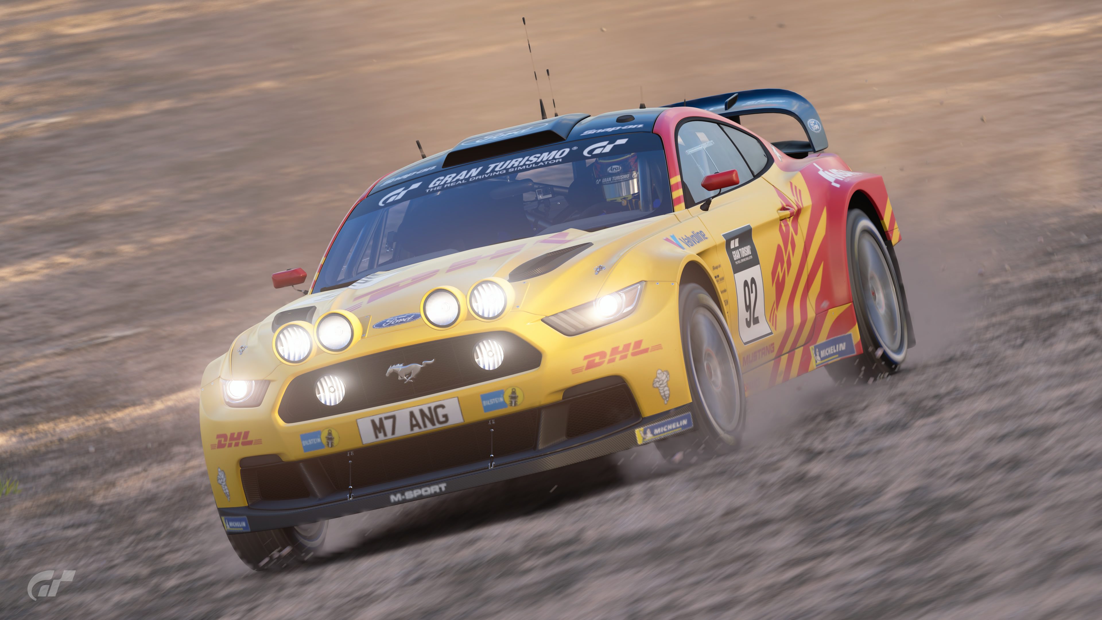
#2 - A nice simple livery borrowing the full stripes from the distinctive Shelby Mustang line. The sponsor placements look mostly perfect, although they do feel a little bunched up within the side contours near the vents. It does seem like some areas of the car aren't broken up enough from the dominant blue and feel empty; such as the rear fender, sides of the hood and the upper & lower door areas, but I can see the possibly moved/additional sponsors breaking up those areas quite easily. Who'd have thought Shelby would go into rallying though? Bringing home the fast Mustang image into an otherwise out of place form of motorsports for it. Nice idea.
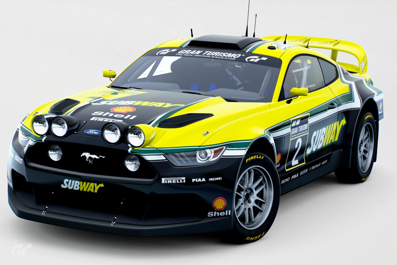
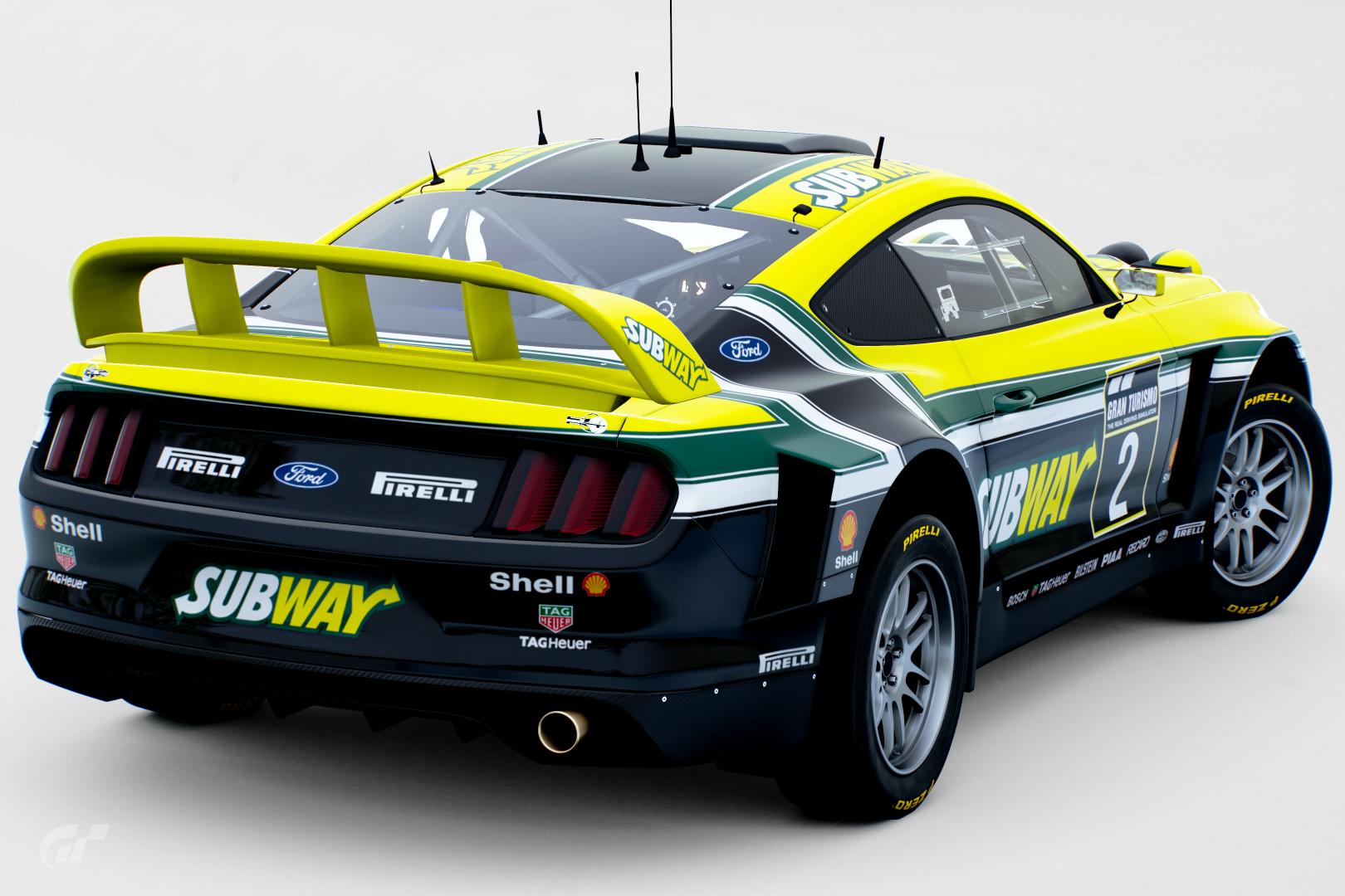
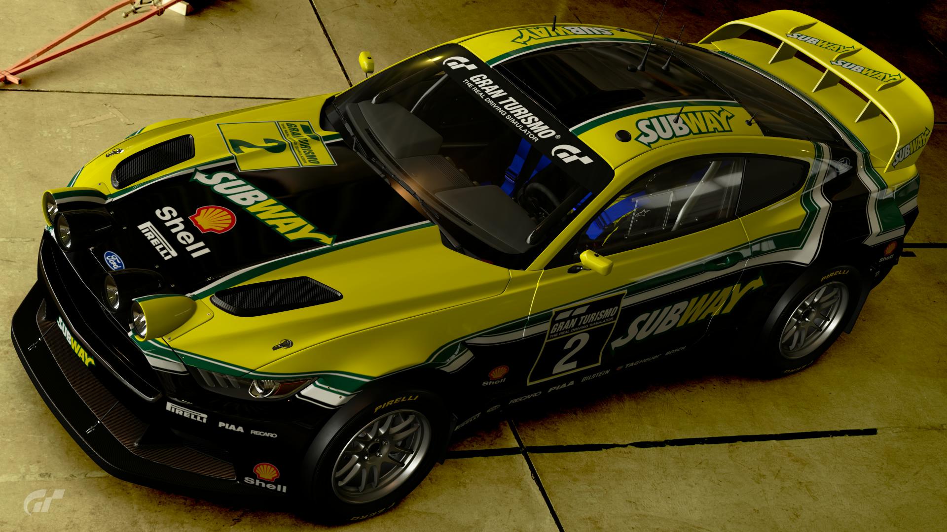
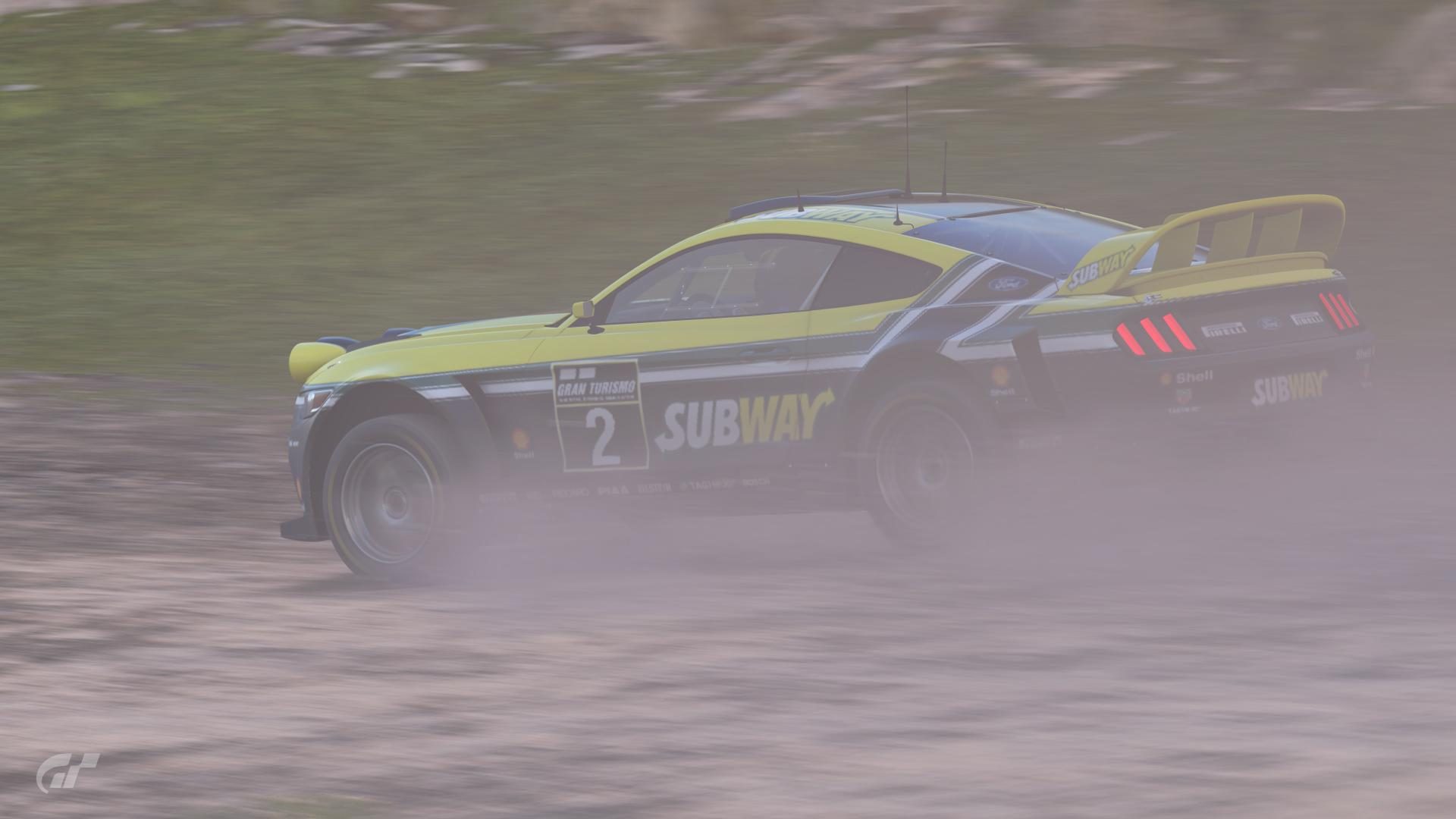
#4 - The first thing that hit me was the colour scheme in conjunction with the simple yet distinctive design, which I liked. Sponsor placements look mostly perfect; although the Shell 'logos' (i.e. the clam
and the text) on the hood look kinda out of place when the other hood sponsors are singular. I'd say keep the text, get rid of the clam for the hood, as it seems to be taking attention away from the main Subway sponsor in that area. I also feel like even though the car has more dark green than yellow, the yellow still stands out as the dominant colour in it's largely untouched nature (by that I mean no sponsors or further designs are added to break up the solid colour, although it doesn't need it ). The only thing I would hint towards possibly breaking the yellow up is possibly having a black or similar dark green colour for the rear wing, so that the amount of untouched yellow is not too much.
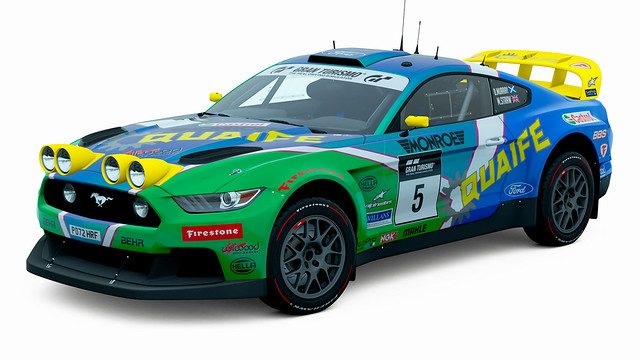
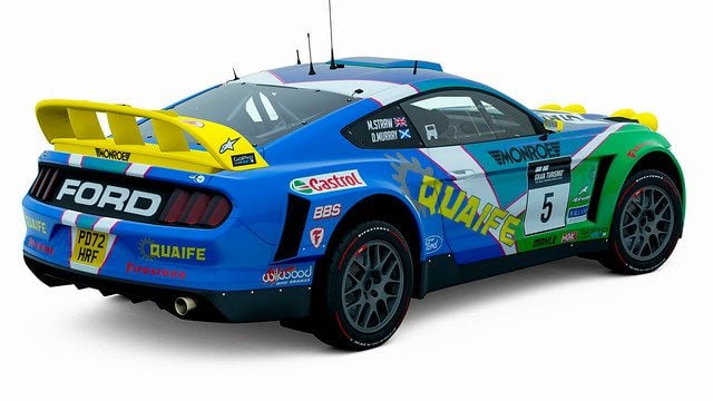
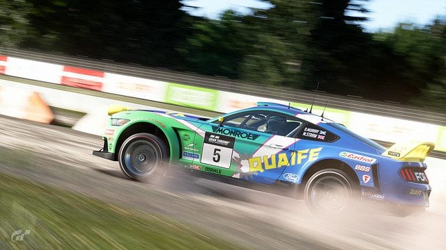
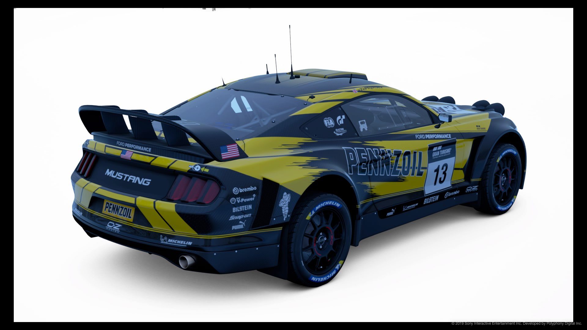
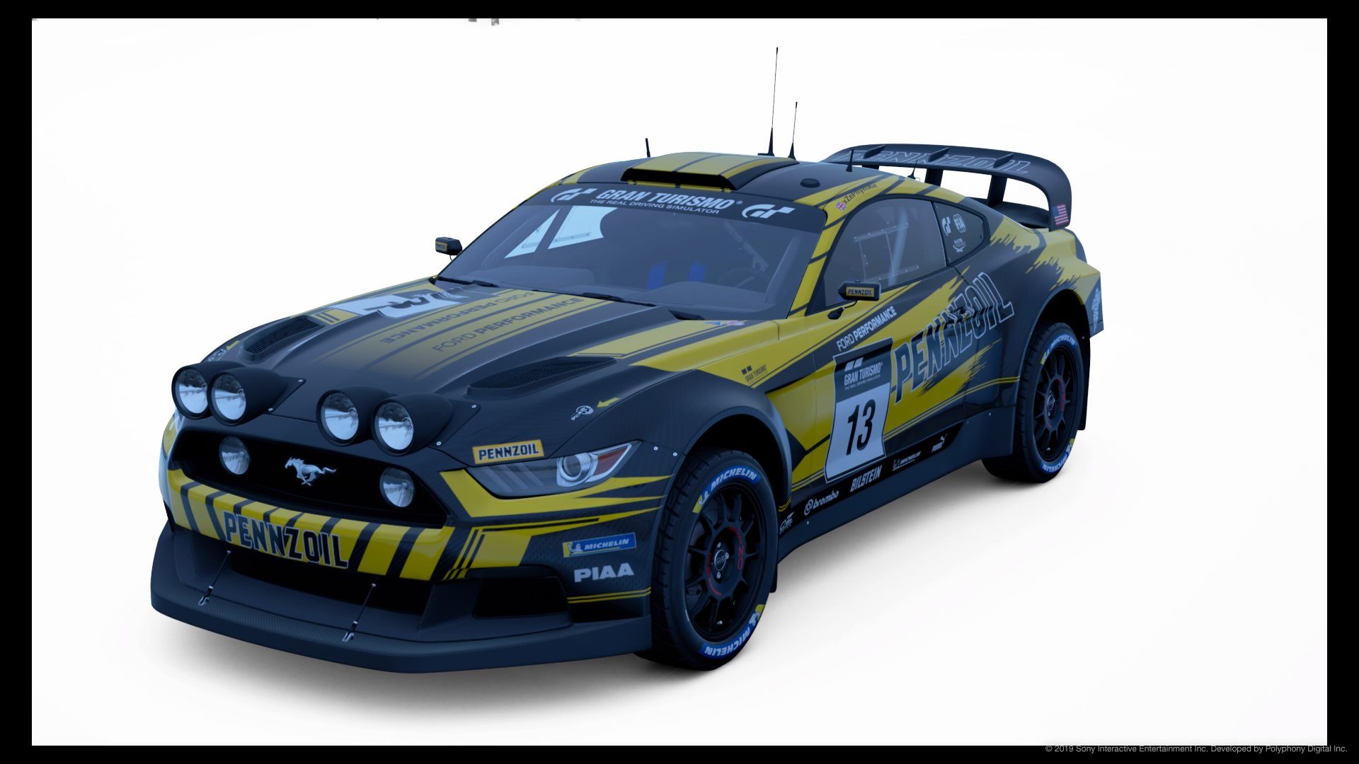
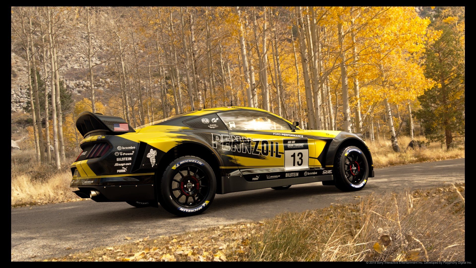
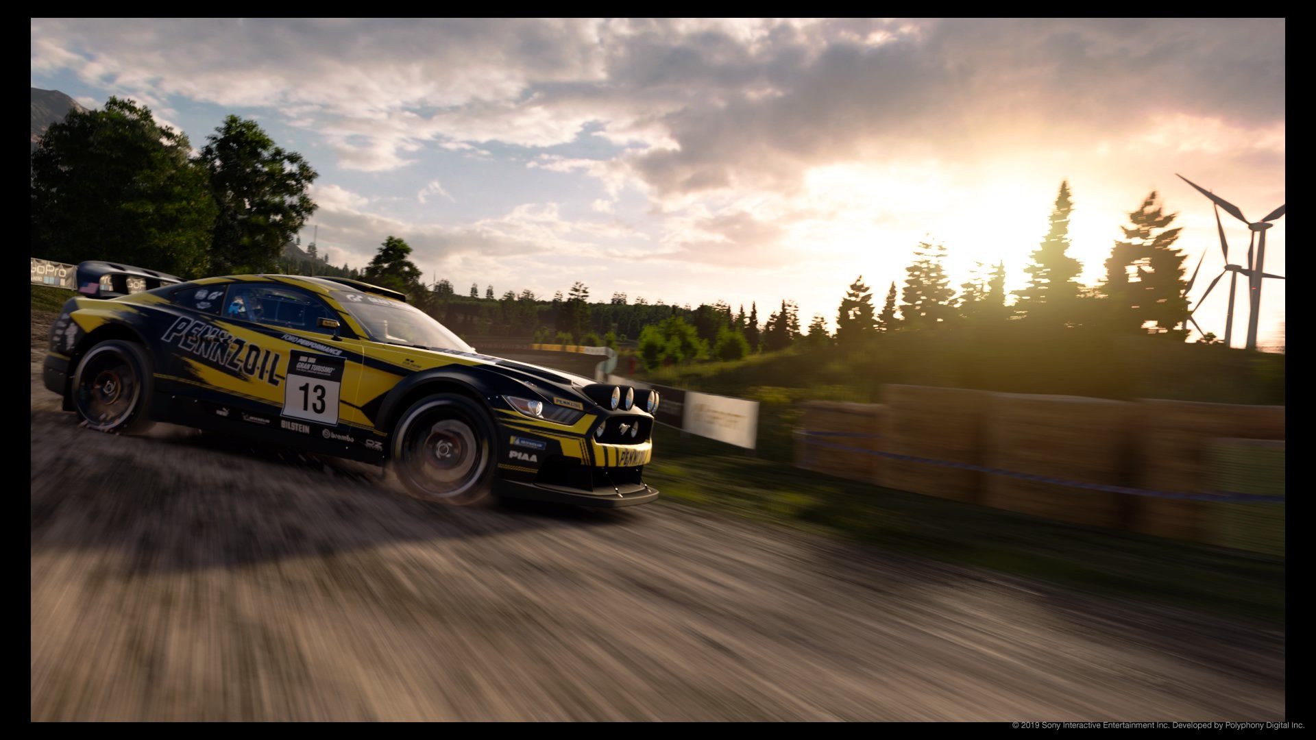
#5 - Out of the 25 liveries here, this was one that I wanted to whittle down into my vote. I love the overall consistency and distinctiveness of the design, with the angular stripefest contrasting a little with the scruffy scratchy patch underneath the Pennzoil logos at the sides. The scruffy patch I felt also added to the overall rally-orientated nature, and it was something I did want to see more around the car. The main point for change would be the gradient on the hood, as even though it appears to be achieving the right amount of darkness on the hood section, it does dull the bold yellow style that has been unaffected elsewhere. I'd say try and keep the visible length of the yellow stripes, but instead of a gradient, try and end those stripes with more of the solid, angular style that has already been displayed. Sponsor placements and sizings are perfect, and aren't needed to break up what is a nicely proportioned design.
#7 - Immediately I loved the vibrance of the blue, green and pearlescent colouring that is highlighted even further with the subtle yellow accents and white lines. Another one I kinda shortlisted to whittle down into my votes. The yellow accents also bring attention to the main sponsor; therefore being great for advertising. Sponsor placements look pretty much perfect, although I feel like some of the sponsors would've benefited from a different colour: the red Firestone text logos conflict with the blue and green colours so they would be better off in white; and even though the black sponsors are readable on the green section, they too would stand out and contribute to the design better in white.
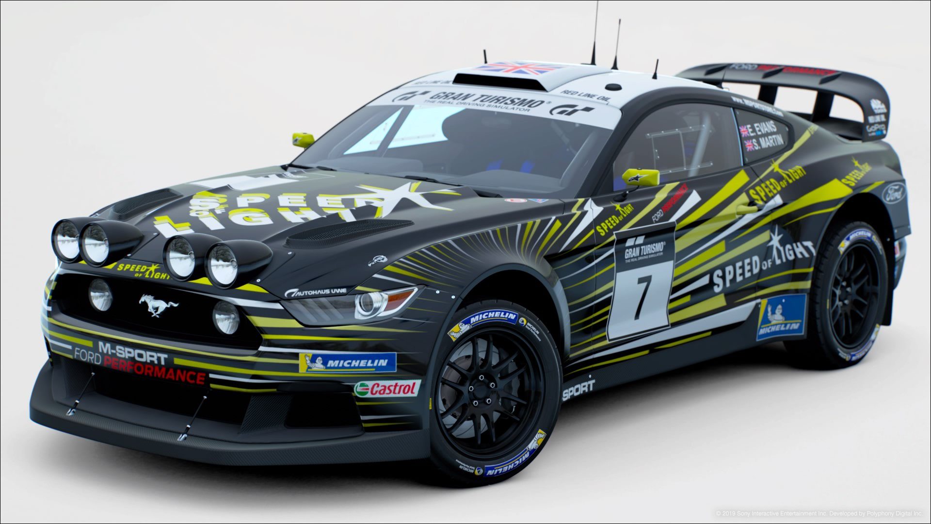
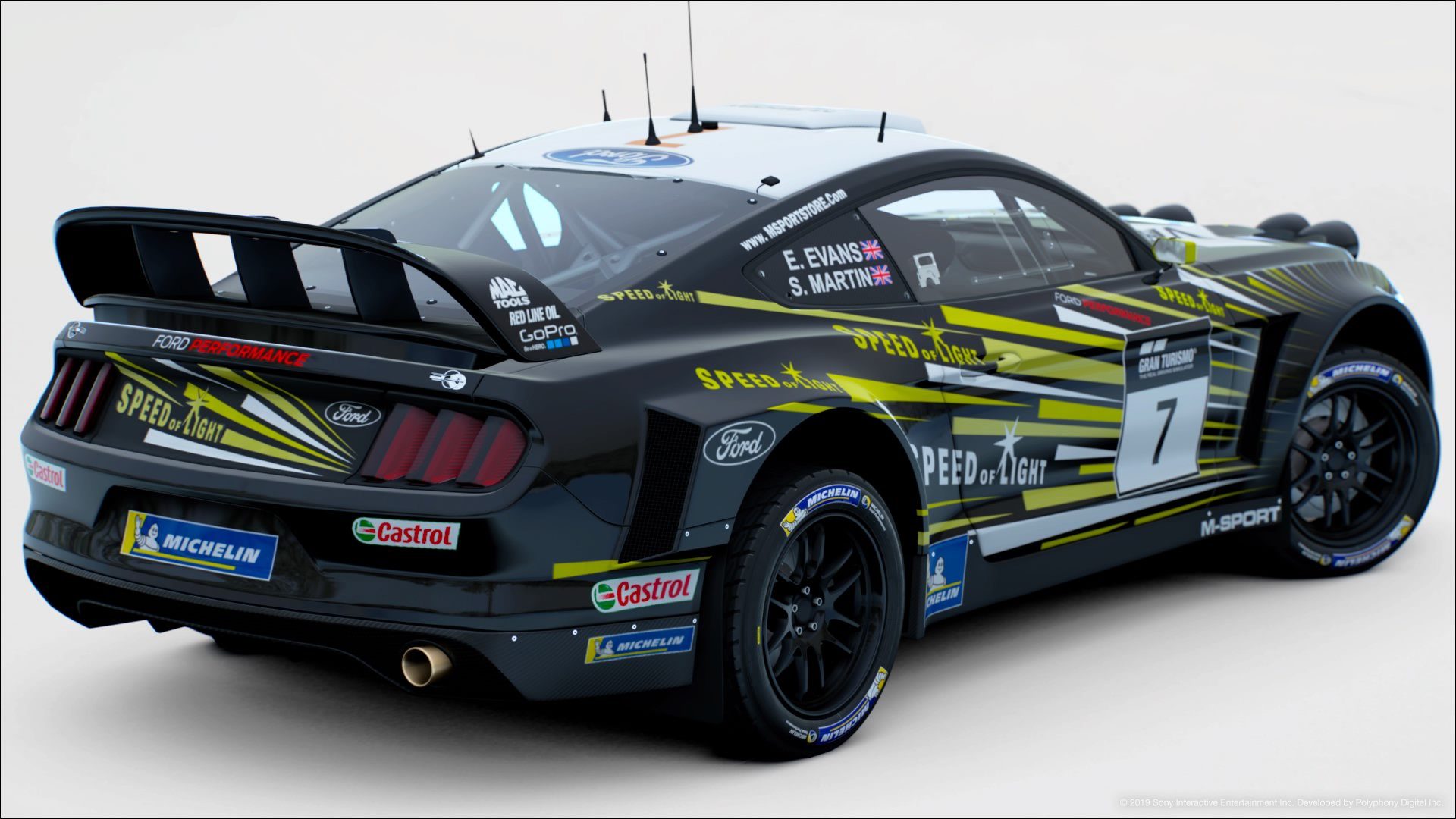
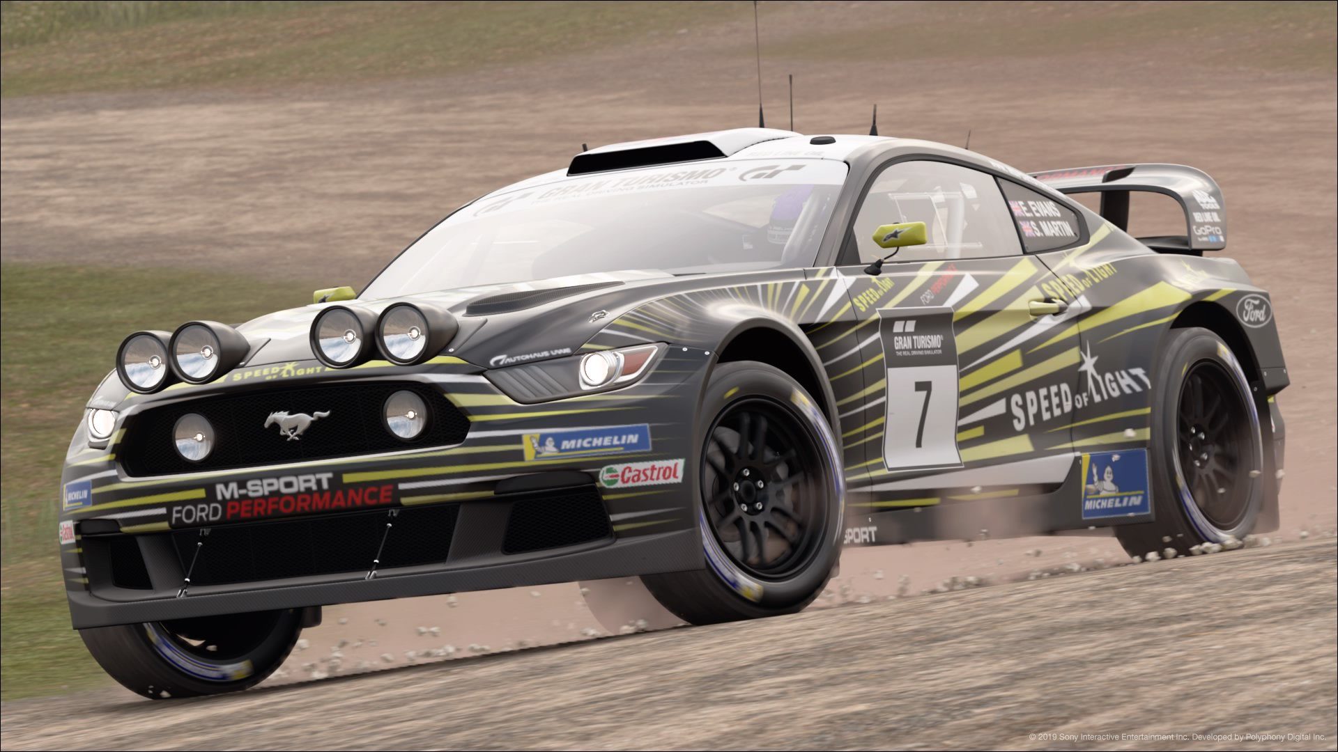
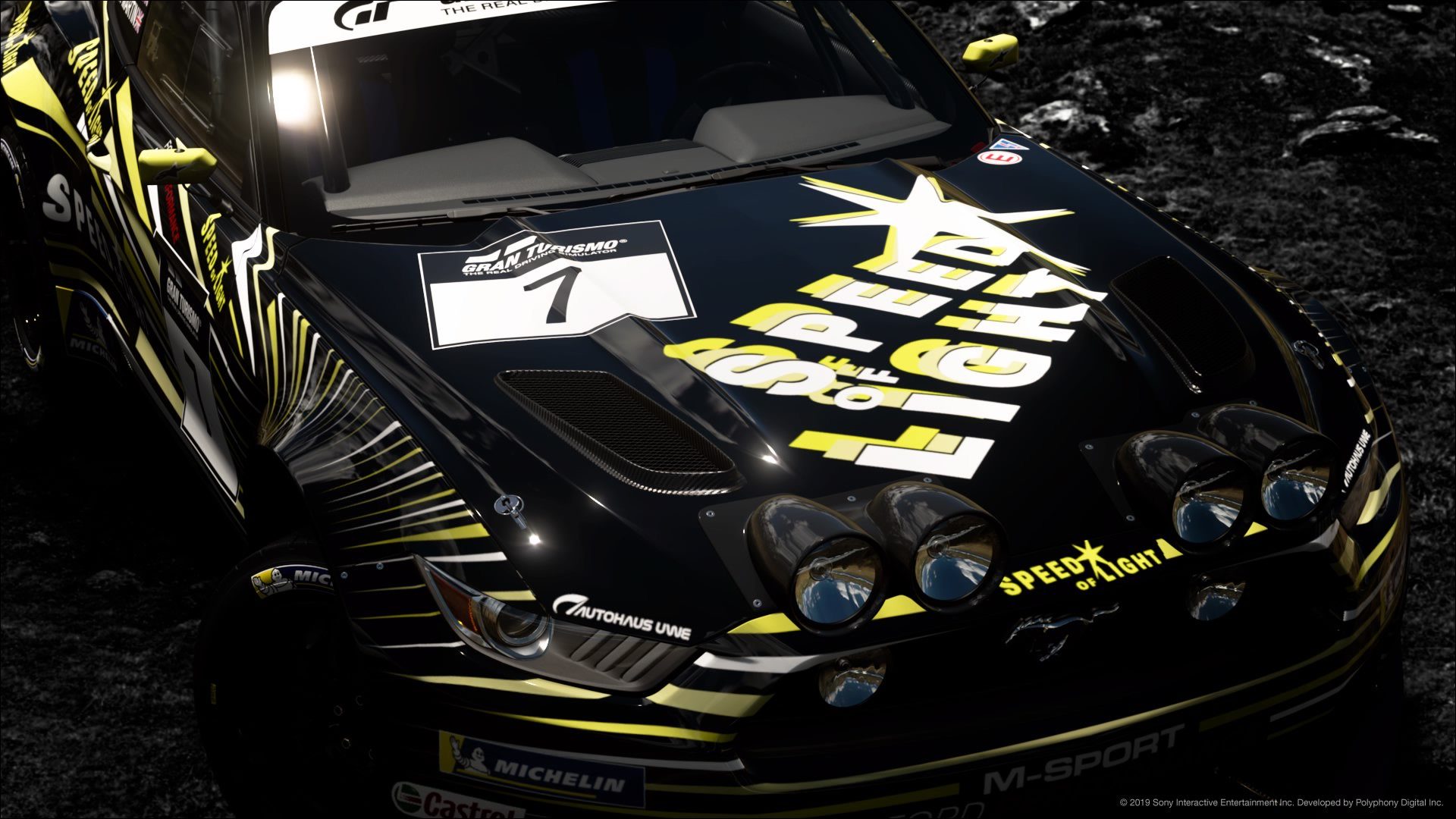
#8 - Again, another livery I shortlisted in my whittling down. I like how the motifs of the Speed of Light logo are used for the whole design in a neat and clean fashion, and they do benefit from the colour change to create a more uniform look. Not a lot of sponsors; and considering how 'busy' the livery design is already, it doesn't need them; but the sponsors that are there are placed and sized quite well. The only thing that knocked it down slightly for me was the hood. I could see the kind of effect you was going for; something like a swooshing effect on the logo, but it looked a bit too conflicting with the bright yellow and white together. I can see a slight black logo underneath the white logo to act as a shadow/separator, so all it needs is to just make that 'outline' effect more prominent. Other than that, a fantastic livery!
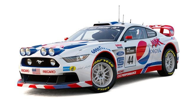
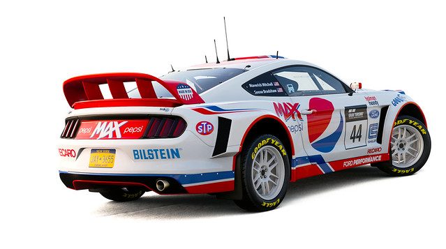
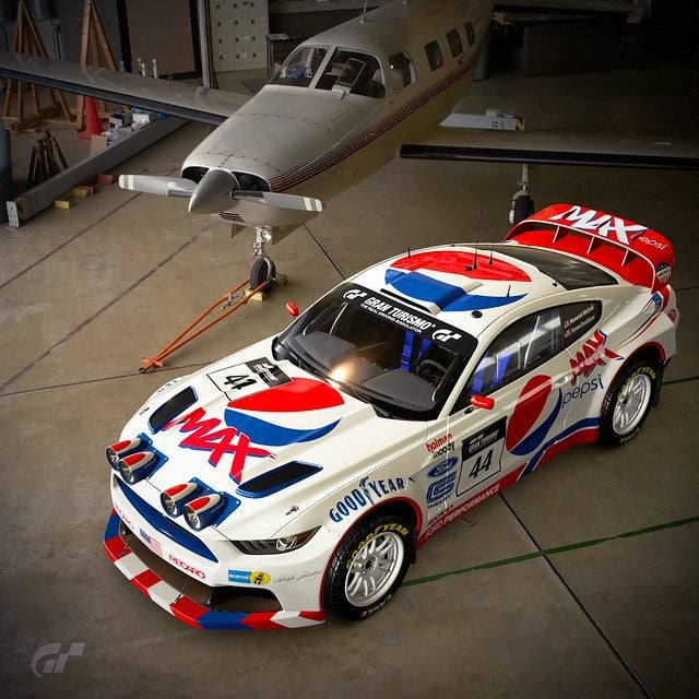
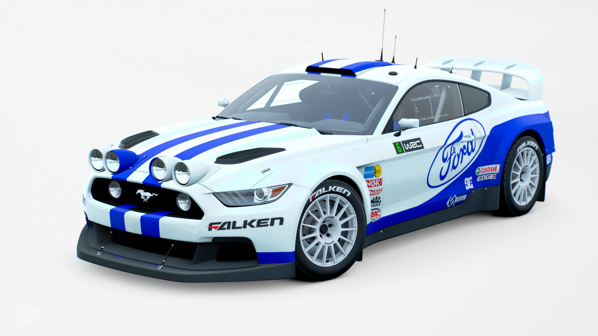
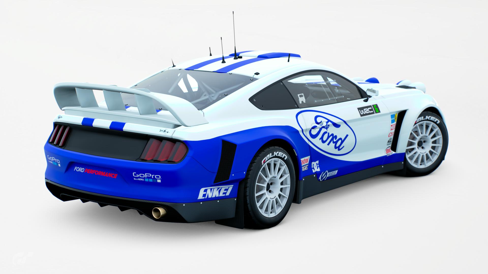
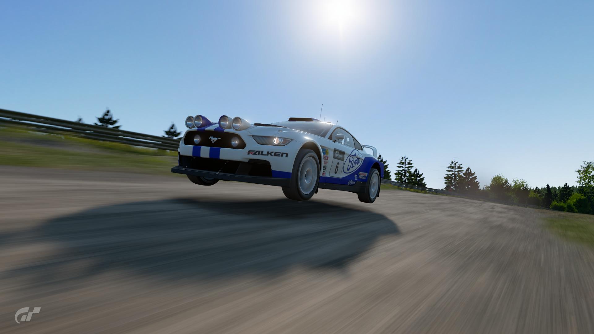
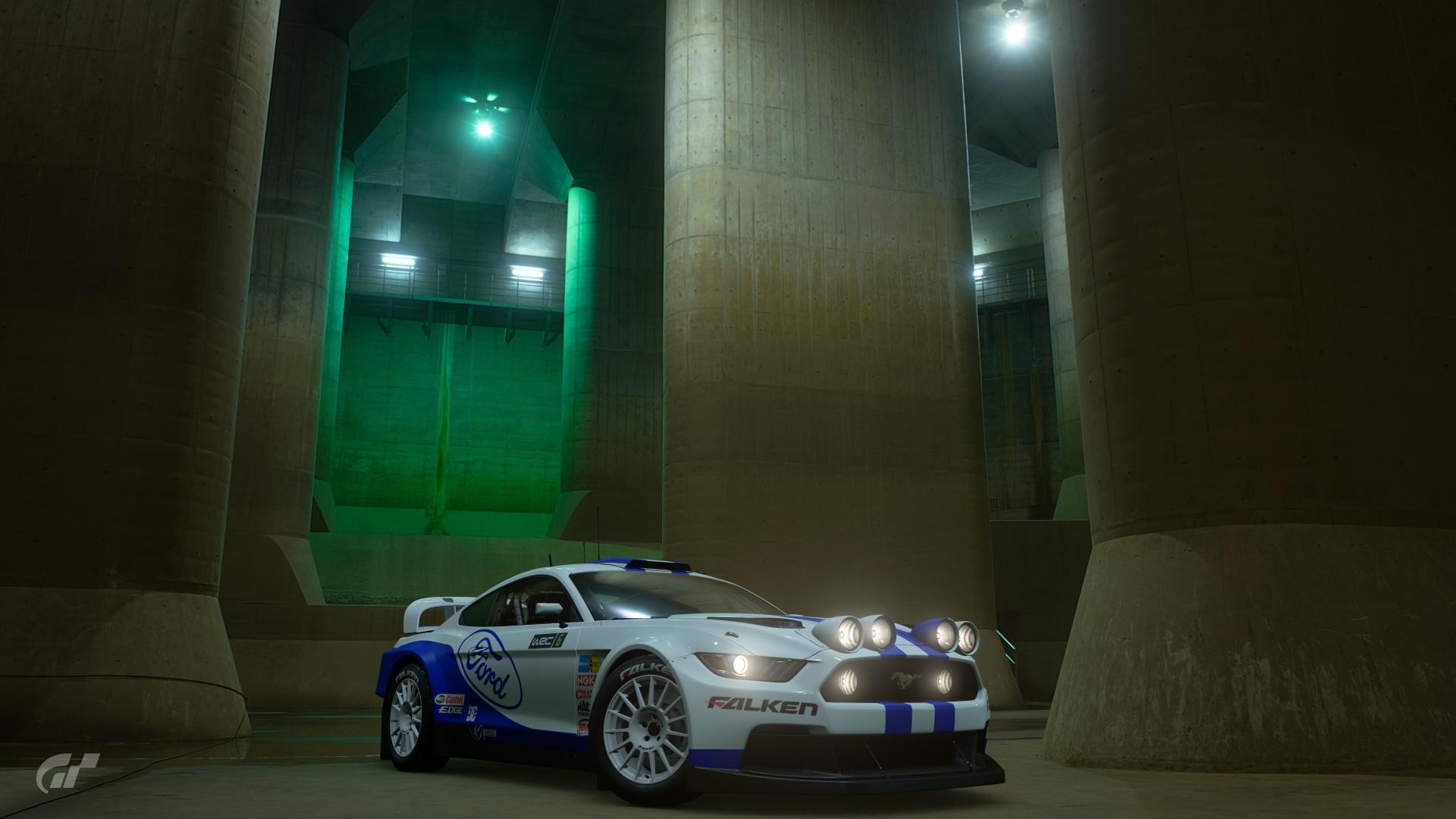
#9 - A really fresh livery design, quite simple but with the right amounts of the bold blue and red colours of Pepsi. Some of the sponsors look a little too large like the Shelby logo at the sides and the Recaro and Blisten at the rear, but at least they fit into a uniform look with the rest of the sponsors. The Goodyear logo on the top of the front fender looks like it suffers from projection issues, or that it's too big for that specific area, but either way it looks too distorted for the 'round the rim' placement you were going for. The 'candy stripe' effect on the lower front section doesn't help the design much, and I feel like using a similar design style to what you have on the side skirts could work better (with an overall red lower front section with the blue overlap near the fenders). I do like the inclusion of Carroll Shelby's signature on the front though; almost as if he gave the car his blessing.
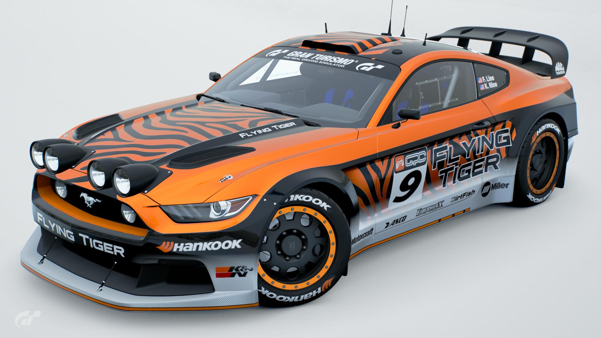
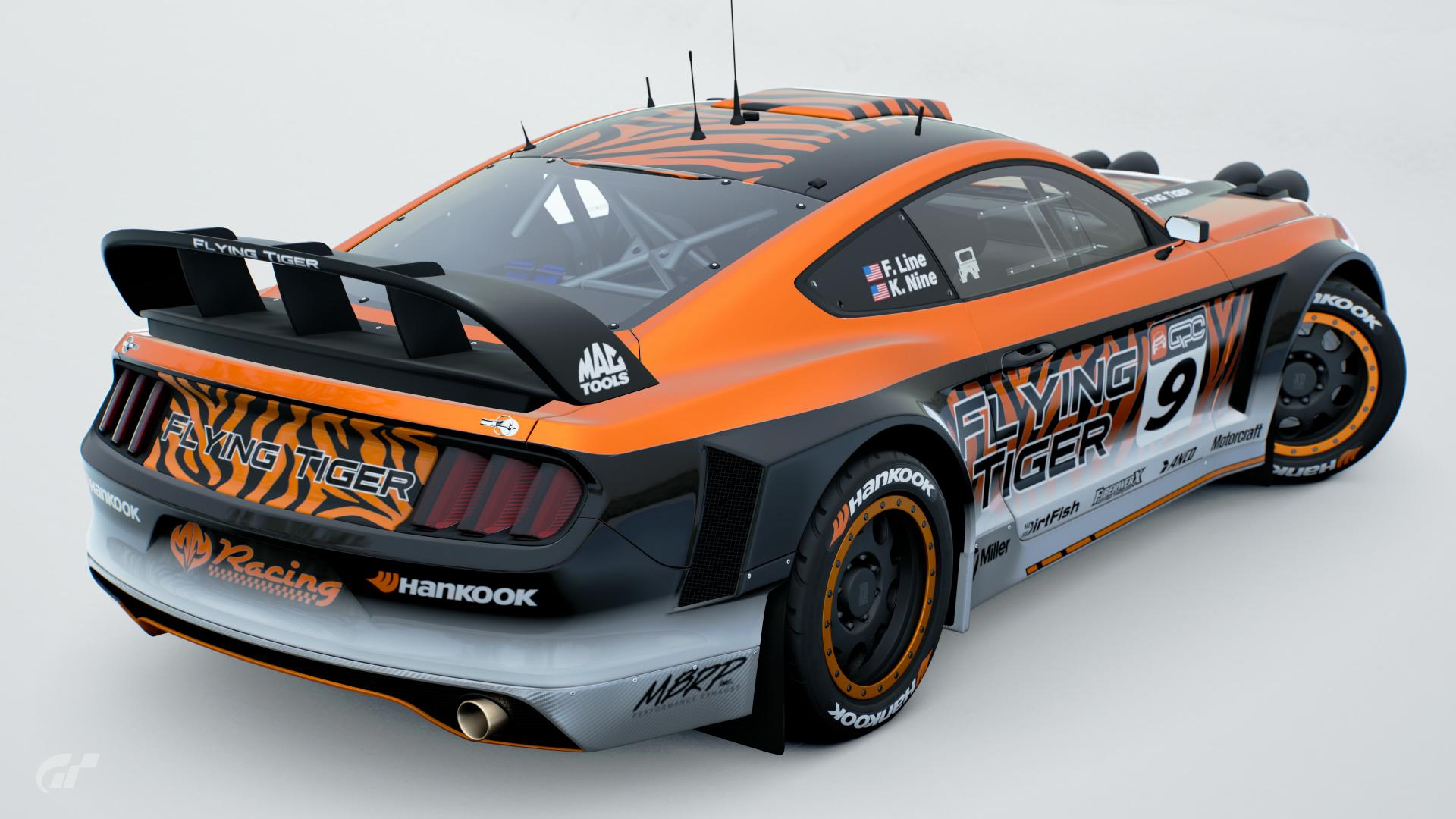
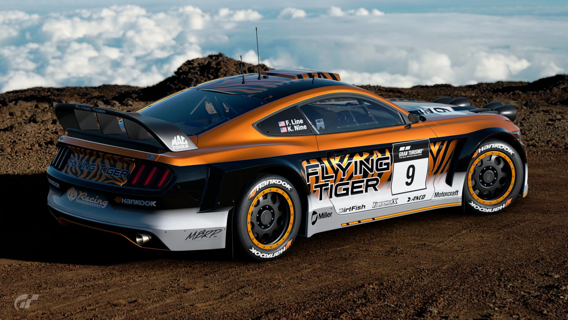
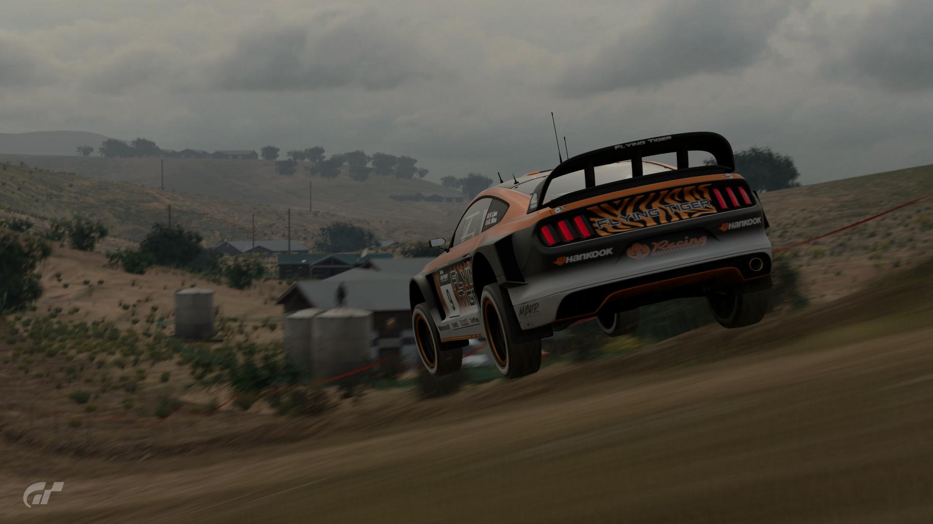
#10 - This does feel like quite a stand-out livery in it's simplicity. It definitely has a different feel to it with the bold black body-conforming lines contrasting with the metallic orange and the white gradient. You haven't gone too overboard with the tiger pattern and honed it down quite well. The dominant orange could've been too overpowering but again you've honed it down to the point that it works. Sponsor placements look spot on, and some of the sponsors seem ideally chosen to better suit the overall livery, such as the Hankook logo with the orange motif. Honestly, there's nothing really wrong with this design at all; if there were more votes, it would be in.
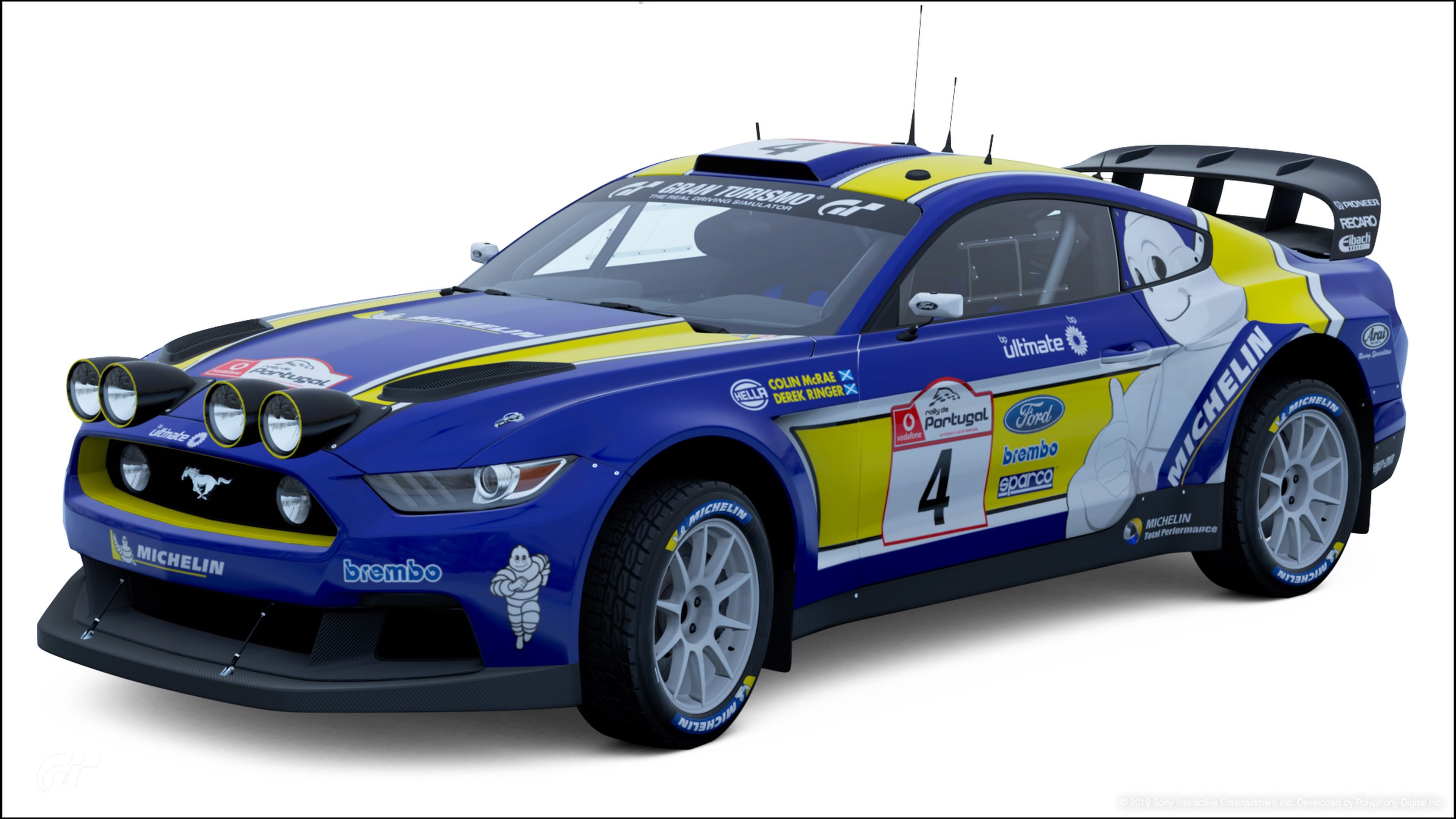
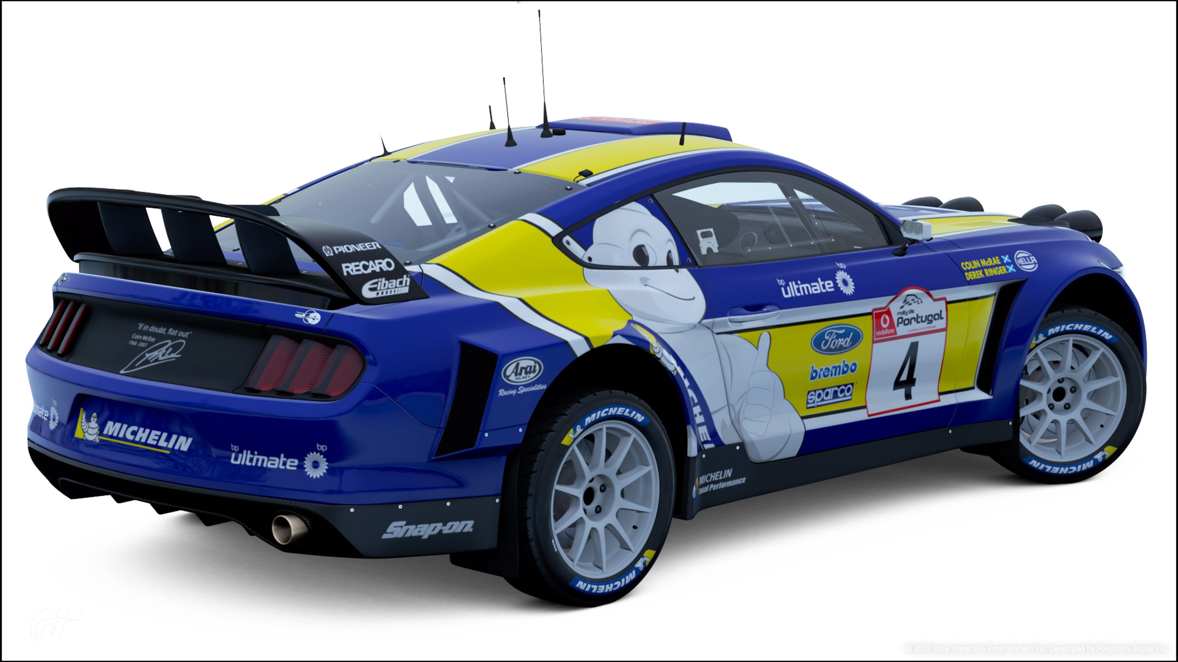
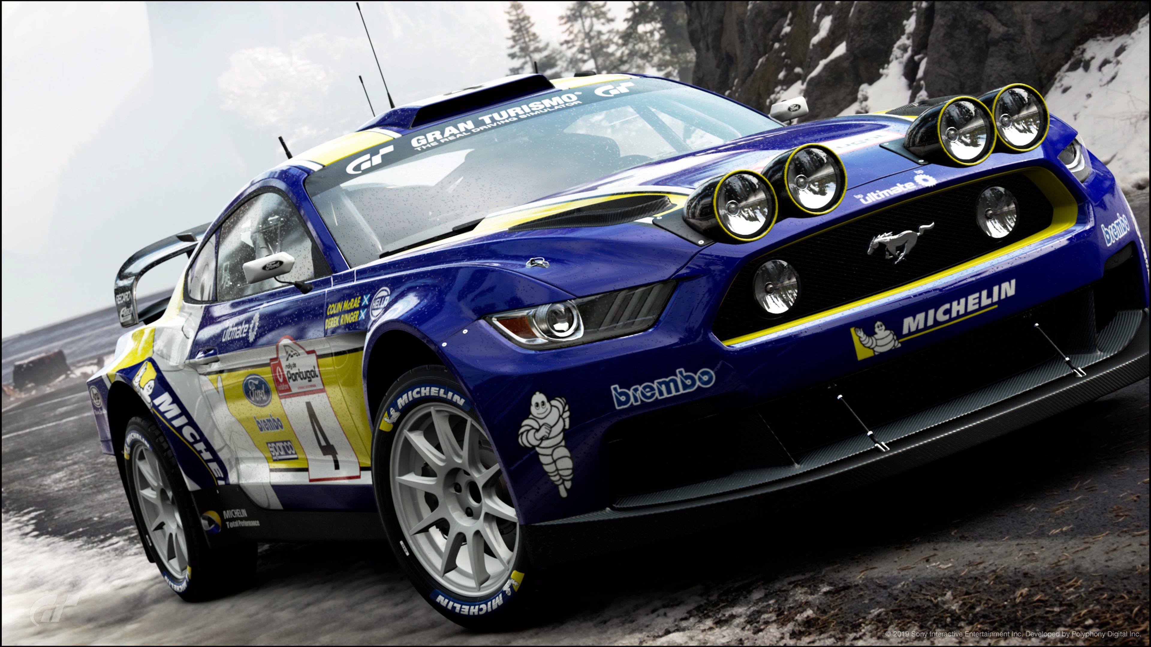
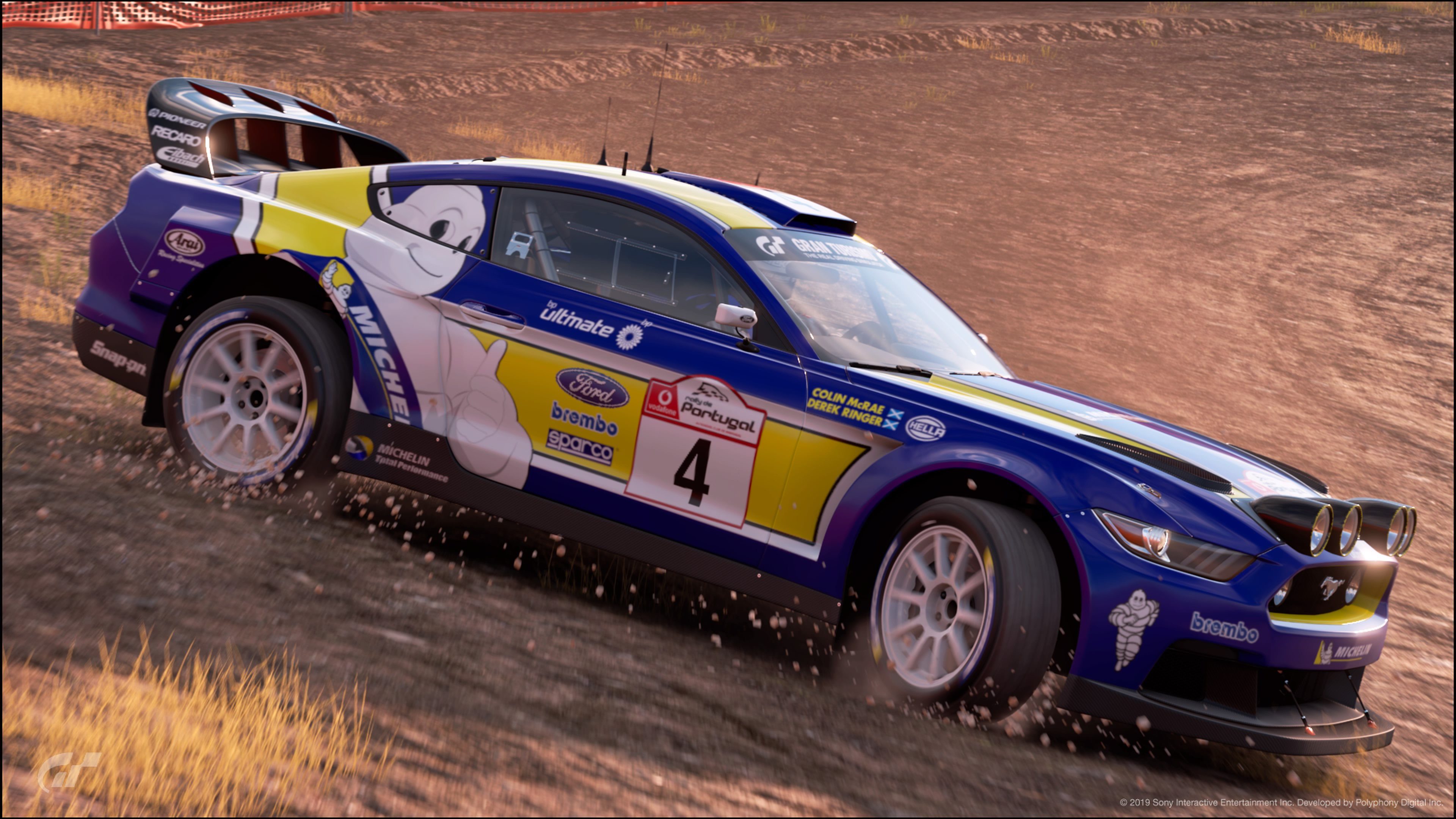
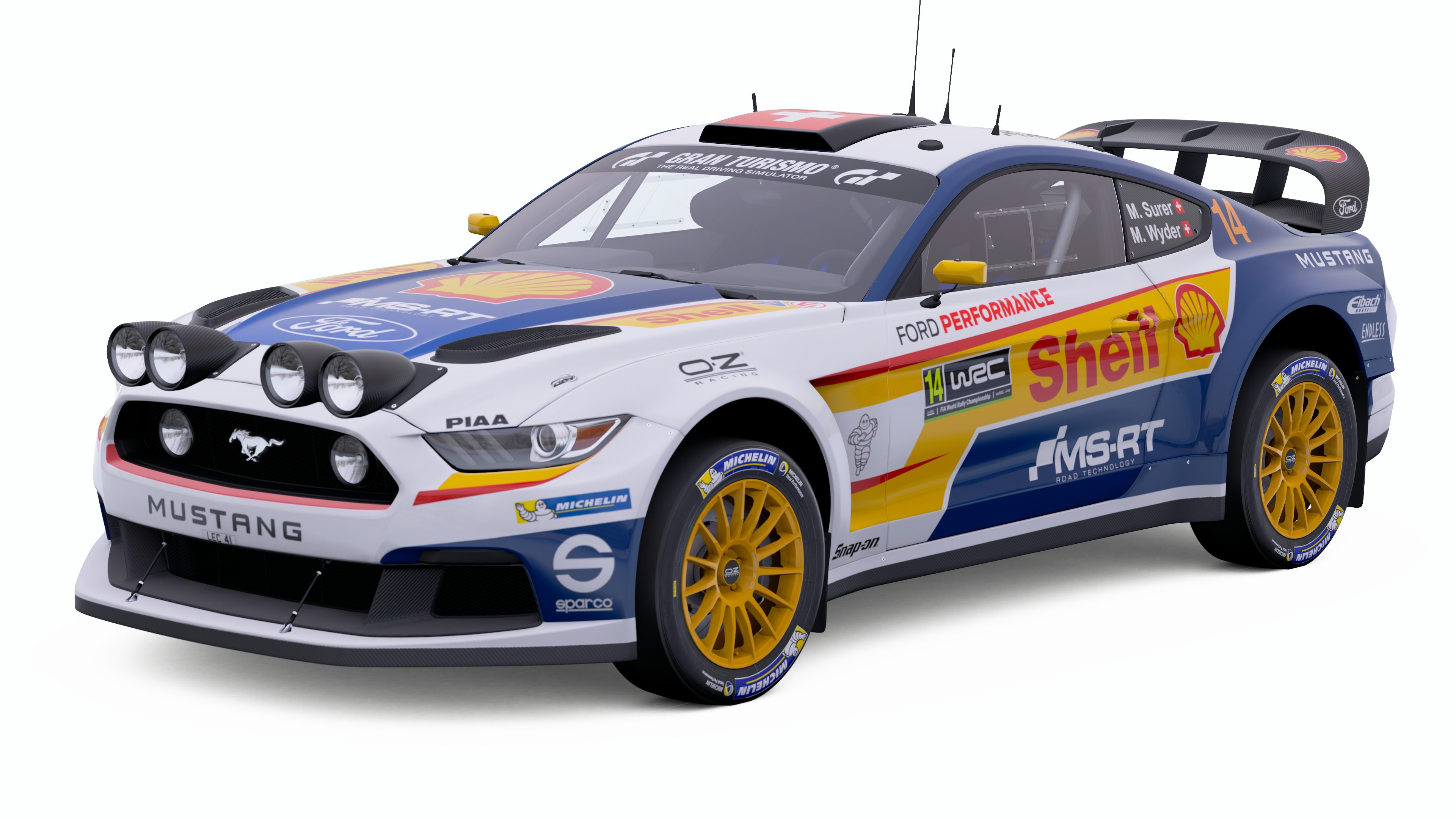
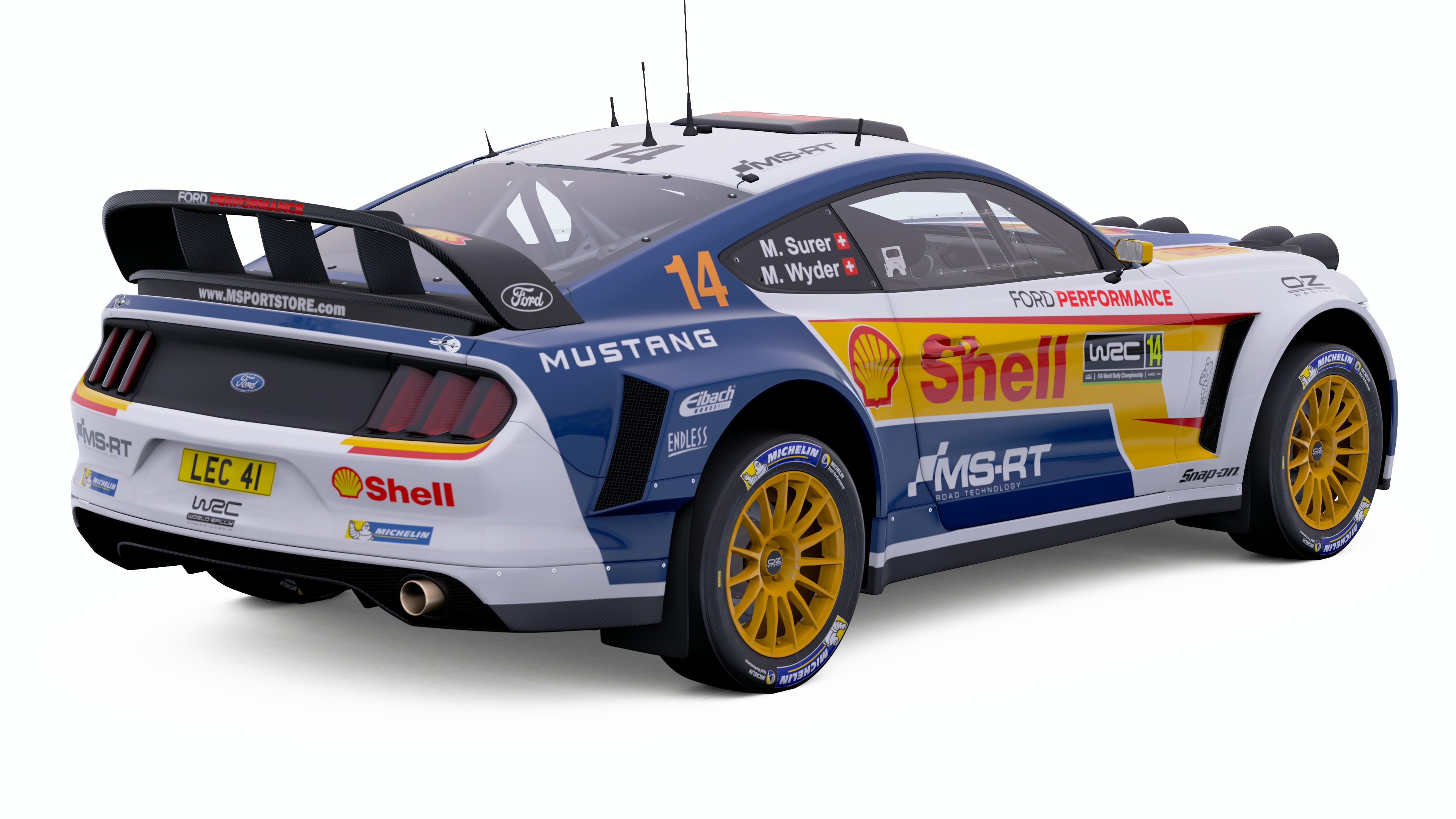
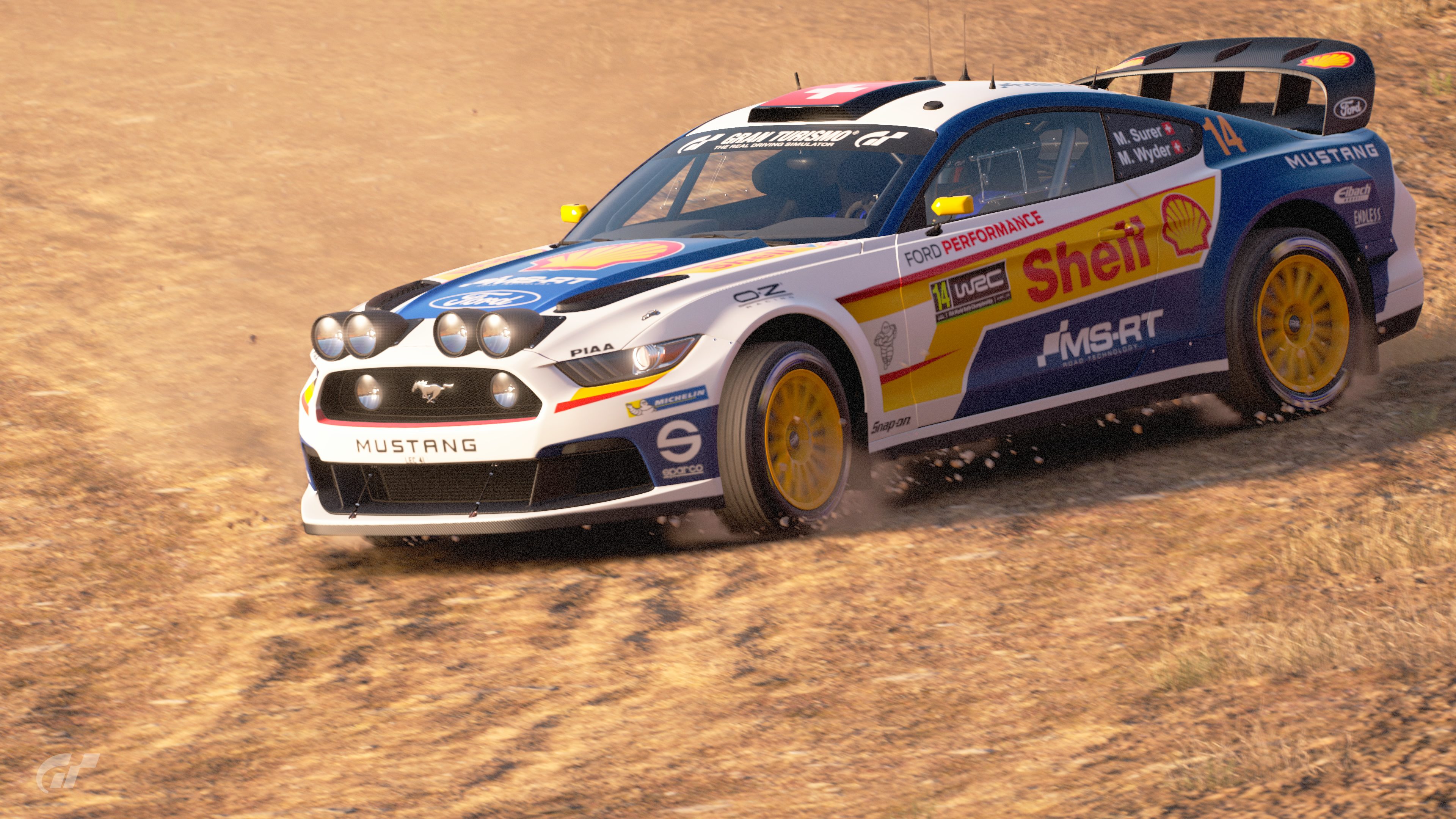
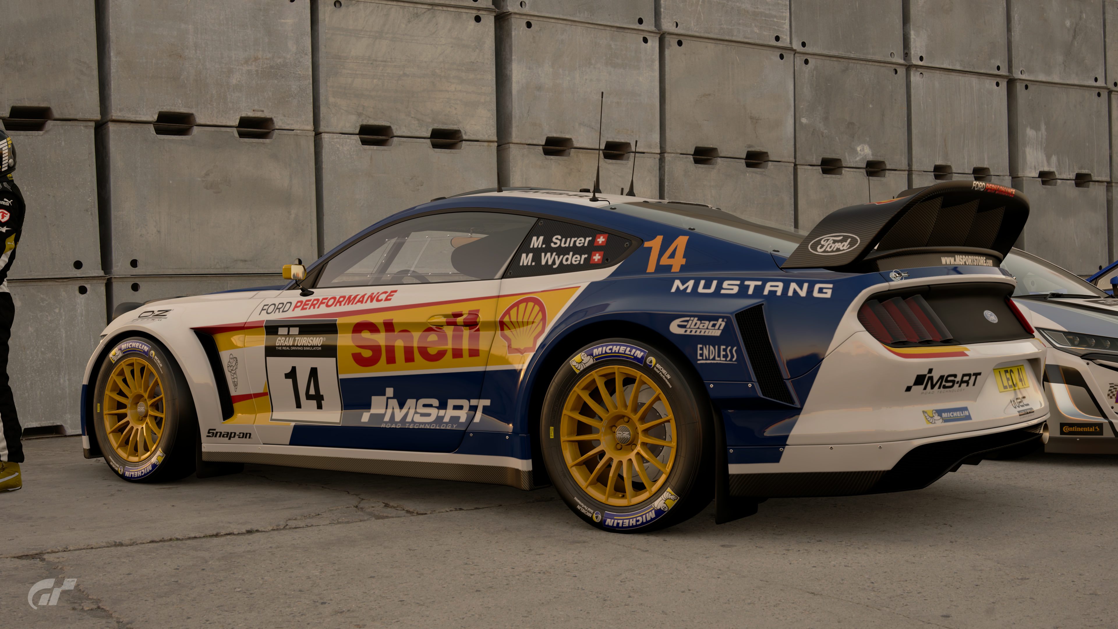
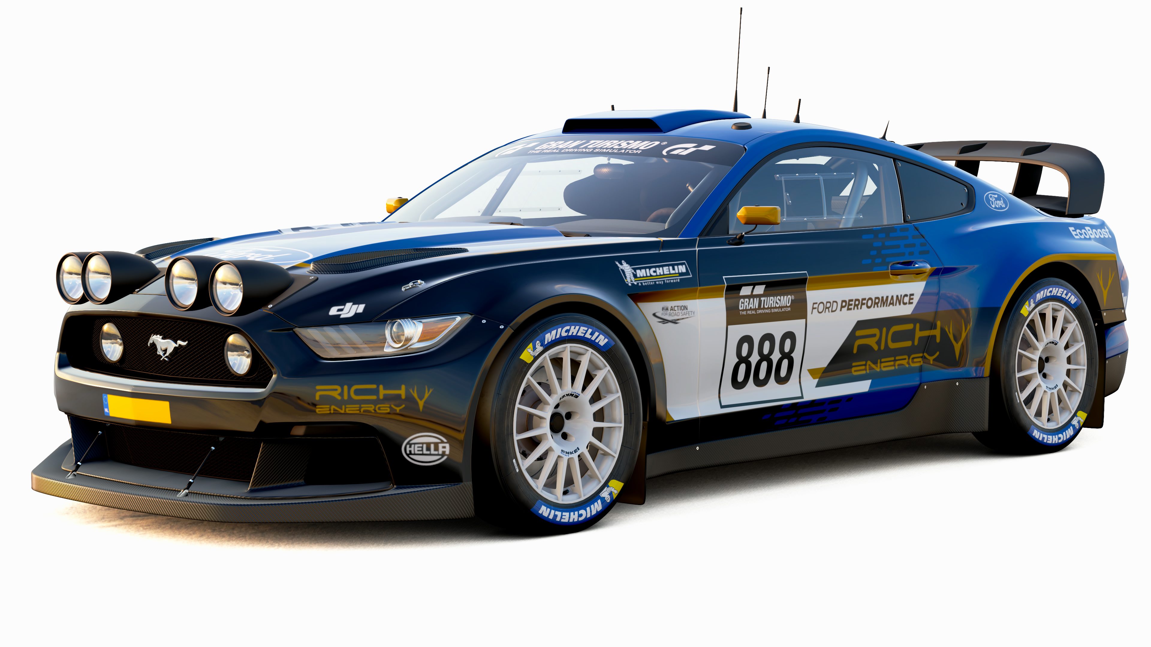
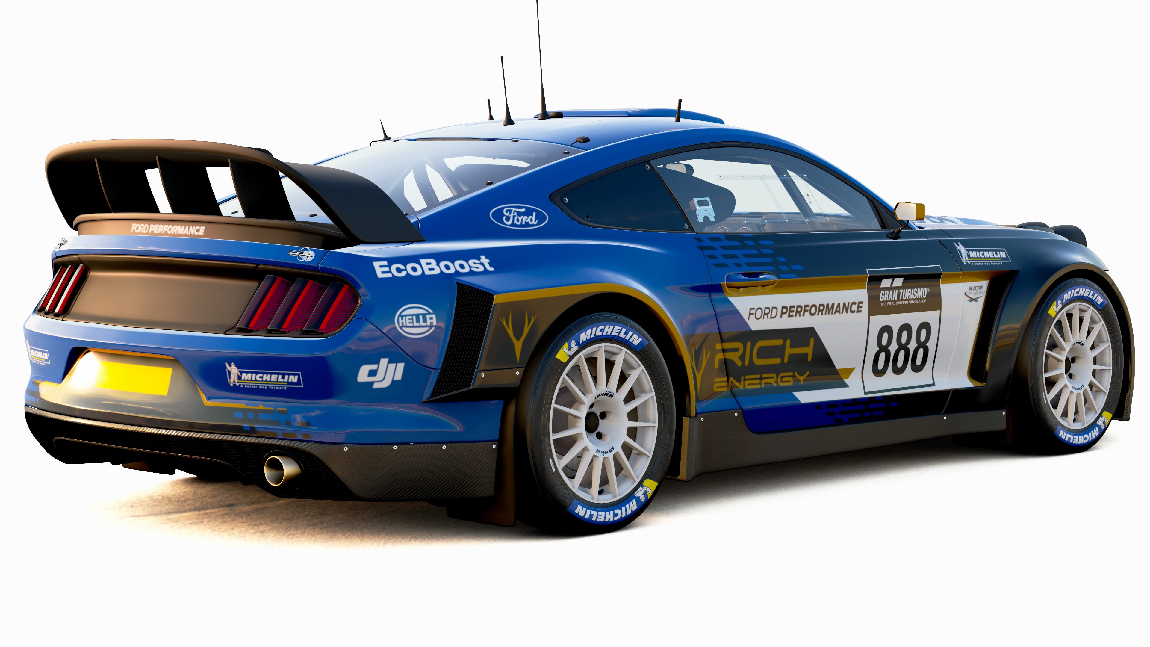
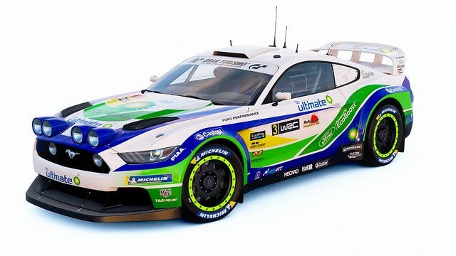
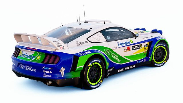
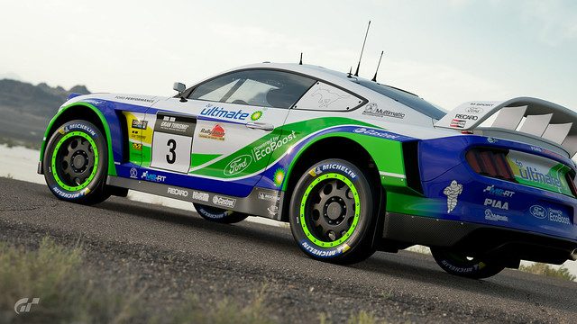
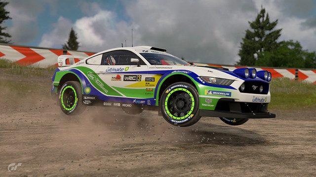
#11 - I guess with Michelin's inclusion into GT Sport, we'll have to get more acquainted with big ol' Bibendum whether we like it or not; and this livery is a great welcomer to that. Great usage of the dominant blue with the accented yellows and bordering whites. The Michelin Man in his iconic stature further drives home the sponsor while breaking up the design further. The sponsor placements and sizings look overall perfect, but the hood is looking a little empty. Maybe slap another Bibendum head on the hood. The Colin McRae tribute is a nice addition too, especially with the signature on the back.
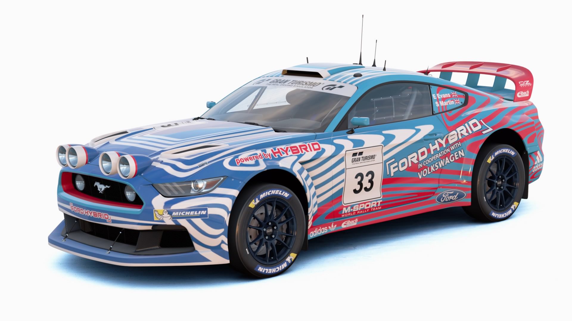
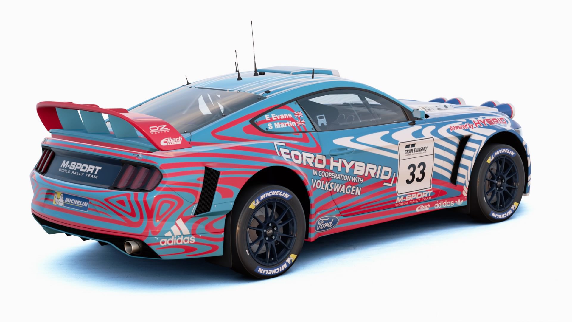
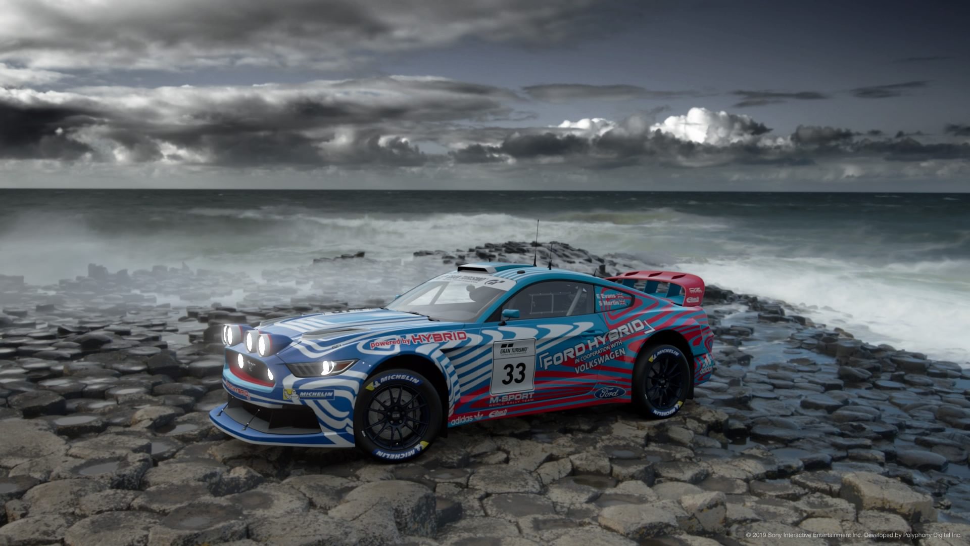
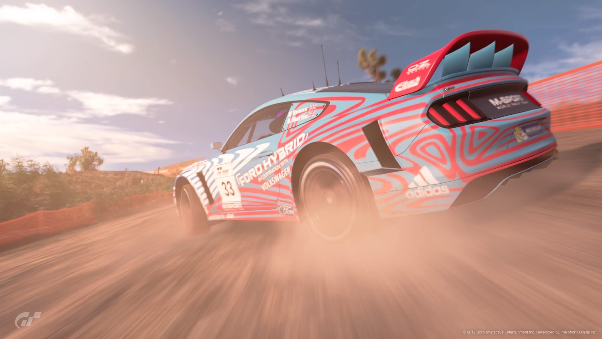
#12 - Who'd have thought we would see the VW ID.3 livery, with a perfectly justified reason for seeing it on a Ford Mustang? I can only imagine the amount of work and effort put into making those shapes and design fit well with the canvas given. The blue and pink do conflict with the eyes, but not as bad as the ID.3. The Eibach and Adidas logos along the sides look a little bunched up as if they have nowhere else to go, but with a livery as 'busy' as this, there doesn't seem to be many other places for them other than possibly the rear bumper. Definitely an eye-catching design though.
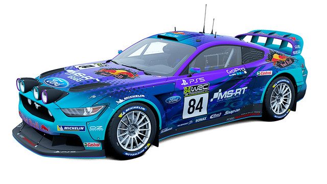
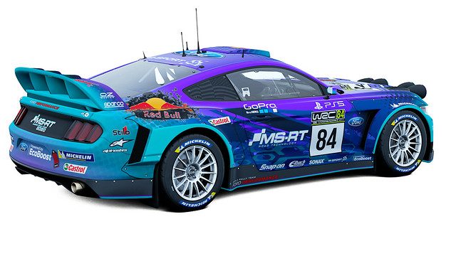
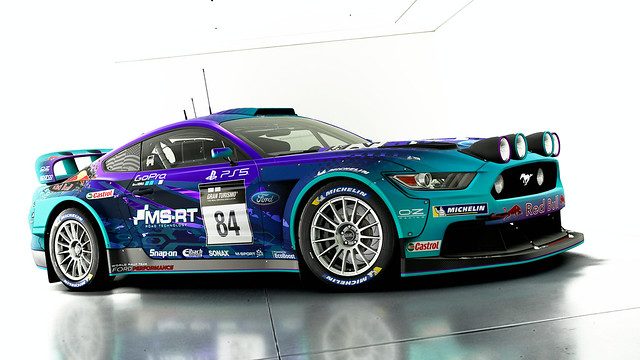
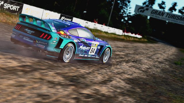
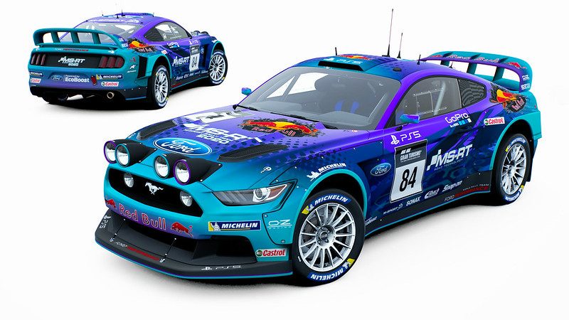
#13 - As with #7, another clash of vibrance and detail with lots of different things going on in this livery. There does seem to be a lot of random patterns surrounding the car, from the ever so slight grid decal on the rear to the rounded hexagons and dashes along the side and the dotted fade along the bonnet and front fender sections. It's like some celestial being has graced their presence and form onto a car livery. I would say the metallic purple (or 'special colour' purple) seems a bit too contrasting with the matte decals, and I'd probably go for something less metallic. The Red Bull logos also seem odd in a positive sense?

They stand out from the rest of the design but I feel like they also kinda look out of place because of that. The other Red Bull logos look a little stretched but not too bad. The placements and sizings of the other sponsors are perfect, as is the little colour accents on the MS-RT logo on the hood and the carbon USA flag look in the rear side window section. I can imagine seeing this at night with some glow-in-the-dark paint applied; what a sight. Excellent work!
#14 - For a rally car livery, surprisingly I'm getting NASCAR vibes from this one. It has a bold colour scheme that is further amplified with the matte texture and black gradients. The coloured shadow effect of some of the decals does look a little off for the kind of livery this is; which might've been suited better with full outlines. Sponsor placements look mostly good, but the Red Bull logo at the rear fender looks a little squashed. The Gran Turismo dashes (I assume that's what they are) also kinda look out of place with the white outline; and as brought up in the submission thread, Mopar? On a Ford?

Definitely another eye-catcher though.
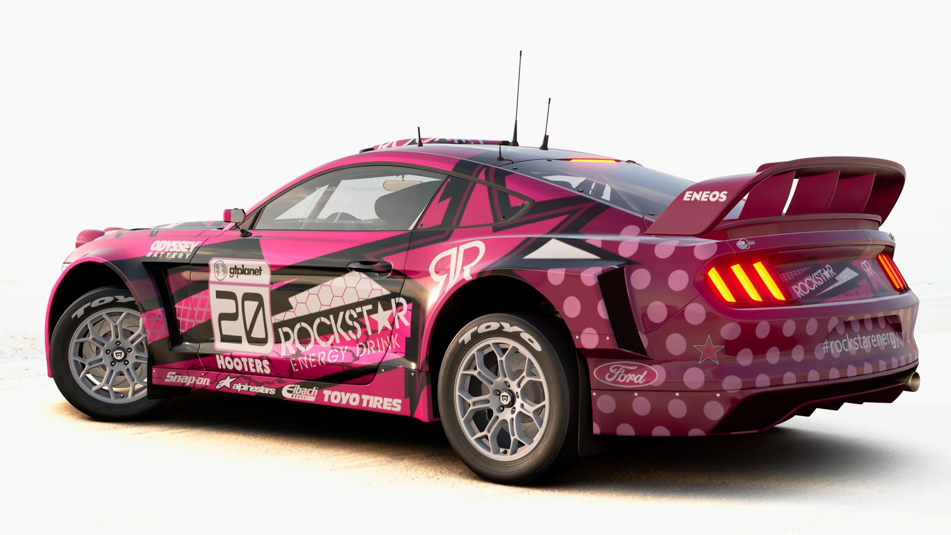
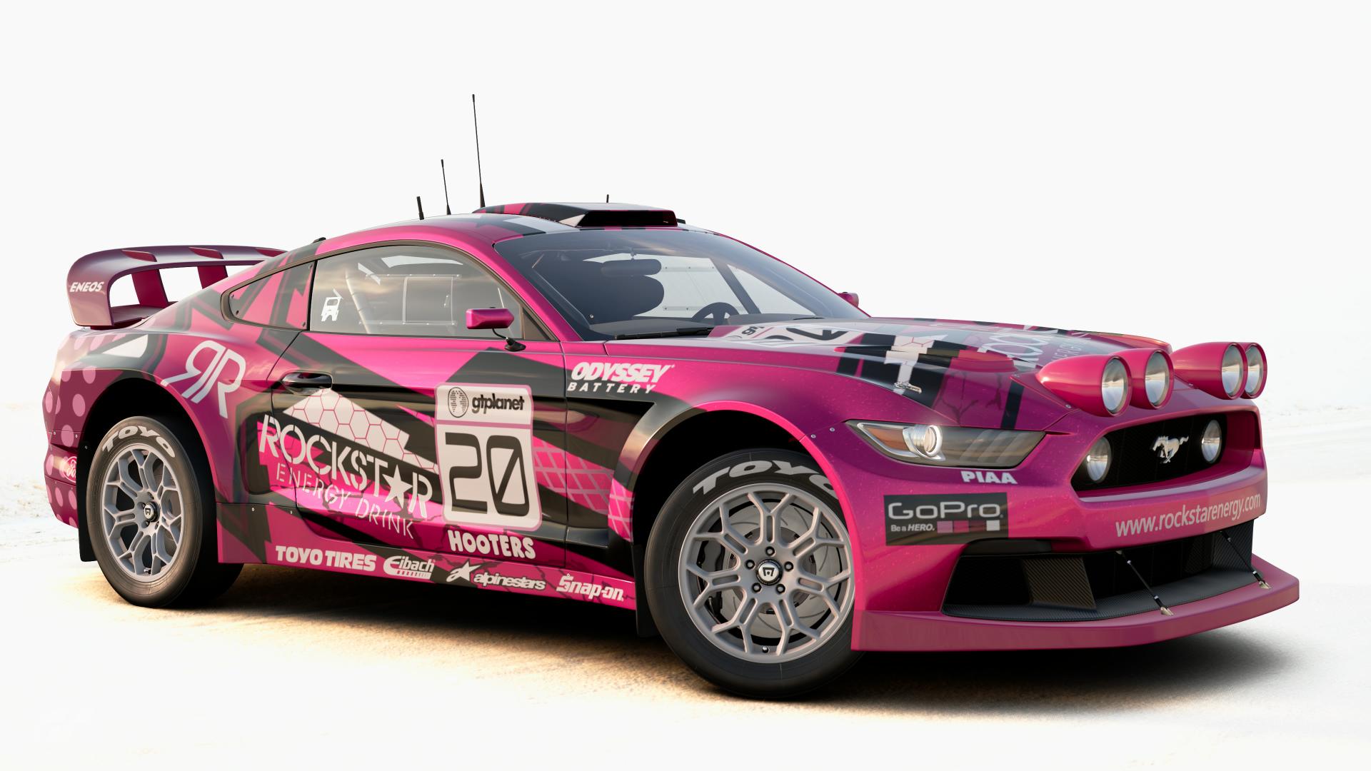
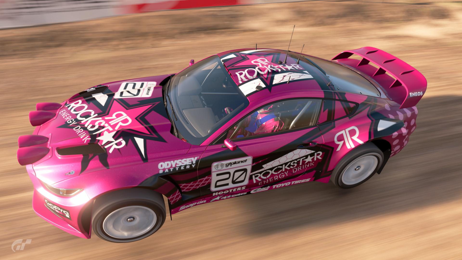
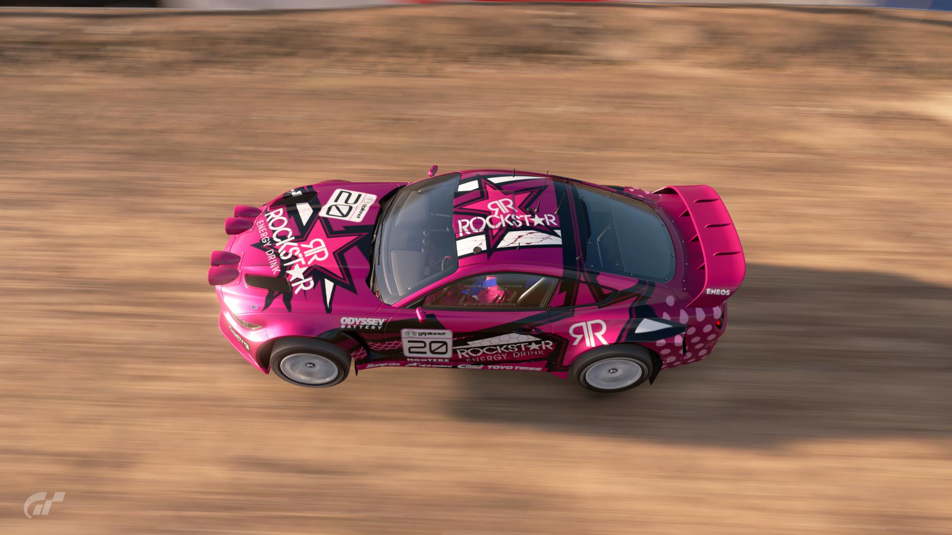
#15 - Pretty in pink? I think so. Hooters? Now you're stretching it
Similar to #13, there's a lot of different details on this livery that break the car up and make it interesting to look at. The sponsors are pleasantly coloured to match the bold monotone style and are placed and sized pretty well. The bold black lines are utilised really well to break up the dominant pink, along with the different shades of pink. I don't drink any energy drinks but if Rockstar need a design for a raspberry flavour; look no further than this masterpiece.
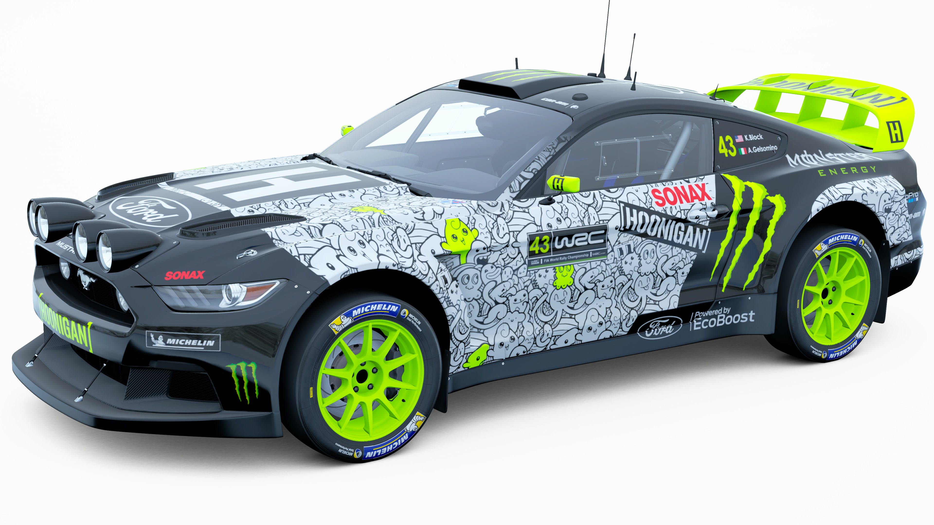
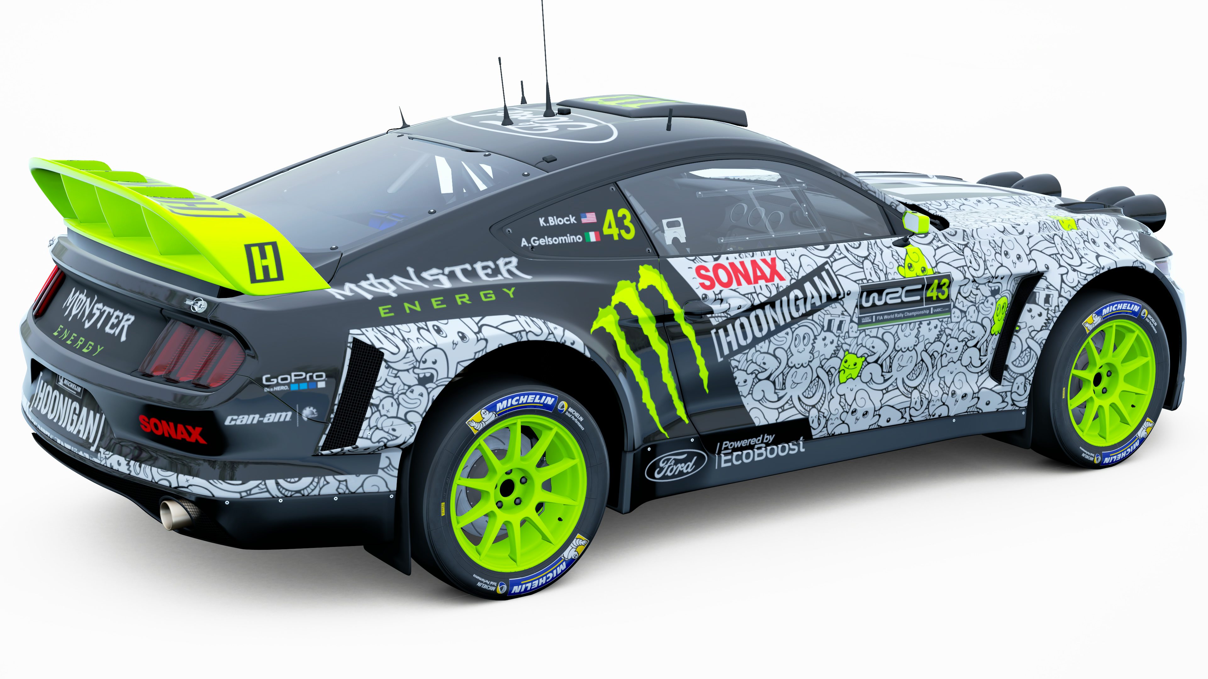
#17 - I mostly get the Ken Block rally vibes with this; but the fluffy creature pattern (apologies if it's a well known set of characters, they do remind me of Pokemon a bit) does seem kinda odd when previous Ken Block liveries have been with solid shapes, albeit with a variety of different styles. The overall structure of the design is fairly good, and the sponsor placements are perfect. I'm not sure whether it's the brightness of the Scapes location, but the bright green used looks a little too bright in comparison to some of Ken Block's cars I've seen; and I feel like it's slightly subtracting from the rest of the design. An interesting livery though.
#18 - A nice clean simple livery with a subtle colour scheme that draws more attention to the actual design of the livery. I love the gold accents that add interest to the black and blue basis. Not a lot of sponsors and the hood looks a little empty; but the sponsors that are there are placed quite well. Even the subtle colour change on the Michelin logo for the black part of the livery makes the car look ever more interesting.
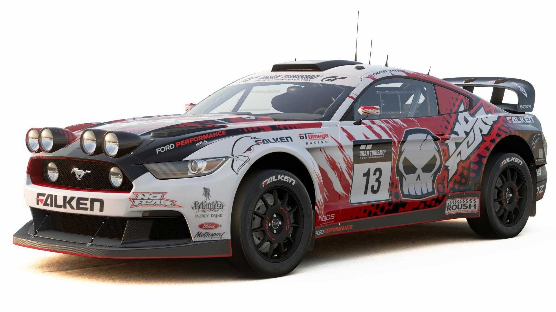
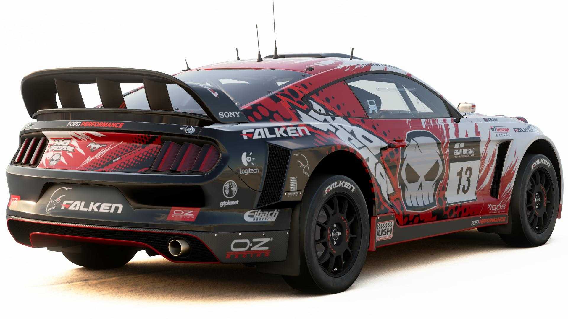
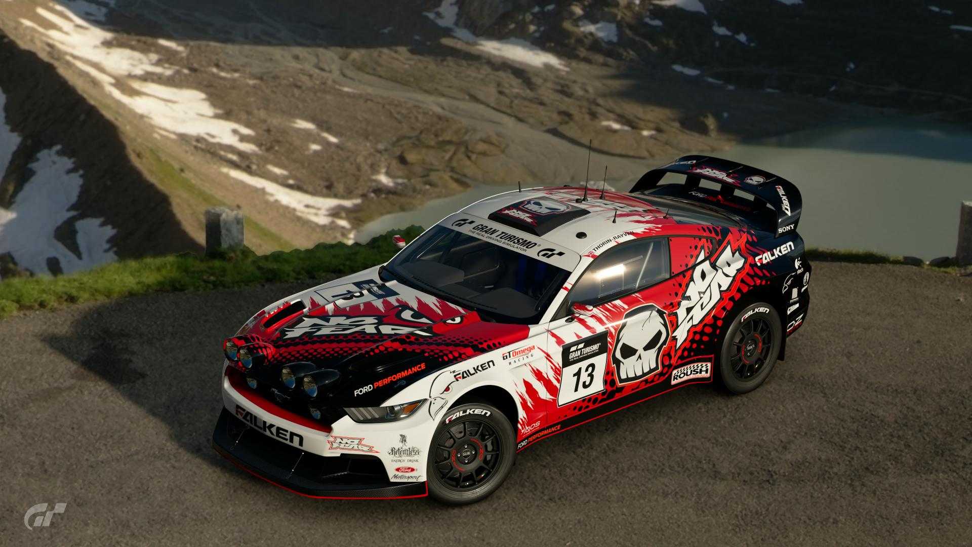
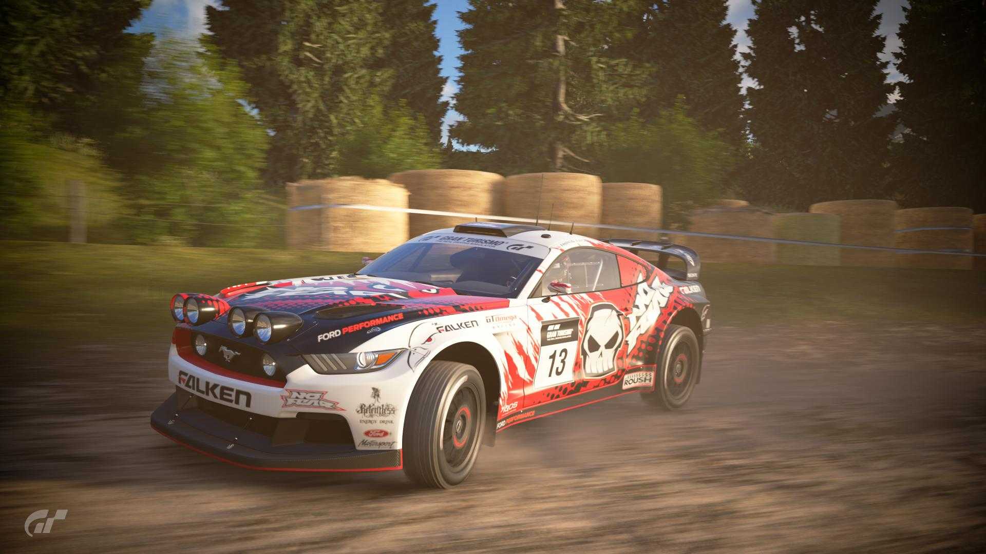
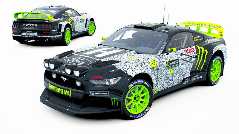
#19 - No Fear. I never thought I'd see this logo again, but this livery brings it back with a bang. The red ripped decals contrasts well with the black dotted fade, and overall the amount of each specific colour used is managed and balanced pretty well. I like the slight change with the actual main logos used around the car; some have the skull whereas the hood has the eyes, and it does give a fresher feel to an already dynamic and well done livery. Sponsor placements look mostly spot on, although I feel like all the OZ sponsor at the lower rear side section might be too big in size, especially when there's a smaller, perfectly fitted OZ logo just next to it on the bumper. Overall, a really loud and proud livery design that I could very well see in a rally.
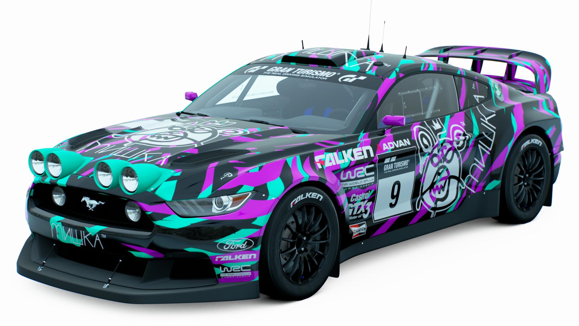
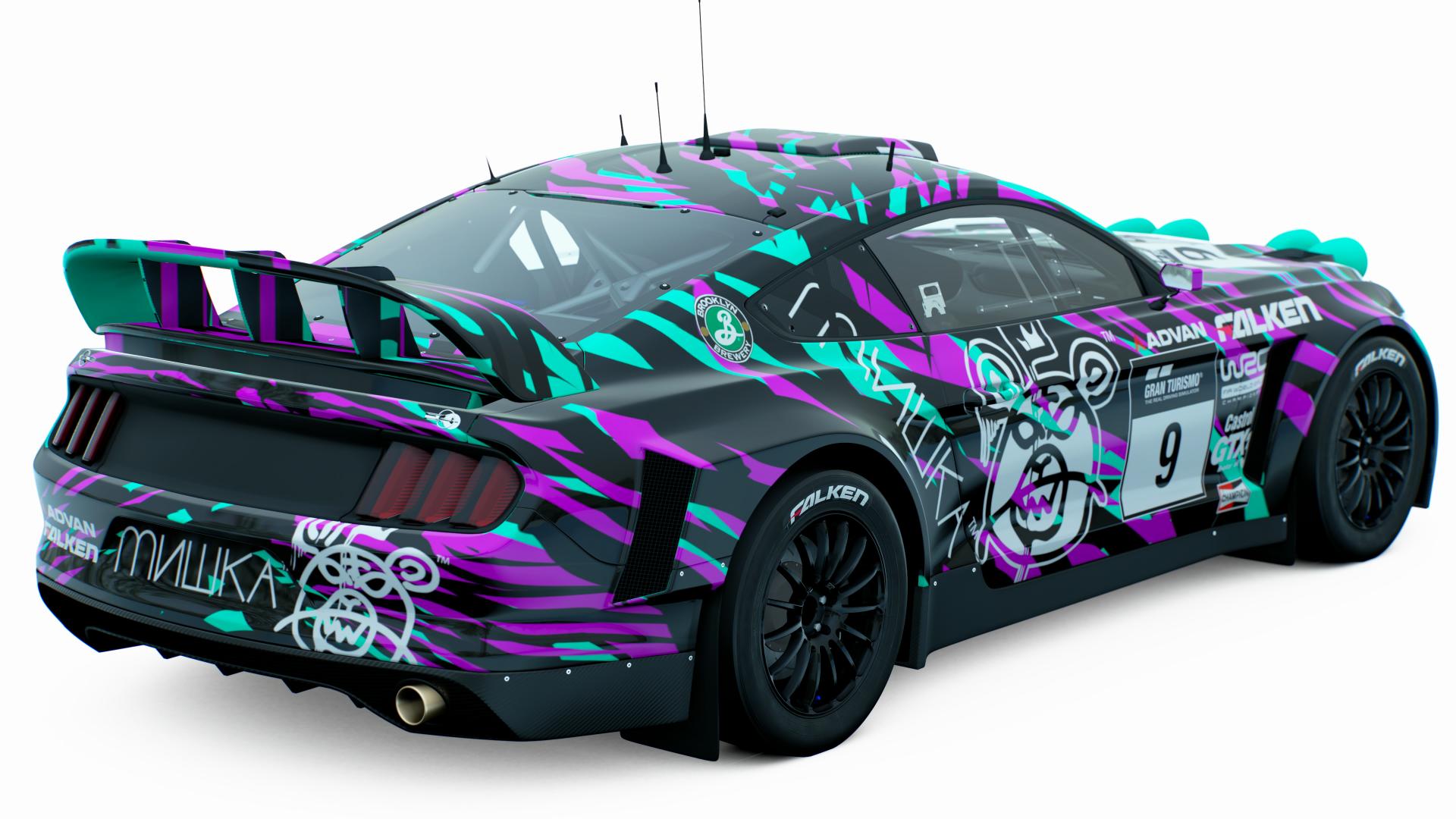
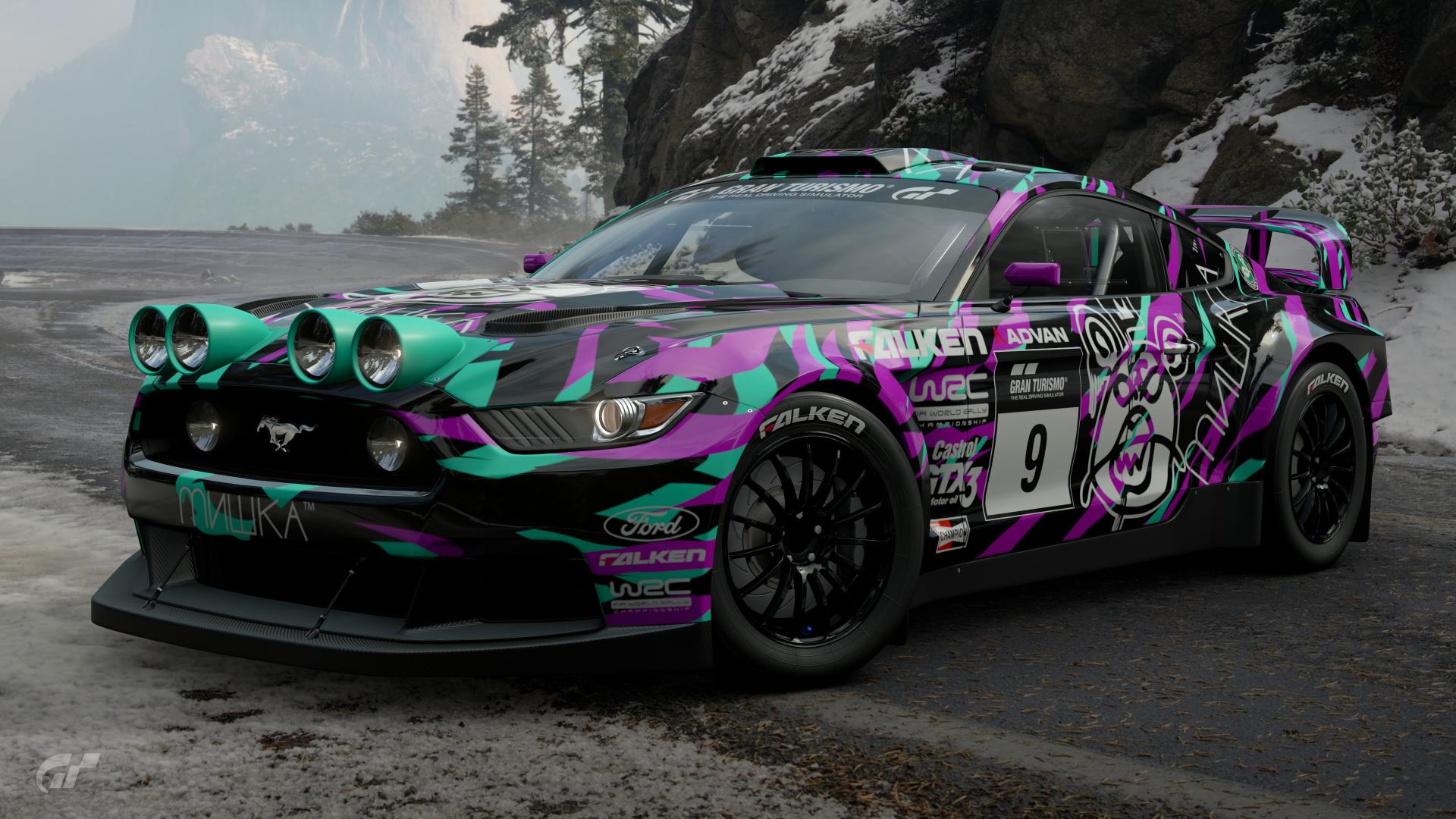
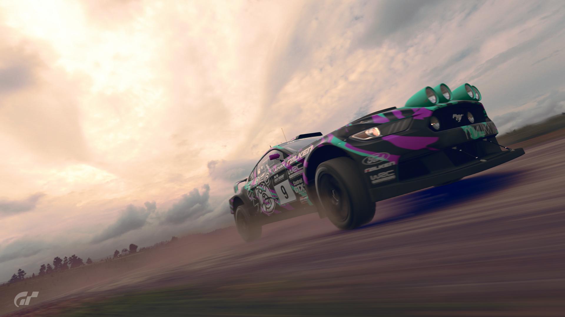
#20 - Another rather dynamic looking livery. The wild teal and pink slashes look mostly controlled and maintained so as to not be too overpowering, although it does look like it gets mixed too much towards the front fender section. Sponsor placements look perfect. Again, the slight change in the main sponsor look at the rear adds more freshness to a stand-out livery. Nicely done.
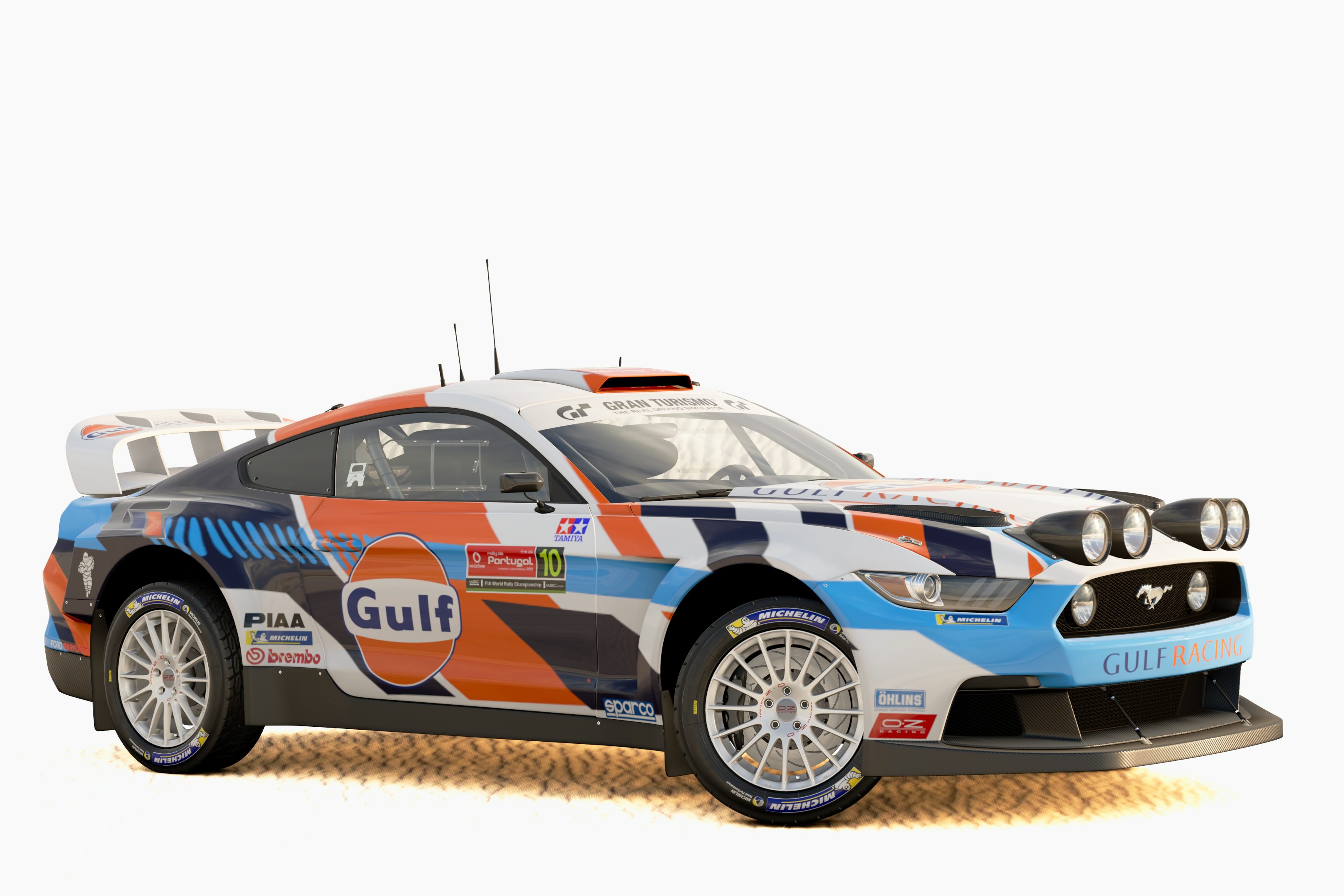
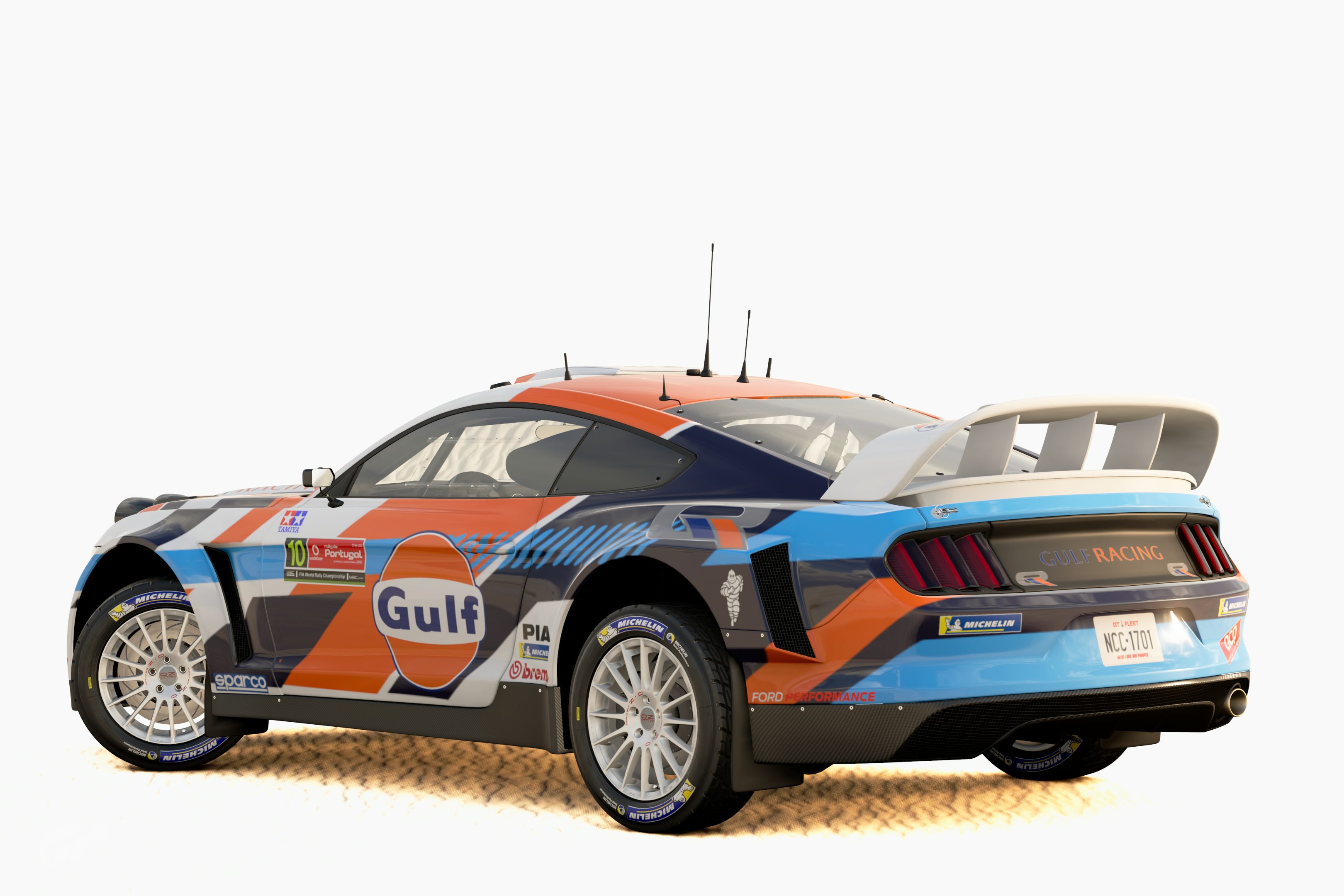
#21 - Yet another dynamic looking livery, with the modern styling of the diagonal stripes. In a world of predominantly blue and orange Gulf liveries, this is a refreshing change with the dominant white and dark blue additions. The light blue dash pattern along the side does suffer from projection issues, and there doesn't seem to be much way to fix that other than to either move that pattern away from the rear fender so that it no longer looks distorted or simply reduce the line length so that they become dots over the top of the fender. Sponsor placements and sizings look perfect.
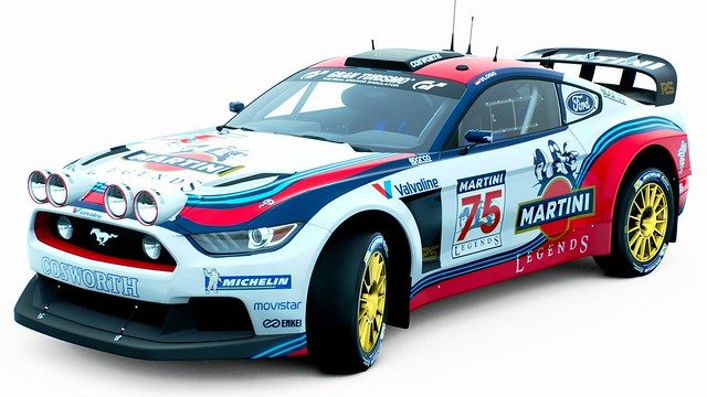
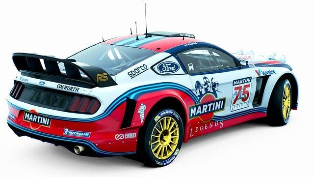
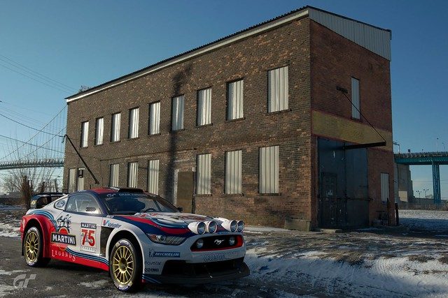
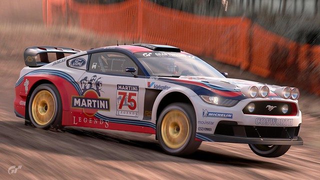
#22 - In with the bold iconic Martini look. The livery keeps the dominant white that previous Martini liveries have been known for, while the other colours and designs work effectively to break up and utilise the space provided. The 'RS' logo accents on the black; especially the front fender vent section, makes it feel like you've been operating on an 'evolved' version of the same car the rest of us have been stuck with, and deals with what has been a problematic area for some. Unfortunately, it seems like some of the curve designs appear disjointed and stretched in their projection; for example on the hood section past the contours and along the rear fender section. Gold was a good choice for the wheels but these wheels seem too shiny and metallic in comparison to the more common powder coat gold wheels that would've suited the livery and the RS badges better. A nice effort though.
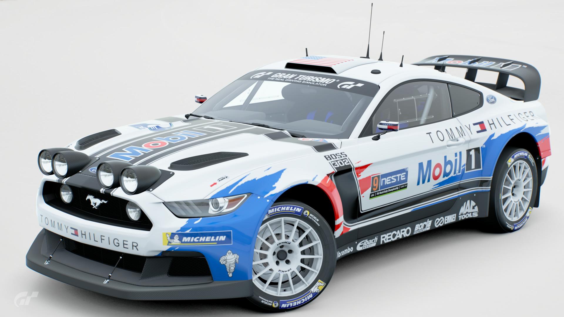
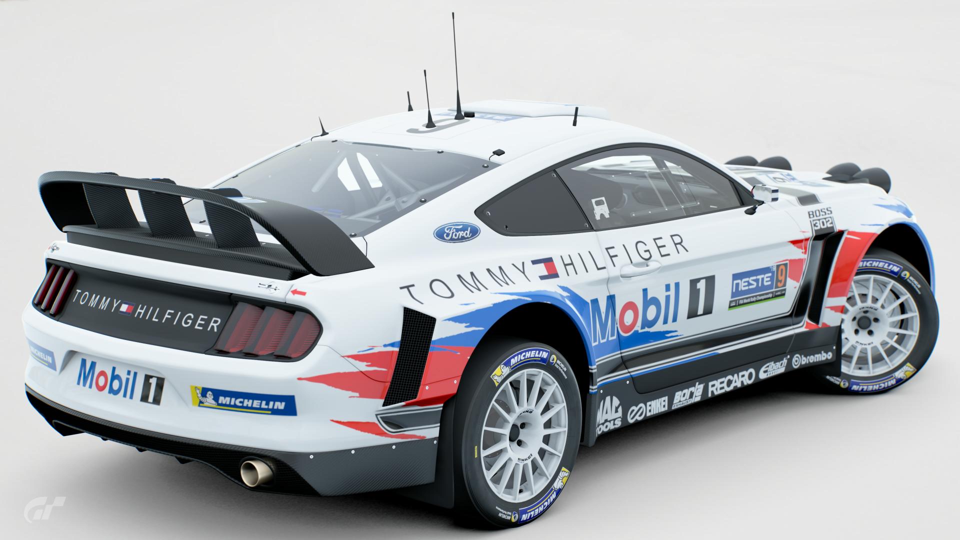
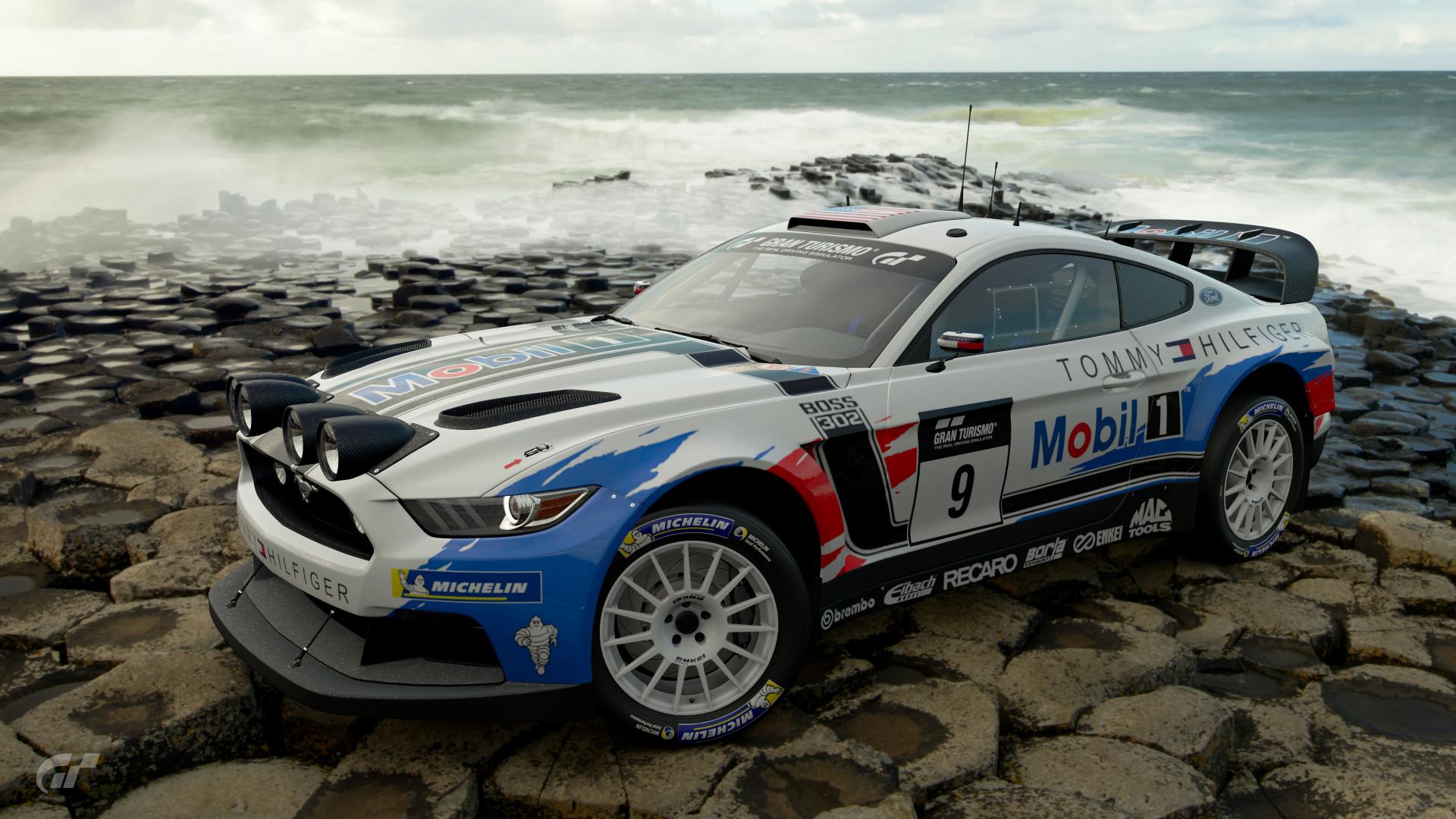
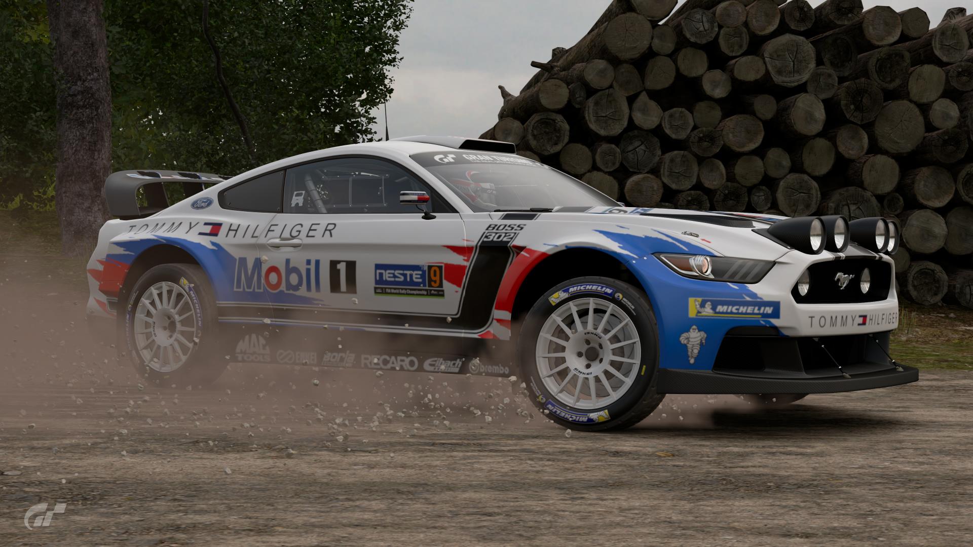
#23 - Just like #2, the injection of the Mustang legacy is strong with this one. The Boss decals help to break up the dominant white space, along with the rough and ripped look of the Mobil 1 colours. The overall design of the livery looks rather neat and the sponsor placements look mostly spot on, but some of the sponsors on the side skirt area look a bit too big like the Recaro and Borla sponsors (the Mag Tools logo is OK though because of the space available for it). If they were closer in size to the Brembo logo, then they should look more neater and more uniform. The use of the Tommy Hilfiger logo as a possible secondary main sponsor is both subtle and well done; breaking up the available space further.
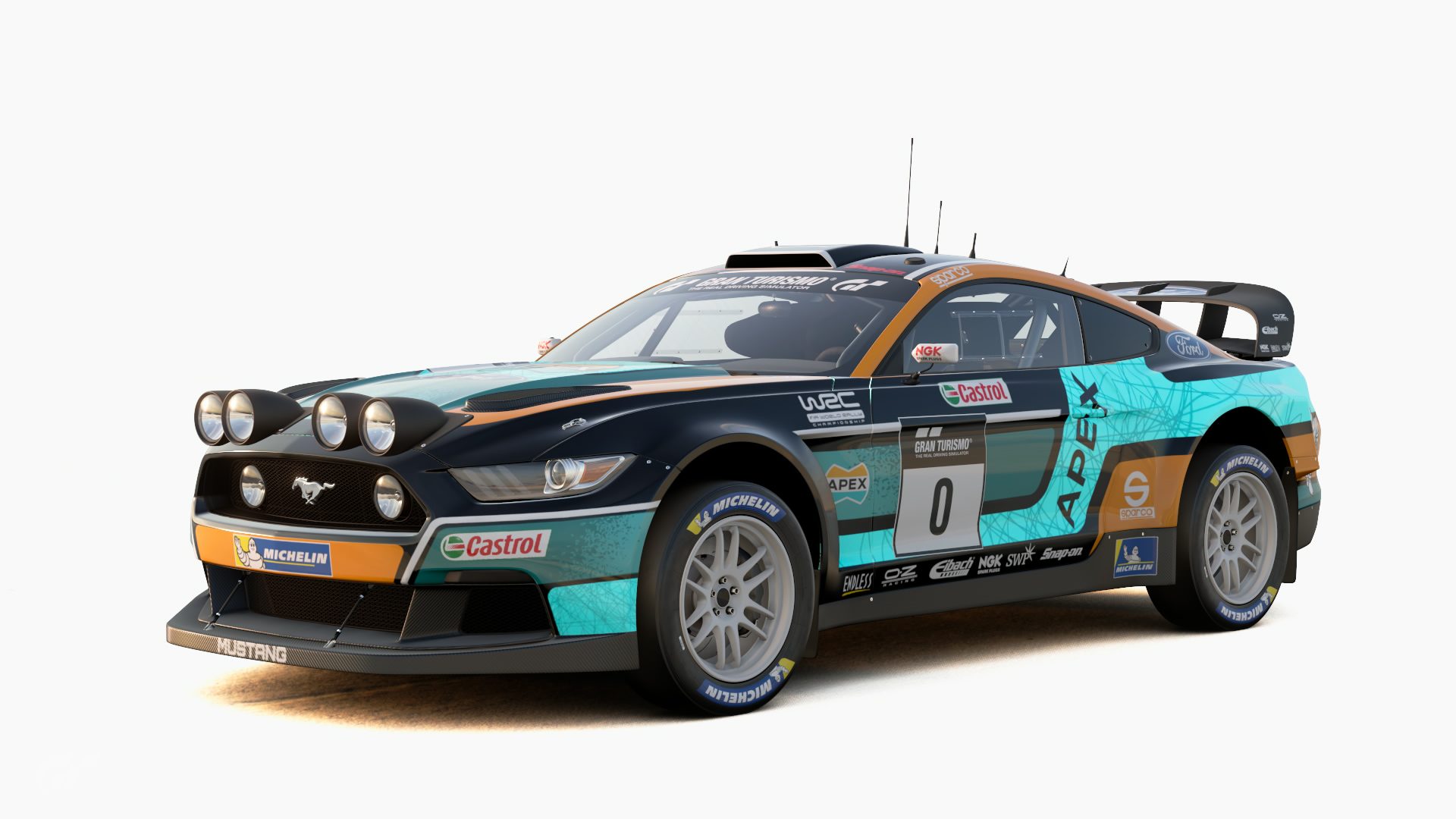
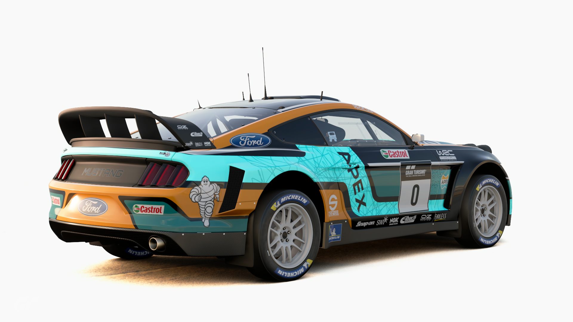
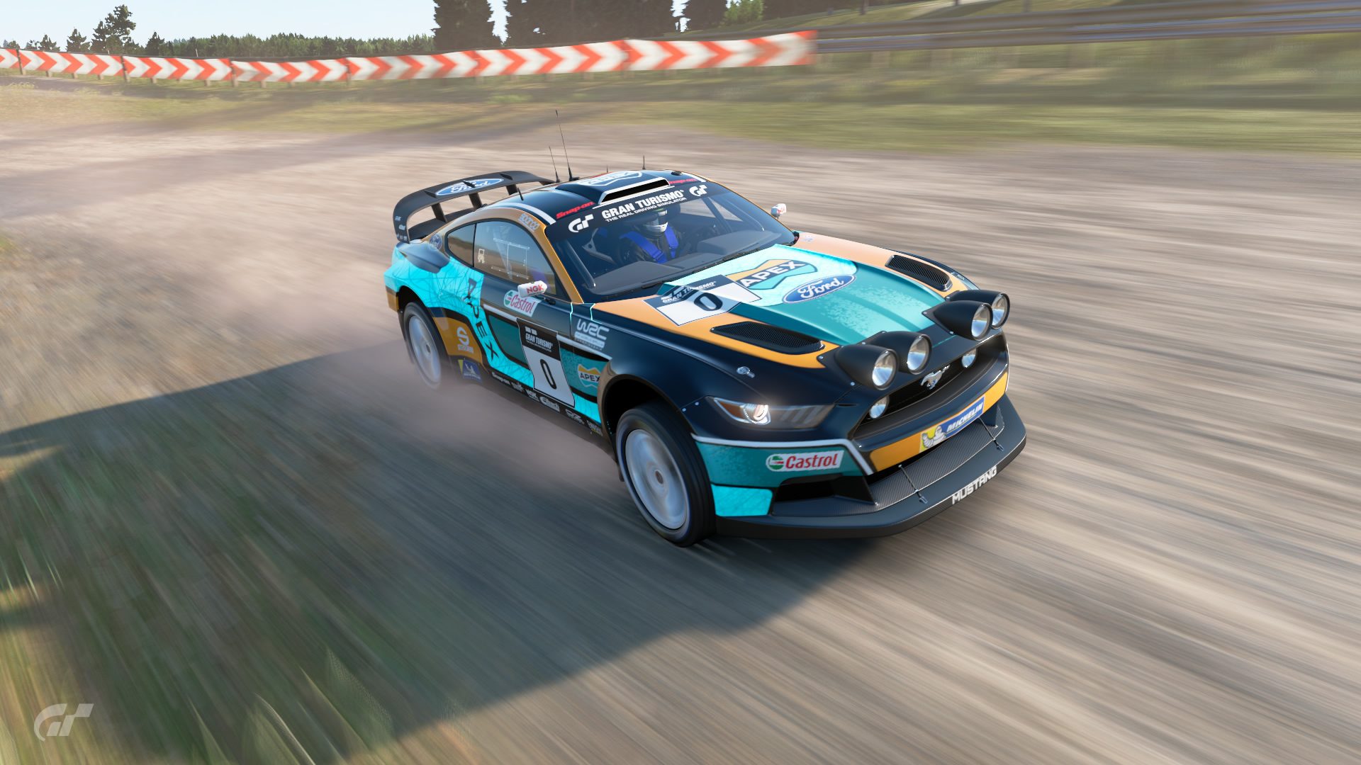
AlexWilmot - Nice bold colour scheme that plays on the colours given from the Apex logo and contrasts them over a black base colour. The shapes are quite modern and fit together quite nicely, breaking up the car shape and creating something more interesting to look at; even more so with the stripy and dotty patterns used. Sponsor placements are perfect; I can't see anything wrong with the sizing of them. Even though the bright teal part of the livery isn't included in the main colours of the logo, it fits so well and helps the livery to stand out.


 _____________________________________
 _____________________________________
 _____________________________________

 _____________________________________
 _____________________________________
 _____________________________________


")


