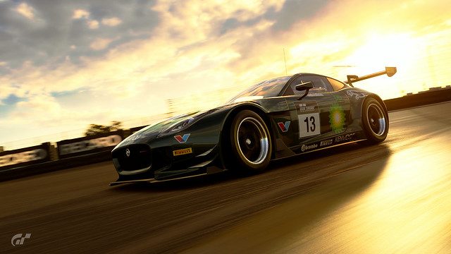
I'm more than liking the composition in the first shot - along with the contrast created by the warm and cold tones. Both the sense of motion and exposure are spot on.
With regards to the second photo, I'm a fan of the black-and-white look, but at the same time feel like the slight overexposure takes away from the smooth silhouette of the car (this is due to the glass engine cover). On the other hand, the sense of motion is - again - spot on.
Last but definitely not least, we have the SRT Tomahawk. The thing I like the most about this shot are the smooth colour transitions (no colour banding) and the toning. While the car somewhat looks like it's floating (due to the camera angle), I'm fond of the lighting because it accentuates the form of the car very well. 👍
") Glad you liked it
Glad you liked it 
")

Not sure if that would be appropriate - I don't do anything special.But I more than appreciate the feedback you gave me... On my own feedback.
In any case, that Porsche shot looks nothing like an "accidental" one. I really like the cold/warm contrast created by the sky (very smooth transition - no colour banding whatsoever) and the fog, which creates a separation between the fore- and background (in addition to the phenomenal depth of field).
And then we have the car in yellow (the complimentary colour of blue), which stays sharp in focus without feeling out of place. The snow texture itself looks realistic and further accentuates the car.
Last but definitely not least, the sun flare is exactly where it's supposed to be and underlines the depth of the photo. As you said, this one looks way too good and shows how powerful the scape mode really is. 👍
They really are quite appreciated.👍


 [/url][/url][/url][/url][/url]


 [/url][/url][/url][/url][/url]


 [/url][/url][/url][/url][/url]
Thx a lot @NP, I have been busy populating my Black and whites garage... Have a goal of doing all the gr3 cars... should keep me out of trouble for a while...Shots #2, #3 and #7 look stunning and are definitely my favourite ones out of the bunch. You did a fantastic job on those liveries, as well! 👍


 [/url][/url][/url][/url][/url][/url][/url][/url]
Thanks for inspiring me @Safoo. I was a little bit stuck now i got new ideas thanks to your photo's. But man your photo's are so crisp. Mine are sometimes a little rough and i can't get it any smoother. How can i find your gallery on gts?
Love the artistic feel that some of the shots you've posted carry. My personal favourites are shots #3 and #9.
Artistic... I like the sounds of that 


 [/url][/url][/url][/url][/url][/url][/url][/url]
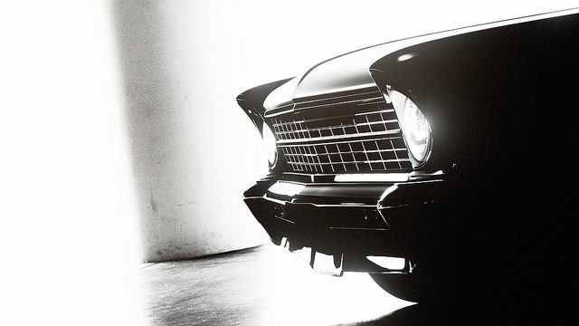


 [/url][/url][/url][/url][/url][/url][/url]


 [/url][/url][/url][/url][/url][/url]


