- 4,387

- Lisboa
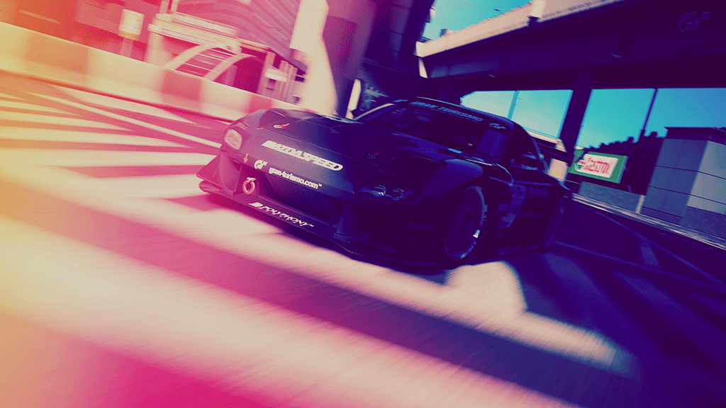
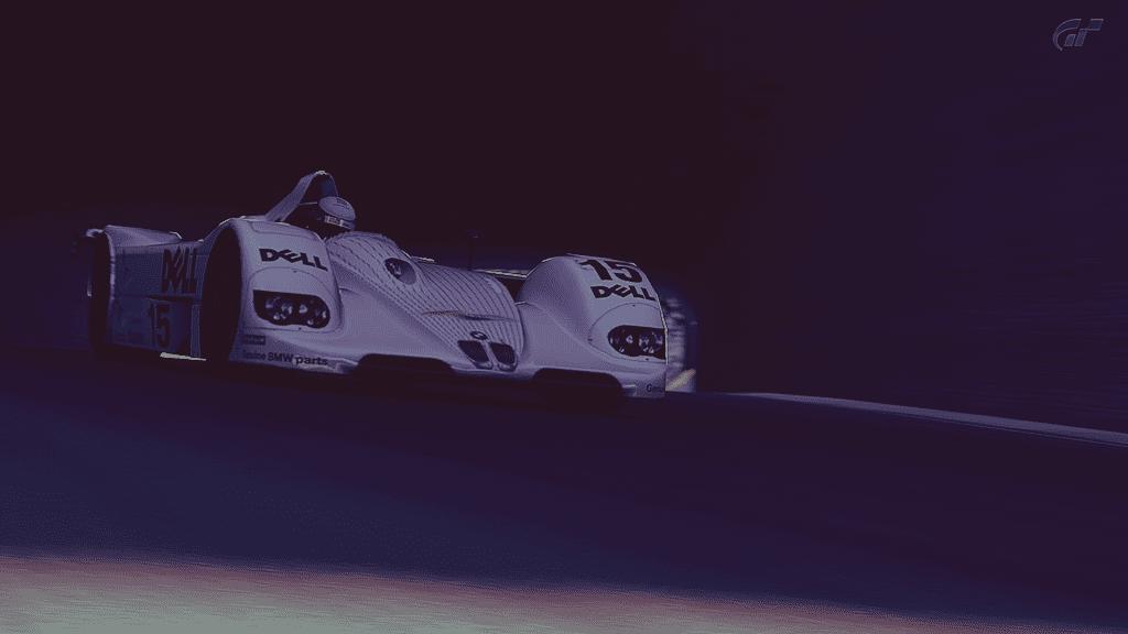
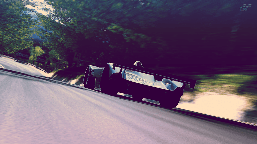
Toning is really good, it portrays the mood pretty good, specially the first two pictures.
The Corvette shots are amazing! Love the dark mood portrayed.
The GT LM set is no worse either, especially the first and second shot. Great job there. 👍

I... love... the... latest... set. One of my favourite cars. Great post-editing work, Michael.👍
You've really found your groove again it seems, nice work on the GT set. I love the last shot, awesome toning work. 👍

3rd and last pic are fantastic.
I simply love each pic of this last set
Composition, angle, light, toning : all is at the best 👍
Toning is really good, it portrays the mood pretty good, specially the first two pictures.
although I feel a couple of them are a little dark, but that could just be my screen etc.Thanks! The first shot still bugs me because it doesn't look like I've done anything to it.
")


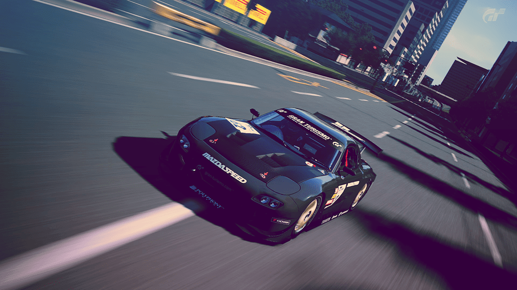
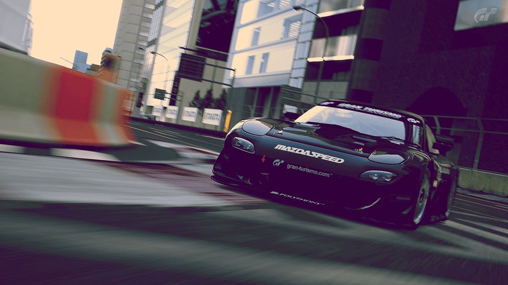
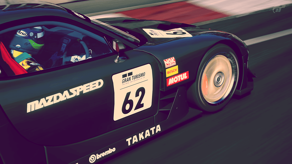
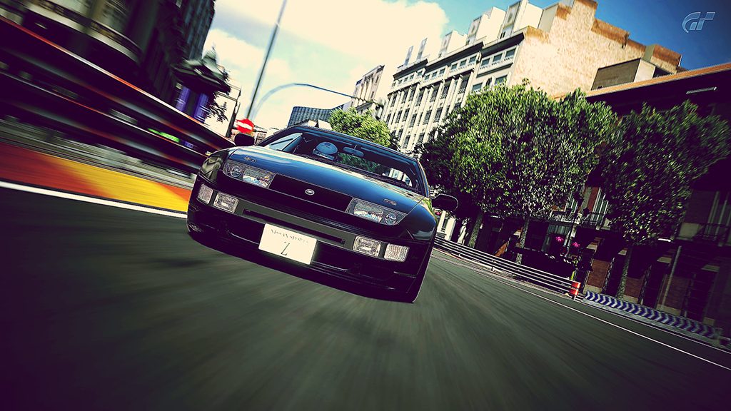
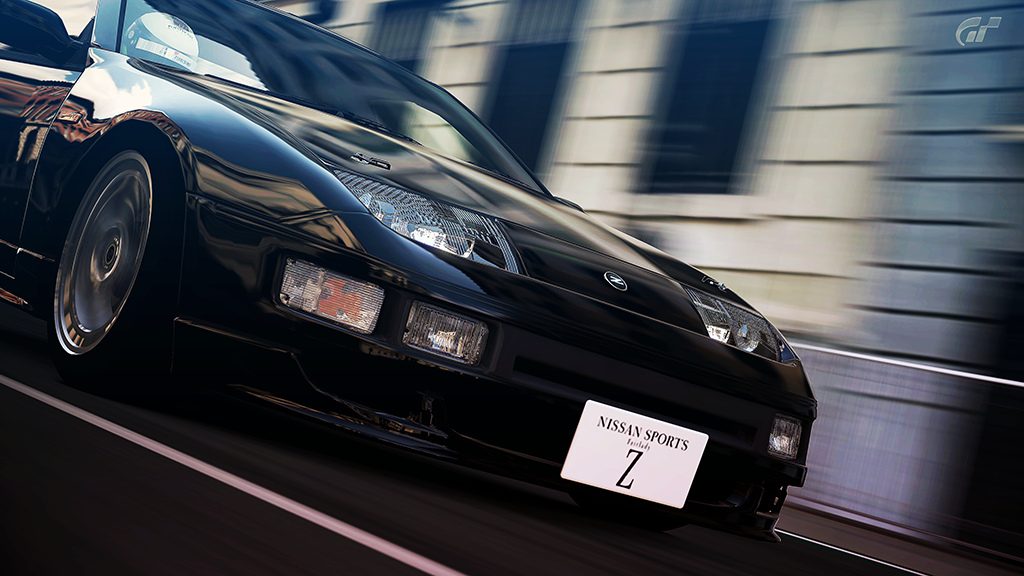
Nice RC-7, 3rd and 4th shots are my fav's
Great RX7 set, love the 2nd last one most!
That's sometimes the better shots
Your last set is once more great mate !
My fav' are the #1, #3 & #5
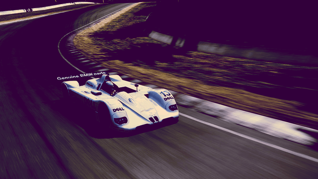
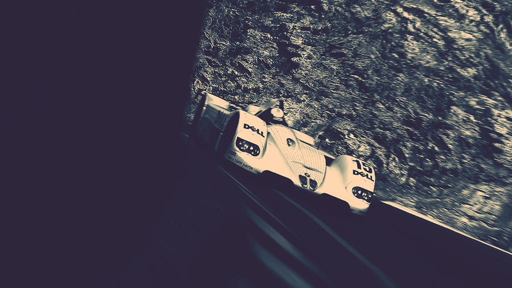
Very interesting pictures you've got here, Michael. I noticed some changes regarding your post-editing work. You're more concentrated on curves and colour balance, aren't you? In any case, I really like the fifth picture because of the high contrast and the relatively realistic tones. Great work. 👍
Tones and composition are lovely!
I like the colour tones in number 1.
Nice toning 👍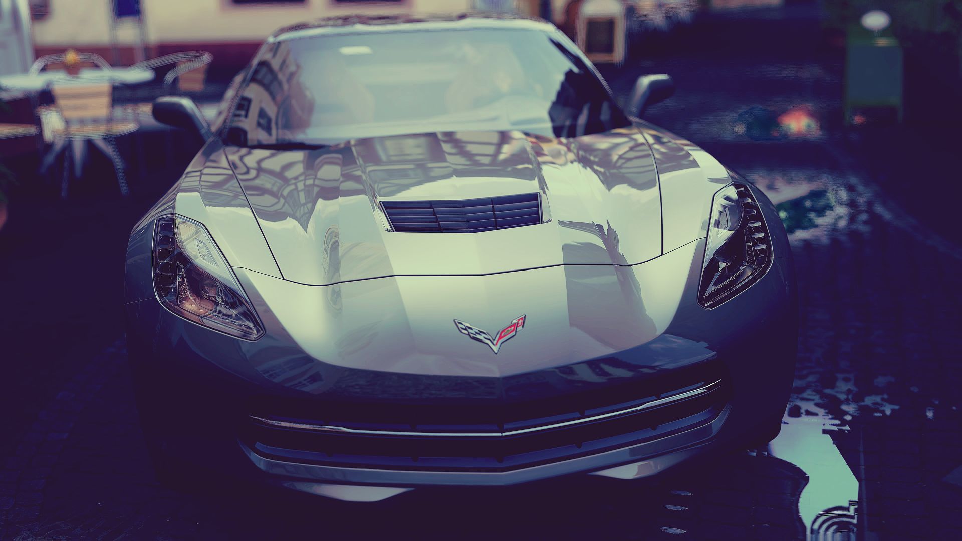
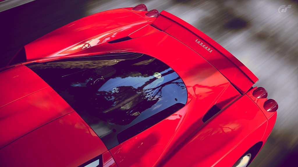
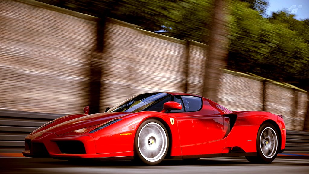
 I forgot how great it looks in red
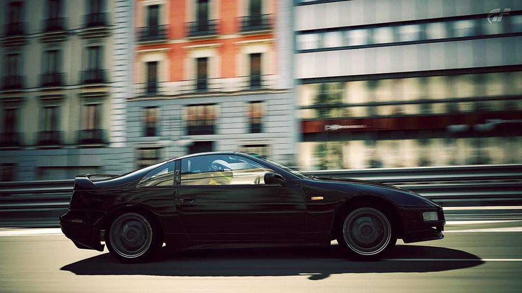
Well they are not as bad as you might think. I would say they aren't you r best work. But still post worthy. So it's good you decided to. 👍
Actually I quite like shot 4 too but the only thing about that one that bothers me a little is the red colour blowout on the hood it makes it hard to define the shape of it when the colour bleeds together.
I agree with George about the toning in pictures #5 and #6. And I also like the fourth picture - I don't mind the car fading out.
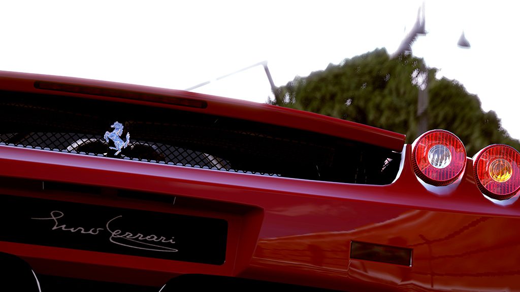
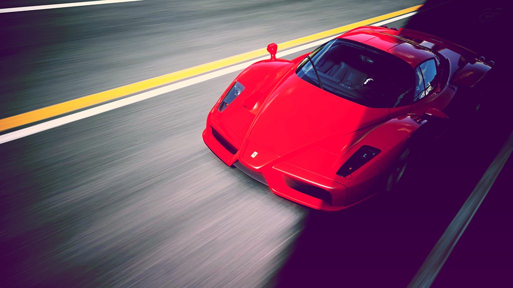
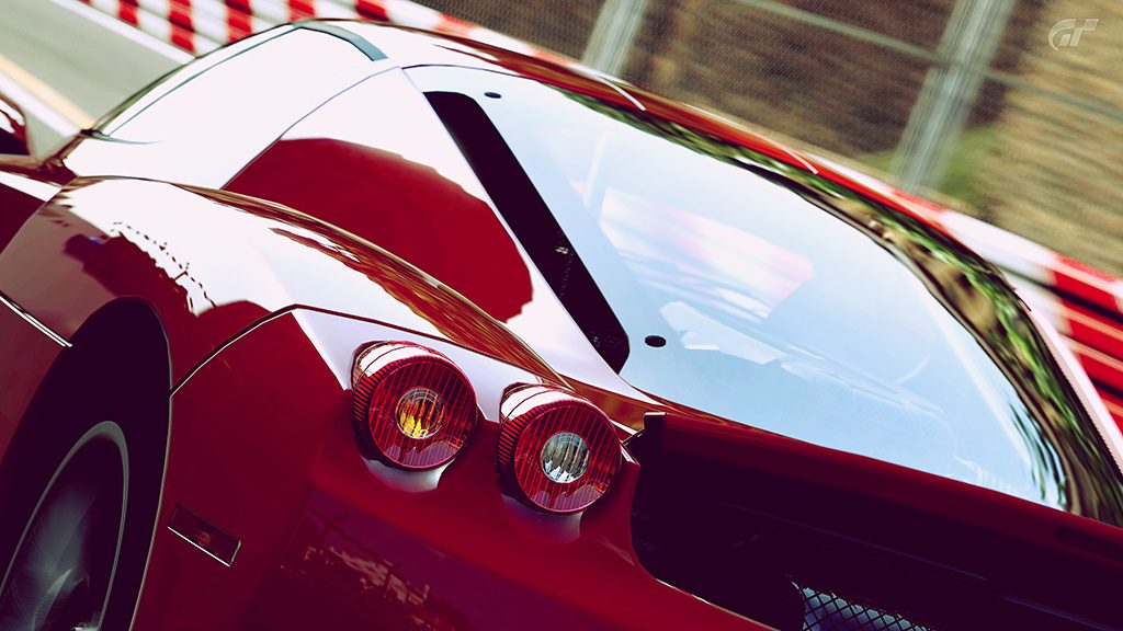
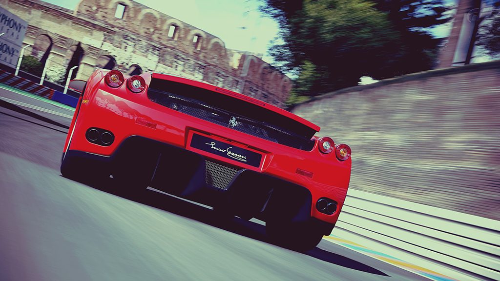
Nice to see you back with some new pics. Very nice Enzo set mate 👍
Great set
Lovely tones and composition . My favorites are #2,4 👍
4th and last are absolute stunners! Great tones and compositions!
That's a great looking enzo set mate. nice work.