- 16,440

- United Kingdom
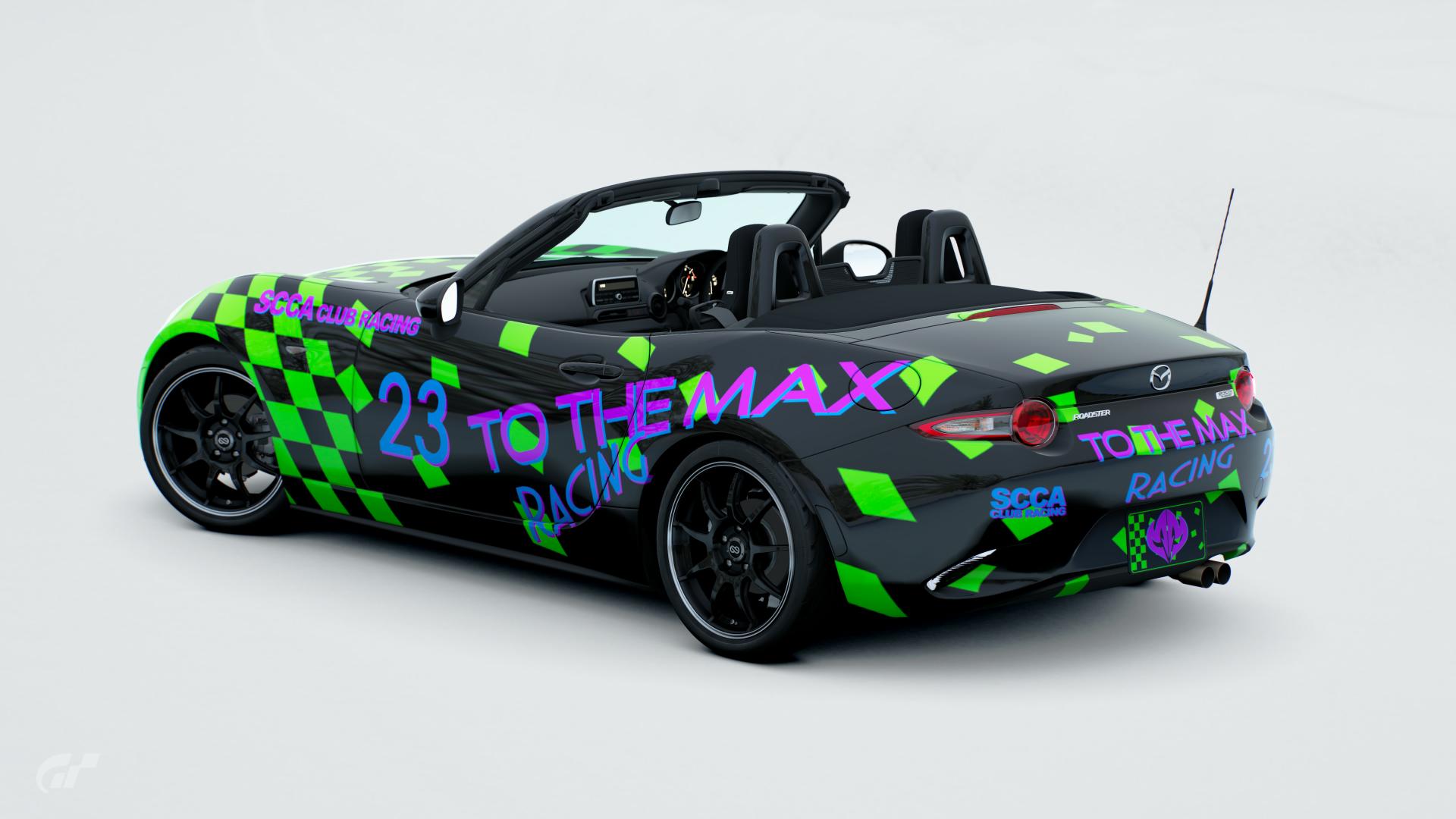
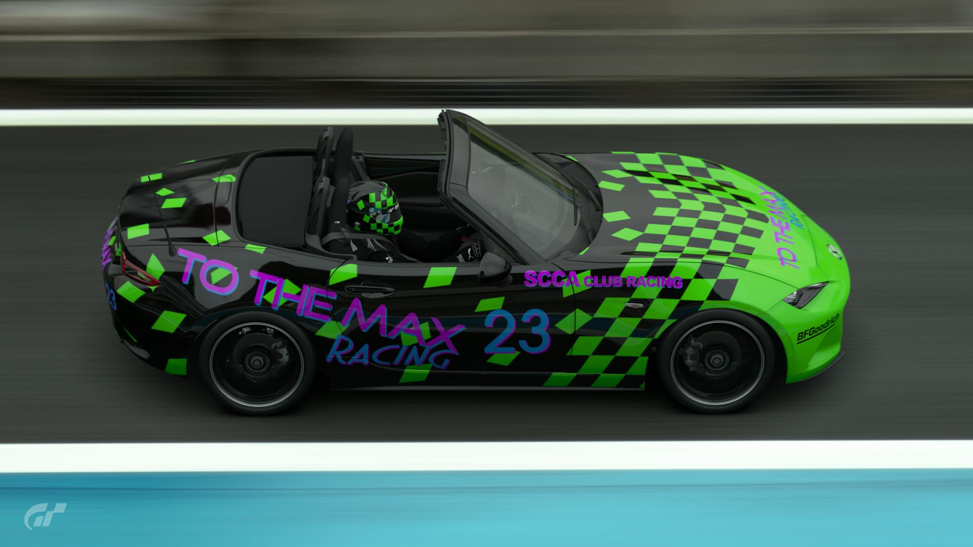
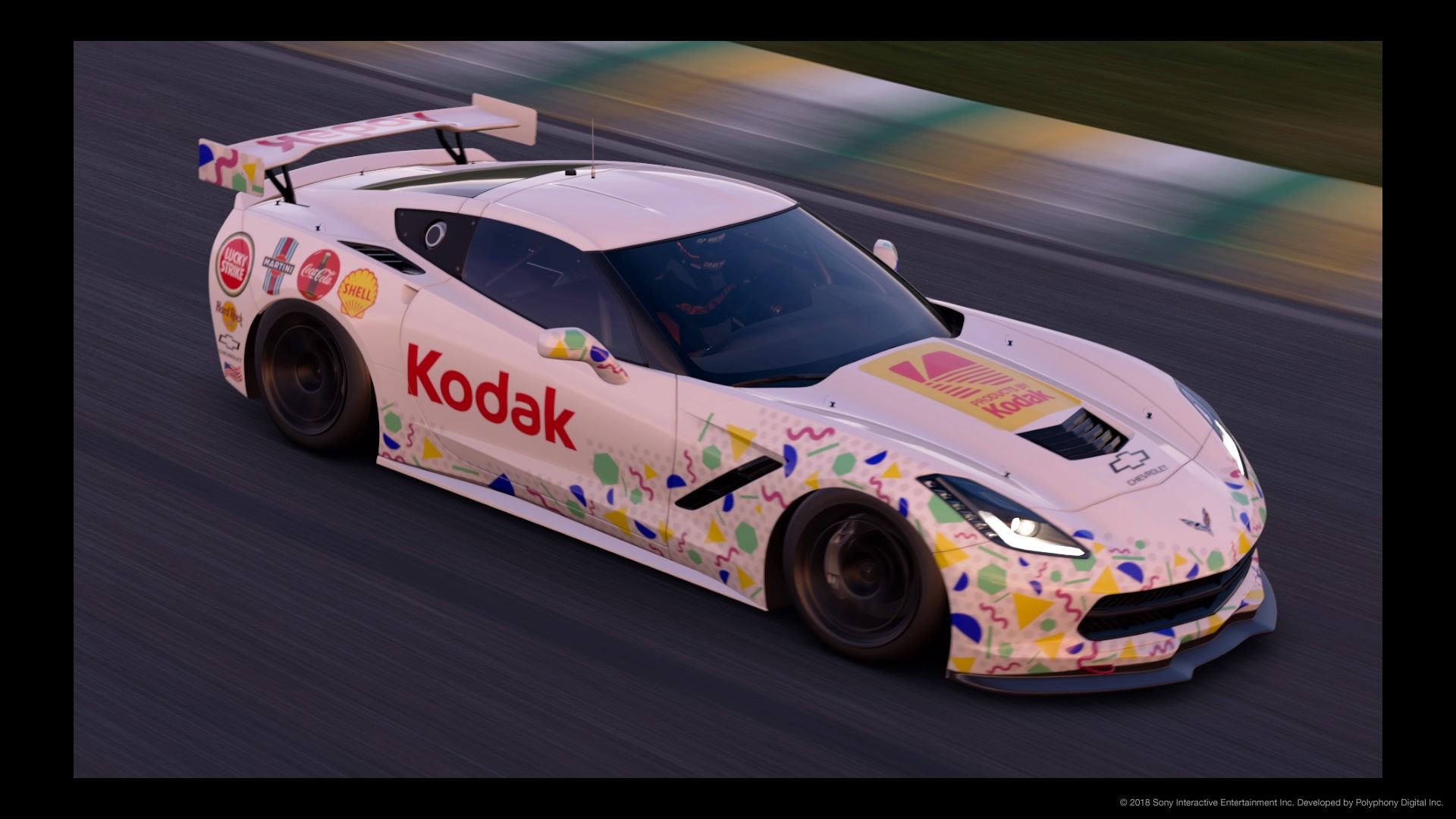
Aaaaand I've just realised I've got a decal on back to front. I'll edit when I get a chance.
nilehciM !
Looks good though 👍
Aaaaand I've just realised I've got a decal on back to front. I'll edit when I get a chance.
this is so on point
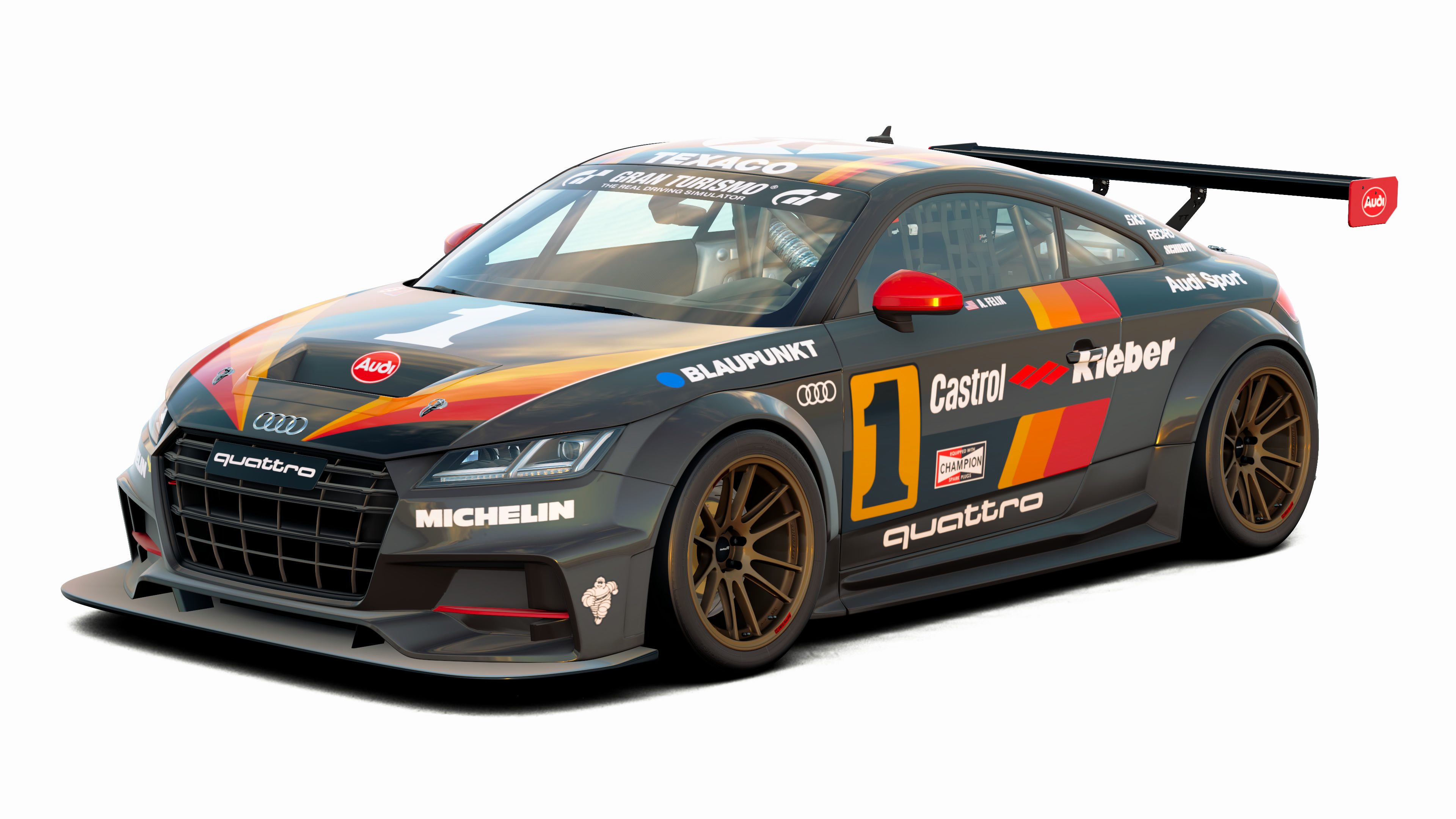
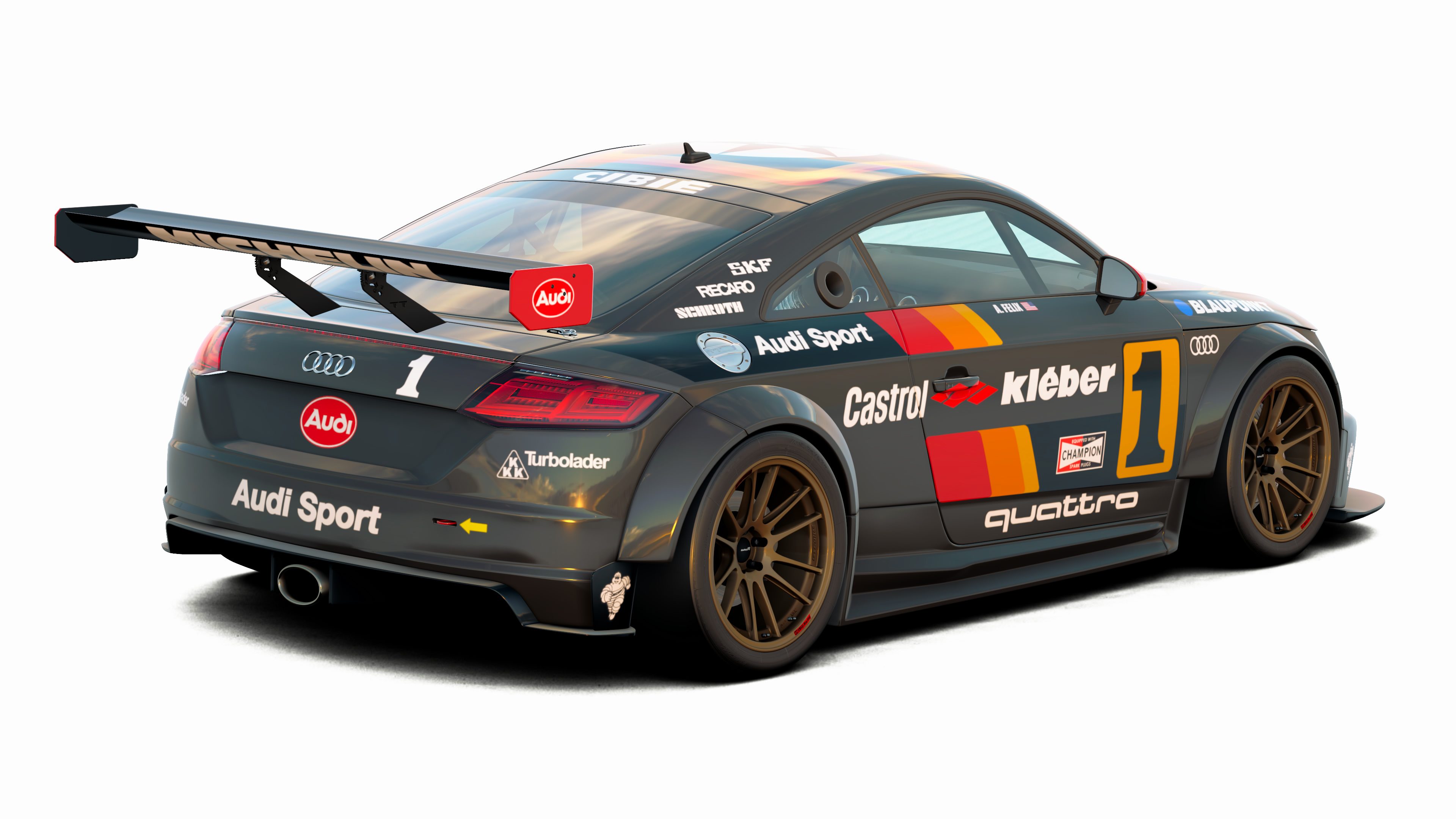
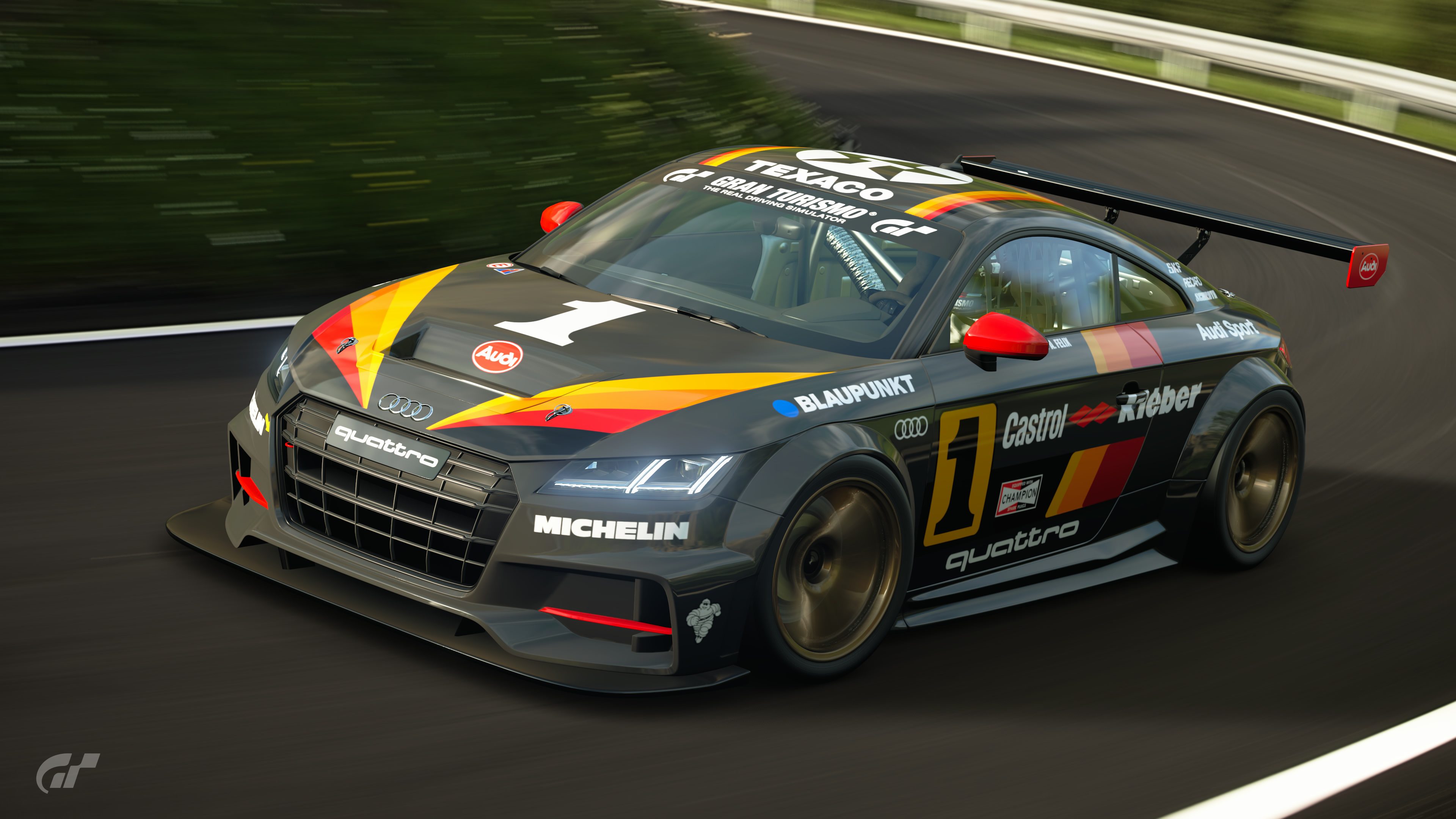
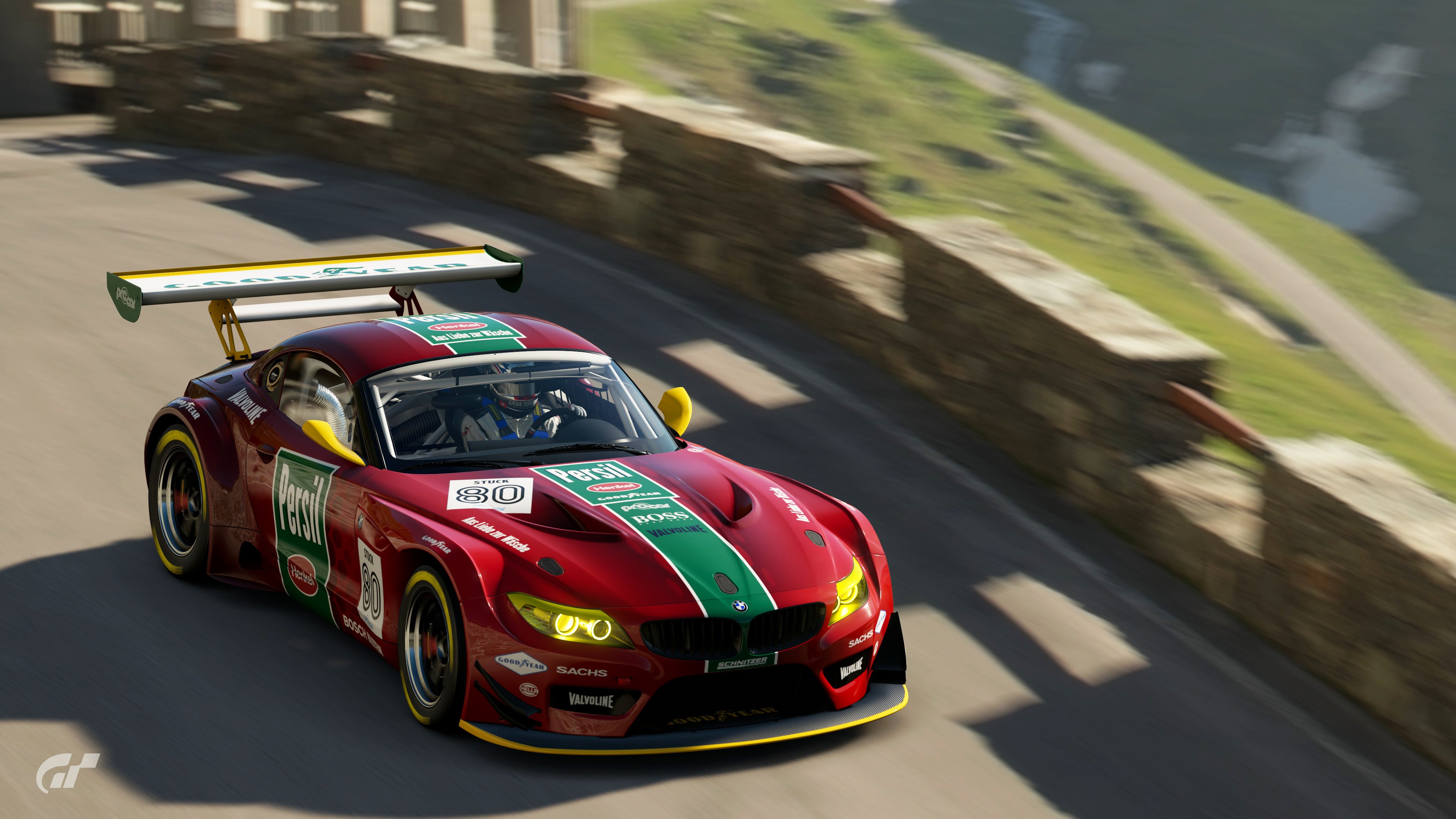
FINAL ENTRY
When I think 80s racing I think about countless hours battling my younger brother and next door neighbor on the craziest tracks we could create. Long before GT we had Scalextric. This is my little tribute to king of the slots.
View media item 44446View media item 44445
How it always felt when we were playingView media item 44444
Livery here for anyone who wants to use it


I was also inspired by the IMSA RX-7's stripes, but I went with a Toyota color scheme, and put it on a Porsche.FINAL ENTRY
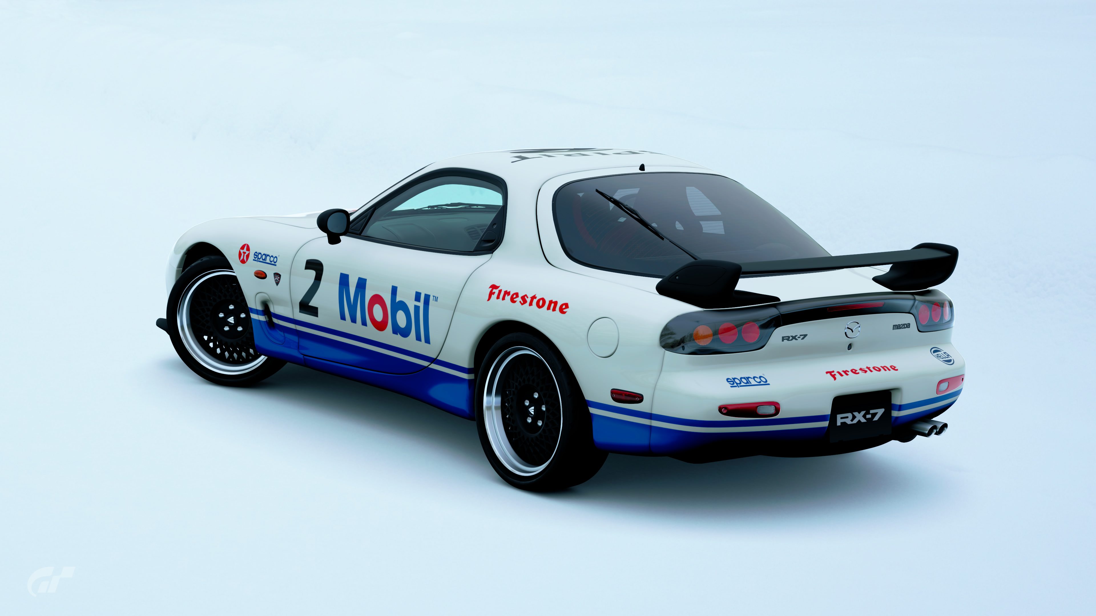
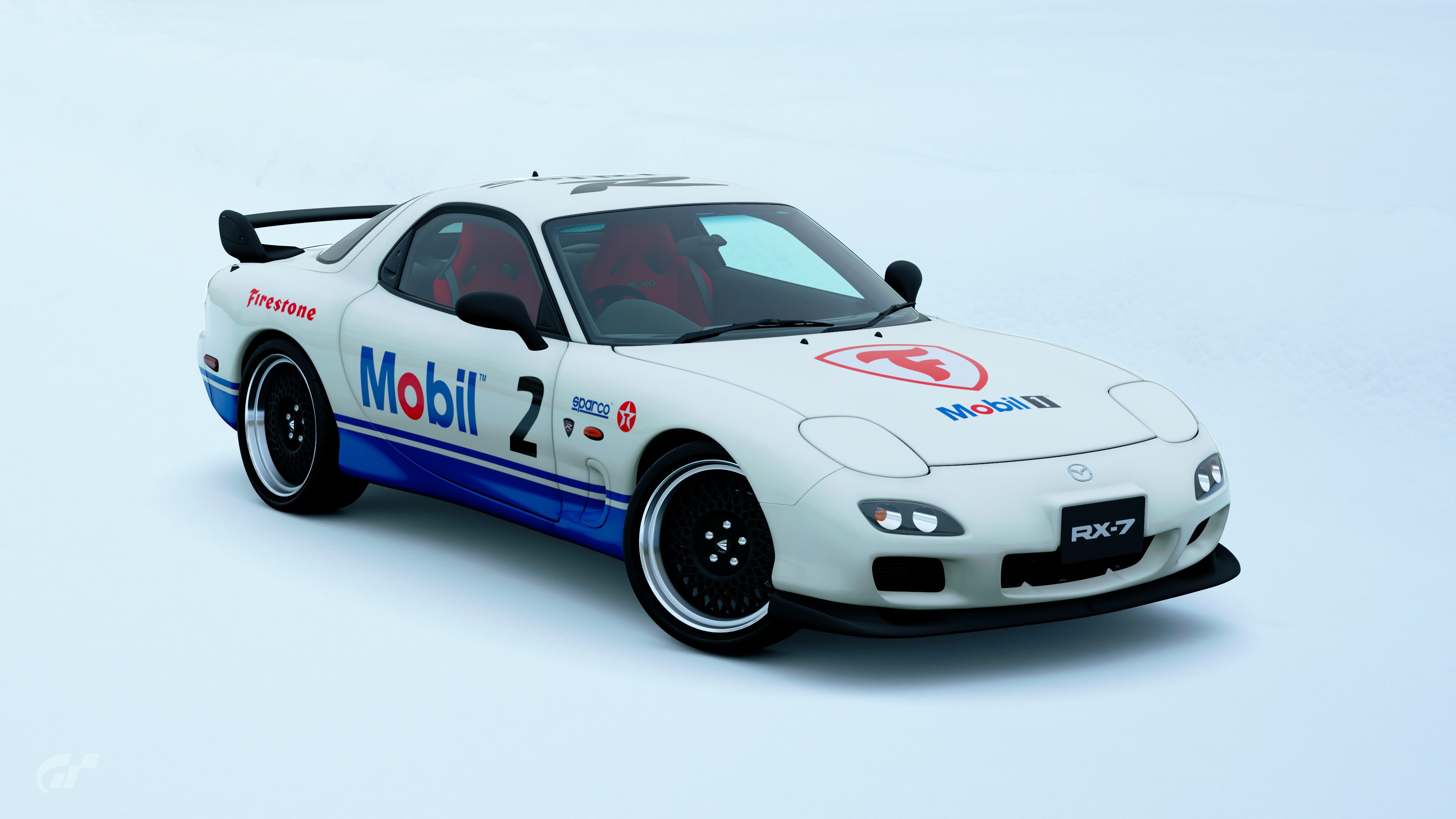
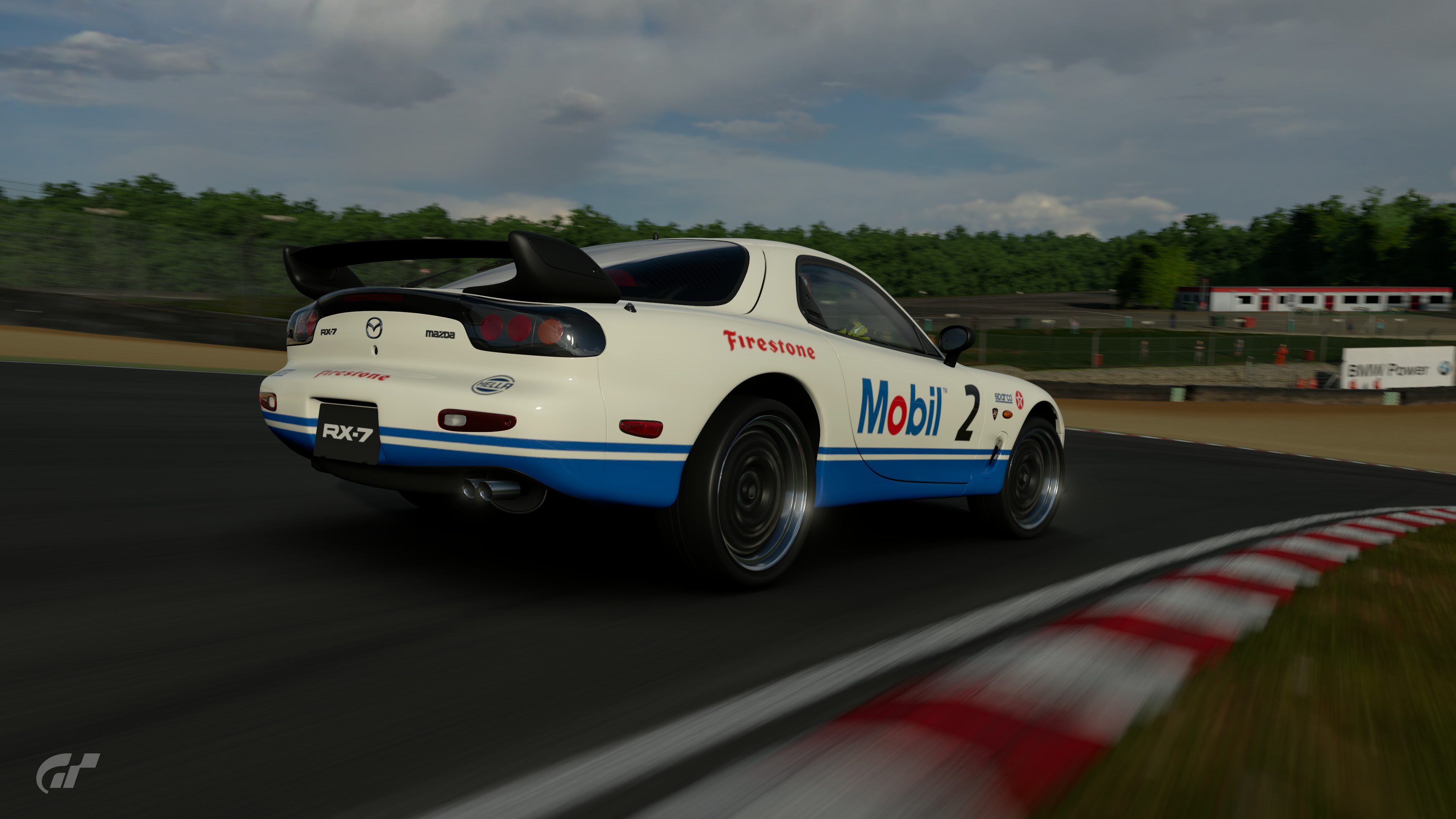
Mazda Mobil1 RX-7
Loosely based on the Mazda RX-7 GTO (the base design of its livery really stood out to me). Since i wanted a more convincing style , a design that you could see in any 80's racing event , regardless of the car , i went subtle with the sponsorships as well.
The only one that actually looks like a 80s livery to me so far.FINAL ENTRY
Mazda Mobil1 RX-7
Loosely based on the Mazda RX-7 GTO (the base design of its livery really stood out to me). Since i wanted a more convincing style , a design that you could see in any 80's racing event , regardless of the car , i went subtle with the sponsorships as well.
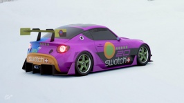
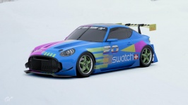
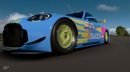
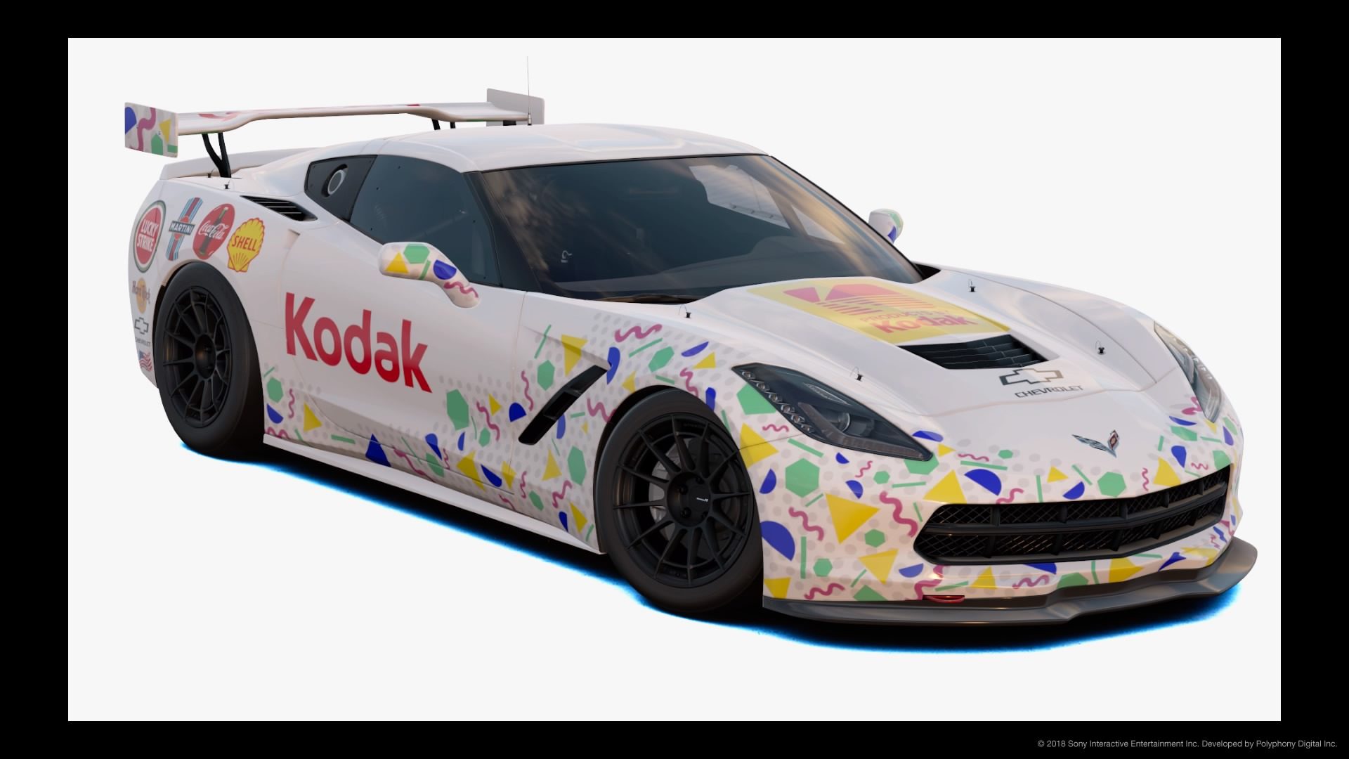
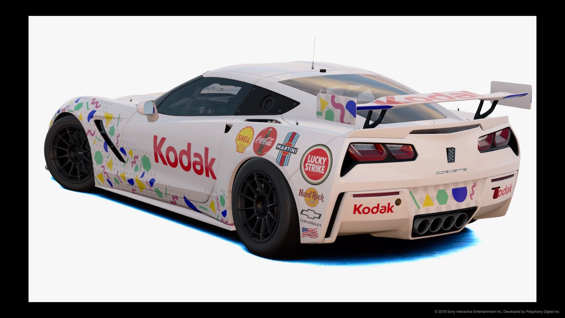
I still have a Maxi Swatch hanging on my wall. Still works! Love it, I don't think I'll ever take it off from there.To me 80's style is about the Members Only Jacket,big hair,OP shirts,parachute pants, and the Ol Big Mac Attack. The big yellow Walkman,with Guns n' Roses playing over the ear phones, skateboarding down the sidewalk with a glass Pepsi bottle in my hand. G.I. Joe and Transformers after school, MTV on the weekends.
My room had a Lamborghini Countach poster on one wall,Back to the future on the other. and the Big Swatch wall clock on the other. Don't lie,you had a Maxi Swatch didn't you?
Every bit of this FINAL ENTRY is made up of decals using the basic shape tool, except for the "Swatch" logo. I feel that if this car were racing in the 80's it's design is strong enough with the brand that it doesn't even need the brand logo on it. I almost posted it without the brand logo on it for a few days to see how many people thought "Synchronize Swatches". This specific Swatch had a different design on each watch band, so the car has an asymmetrical design to it.
View attachment 773584 View attachment 773585
WOW. this is amazing
I think a lot of people are misreading the brief. You're not making a dayglo, huge logos, Miami Vice-style livery here. It's supposed to be a livery that looks as if it was around in the 80's. Not one that gives you a sugar coated, rose tinted view of the 80's.
Only @D-Max can say for sure, but I'd say yours was fine.So in that case does mine not conform? The yellow Scooby? Many thanks
I think it's up to interpretation, and mine follows the rules. Me and a bunch of buddies ran a race car at a local dirt track in the 80's. While I don't remember the exact paint job, it was mostly hot pink/magenta, and blue, and was detailed with an airbrush. The livery was influenced by the time we were living, as is my entry, so to says it's wrong, is being close minded, in my opinion.I think a lot of people are misreading the brief. You're not making a dayglo, huge logos, Miami Vice-style livery here. It's supposed to be a livery that looks as if it was around in the 80's. Not one that gives you a sugar coated, rose tinted view of the 80's.
It is somewhat an idea to yes, use some imagination but also, I love 80's designs and always been curious how people bring the 80;s to the present day. In my opinion, the simplicity of the 80's designs is the best era. It's when things started to really change!I guess one of the challenges, and this is not a criticism of the theme, is that old style liveries on new cars can sometimes take away from the 'classic' look of a design.
However, I like this theme because it challenges people to use their imagination rather than simply trotting out replica designs.
")
do your commodore and see how it goes! no harm in having 2 with the same sponsorFINAL ENTRY
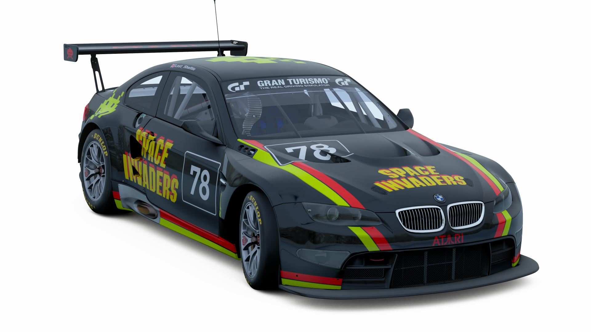
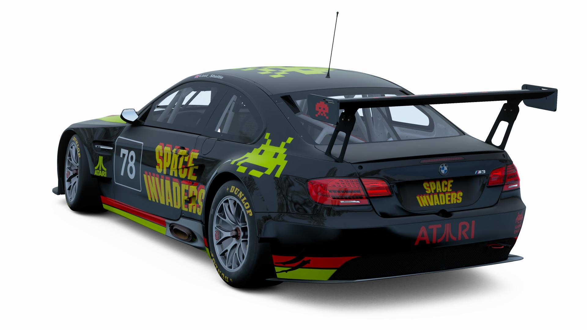
Space Invaders M3 GT3
Chose space invaders as while I never got to play the game when I was growing up, the number of games I played that stole its aesthetic was immense. I tried to stay true to the simple design with only the logo being complicated. Hope it is ok.
Sadly I was too slow to do a Commodore one, so will have to leave that half formed idea for another day (@McDotter is better than my idea anyway)
Sadly I was too slow to do a Commodore one, so will have to leave that half formed idea for another day (@McDotter is better than my idea anyway)