The "Rate My Photo" thread! **Read the OP Before You Post**

  • Thread starter MSD Drifter
  • 2,388 comments
  • 164,751 views
8424484172_473819b769_c.jpg
[/url] Laguna Seca Raceway_4 by wilza01, on Flickr[/IMG]

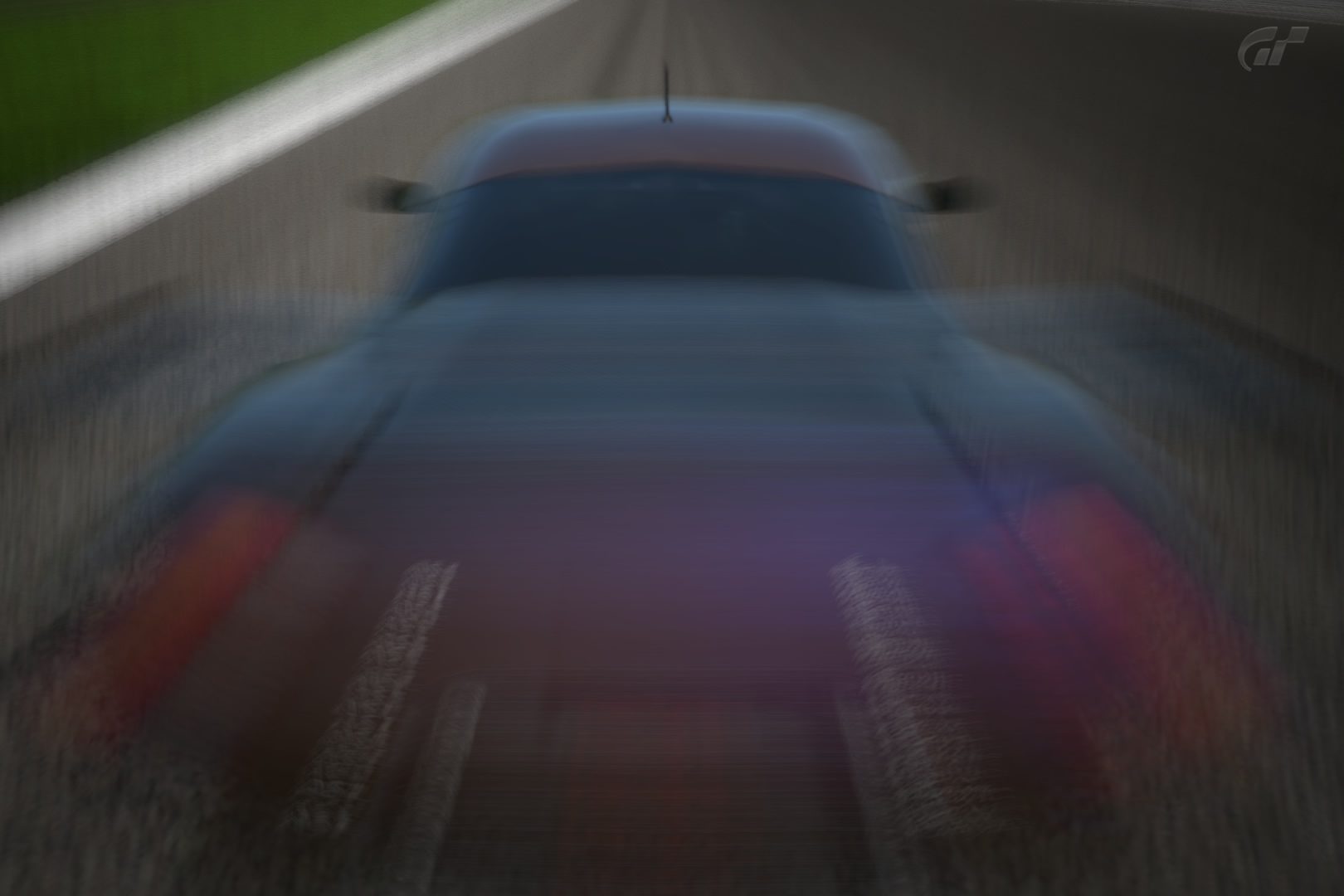
This is a very nice photo especially considering it has not been edited at all as far as i can tell. It has the blue tint from that cool filter that makes it look like a nice drive in the morning. The only problem i have with it is its too centered on the car. I think you may have been able to angle is a little bit better towards were you were going and make a little more of a interesting look. For me... and my rating system, 7.8523/10 (7.9/10)

------------------------------------------------------------------------------------------------------------

Mine: Its my first attempt at a snow edit and while im not really satisfied with it, i need some feedback to see were im at with the editing. Ps... this is also my first edit that took more than 5 seconds using some filter on photoshop. So be constructively mean XD

snowedit.jpg

Origional: http://imageshack.us/a/img33/4720/nrburgringnordschleifeh.jpg

I know the sunrise kinda messes it up a bit but idk how to fix that.. or the tips of trees all that well.
 
Last edited:
Oh god, those are fantastic! I don't know what to criticize. Maybe the last shot would have been a tad better if it was done in the middle of tunnel but that doesn't change the fact that I love those photos. It's a 9.5 from me. :)


Pure Monster - The F40 by DocArmor98, on Flickr
 
I like the fisheye effect, the angle is a little weird for me tho. The colors are nice and vibrant. I'd give this 8/10, i would also like to add that in my opinion the pic would be more awsome if it would focus on the engine.

Here's mine, these are unedited:
Suzuka_Circuit_1.jpg

Tokyo_Bay__Kart_.jpg

Special_Stage_Route_7_3.jpg
 
^^^^
1. i give a 9/10 i like that old feel to it with the black and white filter

2. 5/10 i just can't deal with the angle.

3. 8/10 it's good, it has a nice sense of speed.

19007_396127593811202_1800725757_n.jpg
 
wiithepeople:

1: The car doesnt stand out, it has been blended to the asphalt. Not my cup of tea

2: Very artistic pic, i personally dont like it.

---------------------------------------------------------------------------------------------------------------------------


Click for bigger version!
 
I'd say 7.5/10. Love the atmosfere but I think that the composition could be a bit better, also the numberplate feels wrong.


Beautiful Spring by DocArmor98, on Flickr

The picture looks absolutely wonderful! Love the dark, muted tones in here.
The soft filter is doing the image justice; brings forth a 'ghostly' feel that is very much felt.

You've managed to make the car stand out in the photo and not let it blend into the objects around it.
Your colour choice provides the 'pop' a photo with muted tones like this very much would benefit from.
The contrast of the photos is also done very well, aiding the object of focus in standing out but I feel that the shadows and midtones could be lightened just a little, especially around the body of the car.
The over-exposed sky fits very nicely into the 'ghostly' theme pushed through.

Composition, while great, can be improved on if you left more space between the car and the right border. It would also provide a much better perspective, IMHO, if the focal length was decreased a bit.

Great photo, great mood, great tonal work, good composition. Tiny areas of improvements, but a solid 8.5 for you.


My turn: :)

 
Lets revive this!
I like that picture, good use of the angles. I think it is a little dull in colour though, but it definately has character. 8/10!

N%C3%BCrburgring%20Nordschleife_9.jpg
 

Hmm, I think I'd give this photo a 6/10. Ilike the toning, and the colour of the car is great. However, the angle is a bit unnatural, and the composition seems a bit random, without any sort of unification. Also, the dive planes detract from the look of the car.


Latest Posts

Back