I think It's pretty good...
Pretty neat picture. The cool toning suggests a mood of a misty early morning test drive. The blue isn't overwhelming and it sure isn't lacking, so props to you on the toning department. However, the roof of the 787B looks to be a bit over-exposed, but that might most likely be due to the chrome roof the car has, so no biggie.
It looks like the photo was taken from afar, and suggests a bystander behind the guard rail taking the photo. While that itself is a pretty neat concept, the photo would've benefit from a lower f/number, say f/2.0 or f/2.8. A little bokeh would be nice too.
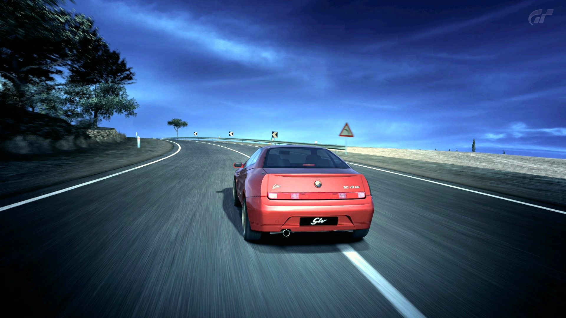
The lack of motion also killed it a little, the way the car was positioned actually looks as if it was moving, and not static.
Composition looks alright, with the rule of thirds being obeyed in the photo.
I especially like how you've managed to capture the side of the car with the rear still being the main focus. However, while composition being faultless, it isn't something people would go drooling or 'wow' at as it looks a little standard. Try tilting the camera more to allow for a steeper, wackier angle, or some other new compositions that makes your photo stand out from the rest.
But nonetheless, good job on the already good composition.
You've improved quite a bit since your first picture, so 👍 to you.
") 7/10
7/10- Great toning, good mood, good composition, but lack of motion brought it down.
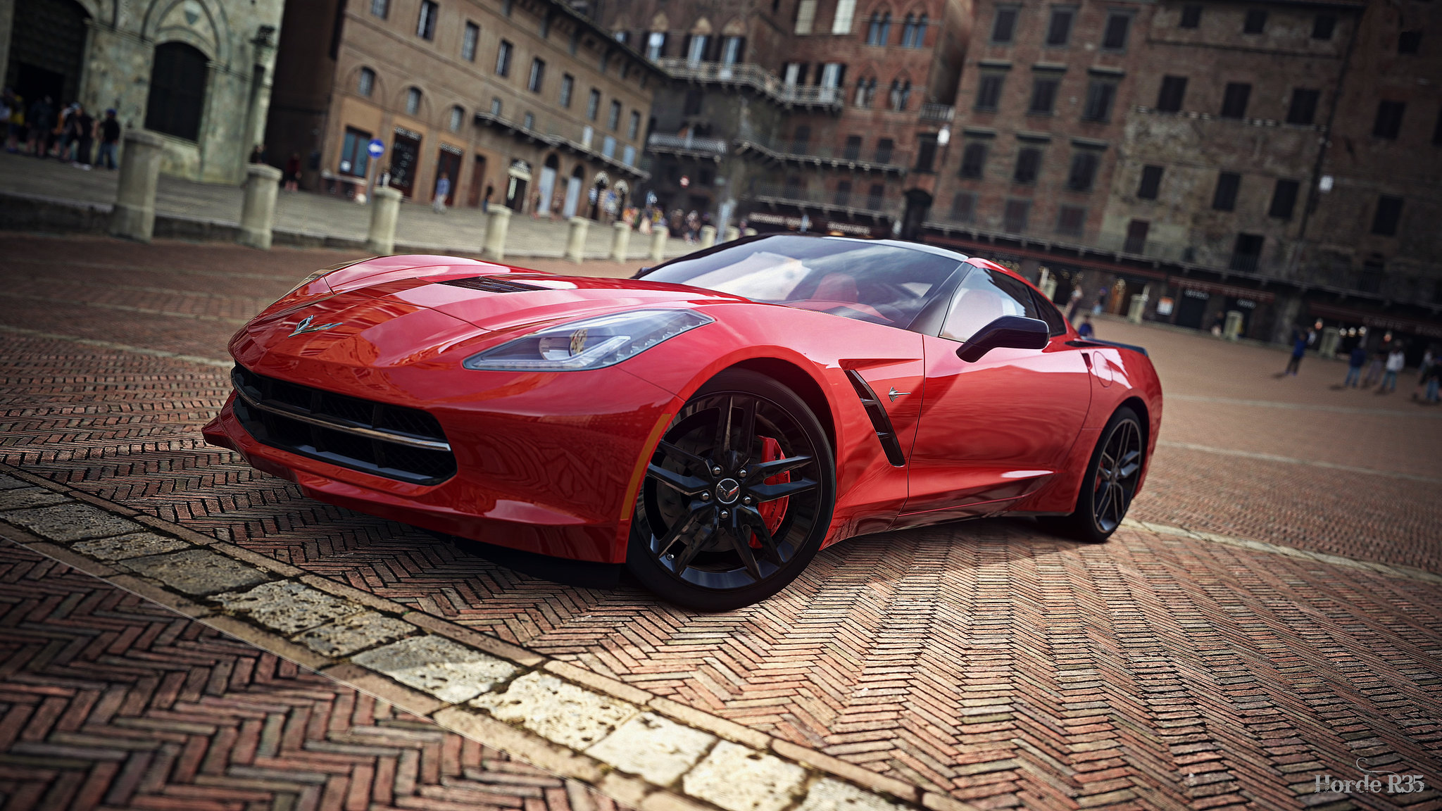
Here's mine:


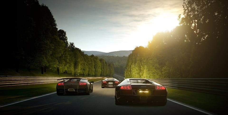
 .
.
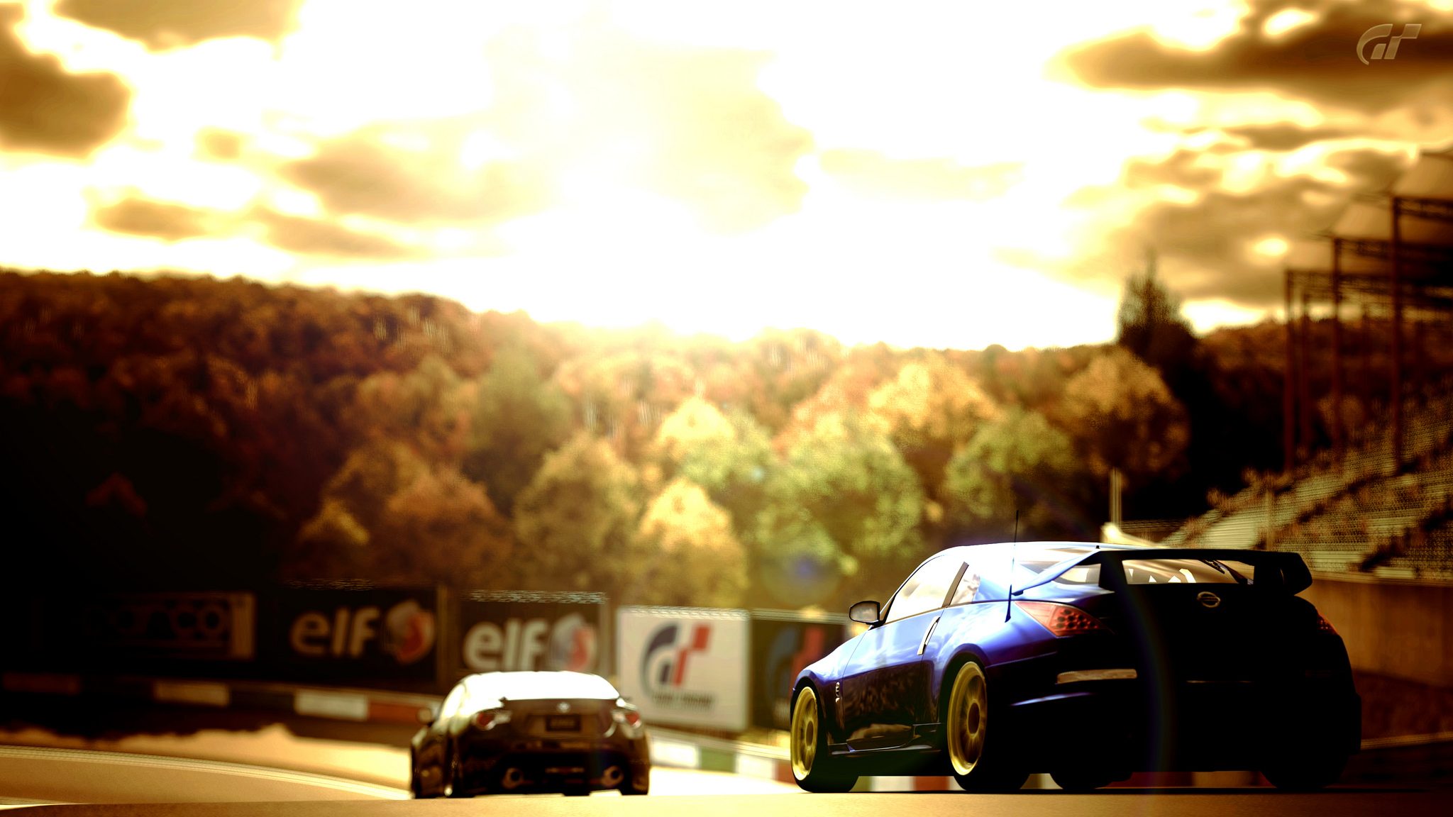
") Of course, everyone has a different taste.
Of course, everyone has a different taste.


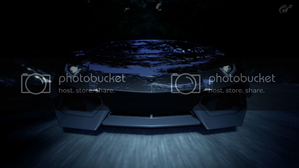
 Otherwise picture is perfect. 9.99/10