


Just started to use the full options on the camera and I don't have photoshop. But I would like to know how you think they look and how I could improve them.
I like the picture of the maserati, are the edges of the pictures meant to be blurred or not? 7.5/10
Tried to go for a realistic downhill shot, I think it paid off but hey, your the critiques

Love the interior shot, how do you do that? 9/10

")
That pic is just mind blowingly awesome, well done 10/10


That pic is just mind blowingly awesome, well done 10/10
I like the idea, i think its paid off but i would of made it a little clearer 7/10


Nope, did a little bit of tinkering with Paint.NET though, just in the saturation and brightness/contrast
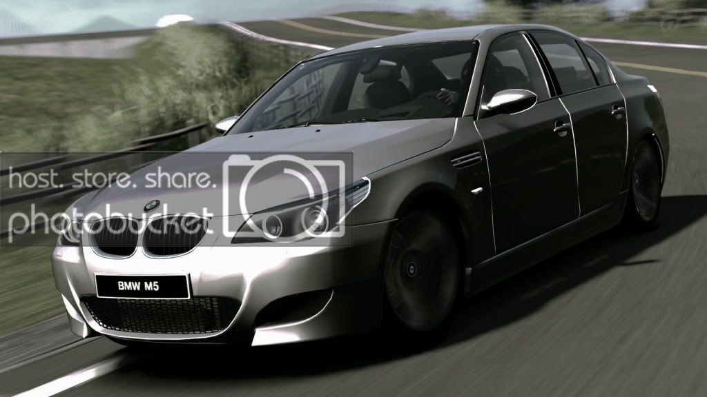
Nice, thats much better, less shiny. Can't see anything wrong with it except the spolier disappearing at the back. 9.5/10!
Here is another, no editing whatsoever!
Sorry about the small pic size though!

8/10
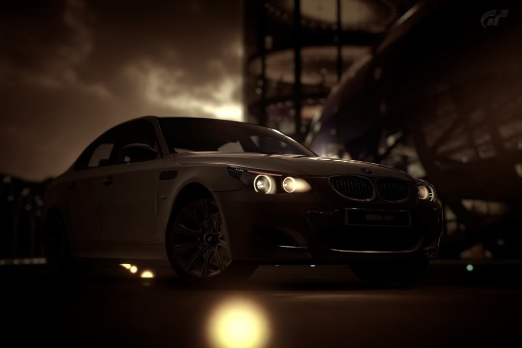
I like the glowing brakes but the angle could been better.
Circuit de la Sarthe 2009 (No Chicanes)_7 by screiinshot, on Flickr
 10/10
10/10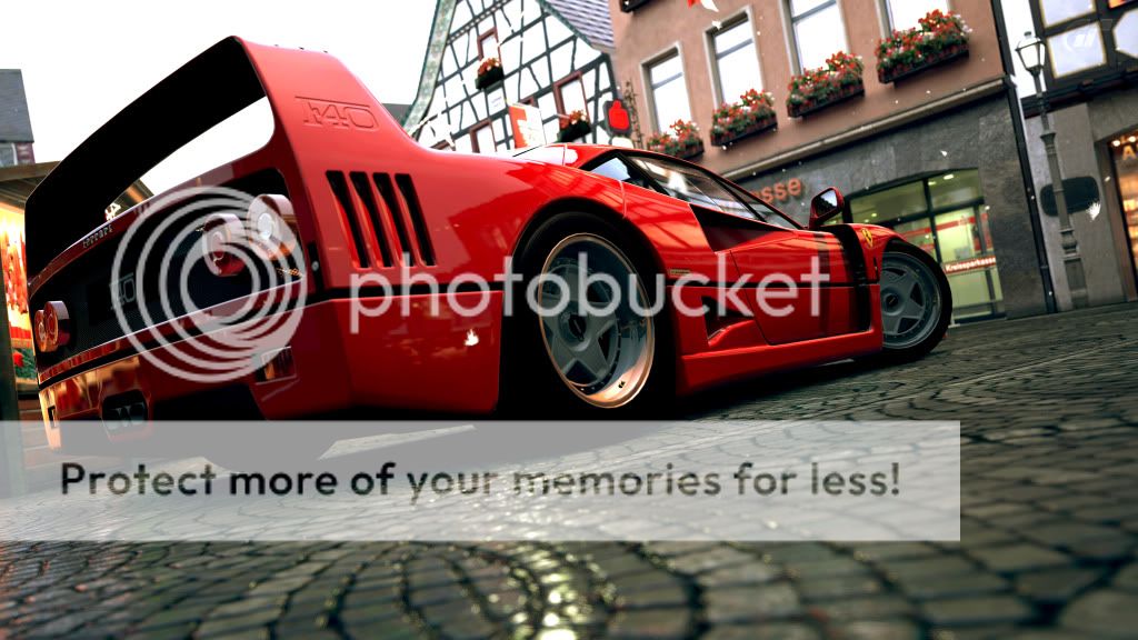
Very Polished and detailed, very realistic overall I really like this Picture 9.5/10 👍
Click for super size.

Heres Mine
(Click For 1080p Recommended for full quality)


") 8/10
8/10


