- 146
- GTP_zdawood
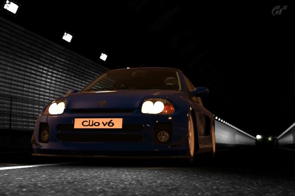
What do we think of this......? [IMG[/IMG]
I'd recommend increasing the contrast, otherwise it has interesting composition. 7/10.
Here's one of mine

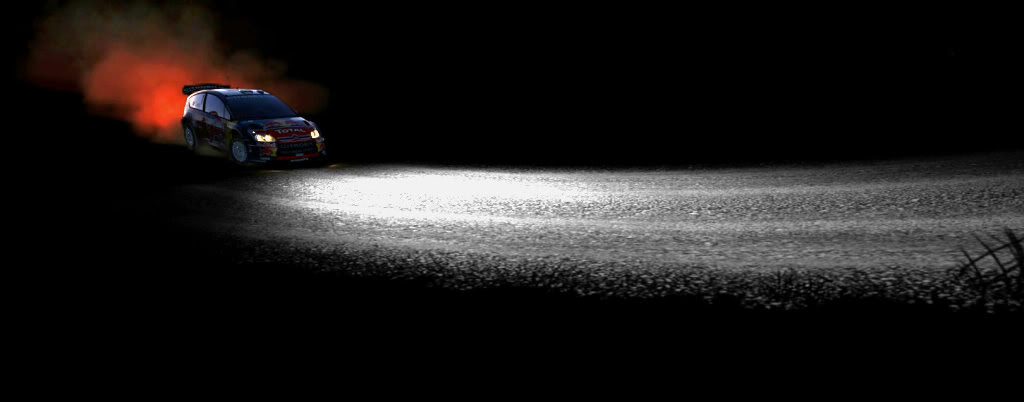
What do we think of this......? [IMG[/IMG]
Here's one of mine


I spent like half an hour editing that last one and I didnt get what I wanted :/


nice one
really liked the focus setup but you could have given more bright to it although you could have done an awesome HDR in this photo, try it
mines:
I spent like half an hour editing that last one and I didnt get what I wanted :/
Thanks to SuperVeloce for the 9/10
Also thanks to Epic-Name & rev91 for the comments
Going to do a double rate:
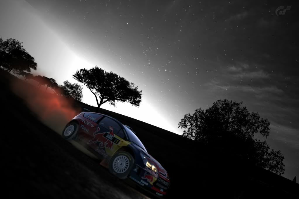
Rev91, I would go for a solid 8/10 for the first shot, I really like that
7/10 for the second as I feel the red is too rich against the darkness that surrounds it, none the less a great pic
GregTheStig nice pic for a standard car gonna go for a solid 7/10 as well.
Another picture from my gallery:

Here is my pictures!
Kyoto - Gion_1 by Kristoffer Hesselberg, on Flickr
Kyoto - Gion by Kristoffer Hesselberg, on Flickr
High Speed Ring_1 by Kristoffer Hesselberg, on Flickr


That first pic is lovely, the shine of the lights off of the car, even in black and white looks class.
3rd pic is weird. The angle of the right rear tyre is mad, looks like there is a ton of pressure going through it.
") And i know xD
And i know xD
I spent like half an hour editing that last one and I didnt get what I wanted :/
Try to add a bit more of the car..
LOL pimpmobileContinuing along with the awesome R8 theme . . .


")

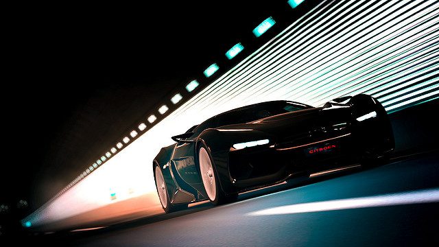
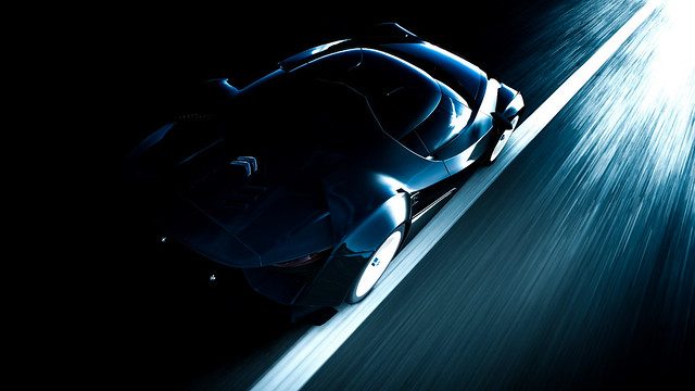
Tasteful use of partial colour? Yes please, 9/10. Love the minimalism in this, and (like everything) while it won't be to everyone's taste, the lack of a background just works. The only things that let it down for me is that the Citroen seems slightly out of focus, or possibly using a longer focal length to give the car more presence in the shot. Keep it up!
Anyway, time for some monochrome, just a general critique please
 8.5/10

Anything on this one would be appreciated:


dandroid13


1) Not a good photo, but not that bad. I assume the focal point is the X2010 because the camera is panning it. That said, composition is unpleasing, as it is too far down on the picture plane. Perhaps if you either composed the shot from that angle a bit farther and zoomed in on the car more, it would be a bit more pleasing, and details like the mountains would be distracting.
4/10
2) This photo suffers from the same problems as the first, but with the subject even less emphasized. When I first began photography (note: real life photography), I was told a few rules,
a) Simple subject
b) Fill the frame
c) No distracting background
d) Experiment from all angles
On your next shoot try taking these rules into effect, and I think you will be pleasantly surprised.
3/10
Now for my photos.


Would like an overall critique of this please!


