The "Rate My Photo" thread! **Read the OP Before You Post**

  • Thread starter Thread starter MSD Drifter
  • 2,388 comments
  • 185,863 views
VWScir.jpg

Since some people skipped your pic, I'll rate it. :) I would say it's a 9/10. Very artistic, even though some may think of it as a bit of a mess. The lighting is a bit bright though.


A close up of the McLaren badge looks good along with the detail of the rear. However, the focus is a bit odd and the filter darkens quite a bit of the detail. Can be rather difficult for someone to try to determine what is being focused on in the image. 6.5/10

Couldn't think of which to post, so I'll post these two.
nrburgringnordschleife8o.jpg

grandvalleyspeedway22.jpg
 
^^^^^

A nice sense of .

What?
The veyron looks like a premium. But because it is against a imaginary race car, I will knock marks off.

7/10
Although that is true, you are rating the visuals of the picture, not the contents:grumpy:

The combination of a blurry background and the low shutter speed(+panning mode 2/3?) make the Scirocco stand out nicely. The bright paint makes it look nearly like a standard though.

The lens flare (although sometimes unavoidable) does distract a bit, as well.
7.50/10
 
Since some people skipped your pic, I'll rate it. :) I would say it's a 9/10. Very artistic, even though some may think of it as a bit of a mess. The lighting is a bit bright though.


A close up of the McLaren badge looks good along with the detail of the rear. However, the focus is a bit odd and the filter darkens quite a bit of the detail. Can be rather difficult for someone to try to determine what is being focused on in the image. 6.5/10

Couldn't think of which to post, so I'll post these two.
nrburgringnordschleife8o.jpg

grandvalleyspeedway22.jpg

Hmmmmmmmm, Interesting, the photos look well planned, done properly and show good sense of speed but they seem a little bland, still good pics 7.5/10

This is my first photo being reviewed, so if you think its bad (you probably will), tell me how to improve please.


[url=http://www.flickr.com/photos/zupplu/6626202177/] lamborghini murcielago lp670-4 svEifel (Circuit) by Zupplu, on Flickr[/URL]
 
^Not bad. Good action, but the car looks like a standard. The front end seems unrealistically flat, and that takes away from the rest of the action. 7/10

ToscanaTarmac_13.jpg
 
^Not bad. Good action, but the car looks like a standard. The front end seems unrealistically flat, and that takes away from the rest of the action. 7/10

ToscanaTarmac_13.jpg


I like the angle, the car and the scenery. But I just feel the whole picture is missing a bit of drama you know. It may be that you had the shutter speed too high. Oh and the quality of wheels don't look that good. Overall 6/10


GOLF r by Matt-Mtb1996, on Flickr
 
I like the angle, the car and the scenery. But I just feel the whole picture is missing a bit of drama you know. It may be that you had the shutter speed too high. Oh and the quality of wheels don't look that good. Overall 6/10


GOLF r by Matt-Mtb1996, on Flickr

I like it, but nothing makes it stand out, so a 8.5/10 for you

SanGimignano-TownSquare_1.jpg
 

Your photo was skipped over!
This is a well laid out shot. The angle makes the front end of the shot lower than the rear, which is good for adding action and speed. The shutter speed and exposure are at very good settings. There is not too much smoke in the picture so realism is there, and car placement is great. And it is quite pleasing to the eye with the balance of warm and cool tones, especially for an unedited photo.
I say 9/10. 👍
Now someone rate Jahgee1124's photo.
 
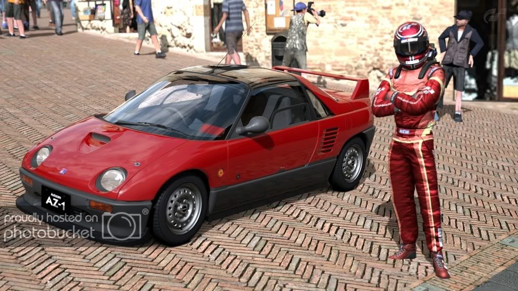
I like the AZ1, but with that bodymods it looks weird. Anyway, without the bodymods it would've been better, so you get a 7/10

 
Good shot. The angle gives a good sense of speed, but the trees look so 2d! :crazy:This is not your fault of course, just bad scenery. 6.5/10


[url=http://www.flickr.com/photos/zupplu/6626204773/] dodge viper srt10 acr Trial Mountain Circuit_2 by Zupplu, on Flickr[/URL]

The shot is okay. The shot does seem to lack balance and seems uneven because it has the car take up half the photo while the other half seems completely void of anything. Although pictures like that have the potential to be great, I just feel that a little tilt could make it better. Also, the photo feels plain with the way you set the picture, and maybe a different camera angle can capture the moment better. But good job on being able to emphasize the highlight of the picture (Dodge Viper) with the lighting and filter (although the background seems a little TOO out of focus).
7/10


Here is mine.

6286553737_8ebee153ca_z.jpg
 

OK I'm going keep it real and not sugar coat like most of you here. I think its a pretty good shot BUT personally i think that it lacks emotion. I feel like its been done over and over and over. It's not a bad shot but it's really boring and played out.

Verdict - 5/10

Here is mine. Don't be afraid to speak your mind. We are here to help each other be the best we can be right?

6646934789_0ef57acebe_b.jpg
 
The colors seem too blended together. The car color is yellow, and most of the shot (mountains, grass) has a yellow tint, so there is not a lot of contrast or focus on the car.
I like the focus. The background is not too blurry, but blurry enough. Good job on that.
There is not a good use of motion. The shot is too stationary to be an action-y fast-paced motion photo, but not stationary enough to be a detail shot.
The damage on the bumper is kind of the same way. There's not enough there to show a weathered car that got beat around, but it's just a little bit. There seems to be just little blotches of brown placed almost randomly. It takes away from the car.
Camera placement is good. You can see the inside of the corner, the action is focused on the corner, it shows the car going around the corner. It has excitement, but not too much to make it cartoony. And you made good use of the detail a standard car gives you.

I say 4.5/10

Someone take my place.
 
Im not sure Im qualified yet to critique pics as Im still a novice. Above pic looks ok to me but plain?

Heres my next attempt. I was given some advice about my prior pic in this thread. Too much focus was one aspect so reduced it a bit but I still cant get the wheels to spin while everything else is pretty focused. Dont know how you guys do it. Here is my next attempt:

TrialMountainCircuit_8.jpg


EDIT: Thanks m-Simm. Ill try your suggestions.
 
Last edited:
^^^ Try to crank down the F-stop and shutter speed, and things will get different. Blur the backdrops more, or else people get distracted by the Mobil signboard and won't see your nice Lexus... The composition still needs a bit more sense of movement along with shutter speed. Maybe it works if you tilt the screen slightly anticlockwise, and display more of asphalts. Adequate lighting but weird wheel rims (IMO). 4.5/10.


CNU10 by m-SimmGT, on Flickr
 
m-Simm Your Lexus LFA is a 8/10 for me its a very realistic look photo, i really love the focus on the car and the backdrop out of focus Great work:tup: me personally i cant think of anything to say i think its a Amazing photo :)

Ford iv :sly: my first post on this thread 👍

Mark1madrid1800px.jpg


fordmark1800px.jpg


Mark1madrid800px.jpg


Hope i get good response :scared:
 
Last edited:
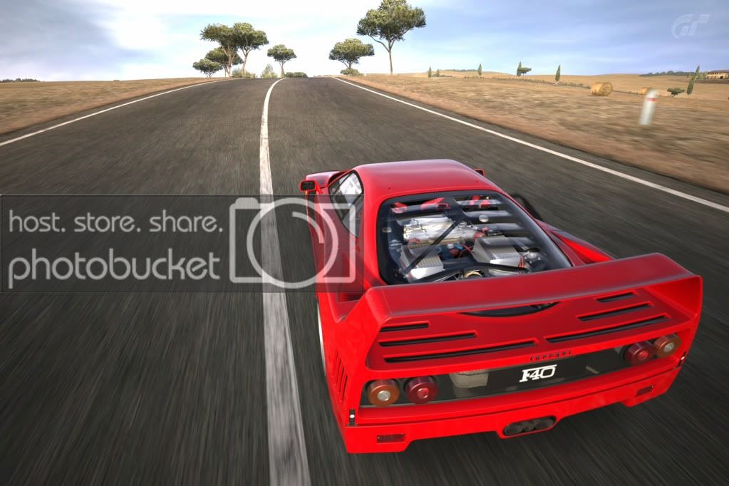
I love those. There's not much else I can say. 9.5/10
ToscanaTarmac_1.jpg

Totally unedited, by the way.
 
@richteajames: Nice shots, although a bit more feel of speed would be nice I think. Also, there's something a bit wierd witht the secind one, but I can't quite put my finger on it. I think it might be the way the tyre smoke is merged with the cloud but I don't really know. So I'll give a 7.5/10 for the first, and a 6.5/10 for the second.

@at1503: I like the composition of the first pic, although I think a bit more space between the edge of the pic and the car would improve it, as, especially at the front, your eye is led off the pic slightly by the closeness. Same with the second one at the back really, but again, very well composed and good lighting. So, overall a 7.5/10 for the first, and an 8/10 for the second

Here is my effort:

 
Nice sunset shot. 8/10 I guess.

I messed with the focus and angle and blurred the background as sugested. First person to give me a higher rating than 6/10 gets a sammich. Who wants a sammich?

TrialMountainCircuit_3.jpg
 
@Snakebitten try using Mode 2 in those type of angles and you should use 4.0 or more in the blur option... reflections are cool I give 6/10

N%C3%BCrburgring-Nordschleife-19-1.jpg
 
Overall very good lighting and action, perhaps a bit more sky and bit less foreground grass would have made it better. 9/10

c1.jpg
 

Latest Posts

Back