- 1,002
Hehe, didn't want to bump a thread from months and months ago, so I decided to go ahead and start fresh.
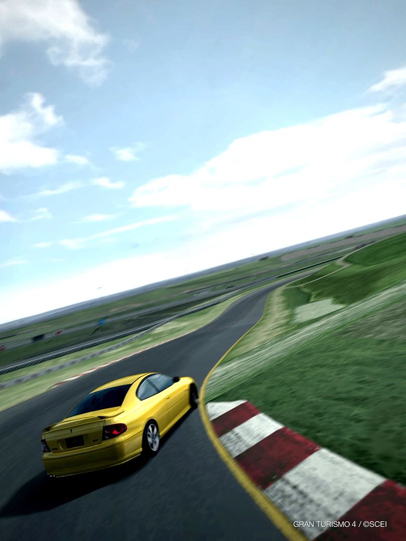
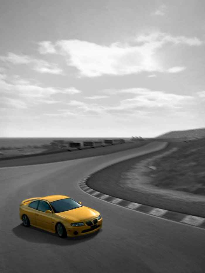
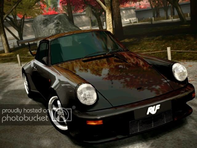
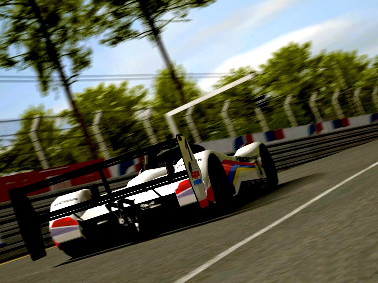
Without further small talk, my first most awesome-est shot to be edited in PS: (sorry, not fancy panel or anything. I know, I iz n00b.
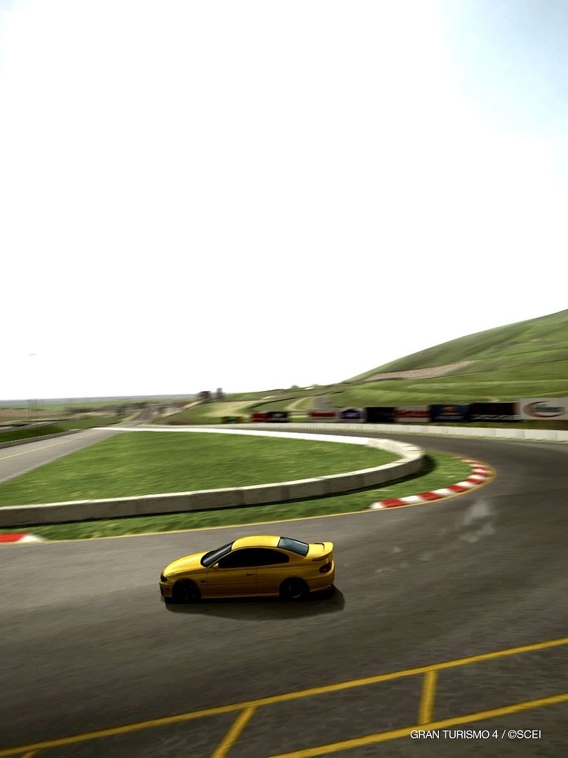
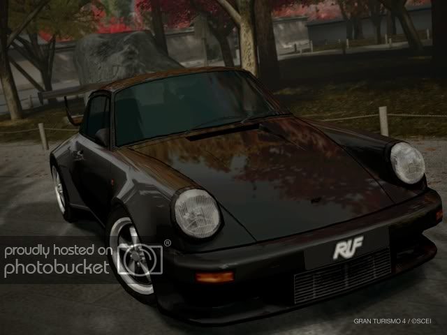
the PMC shot which inspired this:
The original
Hope you guys enjoy and please, criticism rocks. Even if you loathe and despise it, say it!
I wanna thank bram for his absolutely AWESOME guide for this!
https://www.gtplanet.net/forum/showpost.php?p=3279307&postcount=937
I personally think that some of the body lines are a bit thick, and I also see that I forgot the clean up the left front fender. Another time perhaps.
Without further small talk, my first most awesome-est shot to be edited in PS: (sorry, not fancy panel or anything. I know, I iz n00b.
the PMC shot which inspired this:
The original
Hope you guys enjoy and please, criticism rocks. Even if you loathe and despise it, say it!
I wanna thank bram for his absolutely AWESOME guide for this!
https://www.gtplanet.net/forum/showpost.php?p=3279307&postcount=937
I personally think that some of the body lines are a bit thick, and I also see that I forgot the clean up the left front fender. Another time perhaps.
Last edited:

 My criticisms would be that the contrast and red tint are a bit overdone for my tastes. Also the body lines, like you mentioned, are a bit thick. And while you seem to have done some edge cleaning, remember that upping the contrast generally increases the amount of jaggies you get, for example the front wheel in the original is smoother in the original than in the edited version.
")
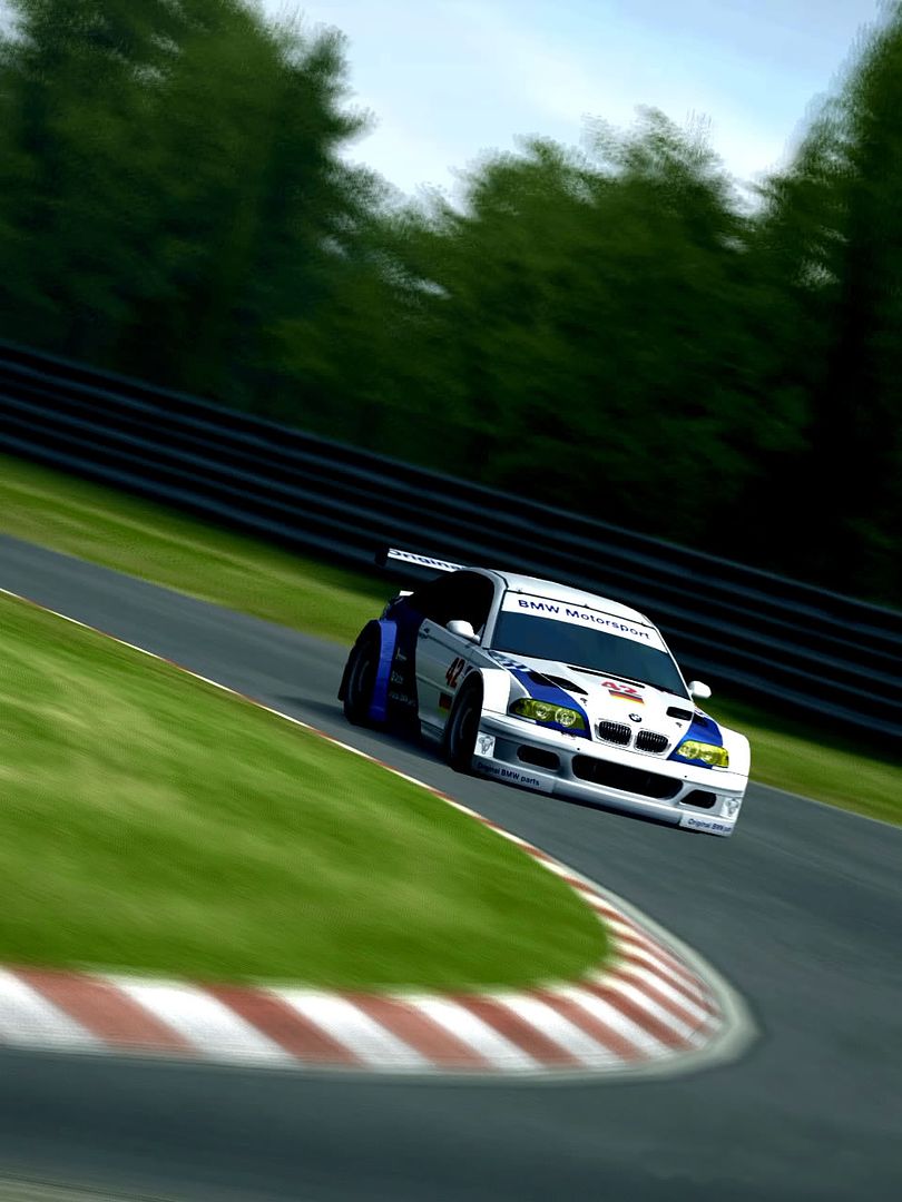

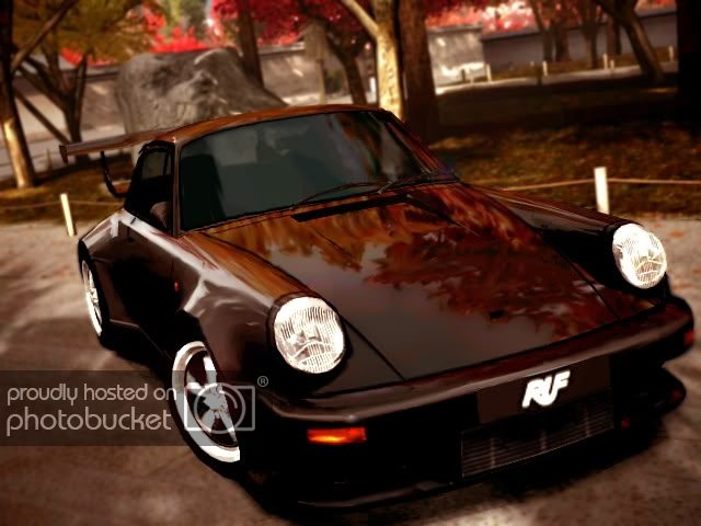
") The shots got better now and they're in a better quality then before.. Also, you've chosen other angles for taking the shots and that's even better 👍 Keep up the good work
The shots got better now and they're in a better quality then before.. Also, you've chosen other angles for taking the shots and that's even better 👍 Keep up the good work