Welcome to GTPX

  • Thread starter Jordan
  • 311 comments
  • 21,179 views

Jordan

Site Founder
Administrator
24,310
United States
United States
GTP_Jordan
GTP_Jordan
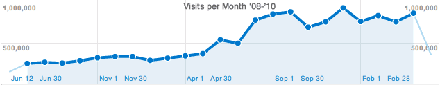
After a year of prototyping and 6 months of development, I am proud to introduce the tenth major GTPlanet site revision, known as GTPX. Since GTP9 was launched with the news blog more than two years ago, traffic to the site has more than tripled, with an average of 1.5 pages loaded each second every day.

bj907n.png


I'd also like to take this opportunity to announce that everyone is now able to upload their own 100x100 avatars, regardless of how many posts you have or how long you have been a member. If this applies to you, read my post here to learn more. Mac and Linux users should also notice improved font rendering and selection (with use of Helvetica and Lucida Sans in place of Arial and Tahoma).

Despite all of my testing and a similar look and feel, all code has been re-written from the ground up and there will be a few bugs I've missed. As always, please let me know with a reply below if you find anything out of place.

Of course, with the pending release of GT5, the best is yet to come, and I'm confident GTPX will serve as an excellent framework for the other new features I have planned after the game's release. For now, enjoy the new look and feel across all areas of the site (I'm particularly excited about the blog's new design and features, which you can read about here).

I'll provide a running list of bugs that I'm aware of below, along with their status if it's an aesthetic change that I am considering.

  • Column headers are in wrong order on the subscriptions page.
  • User drop down menu appears when user title or online status is clicked.
  • Serif font (Times New Roman) appears in place of Verdana in the post composition page editor box. (Only affecting some users.)
  • Profile page tabs cause the right hand column content to "drop" down.
  • People find the "new" thread identifier bothersome, considering modification.
  • Considering a change in link hover color.
  • Store page title typo.
  • Insert thread icon key on forum display. (Icon key has been added.)
  • Thread prefixes appear in thread page titles.
  • Forum footer shows incorrect "powered by" info.
  • Update description on advertising page.
  • Some users see the mobile skin on the news blog for no apparent reason.
  • The "request read receipt" checkbox is unchecked by default.
  • "New" thread identifier overlaps usernames if the post title text wraps.
  • Top banner ads in PS3 browser are not shown in their correct location.
  • Add a more descriptive error message for users with less than 100 posts who try to create a new thread in the GT5 forum.
  • When viewing PMs, the number of the user's threads they have created is incorrect.
  • Include a link to view the forum filtered by a thread's prefix in the breadcrumbs.
  • Incorrect use of "Lucida Sans" as opposed to "Lucida Grande" font in some CSS classes.
 
Last edited:
Great work Jordan, looks fantastic! Thanks for all your hard work keeping GTPlanet the best site on the web. My 1000th post to celebrate this event!! :cheers:
 
Thanks for the kind words, guys. :embarrassed:
Yep it looks great Jordan. Will the theme from the blog carry on to the other pages to?
Yep, all pages should carry the new look and feel now (it takes a few minutes for me to apply it to each section of the site).
 
Thanks for the kind words, guys. :embarrassed:

Yep, all pages should carry the new look and feel now (it takes a few minutes for me to apply it to each section of the site).

Thanks. I'm on Ubuntu so looking forward to the new font :D

Well done, you treat us too well:cheers:
 
I've got quite a bit of feedback for you like I said, mainly a few tidbits of navigation improvements you could do in code only so it should be fairly easy ;)
I'll do a few pictures for you then pm it for you so you can tell me what you think. For once, you change your avatar too, feels so weird now!

Cheers and keep up the good work as usual :)
 
Jordan, this looks fantastic. Thanks for your continued, dedicated work to this little spot where we talk what we like the most; Gran Turismo.

I seem to recall as well that on some occasion you commented that the Guides section was going to be scraped off with the coming of GTPX. Any chance of a preview of what's to come for GTPX? :)

By the way, you seem to have missed the last link of your post, where you say "(I'm particularly excited about the blog's new design and features, which you can read about here)." I can only assume you meant to link us to the blog post there.

P.S. Love the new avatar.
 
I will post all of this on your profile as well.

I will cut straight into the critique. The new "news", "forums", etc buttons on the front page could use a little sprucing up. As they are now they are a bit bland. However I do like the new post layout on the front page. The other features to the posts (replies gallery enhancements) are also very welcome additions. I would also add that the most popular should be placed higher up on the main page along with all the stuff below it. I would also add the FB Twitter and RSS buttons below the search bar (as a result center more whatever image is at the top of the main page). Also I can't believe I am saying this but the front page could use some ads. Its kinda bland. Maybe some form of background. IDK.

Also in the forums I have been dying for a navigation tree "GTP Forums > GTPlanet > Site Feedback" at the top of the page to also be at the bottom. So when I am viewing a thread and am at the end I do not have to scroll all the way back up or hit the home button. I know its small but it would be really nice.
 
Pleasant suprise. Went to the bathroom for a few minutes, come back, and here we are, GTPX. Good job Jordan!!!!
 
Nicely done. Think the "tabs" and that blue line around them could be improved, but yes, very nice overall.

Love how every post has the header with user name now. Very clean.👍👍👍👍👍


Edit: column header on the user thread subscription is not in the new order, not matching the columns below (last post, notification, select box).
 
This looks very, very nice! I remember being apprehensive at GTP9, but I welcome GTPX wholeheartedly wit open arms. Great job Jordan, keep up the good work!
 
Very good looking indeed!

I would however recommend a slightly higher padding/margin between list items (eg in the last news article) and like some said the main navigation and gigantic buttons look a bit cheap ;)

Overall great improvements though!
 
If I said how good this new GTPx the way I wanted to, I would be banned. So I'll say it nicely.

Absolutly amazing job Jordan 👍
 
Looks very swish Jordan top job.
Can't help but notice our PSN ID Is not under our avatar anymore.

*EDIT*
As this GTPx Is like a new forum may I have my warning for lazy grammar removed. lol.
 
Last edited:
Any possibilities that Premium avatars can be allowed to be a bit bigger than the 120x120 allowed now? like, maybe up to 150x150?
 
Nicely done. Think the "tabs" and that blue line around them could be improved, but yes, very nice overall.

I'll echo this, everything else is pretty neat but the tabs have some of the blue line slightly overhanging and generally don't look as significant as they should be.
 
Just going to post some initial thoughts here. Yes the main menu part might be a little simple for people taste but with a few slight tweaks it should be just fine. the blue line versus black background combination can be a little weird perhaps or just that the actual line is a big thick.

I feel like the logo and search bar and little background image stretched 100% on the front page makes the whole news part and sidebar looks weird. On the forums though, it looks perfect since the forum body takes the full width.

The second part which I feel is the thing that could be fixed easily and make the most impact is "highlight color" for links. Right now most of the links you see, you have no visual clue if you're on a link or not, same color, no underline, no nothing. I think a slight color change would give a clear indication to where you're at on a link.

Third for me is the sidebar of the front page. Now you have big imposing boxes on the content part with news which work well because they stand out, they're formated the same so they stack nicely so that's nice but the sidebar part only has the most popular post and then right below that you get lonely text and the feed and twitter follower. I think to balance that out in a more consistent way you should have perhaps one box like you have now, red header and listing of popular post then perhaps a lighter box or something shaped in a similar way for the rest so you have nice balance for news post up to the sidebar if that make any sense for you :)

And last, the footer links, make the links on :hover be white Jordan and it'll twice as good :P

All in all, I think the simplicity part of it is a really good way to upgrade to. I'm a big fan of the less is more motto so ;)

Keep up the good work Jordan and thanks as usual for everything you're doing for the community. I know you like to do your design stuff yourself but I've said it and I'll said it again, If you need any help with anything design related, you know where to find me or ask if you just want opinions.

GTPlanet is and will always be the best GT community on the web, no contest there!

Quick edit: The forums just fully transitioned now to the new theme and I love it, really minimalistic and great balance. Love it!
 
Interesting - the redesigned appearance gives me an impression of a mix of both older and modern styles. I can't say that I prefer the new layout, but I know that's because I'm used to the old appearance. Thank you for all the work you did, and I hope that new viewers of the site from E3 will be impressed. 👍
 

Latest Posts

Back