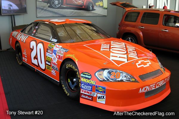
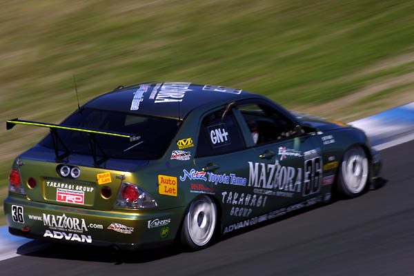
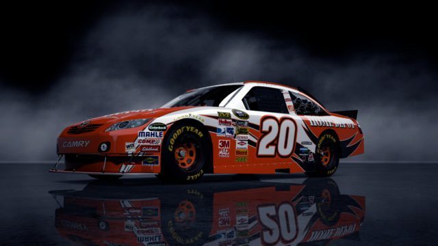
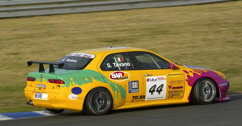
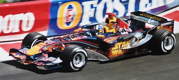
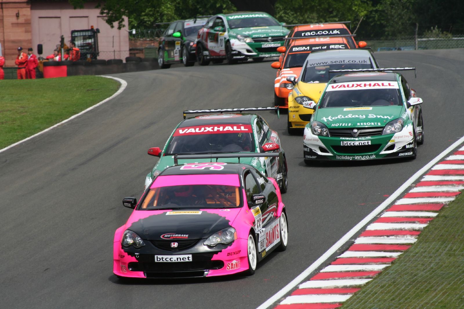
I actually like or at least don't mind many of the liveries posted in here. "Worst liveries" should be things like horrible color combinations (like orange and purple), unfitting colors like hot pink (not terribly motorsports-y), generic liveries (solid color or near-solid, perhaps with just a basic sponsor/team name printed blandly on there), or maybe liveries with humiliating sponsors.
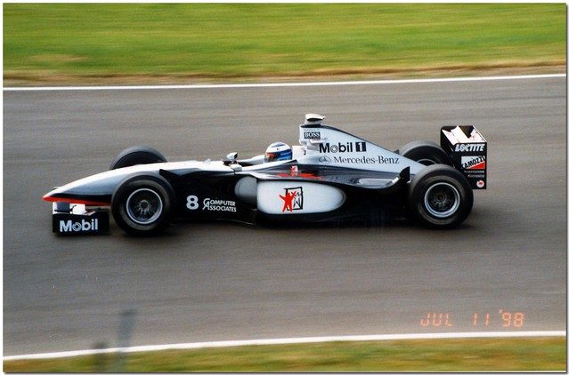
Here's an excellent example of an atrocious livery:
It's just a bland, white car. Not only is it just nearly solid, but it's the most boring color that could ever be painted to a car. The only actual color splashed on there is the urine-yellow stripe. It's like a blank sheet of paper onto which someone made a quick streak with a yellow highlighter.


")