Worst Liveries Of All Time

  • Thread starter Thread starter Liquid
  • 1,118 comments
  • 232,388 views
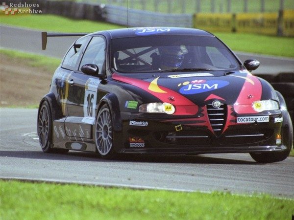
JSM Alfa.

image.php

How on earth does this look anything but fantastic? It's stunning.
 
How on earth does this look anything but fantastic? It's stunning.

It doesn't look all that stunning to me though. Not my cup of tea...
 
I have to say of all the F1 cars put in here there's only 1 that actually was atrocious, the red bull/star wars car :yuck:

I think it because it's quite hard (in my opinion) to make such a beautifully aerodynamically made car look bad.
 
focuswrc08_w308.jpg


Never liked it, just too many colors.
 
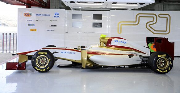
The new HRT looks horrible:yuck:
1330968437.jpg

& the old Chickadee car
18267%20small.bmp
 
I like the new HRT livery.

I don't. It looks... dry. Somehow dry. Reminds me of sand. In a bad way.

I haven't liked any of Hispania/HRT's liveries so far.
 
I think the new HRT livery looks brilliant, huge improvement on last years pathetic attempt.
 
I think the new HRT livery looks brilliant, huge improvement on last years pathetic attempt.

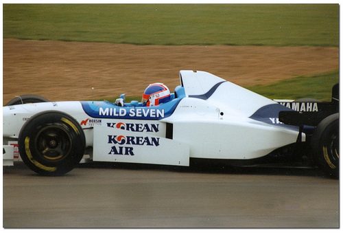
There isn't much you can do with no sponsorship. Once in a while you can make it work, ala Brawn, but often it's difficult. As the penultimate and penultimate-penultimate Tyrrells show.

Tyrrell 024 - 1996
5531612776_fdbebf698e.jpg


Tyrrell 025 - 1997
salo97tyrrell.JPG


I wouldn't call the above liveries ugly. In fact, I like the 1997 Tyrrell for its simplicity. But the point is, without sponsorship and/or sponsorship money, cars will look bare and undesireable.
 
Last edited:
There isn't much you can do with no sponsorship. Once in a while you can make it work, ala Brawn, but often it's difficult. As the penultimate and penultimate-penultimate Tyrrells show.

Tyrrell 024 - 1996
5531612776_fdbebf698e.jpg


Tyrrell 025 - 1997
salo97tyrrell.JPG


I wouldn't call the above liveries ugly. In fact, I like the 1997 Tyrrell for its simplicity. But the point is, without sponsorship and/or sponsorship money, cars will look bare and undesireable.

Yes I agree with you, that's the main reason last season's car looked so boring, they could only really change the colours to improve the looks. I think the new livery is a good move which should make the car stand out more on the grid, it's a good looking car I and hope they stick with the new colours for seasons to come.

Definitely preferable to the slightly mundane Marussia 2012 model.
 
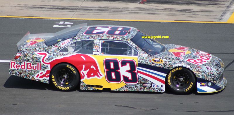
The Red Bull 'faces' collage livery :sick: Looks like someone covered it in paper mache!

482.jpg

photo046.jpg
 
They did the same thing for their Cup cars as well.

KahneChltteMay11.jpg

Vickers83CharlotteMay11b.jpg
 
I feel its one of those ideas which sounds and looks great close up like on the grid and in the paddock but when its out on track it just looks like very dirty fly paper!
 
Robin.
The Red Bull 'faces' collage livery :sick: Looks like someone covered it in paper mache!

I thought that was cool.
 
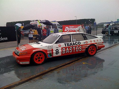
Nah, there is no livery that can detract from the beauty of an E24 6-Series.
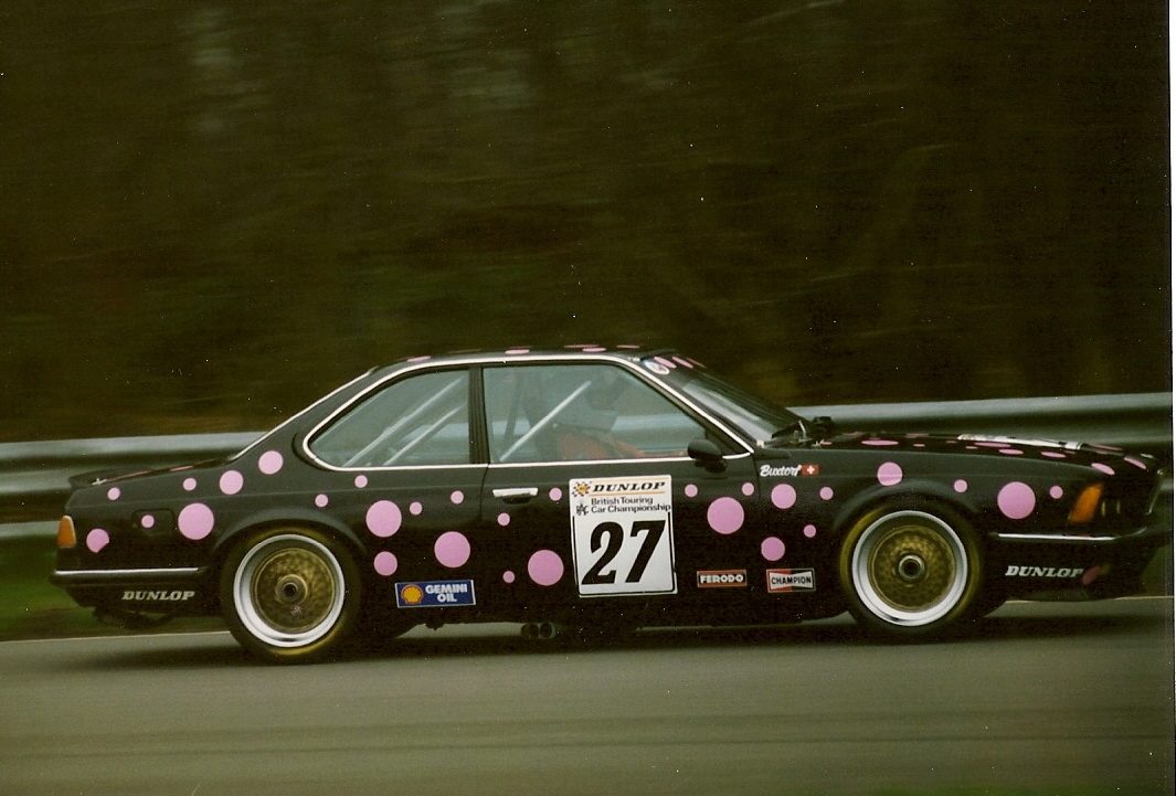
Even worse, side on.

5104912701_0bbf148738_o.jpg


There was an iteration with yellow spots, too.
 

We have a winner :dopey:

Your prize is the car.. :sly:
 
There was an iteration with yellow spots, too.

And by spots, I meant diamonds. The car is seconds away from a collision with the Thruxton armco.

Thruxton-1988-27b.jpg
 
And by spots, I meant diamonds. The car is seconds away from a collision with the Thruxton armco.

Good. It deserved to be put out of it's misery.
 
And by spots, I meant diamonds. The car is seconds away from a collision with the Thruxton armco.

Thruxton-1988-27b.jpg

Still better looking than many new racecars.. because 635CSi :D
 
Back