Worst Liveries Of All Time

  • Thread starter Liquid
  • 1,105 comments
  • 184,995 views
I don't think that looks too bad myself.

My main issue with it is that the stripes look like they were an afterthought, especially with the weird gaps around the door number, and that makes the entire design look imbalanced. I understand why they did it since it's basically a way to incorporate DEI team branding into the sponsor design, but compared to the examples I posted over in the greatest liveries thread it's just a very slapdash look in my opinion. If they had left the roof panel and pillars all black, it'd probably offend me a lot less.

Good grief, how could they mess up that livery so badly... here's another abomination. This top pic is a diecast, the only one I could find of the real car didn't show how bad it looks.

1shark.jpg

images

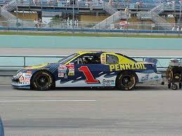
In all fairness that was just a one-off they did for the inaugural Homestead race, if I'm remembering correctly. Special event liveries like that can be excused because you only have to look at them for one race, not for an entire season.

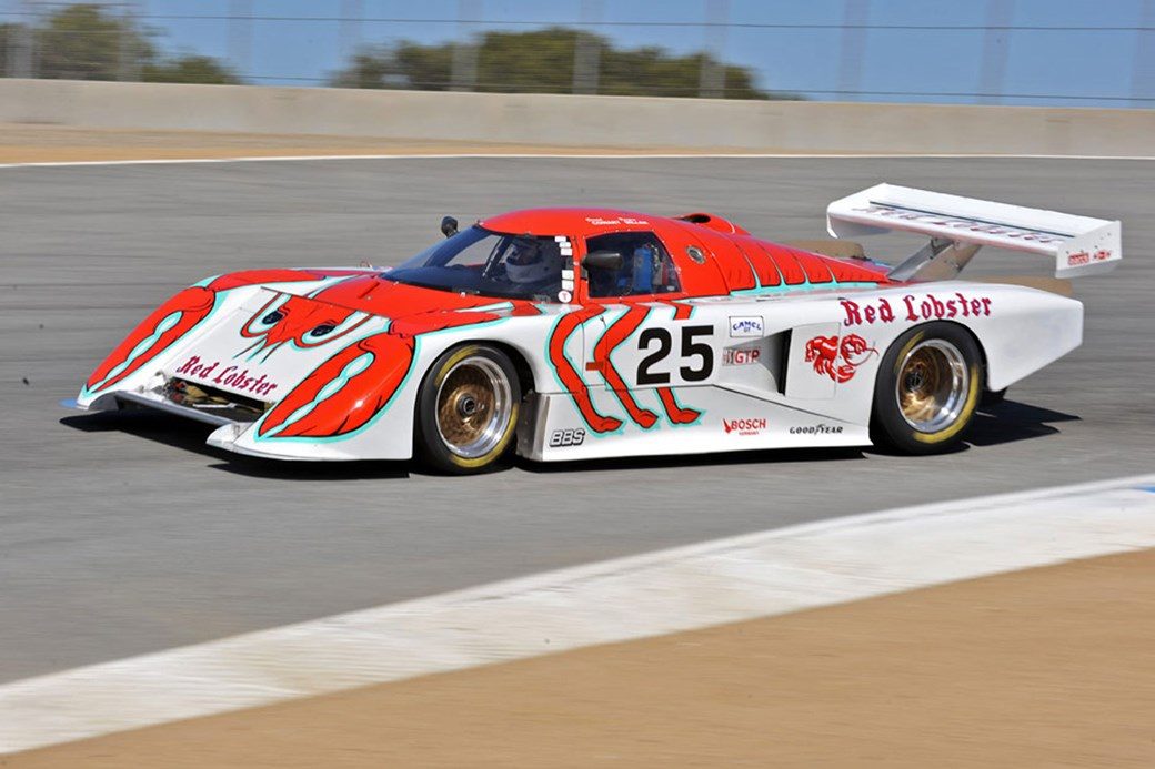
I mean, it IS super goofy looking and all, but still.
 
Last edited:
The "Bitten & Hisses" Jordans from the late 1990s. The nose was painted to look like a snake head, with the uprights connecting the nose to the wing painted to resemble snake fangs.
Probably should've said that I didn't meant open wheelers. The 'face' schemes work perfectly with those. My favourite being the eagle ones from the All American Racing team.
aareagle.jpg
 
The "Bitten & Hisses" Jordans from the late 1990s. The nose was painted to look like a snake head, with the uprights connecting the nose to the wing painted to resemble snake fangs.
I remember reading an article,
I think on JA, where Eddie Jordan said that in one of those seasons in the late 90s, they took the face idea as far as putting a different emotion on the face depending on how the team was doing...either based on how they had done at the previous event, or even a change from a Fri/Sat to a Sun. Those definitely were some of the best looking F1 cars of all time, to me at least.
 
Last edited:
If I'm not mistaken, this is a picture during the wreck that killed Niel Bonnet.
Seriously? I thought there wasn't any video or picture of his crash (other than a bad quality video showing the aftermath of just hitting the wall). If this picture is from that crash, I had no idea.
 
If it's a picture from a fatal accident it might have to be taken down.

---

"You know what our MG/Lola needs? Less Hot Wheels flame and more luminous green. Oh and swap the black for blue. Because blue and green always mix well together."


alms-laguna-seca-2003-37-intersport-racing-lola-ex257-aer-mg-jon-field-duncan-dayton.jpg
This was a spare car that was hastily prepared, hence the scheme.
 
I only just realised the red stuff on the side is actually a rollercoaster.
Is that what it is? I thought it was a DNA strand, the sickly green had me assuming it was a pandemic themed car or something. :lol:

Whatever it is, it's truly terrible.
 
I thought the back half of that was fair, but the front of it looked like some childish nonsense, like it was in the Cars movie. Then I saw the logo in front of the rear tires.

Poor Darrell Wallace.
 
Back