Oh no but it's art!/s
CarcursionCarception
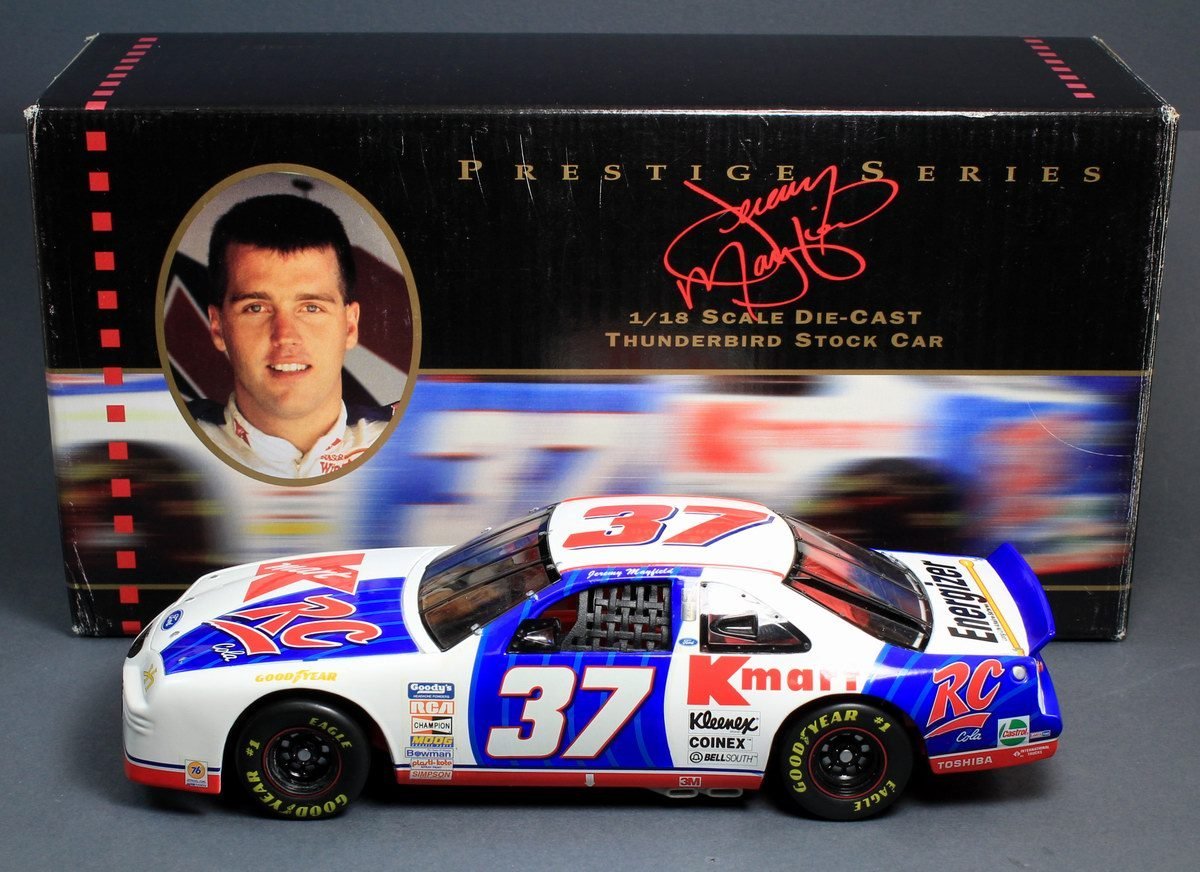
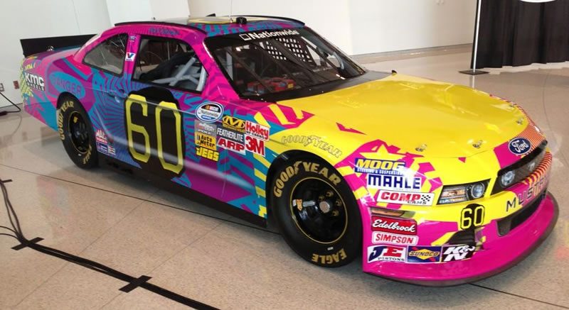
The unfortunate side effect of moving from airbrushing and decals to full vinyl wraps. Sure it's quicker and less expensive, but... well, it is possible to have too much creative freedom.Nascar has had a lot of hideous ones over the years. Travis Pastrana's cars seem to attract it though.
As a Mayfield fan, I take exception to that.
Back in the late '90s pretty much everyone thought this was a terrible looking car. The original version had solid blue patches with straight edges (couldn't find a clear picture of it though), which made it look like an old beater with mismatched doors. Plus the split sponsor on the hood and cluttered side panels looked really out of place in a field where even the backmarkers would have one name covering all the major areas and maybe a secondary on the decklid. It stood out to be sure, but for the wrong reasons.
For its time, it was definitely one of the worst liveries out there.
 Some people may think his Fingerhut car was worse though.



Wrong end.
Ran by Tony Stewart at Dover in October of this year.
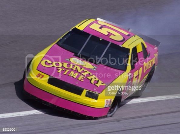
I never really had a problem with using pink on race cars, since it's usually offset by equal amounts of black like the Fingerhut and Exide cars. And in the case of the 51 car it works because hey, who doesn't like pink lemonade?As a Mayfield fan, I take exception to that.Some people may think his Fingerhut car was worse though.

I don't know. Pink seemed to be an unlikely, but less rare theme than one might think back in the 90's. Take the Country Time and Exide cars for example. Personally, I kind of like them for some reason...


I don't know why, but pink lemonade seems to taste better.I never really had a problem with using pink on race cars, since it's usually offset by equal amounts of black like the Fingerhut and Exide cars. And in the case of the 51 car it works because hey, who doesn't like pink lemonade?

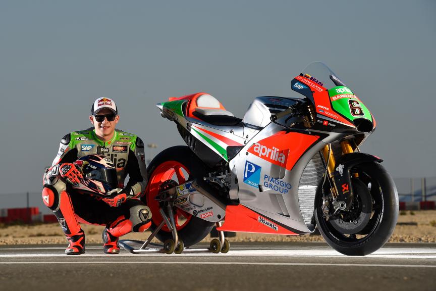
The silver hurts my eyes!
I'd like it a bit more if the silver were white instead, but that's just me. I wouldn't say that's a bad livery at all, really.I think that looks fantastic.
I'd like it a bit more if the silver were white instead, but that's just me. I wouldn't say that's a bad livery at all, really.

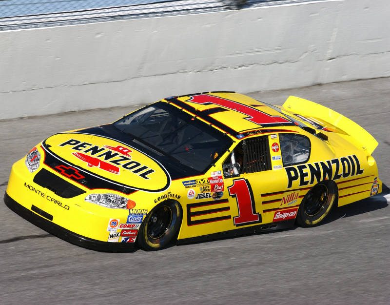

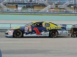
I don't think that looks too bad myself.So, the Pennzoil livery is pretty iconic, right? Simple yellow with thin black stripes, understated but easily recognized. Shouldn't be possible to screw that up, yeah?

...oh. Never mind.
This on the other hand...Good grief, how could they mess up that livery so badly... here's another abomination. This top pic is a diecast, the only one I could find of the real car didn't show how bad it looks.


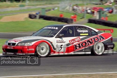
Thats a Japanese Market accord (6th gen Accord was split into 3 models for Europe, Japan and the rest of the world which the US used).
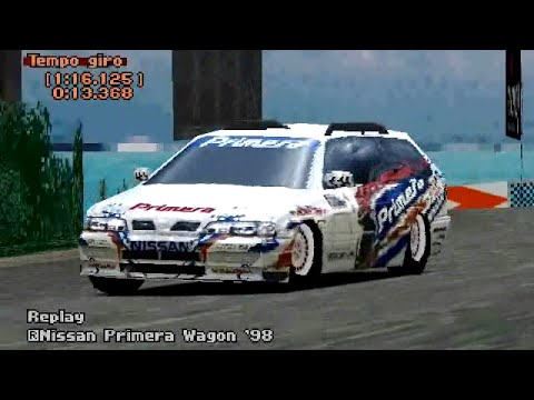
You can do the same with the Primera Wagon as well.
Has there actually ever been a car/livery where the painted on teeth looked good on?Good grief, how could they mess up that livery so badly... here's another abomination. This top pic is a diecast, the only one I could find of the real car didn't show how bad it looks.


The "Bitten & Hisses" Jordans from the late 1990s. The nose was painted to look like a snake head, with the uprights connecting the nose to the wing painted to resemble snake fangs.Has there actually ever been a car/livery where the painted on teeth looked good on?