")


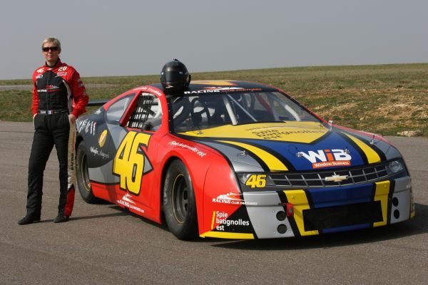
What the heck?So this vehicle from that NASCAR Euro series that apparently almost nobody heard about stands out for one particular reason:

Not only does there seem to be a lack of a livery, but there are also Ford badges on a stock car based on a Chevrolet SS.
And yet i actually love it because it apparently still ends up classified as a Ford Mustang by the series anyway!
That's lazy, especially when they're second car is an actual Mustang. 

Not only that, but the former #1 Mustang was an actual Mustang that looked like that one, we can assume that the #1 below ended up becoming that #69 Mustang.What the heck?

Lack of choice/money maybe lol. Should have a Nascar Euro thread.Not only that, but the former #1 Mustang was an actual Mustang that looked like that one, we can assume that the #1 below ended up becoming that #69 Mustang.
Yet, that still doesn't explain why the team wanted a Chevrolet SS.

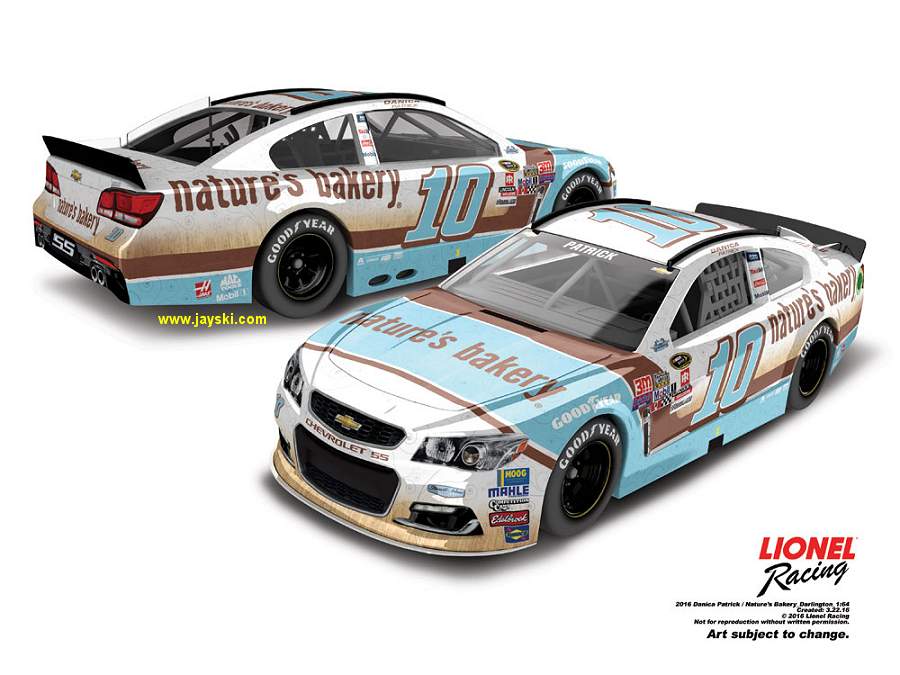
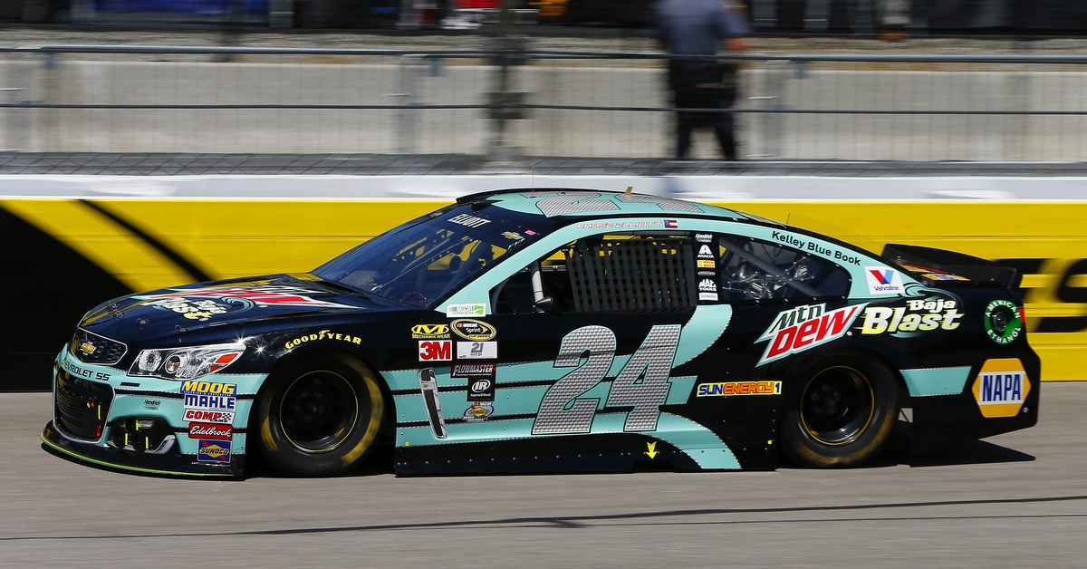
Always hated the look of the Nature's Bakery scheme, but this is awkward on another level. Very halfassed attempt at a "throwback" and the lines just don't work at all.
Take a guess where that base comes from. Probably explains it and basically like you said, it's half assed.
Why would they bother putting effort in the throwback if it won't run anywhere near the top 10 anyway?
Always hated the look of the Nature's Bakery scheme, but this is awkward on another level. Very halfassed attempt at a "throwback" and the lines just don't work at all.

Exactly what is that supposed to be?
Thank God that car's existence barely saw television...
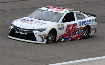
Would this be here in the thread too, if it said "Clinton" instead of "Trump"?
Would this be here in the thread too, if it said "Clinton" instead of "Trump"?
Yes. But let's be honest - it's a NASCAR. Clinton's name was never going to appear on the side unless you really hated your driver.Would this be here in the thread too, if it said "Clinton" instead of "Trump"?
Yes. Politics & Motorsports, though they are inexorably linked, shouldn't be in motorsports IMO (The same reason whhy Indycar put the brakes on a "Anyone but Hillary" car for this year's Indy 500).
Money is money. As long as they pay teams will put almost anything on their cars.Yes. But let's be honest - it's a NASCAR. Clinton's name was never going to appear on the side unless you really hated your driver.
I dislike sport mixing with politics and vice versa.You dislike the livery because of it's main sponsor.
See then it'd make up for the rest of it being bland.They should put another car in the car on the car. With another car in that car.
Carception.