Car drawings

  • Thread starter Pebb
  • 3,547 comments
  • 456,987 views
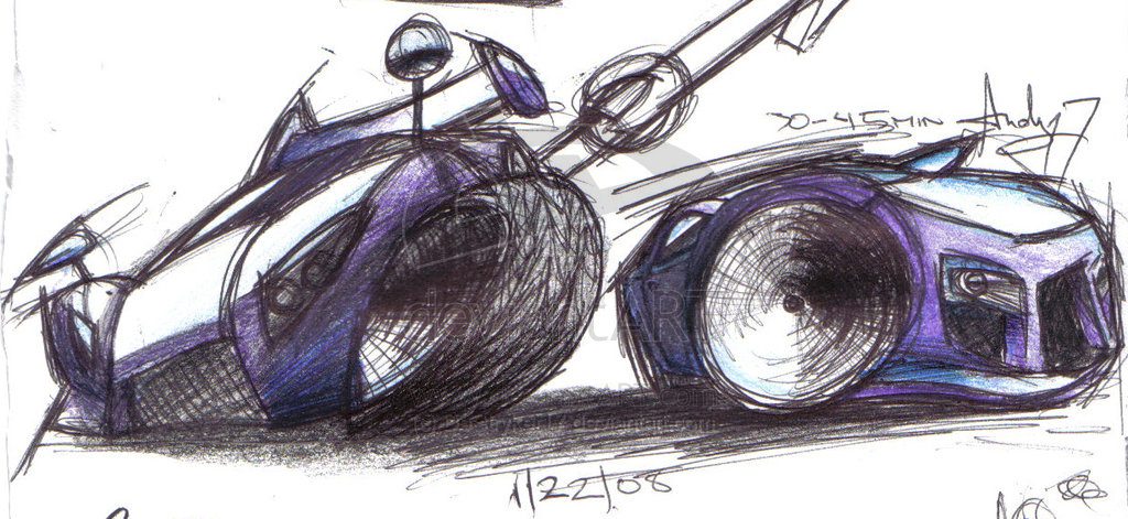
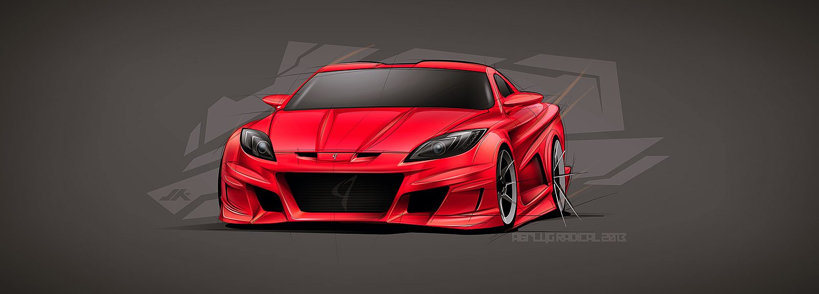
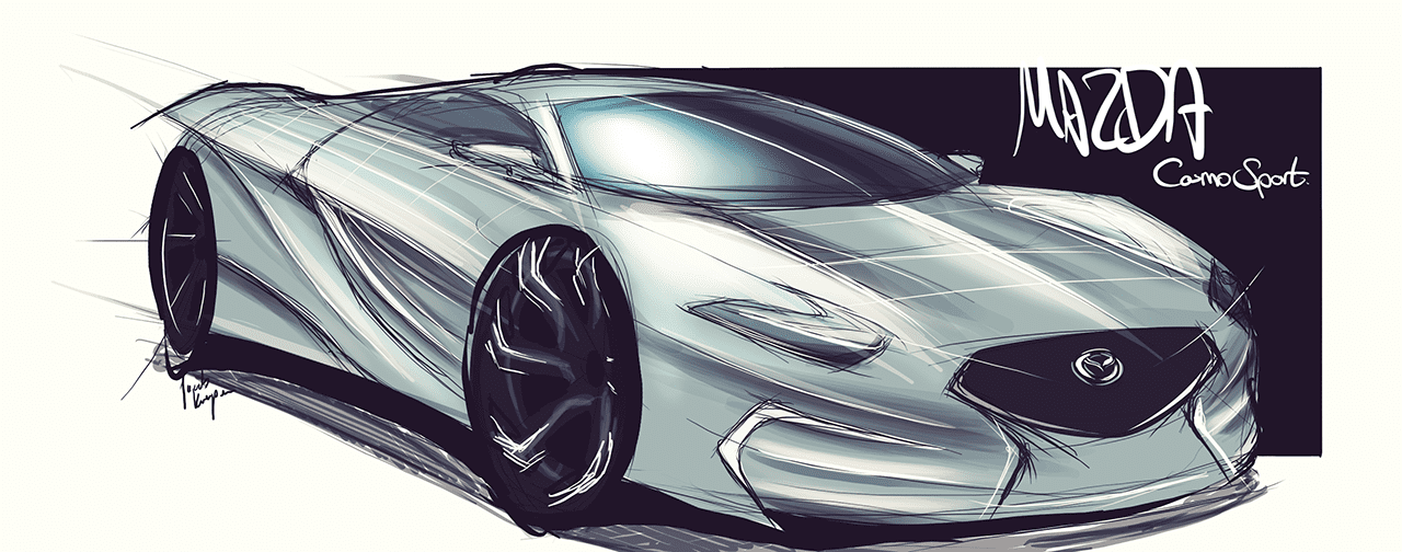
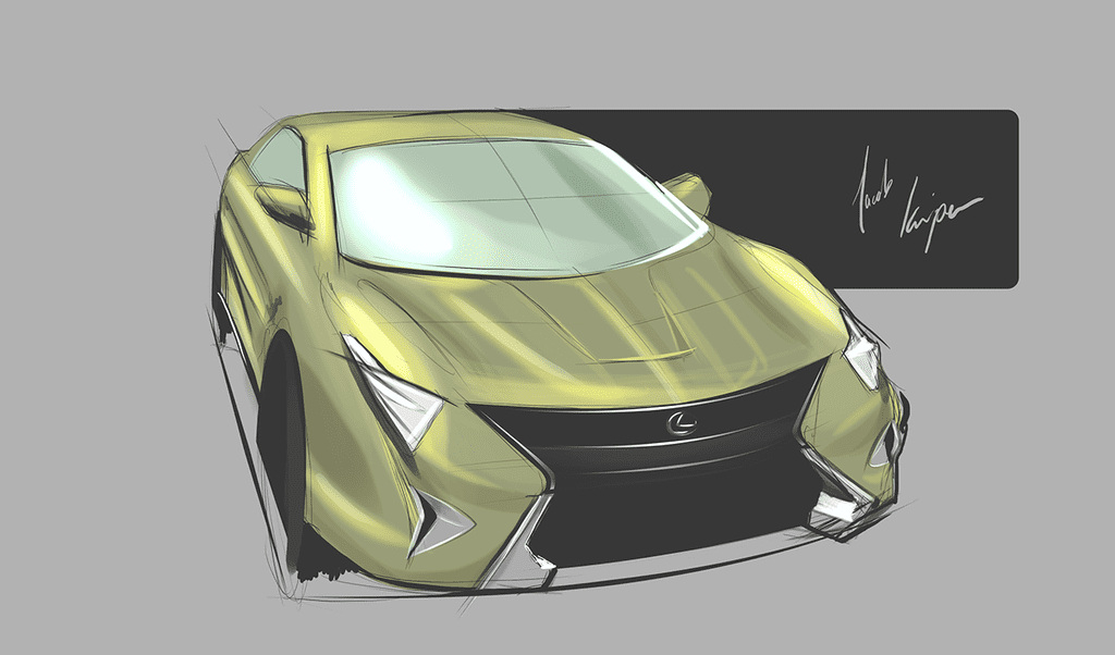
So I pulled out my old drawing book, and found some of my really cool car drawings.

I did this one last year. Not too bad if you ask me
image.jpg


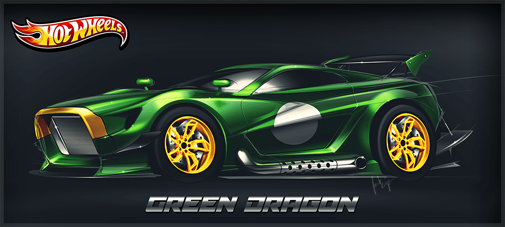
And my first attempt at drawing a 69 Mach 1 from many years ago. (At least for me anyways. :lol:)
image.jpg

Terrible. :lol: But it certainly brings back memories.
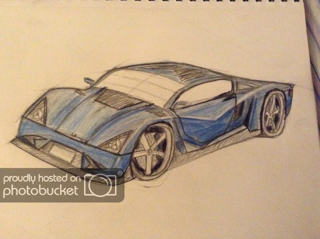
 :embarrassed:
 
I might consider posting some drawings here. I've got tons all over the place, but they're terribly inconsistent in detail. The majority are just random, freehand doodles :)

I should have a few decent ones tucked away. I'll be 17 in October, so I'm still in the learning phase (I'll be starting A level Art and Design Technology tomorrow... am I dead? xD)

For the meantime, the yellow automobile you see below is one I designed and built in the game Little Big Planet 2 around a year ago; badged under my fictional automotive manufacturer 'Bulldog'.

51f9a4f0693c70121a415d489ffa1c076973f619.jpg
 
Hi all! It has been a while since my last post here, in that time i've made some new stuff.

Enjoy!

abflug_radical_z34_by_jacobkuiper-d5w7nty.jpg


jaguar_concept_by_jacobkuiper-d790vfa.jpg


afsfafasf_by_jacobkuiper-d7bjvb0.png


greendragon_by_jacobkuiper-d7bjvd6.png


mazdacosmosport_by_jacobkuiper-d7qtlpz.png


lexus_concept_by_jacobkuiper-d7qtlwm.png
Is there a site or somewhere you can point me so I can learn to make concept drawings like this? I suck at perspective and drawings in general, but I can easily correct that while I find it very hard to get correct shading etc
 
youre makin me look bad! if only that wasnt right under my 350z lol

Don't worry, he's made everyone look bad :lol:

Thanks! But I will have to say that I think photorealistic drawings shouldn't be compared with other styles, because every style and work of art is unique at its own way. What I have experienced when trying to achieve photorealism is that it doesn't really take so much skill than people usually think it does. Of course it takes some skill, but it takes much more, PLENTY of perseverance; strenght and will to make everything elaborate, detailed and precise. I wanted to prove myself I can preserve the quality until the very end, and that takes more nature than skill. For example, I don't think I could do fast sketches and my own car concept models very well, it's a whole new world.
 
Last edited:
Thanks! But I will have to say that I think photorealistic drawings shouldn't be compared with other styles, because every style and work of art is unique at its own way. What I have experienced when trying to achieve photorealism is that it doesn't really take so much skill than people usually think it does. Of course it takes some skill, but it takes much more, PLENTY of perseverance; strenght and will to make everything elaborate, detailed and precise. I wanted to prove myself I can preserve the quality until the very end, and that takes more nature than skill. For example, I don't think I could do fast sketches and my own car concept models very well, it's a whole new world.
couldn't agree more. im learning this at school myself and you need to do as many sketches as possible to get better. so a bunch of 30 min sketches are preferred to 1 50 hour drawing. but that photo realism is an amazing skill no matter what.
 
Not a drawing but more digital.

It counts I guess...
Williams Livery concept.png
Moved the sponsors to the nose of the car (Aside from engine supplier, and Ranstad) And gave the slightly dull plain white some dark blue to break it up a little. The driver number is also moved from the sidepod and to the airbox to give a less cluttered look to the car, as less of the surfaces have had paint and sponsors defacing them. The white paint is made to be a very glossy and the blue to be very dull, in order to give a decent contrast. I have avoided having Martini plastered all over (Limiting it to the front and rear wings) as alcohol sponsorship needs to be more subliminal in today's society, it will of course be changed to 'Racing' for races where alcohol advertising is illegal, but as Williams did at Russian, the team logo of 'Williams Martini Racing' will remain on the car to give subliminal advertising, which isn't illegal because it's the team name, y'hear Putin?
Red  Bull Racing livery.png

Moved logos to tops of side pods and nose to clean up busy side profile (Leaving room to add in regulated visible racing number on the side pods) large Casio watch used in order to give a distinct look to the rear (A section normally left blank) And the Red Bull has been moved further up the nose in order to give some room for a hidden nose design. Also forms a visual stroke with the airbox yellow/white decal. Infiniti logo over the bull is to show championship partner status and on the other side, the watch is replaced by a large Infiniti logo and a smaller Casio logo covering the bull.
mp48.jpg

Redesigning a classic F1 livery is tricky. The main redesign was a quick idea not shown too well in this render. The gold stripe in front of the cockpit will be chrome effect, the red is high gloss and the white is pearlescent. Brazil logo on the front wing endplate is moved too far up and would be surrounded by the same gold effect as the cockpit. On the top of the sidepods would be messages from each team member to Senna, as this is a concept for an Au Revoir Ayrton livery.
Mw1.png

Aussie Mark Webber recently left F1 but what if he joined Prost and Stewart in running a team? Taking links to contemporary partners (Adidas, Red Bull, Renault) and Aussie talent at the wheel (Livery shows Ricciardo) with a subtle hint to ANZ bank funding the team, as done with Lotus, and Genii Capital, and Ferrari with Santander (And McLaren for that matter...). This car takes the Australian National Racing Colours (Source: http://en.wikipedia.org/wiki/List_of_international_auto_racing_colors) and applying them to create a striking visual impact with minimal sponsorship intrusion, compared to contemporary liveries.
McLaren concept.png

Honda and McLaren are joining forces again, to much nostalgic fanfare from people wanting a rehash of the old Marlboro liveries adorning the 80s and 90s F1 racers. However, this isn't too likely. It is McLaren after all... So I came up with this. The grey is the same McLaren chrome paint of today (And many many years before...), the black is similar to today as well, but the red is a high gloss, triple lacquer paint. This is used for the logos, now limited to the black areas of the car (Sidepods, nose, rear end leading up to airbox) with the engine manufacturer Honda occupying the red space with their logo above the airbox and on the nose. Of course, the rear wing's number might not read the same, but the placing is to maximize the space taken up in order to make the number recognizable. The font is a crisp and cool futuristic design shared with Daniel Simon's book 'The Timeless Racer'.
Caterham concept.png

Assuming they still exist in 2015, this is my proposition for a Caterham livery. The last Caterham livery was pretty dull, the colours weren't great either, I mean lime green and dark green? Never mind, this livery replaces the dull as heck 2014 effort by replacing the zest with black. Once again, I have moved the driver number to a more sensible position so you can tell who is who at 200 mph. But there have been a few more significant changes including the drivers national flag taking up the lower part of the rear wing, the Renault logo being on the airbox, and the Airbus logo being on the sidepods. Of course, these would also be placed on the nose and facing the camera, as Caterham needs the money right now...
Ferrari concept.png

Again, a focus on the retro, but infusing modern touches. As with other designs, the nose carries most of the sponsor logos, however the side view does carry more logos compared to the above designs. The driver number is once again made visible to spectators, with the driver's national flag placed just behind (Trivia: The German flag is a subtle reference to Schumacher's earlier helmets) and in traditional style the details are white as fitting with the retro theme.
Force India concept.png

Bold and brash, as only Force India manages to pull of today. The bright colours of green and orange are accented by a dull grey, which is accented by chrome (Represented by the white) and bare carbon (represented by the black) for maximum visual shock.
Sauber concept..png
Sauber's current livery is dull. Lets face it, its a recoloured HRT livery. the grey is made to be reflective as possible, which is framed in dark, metallic red and glossy white. The matte black of the nose is used to highlight subtle details in glossy black (Not shown in the render above) and the liveries stand out more, while leaving a clear sidepod.


Thanks for taking the time to read all that... if you did...
 
Last edited:
I feel like sharing something, but I've got nothing recent I'd like to share. So here's this from '08:

Purple_Toons_by_DeStryker17.jpg


Just a doodle, scritch-scratchy pen and coloured pencil for blocking in some value.

Was into drifting poses back in the day and was exploring where I could exaggerate proportions to emphasize the attitude the car presents itself with.
 
Back