

- 2,224

- Australia
I want to know what the actual colour is, because usually the Day-Glo Orange looks a bit funny on the renders, but I'm not too sure if it is Day-Glo. I hope it is because it will look great if it.

The number on the window IS too big.
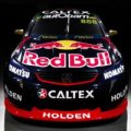




What's that blob in the bottom of the second 2?
Normally I'd say "I see", but that defeats the point - I can't see. To my eyes it's a car the colour of a muddy creek. I can make out the lines, but the colours bleed together. Maybe not as badly as the Castrol Edge desigm Greg Murphy had a few years ago, but it's still an atrocity to my eyes.As I said in my post (and a reason I liked it) it's the driver initials. So in this case it's JC
Normally I'd say "I see", but that defeats the point - I can't see. To my eyes it's a car the colour of a muddy creek. I can make out the lines, but the colours bleed together. Maybe not as badly as the Castrol Edge desigm Greg Murphy had a few years ago, but it's still an atrocity to my eyes.
Wow! Team Red is now Team Orange


Just red on green or green on red. The presence of a third, similar colour usually exaggerates the effect. The best example that I can give you is if you get a pool table with green felt, then put the red ball and the brown ball next to each other and ask me to pick them apart, I won't be able to. In cases like that, I usually use other stimulus - for example, I know that the red ball is #3, so if I see the number, I can tell them apart.Are all colours bad for you or just particular ones?
Relegation for SP tools
I fully expect GT's #2 to have a white outline. If it's green too

What I meant by relegation is they don't have the prime rear door/quarter panel position that HSV now occupies. That's obviously a result of less coin from them or, HRT asking for more for the same exposure.I wouldn't say it's a relegation for SP. Thier contract is up at the end of this year and I think it's pretty clear that they are scaling down their involvement. Wouldn't be too surprised if they don't make a appearance at all next year.
Here you go.
Normally I'd say "I see", but that defeats the point - I can't see. To my eyes it's a car the colour of a muddy creek. I can make out the lines, but the colours bleed together. Maybe not as badly as the Castrol Edge desigm Greg Murphy had a few years ago, but it's still an atrocity to my eyes.

FINALLY!!! A NUMBER ON THE DOOR!!! It's been too long since we last saw them...I wouldn't say it's a relegation for SP. Thier contract is up at the end of this year and I think it's pretty clear that they are scaling down their involvement. Wouldn't be too surprised if they don't make an appearance at all next year.
Here you go.
I reckon they've only done that because they couldn't find anyone silly enough to pay for the space it's taking up. Otherwise it'd just be a big blank orange space.FINALLY!!! A NUMBER ON THE DOOR!!! It's been too long since we last saw them...
And GT's initials should be in bold neon yellow on the front bumper so that the other drivers know it's him and can brace themselves for being punted off.Here's a case where GT's number should be a big behind #2 almost covering the lion.
Do you reckon he taught that move to Rick Kelly so he could win the '06 title or vice versa?And GT's initials should be in bold neon yellow on the front bumper so that the other drivers know it's him and can brace themselves for being punted off.

FINALLY!!! A NUMBER ON THE DOOR!!! It's been too long since we last saw them...

What makes the window numbers "silly"??Yep, couldn't agree more. Hopefully more teams start having numbers on the doors again in the future and we might be able to finally get rid of the silly side window numbers.

I'd like to see one or the other, but not both.Yep, couldn't agree more. Hopefully more teams start having numbers on the doors again in the future and we might be able to finally get rid of the silly side window numbers.
What makes the window numbers "silly"??
Give me numbers on the doors any day of the week, so much more aesthetically pleasing.Five-Minute Designs looks like it will do a booming trade this year:
http://www.speedcafe.com/2016/02/18/gracie-unveils-caltex-ford-at-ipswich-test/
I wish that V8SC would live stream the test day next week. If not, hopefully Speed Cafe has their usual "sights and sounds" videos.
I really like that. The render was great, but that is awesome. Favourite livery I've seen for a while in V8SC.View attachment 515879
The HRT looks great in real life! Looks mean and aggressive. Just a couple of things I don't like about it though..
The red lip on the splitter and side skirts looks funny and makes the car look taller and a bit awkward, also, the number on side needs to be a lighter more neon shade of green light like the Monster colour, at the moment it's a bit too dull.
Also a bummer that NGK are now on the mirrors, just seems weird not seeing it on the mirrors.
