- 242

- Melbourne
I was at the open day today. Car looks great in person, although I may be biased. The white is a bit odd but it is a change from recent years. DVS cars lool very good too. Will get some photos up soon
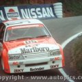
Jeez, Payce are spending a bit of coin this year aren't they.The GRM Volvo's look great!
So do their Dunlop Series Holden's (here is a pic).

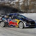

It just looks like something that I would expect to find in the Dunlop Series.Why do say that about the Holdsworth car?
It's like they kept trying to change it, but were never quite happy with what they came up with.Not to mention the shape of the design over the rear wheel arch is pretty awkward looking.

I feel it's more professional. I like it. For those that don't like the look of it, GRM might switch things up during the year. Besides, I bet it does look better in person.


That's a lot better if I'm honest. The darker green and the black rims really make it. Still a simple design, but like the Volvo, the colours make it work.Some small changes to Frosty's livery for this year and they switched to black wheels which is awesome.
Some small changes to Frosty's livery for this year and they switched to black wheels which is awesome.
It's believed that they're leaving the sport entirely. Mostert will carry Supercheap Auto, and Waters will either be Monster Energy or Enzed (or both).Does this mean no more Pepsi livery?
It's believed that they're leaving the sport entirely. Mostert will carry Supercheap Auto, and Waters will either be Monster Energy or Enzed (or both).

Yikes....not feeling this one 👎 The overall scheme is ok, but I'm really not a fan of the hood (bonnetSome small changes to Frosty's livery for this year and they switched to black wheels which is awesome.
 ). The Castrol green doesn't fit at all with the rest of the car. If they had the darker green tied in elsewhere, it might be ok; but as is, it's just a big'ole dark green square. Can't say I like the wheels either. I think silver, or gold with chrome lip would look better.
I'm the same. It looks confused.I'm really not a fan of the hood

The darker green and the black rims really make it.
 Black wheels are cool though, it'll probably grow on me.
It's almost like the livery was done without the Castrol logo, and then someone just stuck it on after the fact. Not sure what's going on with the shapes behind the front wheel either.I'm the same. It looks confused.