They weren't too bad, but not exactly fantastic either.I might be the only one who liked the 2012 stepped noses but this is just awful
So it not only has the 2012 stair nose, but also the 2014 gentleman's sausage nose.Force India you really are 🤬 stupid. Thanks for the ugliest car on the grid guys.


I dunno I thought cars like the Lotus, Caterham, Sauber, and Red Bull did theirs. I'd even go as far as saying the E20 was the best looking car to come out of Enstone in recent years.They weren't too bad, but not exactly fantastic either.
Welp, still sounds like ****.
 Maybe because Sauber is using the 2016 engine...
Case in point.I think what bugs me the most about crappy paint schemes is that they're the only thing which is borderline free. You can have the crappiest car in the world...and still paint it nicely.
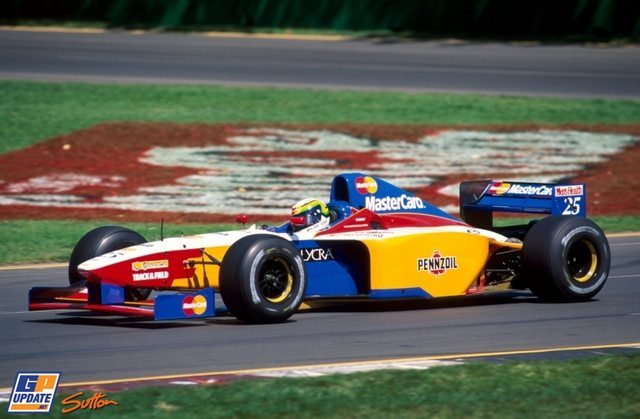
Wait, are you trying to present this as a good livery or a bad one?Case in point.
I am trying to present it as a crappy car that was at least painted with some imagination.Wait, are you trying to present this as a good livery or a bad one?
Because the Lola looks like it was on display when there was an accident at the Crayola factory.

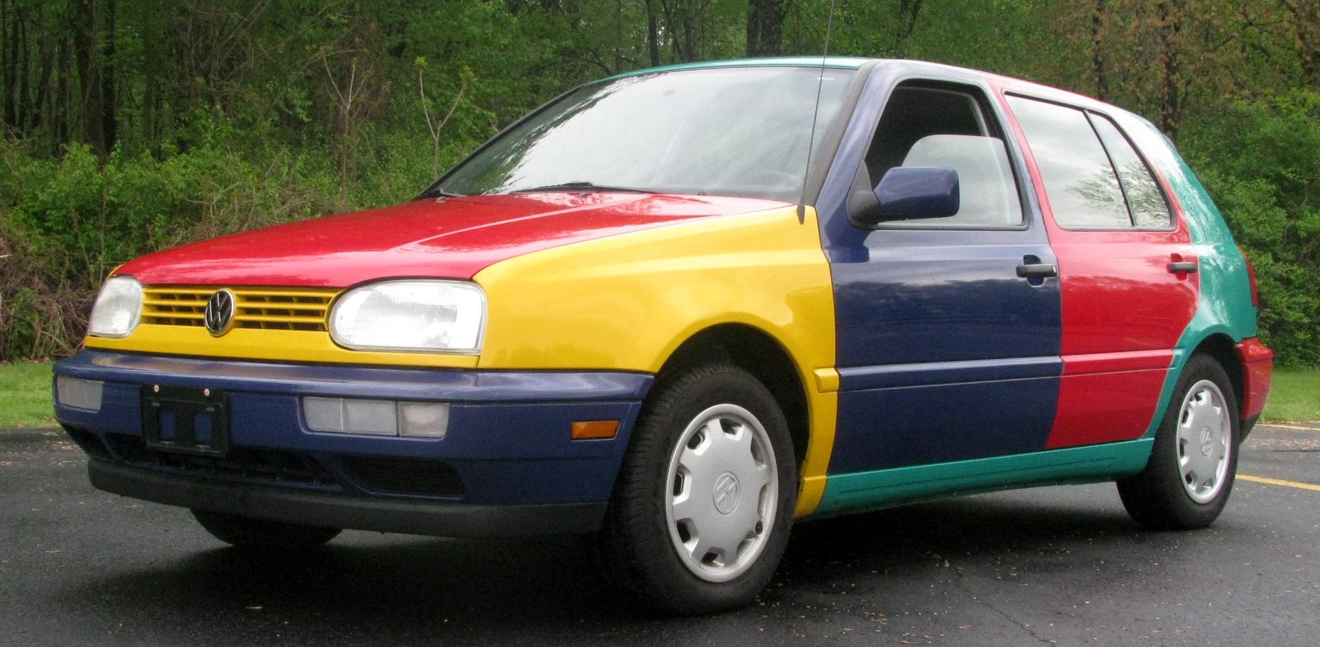

Dear god....
There is still a glimmer of hope then. If they sound even partially like Indycar's then its a step forward.Maybe because Sauber is using the 2016 engine...
I am trying to present it as a crappy car that was at least painted with some imagination.
I happen to like it, but I am also not opposed to these.

I've actually raced against this one.

There is still a glimmer of hope then. If they sound even partially like Indycar's then its a step forward.
So it not only has the 2012 stair nose, but also the 2014 gentleman's sausage nose.Force India you really are 🤬 stupid. Thanks for the ugliest car on the grid guys.

Efficiency is not sexy. Formula E disgusts me to that end.That's a great example of one of Mrs. Ten's favourite sayings... just because you can do something doesn't mean you should.
I'd disagree - the closer they get to silence the more efficient they become. Efficiency is sexy. Bwaaaa-bwaap-bwaap-bwaap is a waste of energy*.
*Although I admit I've just drilled my motorbike exhausts out... hmmm...
Aww, c'mon. This is incredibly efficient!Efficiency is not sexy. Formula E disgusts me to that end.
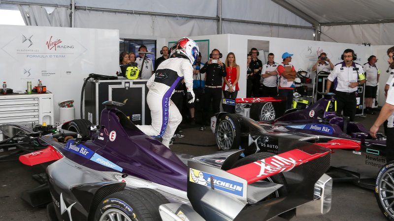
HA!Aww, c'mon. This is incredibly efficient!

 xD
xDAww, c'mon. This is incredibly efficient!

Well, not to mention how efficient is it to produce and ship twice as many cars around the world as would otherwise be required, so you can go race in city centers where you will disrupt traffic and cause gridlock, adding to pollution, all in the name of touting how green and efficient you are.Relatable middle aged man with a career in driving objects with 4 circular objects jumps out of his affordable convertible to a more highly economical and relatable convertible with a cool color
Welp, still sounds like ****.